MoniqueN.
-
Posts
906 -
Joined
-
Last visited
-
Days Won
15
Content Type
Profiles
Gallery
Forums
Everything posted by MoniqueN.
-
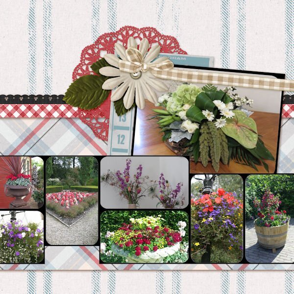
Mwuah.........should of chosen other pics or move some flowers to another place on the project. Ah well...........

- 382 replies
-
- 11
-

-

-
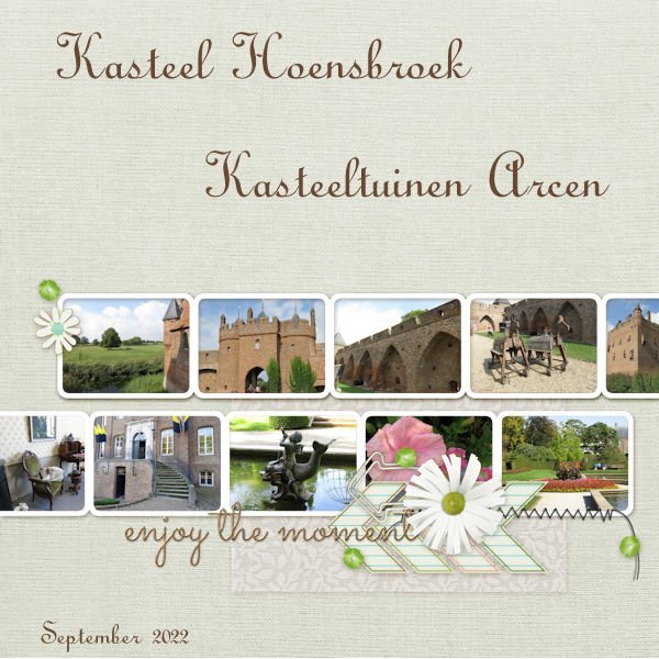
With every workshop I'm so pleased/enthousiastic (sp?) to see the same base lay out we get from Carole and everyonen has a complete different project as a result, I love it every time!? Here is QP7 Font is Annabel script. Photo's taken at castle and castle gardens over here in the Netherlands.
- 382 replies
-
- 10
-
-

-
-
Love it!?
-
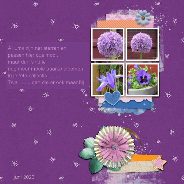
Last year I made this lay out in black, just as it was. I'm joining Corrie now in her purple mood, with this one.?
- 382 replies
-
- 10
-
-
-
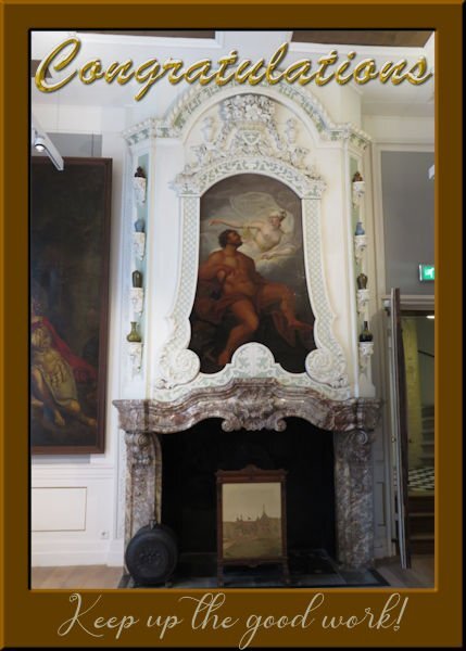
? The font is something with Bungee in it and Zaph Chancery. Photo's taken at the museum we went to week before last ?
-
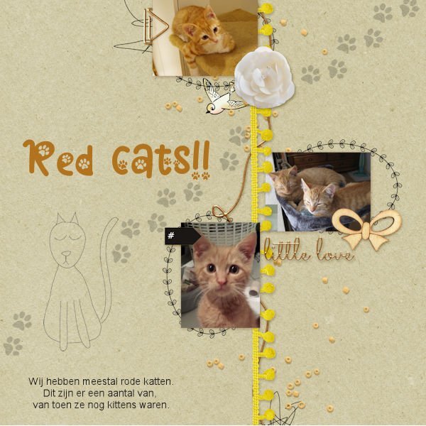
QP6 Font is Cat paw (duh ??) and the cat footprints are from Marisa lerin.
- 382 replies
-
- 11
-
-
-
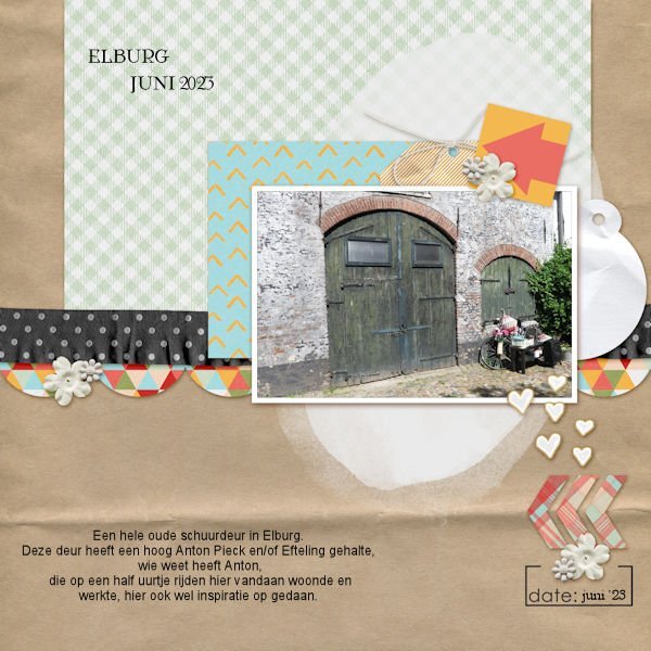
Text font on the left side at the top = Anton Pieck (Very famous artist) Anton Pieck In short translated: This is a very old door of a shed, maybe Anton Pieck got here his inspiration from, he liveda half hour from this place.
- 382 replies
-
- 10
-
-
-
This was a quick one, add a photo, text and ready ? Maybe I can use this one as print and cut for my cricut machine ?
-
Day 5, just the Datstamp kit again and added a maat, because the date was hard to see. I think a line, in the same colour as the lines in the QP and than along the mat would of been nice . But it's ok for now ?
- 382 replies
-
- 11
-
-
-
If you would like to remove a background outside of PSP, I would recommend https://www.remove.bg/ I use it a lot working on projects with my Cricut machine ?
-
Sorry for your loss..........
-
Love them!?
-
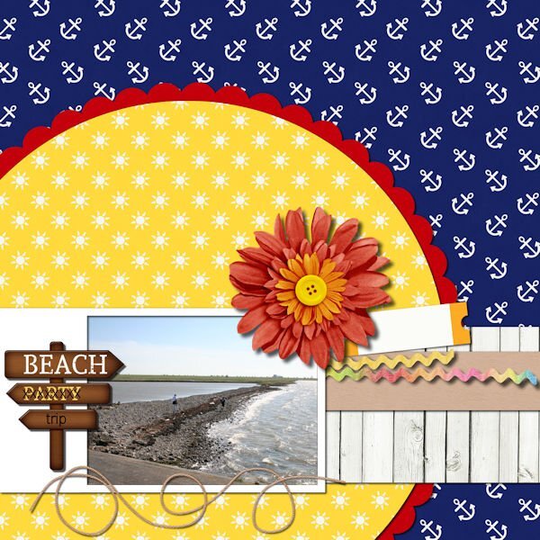
Mwuah.........I didn't like the QP much also because I don't have many pictures at or near a beach ?
-
This was a difficult one to fill. Chopin script is the font, photo's my own ?
- 382 replies
-
- 13
-
-
-
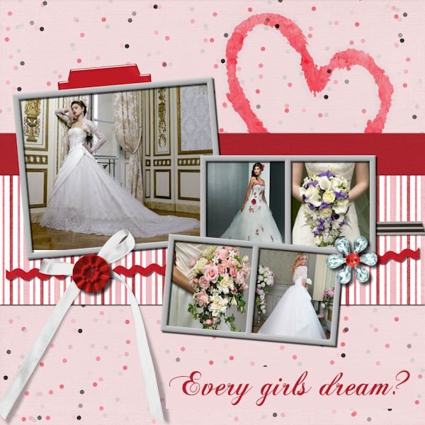
A romantic lay outs needs brides ? Photo's from the internet ?
- 382 replies
-
- 11
-
-
-
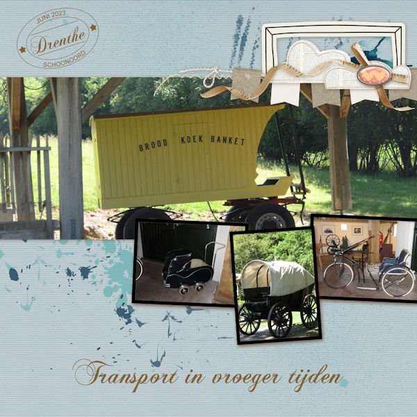
I used the date stamp script for the date, I think the font was Chopin ? The text says: Transport in earlier times
- 382 replies
-
- 12
-
-
-
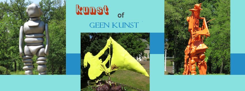
Day 3 Photo's on the first project taken in Elburg, a town in the Netherlands. The project is ok, but other photo's would of been better. The FB pages says: Art of no art in Dutch. One of the fonts is Gunplay 3d, the other I forgot to write down??♂️
- 382 replies
-
- 14
-
-
-
I love the way you used the lines on the mat to add your text ?
-
What font did you use, Ann? It's funky(?), but a bit hard to read too??
-
@Corrie Kinkel It isn't my first time either, but as you said easy projects once in a while are nice to do too ?
-
@CasselNo, they were stationary, enamel flowers on iron sticks ? @Corrie Kinkel I like Carole's idea of unboxing ?
-
K- Kerel (Guy in Dutch ?
-
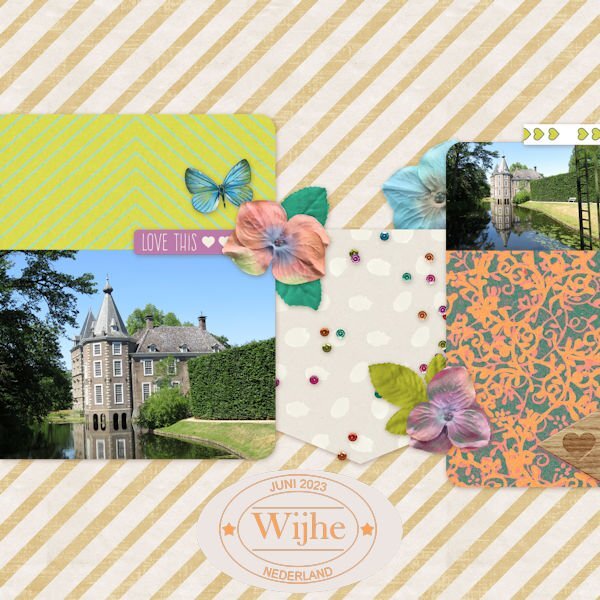
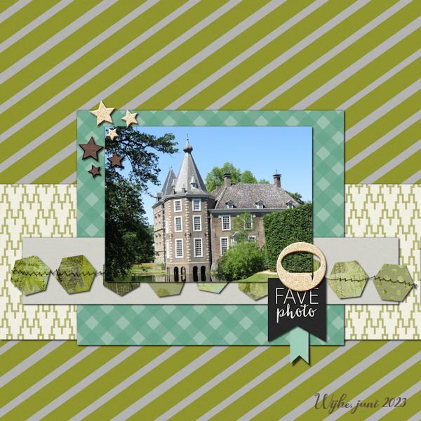
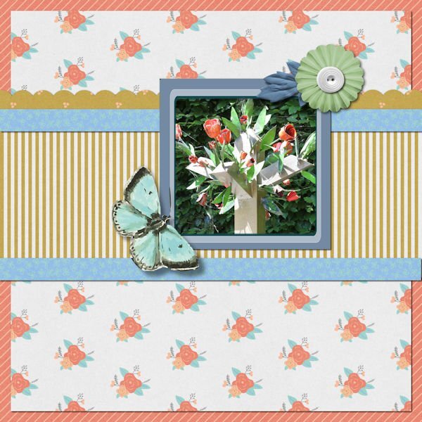
Cute butterfly is the font, photo taken in Wijhe, the Netherlands ?
- 382 replies
-
- 12
-
-
-
Image taken at a castle in Wijhe, the Netherlands. Font is Cute butterfly?
- 382 replies
-
- 12
-
-
-
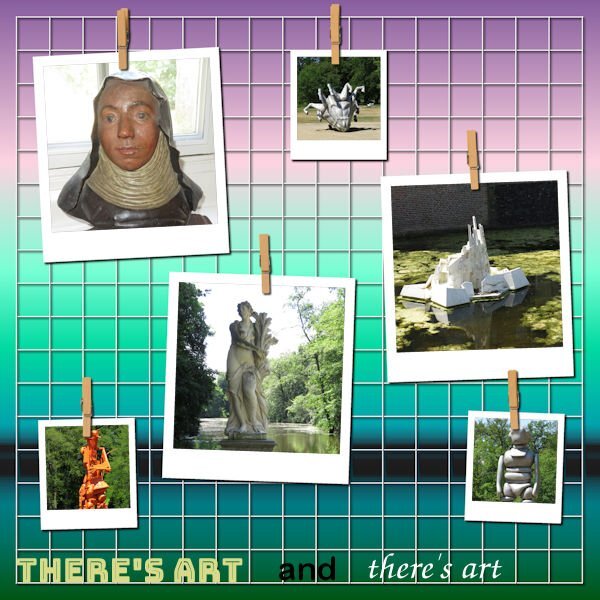
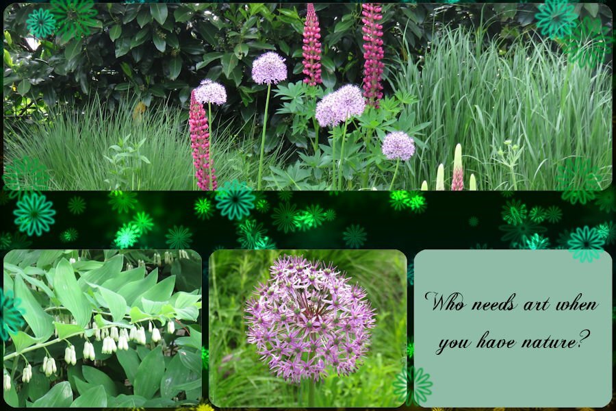
Art in a convent garden in Elburg, the Netherlands. I added a frame, because the picture faded a bit in the busy lay out.
- 382 replies
-
- 11
-
-