-
Posts
863 -
Joined
-
Last visited
-
Days Won
14
Content Type
Profiles
Gallery
Forums
Posts posted by MoniqueN.
-
-
4 hours ago, Cassel said:
@Anne Lamp The first time you mentioned the cam, I thought it was YOUR cam, but now, with all those animals, I know they are not on your property! Good work! Good extraction on the bird!
@Randy I have some versions that tend to do that and change to text instead of icons. But you can change that. Go to View > Customize and while that window is open, right-click on the text instead of the icon and select Icon in the list that will pop. Your project #4 does not show. Can you repost it?
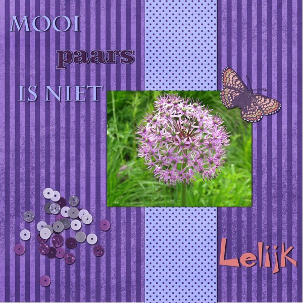
@MoniqueN. Great page. The only thing that "annoys" me is the flower showing behind the paper. Even if it is showing as a "paper image", my brain still thinks that the flower should be on TOP of the paper! ?
Funny you say that, I've been moving around with it, but couldn't decide which way. Thanks for the input!
-
 1
1
-
-
Day 5
We were at an show garden this weekend, the pictures I took there and will be used for this bootcamp.
The text says: A lovely spot to get some rest, but the funny thing is, we never sit there but at a spot earlier on.
I used parts from kits I had in my stash from pixelscrapper and the text "rust" (rest) I used "enamel" (effects--artistic effects--enamel
-
 2
2
-
 7
7
-
-
18 hours ago, Ann Seeber said:
Mooi paars is niet Lelijk - Google says: Beautiful purple is not ugly ?
Yes! Funny, I just edited my original post and now I see your question ? Ugly is lelijk in Dutch, so that's why I chose that font in the right corner.
-
 1
1
-
-
-
U- Universal love for our mothers (well most of us do)
-
-
In future when searching for a font, you can use whatthefont . ?? The site helps you find the font you're looking for. ?
-
 1
1
-
-
-
I don't know how thick scatters are because I don't know exactly what it is/what they are. (Paper, metal?) Something in thickness between sequins and confetti??
-
-
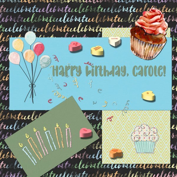
I'm working on day 6 of the double page workshop and added some scatter on my project.
Does scatter need a shadow? I'm asking, because when I add shadow the whole scatter gets very dark. (Tried different settings)
The scatter itself I reduced the opacity to 36, so I thought maybe the shadow has to be 36 too. But that doesn't look ok either. Maybe I should use an even more lower opacity??
-
 1
1
-
-
-
31 minutes ago, Ann Seeber said:
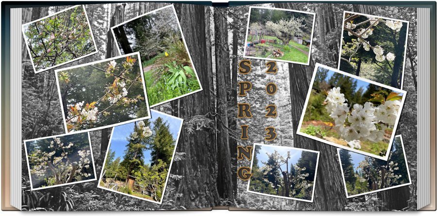
I finally came up with a sixth layout but it's not the style of that assignment. I used the scattered photos script, the open book script and the title style from last month's title workshop #1. Not real happy with the title but it'll do. The photos are from my daughter in California of her flowering trees in the midst of the redwoods so I went to Pixabay and found a shot of the Redwood National Forest as a background which I treated to a Multiply over a white background and that removed all the color. I liked the effect as the flowering tree photos were more visible. The title font is Cooper Black with Texture/Sculpture effect and filled with Picture Tube flowers.
Ann, have you tried to lower the opacity of the background page, so that you can see the title more or change the colour of the edge of the title? The layout is wonderful!?
-
 1
1
-
-
-
-
18 minutes ago, Nancy McNamara said:
Day 1
I have managed to get some work done this week (between the computer and an external drive) in spite of my full disc. I plan on continuing to work on some more of the lessons this week! I have thoroughly enjoyed all of the fabulous creative work that has been posted during the workshop.
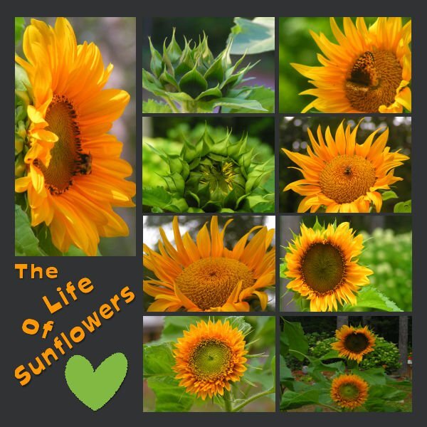
My pages were Sunflowers from 2022, they are dwarf Sunflowers that I grew in containers on a tabletop. I live in a woodland setting with spots of sunshine, but I have always loved Sunflowers. I have read that you can't grow them under trees, but I think this proves them wrong! If you don't have much space to garden, I would highly recommend giving dwarf Sunflowers a try it is very rewarding!
Nice and bright!
-
 1
1
-
-
-
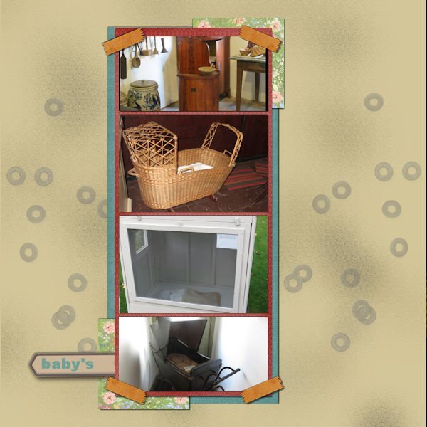
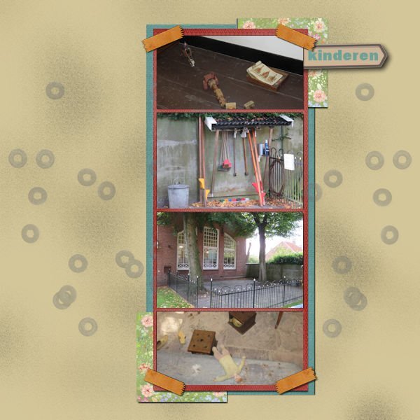
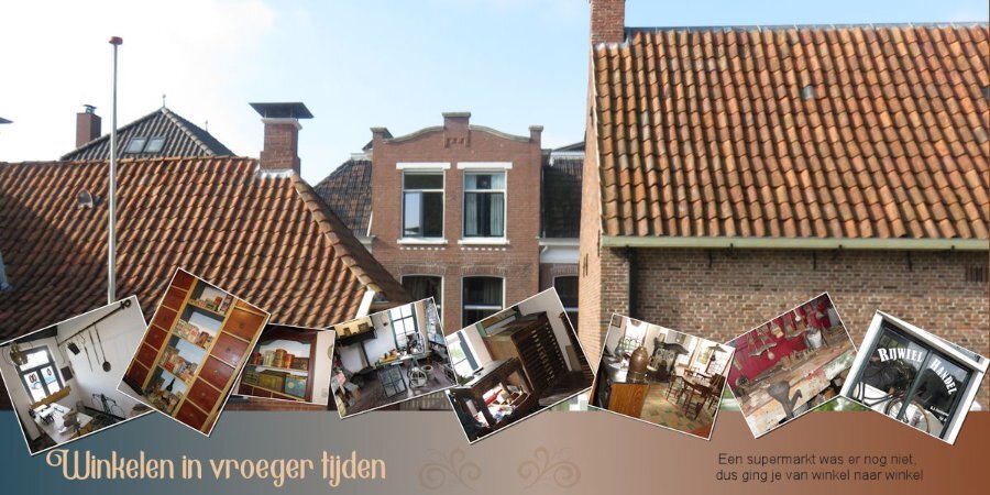
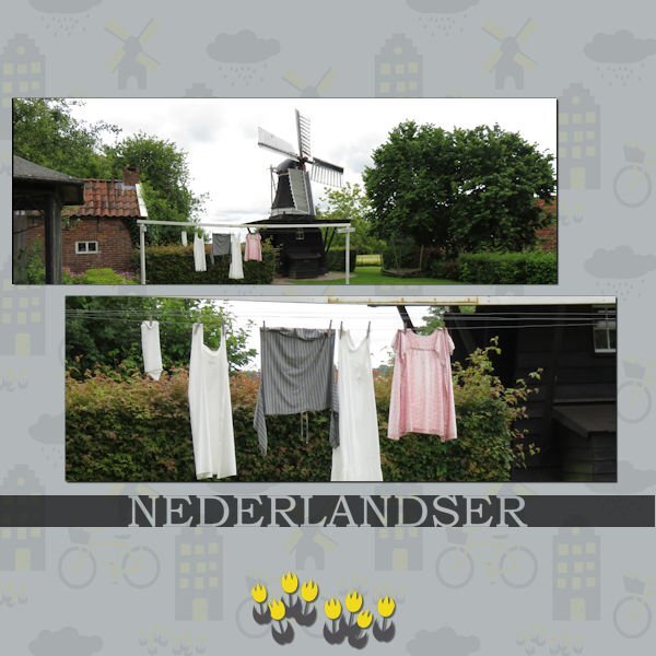
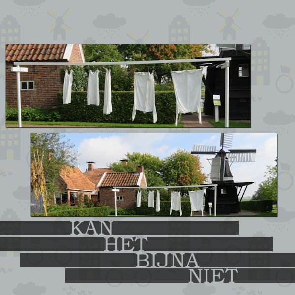
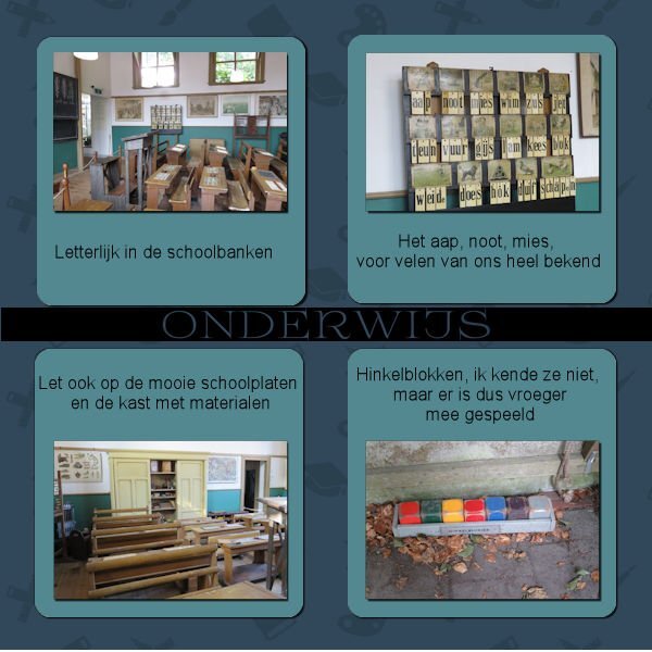
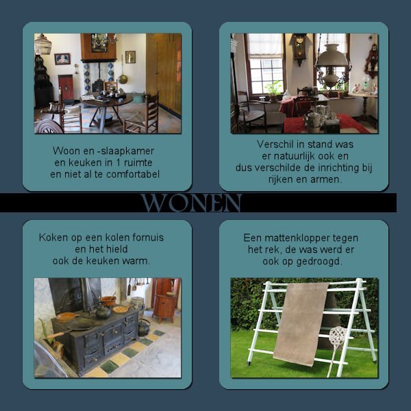
I'm almost glad Mary is also late with her projects. Had a busy week last week and when I finally sat down ,nothing was to my liking. But here's day 1?
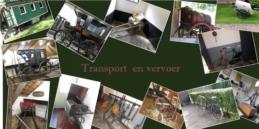
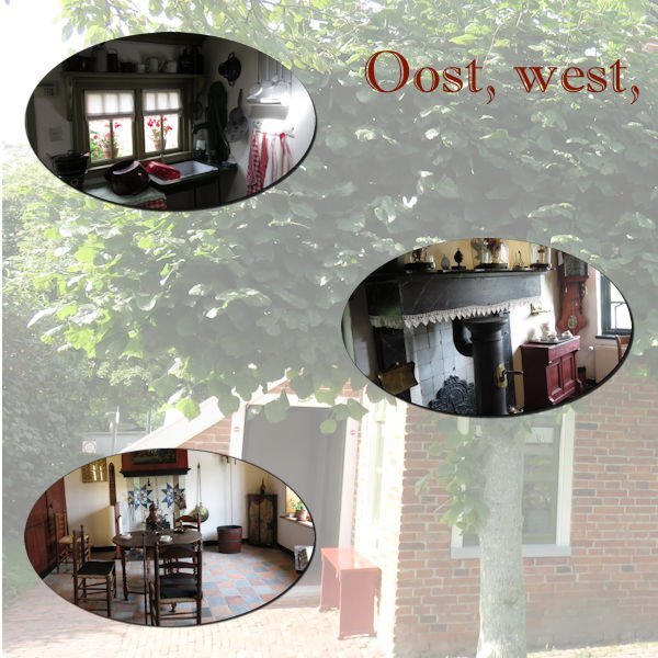
My project will be about a museum in the North of the Netherlands.
I used Carole's Cut out phrase script for the text, Arial is the font and also Book antiqua, one other font I don't know. I think the template came from pixelscrapper
-
 3
3
-
 7
7
-
-
38 minutes ago, Cassel said:
Too bad.
If you have a recent version of PSP, you might have to test the various fonts by typing the same word you used, and scroll through the fonts dropdown list. The new versions of PSP will preview the fonts as you hover over them.
I have Nexusfont installed, so will try that also.?
-
I found the script but it doesn't say which font it was ?
-
9 minutes ago, MoniqueN. said:
Can I see that even when it was saved a few days ago?
Found the edit history, will have a look if I can find the font ? Thanks for your help??
-
23 minutes ago, Cassel said:
I don't think there is such a way but just in case, did you check the Edit history by any chance? I wonder if the selected font would show there.
Can I see that even when it was saved a few days ago?
-
Is it possible to find the font you used in a project?
And in this case after using Carole's Phrase cut out script? I forgot to write down which one I used and for the consistent look I would like to know which one is it was?
-







Scrapbook Bootcamp - May 2023
in Showroom
Posted
Repost: Flower at the right now on top instead underneath the papers. ?