

Marie-Claire
-
Posts
719 -
Joined
-
Last visited
-
Days Won
1
Content Type
Profiles
Gallery
Forums
Posts posted by Marie-Claire
-
-
What a thoughtful and lovely surprise !
-
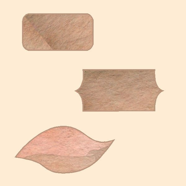
After working on this for a long time, I succeeded, and also to save them as basic shapes in 1 file, but I still struggle a lot with those nodes. I'll have to practice a lot!

-
 10
10
-
 7
7
-
-
I just now see that the arrow is not good yet. I'll have to work on that some more
-
Hi everyone,
The heart went easy, but then suddenly with the arrow I couldn't do it with the nodes anymore. But the persistence wins. The difference between the nodes symmetric, asymmetric and cusp has now become clearer to me after this explanation. Thank you Carole !
-
8
-
6
-
-
I'm in too!
-
2
-
-
What a beautiful reward for your work, to see your daughter's reaction. ?
-
1
-
1
-
-
On 5/25/2023 at 4:57 AM, Suzy said:
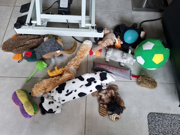
I just saw these! And they’re are all wonderful…the texture is just right. Visible, but not too big and aggressive.
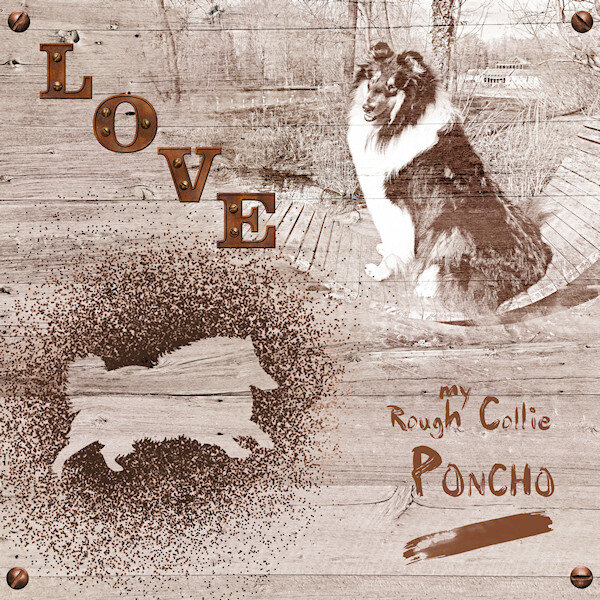
How many toys did Poncho have?
You had the word “selfies” on the LO, so I thought the cat stepped on the phone and took her own photos. ?
Suzy, Poncho has many toys ?
-
 2
2
-
1
-
-
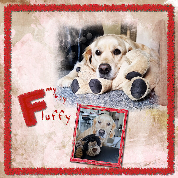
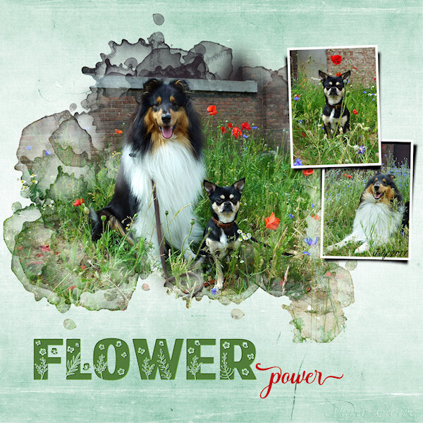
I am the lucky one who won the wool2 tubes from Cassel and I tried something with it. The background paper is by Marisa Lerin
Own pictures. Our daughter's dog regularly comes on holiday for a week while she is on the move for work.

-
3
-
10
-
-
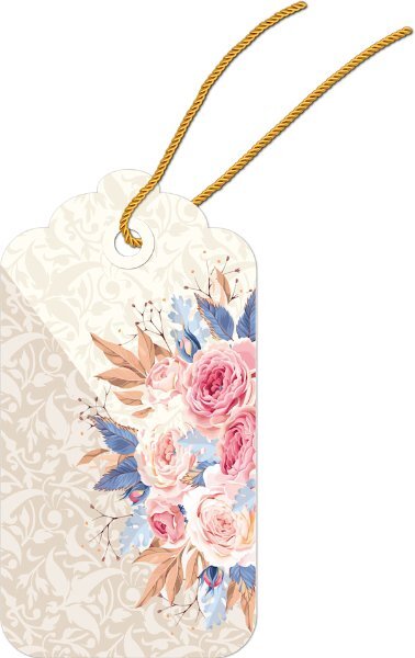
Using Master Class Tag again!, I got the rope through my tag ?
-
4
-
-
4 hours ago, Michele said:
At first I thought about wedding dresses, then I decided baby clothes would be the most sentimental. I downloaded a kit by Janet Kemp from PS and used Carole's Hanging Photos script. I'm so glad I bought it because it takes a long time to get this result manually. And it's great that it leaves everything on its own layer; I did some rearranging. The title font is Lovely Blooms from CF and on the baby blanket I used Mix Stitch from Dafont.
This is so beautiful ! nice idea !
-
 1
1
-
-
12 hours ago, Susan Ewart said:
Project 4
I used the kit that came with this Project (cpjess-spring skies). But you wouldnt know it, unless you took a peak in my layers palette. I used the blue sky paper, duplicated it and turned it upside down so the clouds above were same below - but you wouldnt even see that now as it all blended in, all these two layers had adjustment layers applied to them and both paper layers had different reduced opacity. I used the blue paper (with newspaper writing on it) with a reduced opacity and above that layer I promoted a selection of it to make my pinking shear effect. And above that layer was a photo of mine of Canada geese flying into the pond. I didnt like the photo background look so I played with blend modes and chose "difference" and it made the birds look like a graphic and the pinking shear was lightened against the background of the same paper below it. I thought it looked interesting. Lots of this was me moving layers around and seeing what would happen with the blend mode. This again, was a happy accident. that works better with the two smaller photos. I made the other little strips of paper from the original blue paper and from the new brownish paper. Used also in the title.
Font: NNSafari Serif (Creative Fabrica)
Photos: mine
This was shot on November 20, 2011 and these geese (over 800) had only 2/3rds of the pond as the rest was frozen, and they had to share it with about 6 other species that flew in. It takes about 10 minutes for the geese (coming from the farm fields nearby) to all get landed. the sky is black with Canada geese, it's really quite a site and fun to watch them come in for the landing. This is a very different kind of layout for me.
Susan,the result with the birds in the background turned out well! It's fun to play with different layers and blend modes. ?
-
1
-
-
This is really beautifully done, and those plants!! if you don't know and you see the picture you think they are real. Great! ?
-
1
-
-
layered template : Cassel
Digitalscrapbook, blogtrain,
Papers of Elizabeth Minkus, from minikit Oct2018 That Smile.
Tag of Sharon Dewi, from minikit SpreadYourWingsFont, Lucida Handwriting
Photos are mine
-
10
-
-
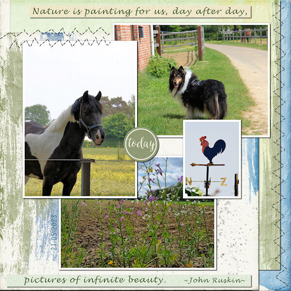
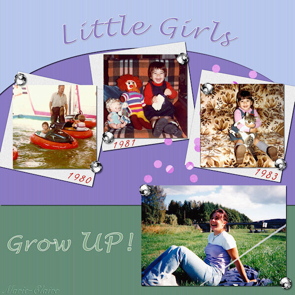
With pictures of my daughter Nelly.
-
3
-
6
-
-
7 minutes ago, Sue Thomas said:
A truly outstanding page. textures, overlays and the blend modes, is all a matter of trail and error, to achieve the desired effect, but well worth taking the time.
now that i look back at it...i might have to put a shadow on the screws in the four corners ?
-
1
-
-
48 minutes ago, Susan Ewart said:
Stunning! I love everthing about this. It looks like a photo from the 1800's. Really incredible, complex work. Thank you for the instructions. Very interesting to have different blend modes on the different layers.
Thank you Susan, and now that you mention it, I hadn't looked at it that way ?
-
1
-
-
In the April Q&A I had asked Carole how to make a Stencil effect. My idea was to make different papers with it. But at my first try, I wasn't sure for which project I could use such papers. My eternal problem is what shall I make as a project. So I just did something, and tried things out for several days until I finally came to something.
I didn't use the stencil technique here to make a paper but saved it as a png.
The alphas are a freebie from Carole, as are the screws.
Of the photo, of course that is Poncho, I first made a B/W version, duplicated it twice, on the first layer the blend mode: overlay, on the second layer: screen and on the third layer I applied: soft light.
Font is from DaFont and is : PaintyPaint 1
and a watercolor bruch for the stripe.
-
9
-
-
20 hours ago, Susan Ewart said:
These are beautiful. I have a dumb question. Is the font itself transparent? So that any layer below would show through? The look is really eye catching. I'm going to check out that class. I have been watching classes when I warm of for my workouts and seeing that the ones I saw when I first started I didnt really understand. Now that I've learned more I understand the concepts of the tutorials better. Enough to know that I can be successful at trying them.
Susan, thank you, the font itself is not transparent, you make that with the cutout effect. It is well explained in the master class.
You can use any thick font for that, I used Mongolian Baiti font, I think it's a Windows font.-
1
-
-
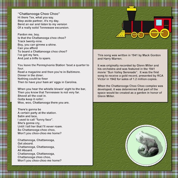
4 minutes ago, Mary Solaas said:
So, now I've finished the pictures of the Chattanooga Trip. I've completed what will go on the front of the album and the first page.
i love that song, and the Glenn Miller orchestra !
-
1
-
1
-
-
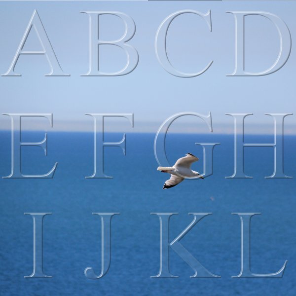
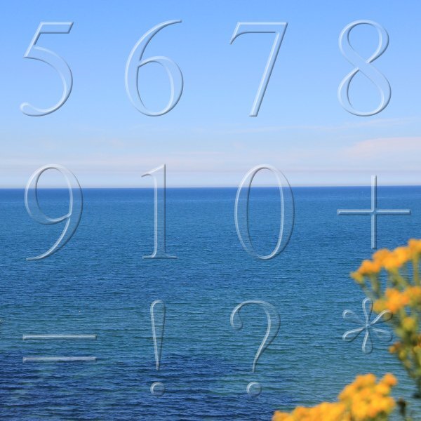
I've been busy making transparent alphas. With the help of Masterclass Alpha Making 2 I made the full upper and lower case alphabet and the digits, as well as some punctuation marks. Here I have posted some examples.
-
4
-
8
-
-
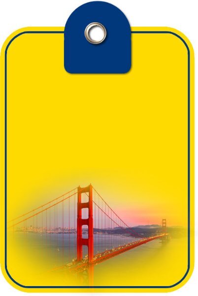
23 hours ago, Corrie Kinkel said:
Wednesday I'm leaving for 3 weeks to the USA to visit my daughter, son in law and the grandkids. I'm going for the first time to the Bay area of San Francisco where they are living now. We will certainly visit the city and see the Golden Gate bridge. My journey will give me great photo opportunities, at least I hope so, which will result in new layouts. Also we are going for a long weekend to see the Grand Canyon, I'm very exited! In preparation I made this tag in the State colors of California with a illustration of the bridge found on cleanping. It has place to put a date and then it will go on a layout.
The coming weeks I won't be scrapping but once a while I will come here in the campus and on facebook to see what everybody is doing. See you all in June!!!
Goede reis Corrie !
-
1
-
-
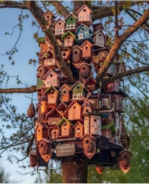
Beautifully done! if you look at the photo and you don't know it's a mini version, you think it's all real. I like the little things on the bottom shelf. Really great!
But I may have found you another project Carole, I wouldn't want you to get bored when your green room is finished.
This is a bird hotel in Amsterdam, according to the commentary accompanying the photo. I saw the photo pass by on fb and immediately thought of you.
-
2
-
-
Paper is from digitalscrapbooking from Janet Kemp
The mask I made with Cassel's script cass-MaskMaker
Font: Flora Garden and Misha Gergoval
-
1
-
12
-
-
Day 6
I also wanted the open book script, and I'm happy with it.
the stamp3 script is also one of the scripts I bought, and used it right away.
-
2
-
8
-


Vector Workshop 2023
in Showroom
Posted
Lesson 3...Oh Boy ..... ?