Ann Seeber
-
Posts
3,339 -
Joined
-
Last visited
-
Days Won
80
Content Type
Profiles
Gallery
Forums
Everything posted by Ann Seeber
-
I created a PSPIMAGE template from Carole's sketch. The wavy ribbon is still a bit rough. ? I'll post it in the Files on Facebook for whoever would like it.
-
Donna and Susan: I took my pale pastel in 3600.jpg and posted it in our Facebook group files so you can colorize to your liking. Enjoy!
-
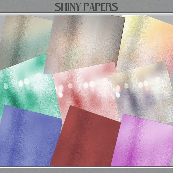
I have a small set of pale pastel shiny papers in my files but with no identifying information as to where they came from. After seeing that Donna tried to colorize hers, so I thought I'd try on mine and have had some success. I did them all in 3600 but here's a preview. Voila!

-
Happy Easter, Cindy. Have a look under Blogs / Tips and Tutorials. It has a search bar on the top right where you can put the key word from the clue... in this case, compatibility.
-
Thank you, Jnet. Happy Easter to you, too. ?
-
Email sent! Fun, Carole! ?
-
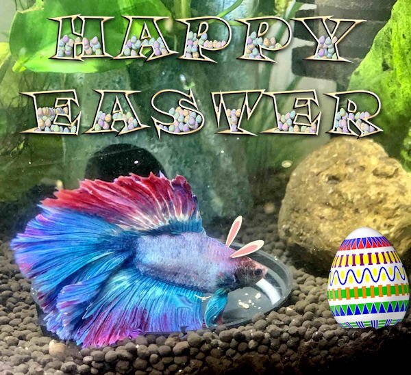
My Betta 101 group on Facebook requested Easter themed photos. So here's Comanche with bunny ears and the text decorated with the cass-easter-egg picture tube and one of Carole's decorated eggs. The font is Snap ITC.
-
Michele: I just looked at it and the handout is not a hot link for download... yet. Sometimes there's a lag getting it transcribed. I just sent the question to Carole via the gold tab on the lower right "Need Help?"
-
I wondered about the name "Alludo" and when I looked it up it says it was "formerly called the Corel Corporation." I didn't know about the change. The reference says: "Cascade Parent Limited, doing business as Alludo, is a Canadian software company headquartered in Ottawa, Ontario, specializing in graphics processing. Formerly called the Corel Corporation, the company is known for producing software titles such as CorelDRAW, and for acquiring AfterShot Pro, PaintShop Pro, Painter, Video Studio and WordPerfect." Cassel, when did this change?
-
Rene: Stay safe! ?
-
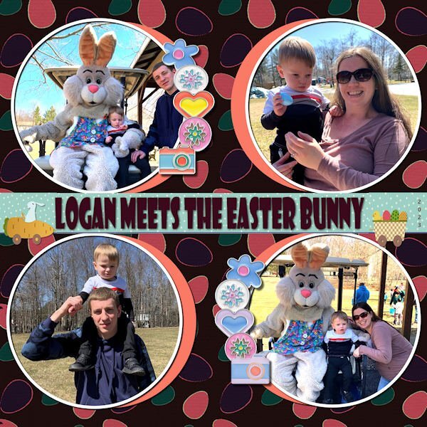
I forgot the theme was Easter so I'm sure my layout with my great grand, Logan, meeting the Easter Bunny would qualify!
-

From the album: ANN SEEBER - MISCELLANEOUS
Grandchildren Ilana & Maverick sent some photos of their son, Logan, meeting the Easter Bunny this weekend. I was poking around in Lab 13-4 so I used the template. I got some Easter/Spring freebies from Digitalscrapbooking, including the background paper where I applied the Difference blend mode. The title font is Showcard Gothic. The strip behind it came from a marisaL Easter journal card that I cut apart and stretched across. -
Grandchildren Ilana & Maverick sent some photos of their son, Logan, meeting the Easter Bunny this weekend. I was poking around in Lab 13-4 so I used the template. I got some Easter/Spring freebies from Digitalscrapbooking, including the background paper where I applied the Difference blend mode. The title font is Showcard Gothic. The strip behind it came from a marisaL Easter journal card that I cut apart and stretched across.
-
Rene: My two projects were mixes of single and doubles. It's possible we had to split them at first because the forum wouldn't display doubles. Now we can.
-
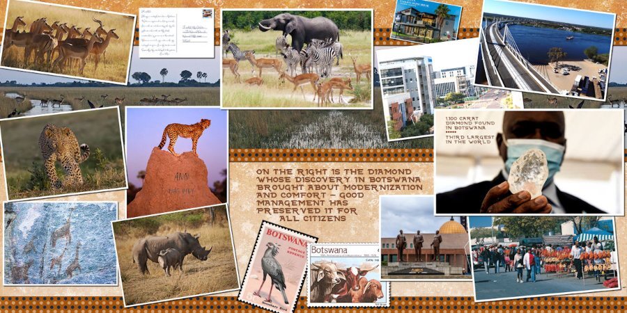
I'm signed up. In the past I've created travel pages (real and fantasy). It was really fun to do a set of pages for a trip to Botswana, Africa, which I'll never do IRL but admire from reading about the country in the No 1 Ladies Detective Agency book series by Alexander McCall Smith. I'll show you a sample. The very first project I did when I joined the Campus was double page layouts illustrating our family vacation to Acapulco, Mexico. Not sure what I will do this time around. We'll see...
-
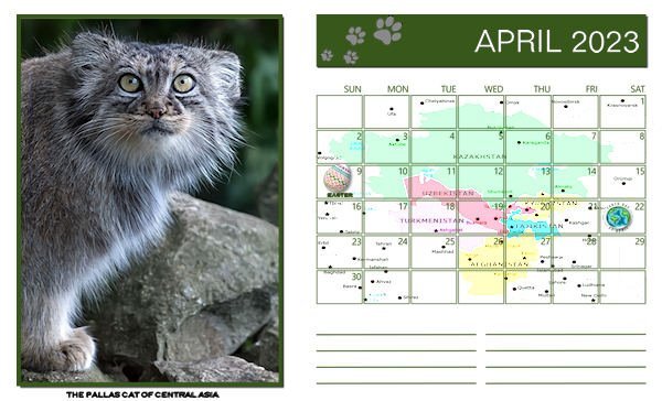
Happy April! Here's my monthly Wild Cat Calendar featuring an unusual cat from Central Asia. I posted the full JPG in the FILES section of our Facebook group. It will print out at 11" x 8.5" landscape. I used Hard Light on the map of central Asia under the calendar format and was pleased with the result. These Pallas cats are about the same size as a domestic house cat but with short legs and long hair. I love their comical expression.
-
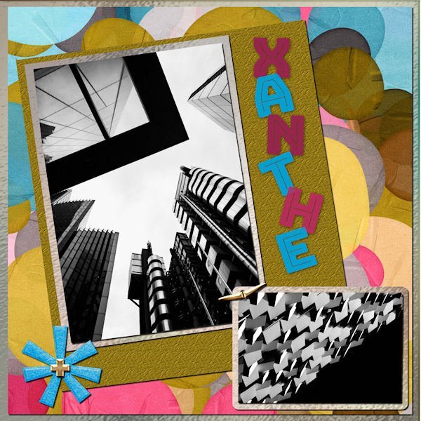
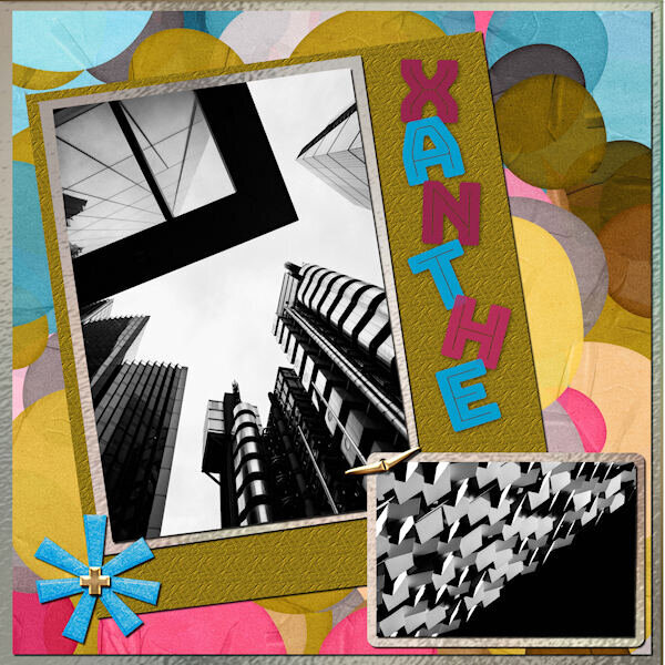 This is the March 2023 Sketch Challenge. I used a kit called ps-rachel-martin_xanthe for any papers and elements. The photos are random from Mike Hindle on Unsplash. The font is Bungee Inline and I used the technique taught by Carole in the Text Workshop-Lesson 5 but this time I used a "fatter" font and added texture. I took the title from the name of the kit.
 -
I did the March Sketch Challenge. I used a kit called ps-rachel-martin_xanthe for any papers and elements. The photos are random from Mike Hindle on Unsplash. The font is Bungee Inline and I used the technique taught by Carole in the Text Workshop-Lesson 5 but this time I used a "fatter" font and added texture. I took the title from the name of the kit.
-
I used a kit called ps-rachel martin xanthe for any papers and elements. The photos are random from Mike Hindle on Unsplash. The font is Bungee Inline and I used the technique taught by Carole in the Text Workshop-Lesson 5 but this time I used a "fatter" font and added texture. I took the title from the name of the kit.
-
Marie-Claire: How did you achieve those nice borders on the letters? Yours really stand out the most!
-
Nice colors, Julie! ?
-
WOW! It's a triple play! You covered one text workshop, the song of the month and the freebie, all in one! Nice - congrats!
-
Carole: Thank you for a great workshop! I think someone said they did this one in the past, but it must have been before I joined, as these techniques are all new to me.
-
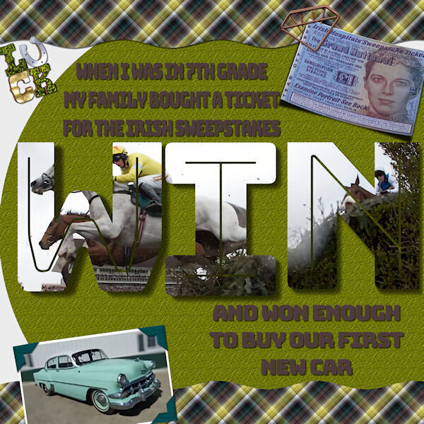 Here's my final project for the Text Workshop. A bit of a story. When I was in 7th grade my parents had bought their annual Irish Sweepstakes ticket and, for once, they won! The way it worked, thousands of people bought tickets and the hospital (charity behind the game) committee in Ireland drew a ticket for each horse in the Grand National race. If you we assigned a horse you automatically won money, and of course, if your horse won, you got more. So, our ticket was assigned but did not win the race. I think my folks got about $1000 which, in 1954, was enough for a new car! (First new car they ever had.) It was a fun time! My font is Bungee Inline. The photo corners are from my own kit. I made the plaid from the horse photo colors. Cassel's curved photo script on the ticket. Interesting techniques using vector texts as shapes.
 -
Here's my final project for the Text Workshop. A bit of a story. When I was in 7th grade my parents had bought their annual Irish Sweepstakes ticket and, for once, they won! The way it worked, thousands of people bought tickets and the hospital (charity behind the game) committee in Ireland drew a ticket for each horse in the Grand National race. If you we assigned a horse you automatically won money, and of course, if your horse won, you got more. So, our ticket was assigned but did not win the race. I think my folks got about $1000 which, in 1954, was enough for a new car! (First new car they ever had.) It was a fun time! My font is Bungee Inline. The photo corners are from my own kit. I made the plaid from the horse photo colors. Cassel's curved photo script on the ticket. Interesting techniques using vector texts as shapes.
- 331 replies
-
- 13
-

-

-