-
Posts
3,337 -
Joined
-
Last visited
-
Days Won
80
Content Type
Profiles
Gallery
Forums
Everything posted by Ann Seeber
-
Ah, thanks, Sue. That's what I was looking for!
-
Actually, he was never considered well built. He has an ewe neck, for starters. I think he sold as a colt for $20. LOL
-
Is it really rotated? I thought it was cut at an angle (5%?)
-
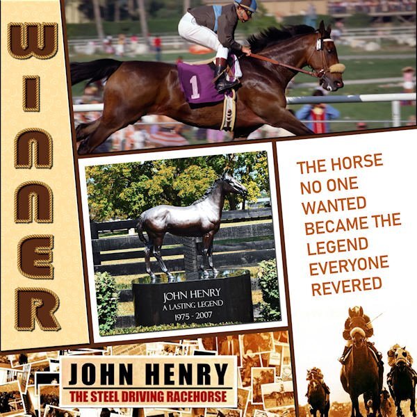
Here's my Day 6 - I filled all sections with images and/or text. We saw this horse in person at the Meadowlands Racetrack in NJ. Everyone was so excited to see The Legend. I discovered they made a 90 minute documentary about him and the DVD is available for ONLY $100!! ? The sad part is that he was incorrigible as a young horse, so he was gelded and, as a result, was unable to pass on his talents to any progeny. The font I used for the title is Bauhaus 93
-
Here's my Day 6 - I filled all sections with images and/or text. We saw this horse in person at the Meadowlands Racetrack in NJ. Everyone was so excited to see The Legend. I discovered they made a 90 minute documentary about him and the DVD is available for ONLY $100!! ? The sad part is that he was incorrigible as a young horse, so he was gelded and, as a result, was unable to pass on his talents to any progeny. The font I used for the title is Bauhaus 93. The vector tube script was perfect!
- 331 replies
-
- 14
-

-

-

-
Thanks, Rene. I'm unsure how you find the information as to the angle of the image on the layer.
-
Carole: I just watched the video for Day 6, and you say: "for this particular template, if you are using it, you can rotate your title to match the line, but I can tell you that it was an angle of five degrees." My question is how do you know it was five degrees?
-
I hear ya! I had to re-do my line 4 times before it looked like a curve! ?
-
Gorgeous layout Susan! Love the colors, especially. I usually give my title letters the Effects/Cutout treatment and I think the result is the same with less work. I was surprised how easy the text on a curve turned out to be!
-
I know Carole said not to use a shadow, but I did. I duplicated the vector layer, rasterized it and added a shadow. My text is rather narrow and needed an emphasis.
-
-
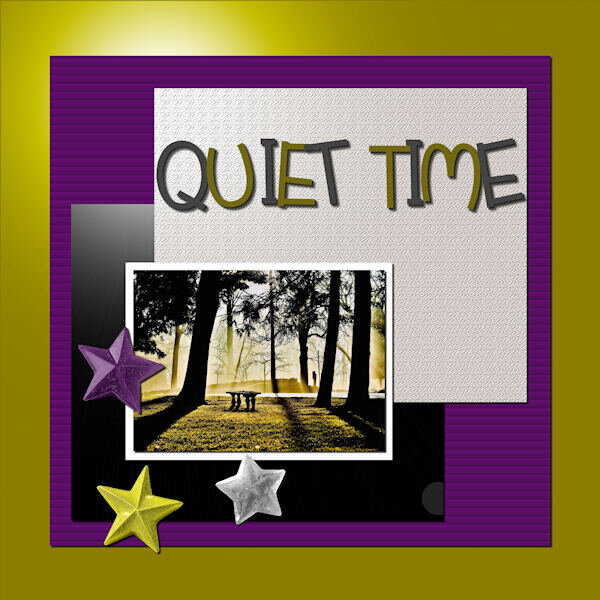
A photo from Chuck Calio on The Hudson Valley in Pictures titled Quiet Time. The stars are from my kit of glitter star templates by Esperanza Mixto on Pixelscrappers. I used various effects on plain color fills. The title font is Before the Rainbow from the Freebie Challenge.
- 331 replies
-
- 17
-

-

-
Thank you, Carole. I have a selection of them as templates which I can colorize and, in this case, lower the opacity to give them more of the look of translucency. There are 10 versions, and they are labeled: ps-esperanza-mixto-glitter-star-templates-kit, from Pixelscrappers.
-
-
-
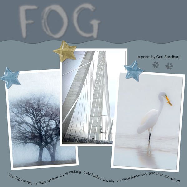
LESSON 4 - FOG - I hunted up 3 photos on Unsplash to illustrate Carl Sandburg's poem "FOG". The stars are from my new kit. The colors are from my kit's palette. The cat footprints were from a free site that Google found. I was pleased that I got the text on a path to work properly the first time!
- 331 replies
-
- 16
-

-

-
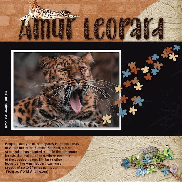
Here's my Lesson 3 - The Amur Leopard. The photo is from Unsplash, the title font is Baby Olivia, the papers and the scatter are all mine from my new Rustic Kit. The lounging leopard and the turtle/bird cluster are from an Animal Kingdom Kit by ddeb.
- 331 replies
-
- 16
-

-

-
-
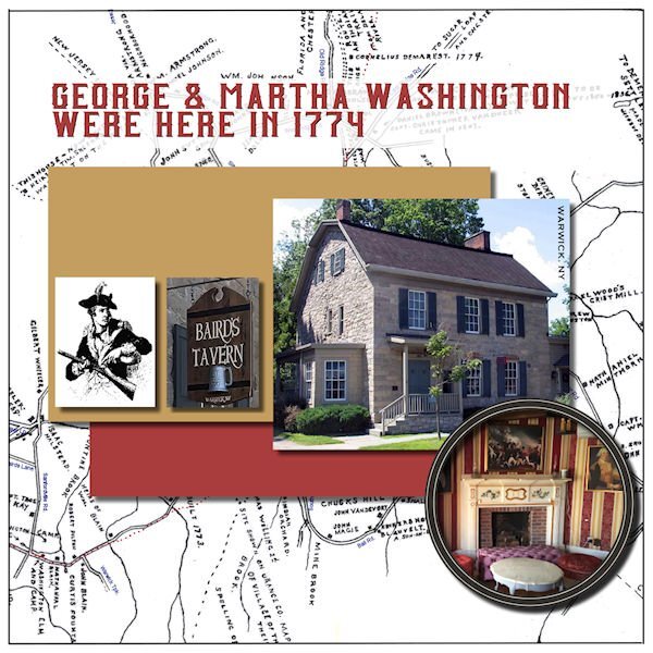
My late husband and I lived and worked in the Historic Village of Warwick (NY) for over 40 years. No one goes around in period costume but there are many buildings restored to their original glory from the 16th and 17th centuries. It was dubbed the Queen's Village after the citizens rallied for King George during the Revolutionary War. Then General George Washington visited and stayed awhile. There was an iron forge that created this huge chain that was shipped to the Hudson River and stretched across to repel British invaders.
-
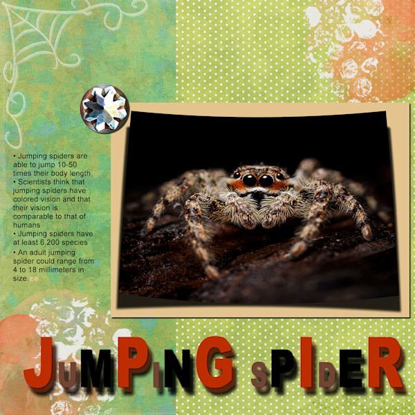
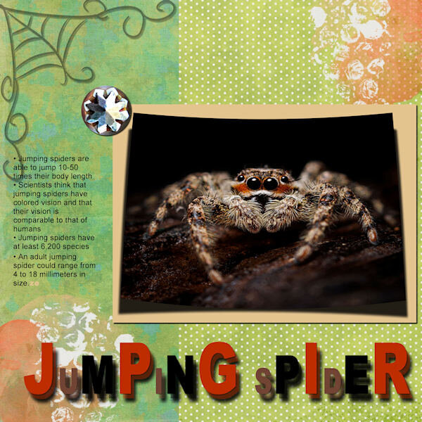
Here's my Lesson 2 - Jumping Spider. Used Cass script for the curved photo from Unsplash, Rainclouds & Rainbows kit for the papers, splashes and element and an old Halloween kit for the spiderweb.
- 331 replies
-
- 16
-

-

-

-
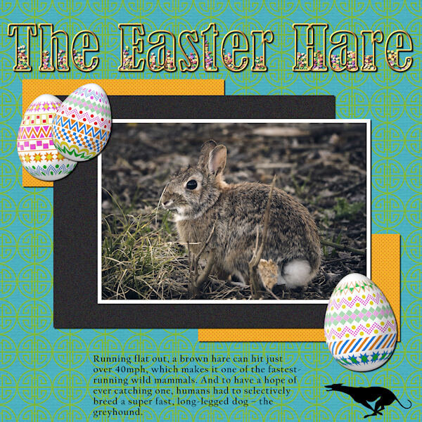
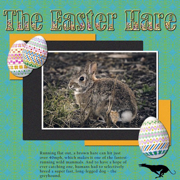
LESSON 1 - THE EASTER HARE - Photo from Pixabay by Matteo Baronti; Cass-decorated eggs; TITLE - Bernard MT Condensed filled with PSP Tube candies (for Easter, of course); Greyhound silhouette from Vector Stock. I also used Cassel's template and the MarisaL Tangible Hope kit. (Thanks for the kit, Carole, I noticed it was free because it was from your account)
- 331 replies
-
- 14
-

-

-
I just found the cat in with the meercats! Ha ha!! Clever photo and nice use of the text. Love your colors. I recently discovered the sculpture effect and am floored as to its potential! Thanks, Cassel!
-
I downloaded the Corel Freebie of the week and added some photos from my daughter and granddaughter's recent trip to the San Francisco Ballet to see Giselle performed.


