-
Posts
3,806 -
Joined
-
Last visited
-
Days Won
102
Content Type
Profiles
Gallery
Forums
Everything posted by Ann Seeber
-
-
Jannette, in the US the "hood" is the covering for the engine on an automobile. In the UK it's called the "bonnet." The phrase "played under the hood" would refer to the user working on the engine with a car, or in this case, creating their own customized filter in Filter Forge.
-
-
Happy October! I love Halloween, and wild cats. Here's my October Wild Cat Calendar featuring Sushi, the Fishing Cat. There's a full-size version on our Facebook page that you can print @ 11" x 8.5". I do one for my refrigerator door. LAYOUT DETAILS: Info from: SMITHSONIAN'S NATIONAL ZOO Fishing cat | Smithsonian's National Zoo 2023 Calendar Template from Cassel Fish and Halloween Witch illustration - Pngtree Title font under photo and journaling- Agency Fishing Cat photo of the recent rescue, Sushi, from The Wild Cat Sanctuary in Sandstone, MN I find it hard to read the journaling on the reduced-size version here so I'm posting it separately: "The Fishing Cat is one of the largest of the small cats. This robust, deep‐chested cat has a body length up to 45 inches and stands over 16 inches at shoulder height. The adult male weighs up to 31 pounds. As their name suggests, they swim, dive and fish for food. Their body is ideally designed for under water movement and their toes are partially webbed. These cats "fish" at the edge of bodies of water. They appear to scoop their prey from the depths of the water and have also been observed playing with fish in shallow water. Fishing cats are native to southern Asia. Their conservation status is listed as VULNERABLE, mainly because of habitat loss due to encroaching civilization."
- 257 replies
-
- 13
-

-

-
What a very nice presentation, Phil. You are giving me ideas! Oh, and welcome to the Campus. Hope to see more of your work.
-
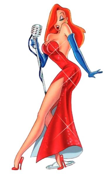
Michele, your illustrations remind me of Jessica Rabbit in the Disney film, "Who Killed Roger Rabbit?" when she sings, famously, "I'm not bad, I'm just drawn that way!" ?
-
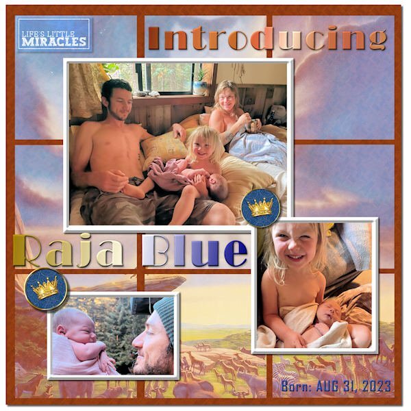
Thought I'd also post my Sketch Challenge here to introduce my new great grandson, Raja Blue Lennox, little brother to Magic. He was born at home on Aug 31, and it took the parents a week to come up with a name. ? I think he weighed in at nearly 9 lbs. Daddy Will introduced him with a musical rendition of the opening to The Lion King, so I went with the theme and used a Lion King poster in the background, mirrored and screened in each of the 9 squares. The mat behind them has a wood grain pattern. The crown brads are from Janet Kemp. The title font is Broadway, treated to a Copper gradient and a Chrome Reflection gradient. The little word art top left is from Marisa Lerin. I tried out PSP's One Step Photo Fix and was impressed with the results. I think it is improved in PSP 2023.
-
Finally finished my Sketch Challenge. Introducing my new great grandson, Raja Blue Lennox, little brother to Magic. He was born at home on Aug 31, and it took the parents a week to come up with a name. ? I think he weighed in at nearly 9 lbs. Daddy Will introduced him with a musical rendition of the opening to The Lion King, so I went with the theme and used a Lion King poster in the background, mirrored and screened in each of the 9 squares. The mat behind them has a wood grain pattern. The crown brads are from Janet Kemp. The title font is Broadway, treated to a Copper gradient and a Chrome Reflection gradient. The little word art top left is from Marisa Lerin. I tried out PSP's One Step Photo Fix and was impressed with the results. I think it is improved in PSP 2023.
- 28 replies
-
- 14
-

-

-
Bonnie, your photos are fabulous. In this case, I think I would put the photo of the rocks on the top and the signage on the bottom. Just my opinion.
-
I'm trying to visualize her dancing in those shoes with Fred Astaire -- backwards! You can do it, Babs!
-
I just went through reams of graph paper at home, re-arranging walls and furniture. ?
-
I went back to college for an AAS in Visual Communications and had the opportunity to do an elective in Auto-Cad, which is what the draftspeople and architects now use instead of hand drawing everything (which my daughter preferred - she hated Auto Cad. I call her my Luddite! LOL If she could she'd stick with a slide rule instead of a computer) Well, I LOVED Auto-Cad and begged my advisor to ok Auto-Cad II for me. I'm clumsy at hand drawing, myself, but Cad was a dream! Deb has Cad in her office but hires people to do her drawings with it. ?
-
Yes, she literally writes by hand in Copperplate Gothic. They had an entire course on it in college. She has lots more pieces on display on her website here if you'd care to explore.
-

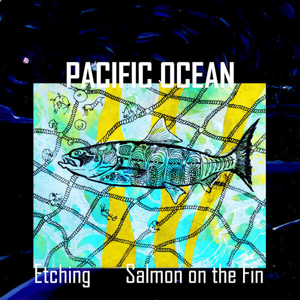
MAGAZINE-DEBRA LENNOX ART-PG03-PACIFIC OCEAN_600.jpg
Ann Seeber posted a gallery image in Magazine Workshop
-

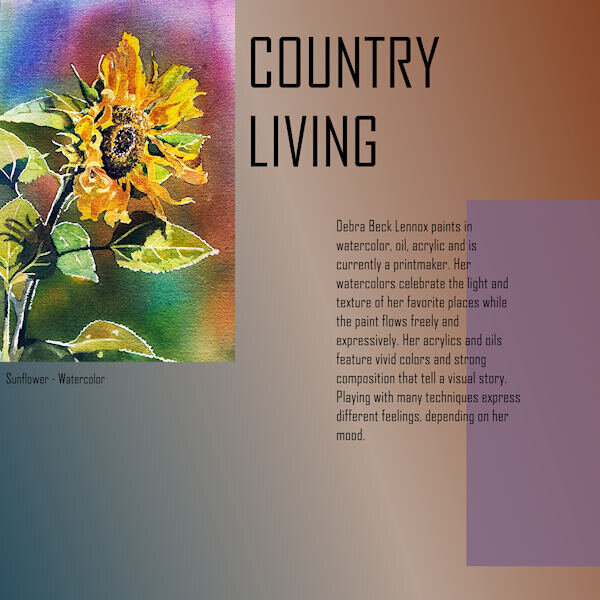
DEBRA LENNOX ART-COUNTRY LIVING-PAGE04_600.jpg
Ann Seeber posted a gallery image in Magazine Workshop
-

MAGAZINE-DEBRA LENNOX ART - PG 6 - MOONS-DANCING MOON_600.jpg
Ann Seeber posted a gallery image in Magazine Workshop
-

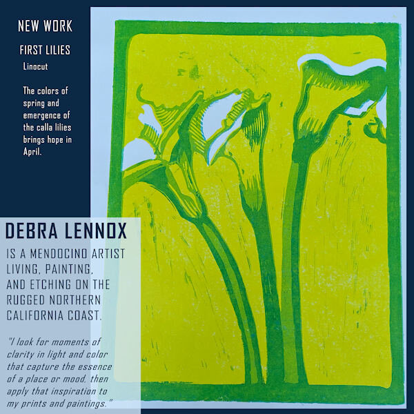
DEBRA LENNOX ART-PG02-FIRST LILIES-revised_600.jpg
Ann Seeber posted a gallery image in Magazine Workshop
-
Bina, when I click on this one it serves up a .zip file. That didn't happen before. ???
-
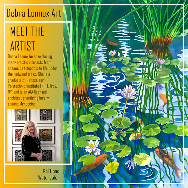
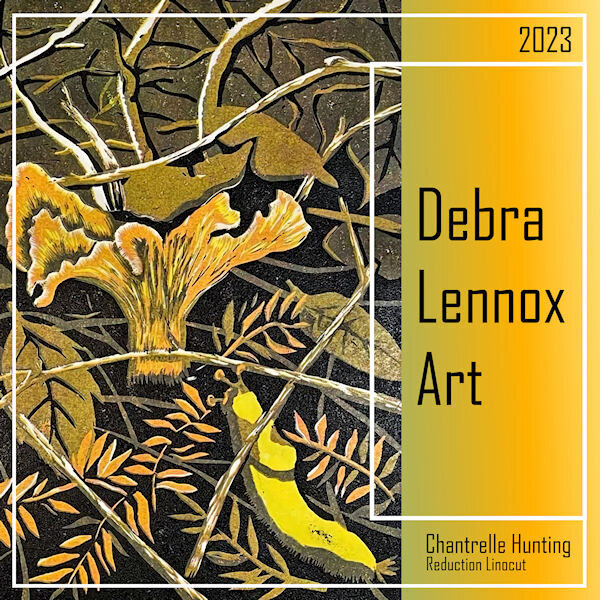
Here's my Back Page for Debra Lennox Art. I mirrored the Front Page mainly by sliding the parts of the photo group over and moving the double frames. I used the same gradient as the cover. I'm still using the same font: Agency. I have this watercolor on my bedroom wall but had to position it so you see it as you walk down the hallway as it is quite large @ 32" h. x 40" w. with matting and frame. Deb has 2 children, both married, and there are 2 grandchildren, Magic and Raja. I meant to also post the thumbnails of all 8 pages. I've added it now.
- 374 replies
-
- 13
-

-

-
Nice, Sue. I used the same technique for my page 8 but mirroring the front page. See it posted below.
-
@SusanEwart, the blend modes were the main reason I now lean on PSP2023 as they are so handy to just scroll through and see the effect in real time on the image. It's a new feature of '23.


