-
Posts
766 -
Joined
-
Last visited
-
Days Won
9
Everything posted by Donna Sillia
-
Ann, when you had your calendar printed, did you leave the back white?
-
I decided to print my pages just to see how they looked and am really glad that I did so. Then, I compared the cmyk that I had also saved; the rgb colors printed much more vibrantly, although I had to increase the vibrancy on a few, especially the reds. They look garish on the computer, but printed they are much better. No more going to the trouble of converting them to cmyk.
-
As I explained to Carole, I was helping a friend with his book using Canva, and he introduced me to Jane, the woman who owns the local business that does all his printing. I have contacted her, and we are discussing printing and formats. I will let everyone know how that turns out. I would rather support a local business, if possible.
-
I will follow your advice. I have the files saved in both formats, just in case. I worked on a book for one of my friends and have contacted his printer for advice, although it will be a small order and I don't know if they will print it. I am also contacting Staples and UPS printing. I have a very good experience with UPS when a needed a card printed fast.
-
Thank you for the information, Ann. I will try them.
-
Today I am converting all my pages to 300dpi and then copying them into Photoshop to convert them to cmyk. Since Photoshop won't save them as png, I am opening the psd file in Paintshop and saving it as a png. After I am finished, I will be contacting a printer.
-
Can someone give me advice on how and where to have my calendar printed? I keep reading that you have to convert to CMYK colors and 300dpi.
-
Thank you so much,, Susan. I used Adobe Express and Filter Forge a lot for the backgrounds.
-
Thank you, Corrie. I am so glad that I chose my grandson's photos to use in these challenge. I am planning on have it printed for him and his girlfriend for a Christmas present.
-
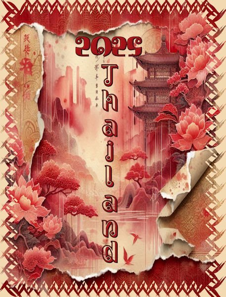
Cover: I used an Adobe Express creation for the picture. I created the mask using one a cass preset piping shapes and the cass raster to mask script. The background paper is a tan taken from the image.
-
Finally, the December calendar I once again used Adobe Express for the background with a few adjustments. The photo is from David, and I thought it looked festive even though Christmas is not celebrated in Thailand. The bottom picture is also from David and is actually a Gay Pride festival. I merged the mask and added color to the opaque areas and then applied a bevel. The nutcracker was made by me from an Adobe Illustrator tutorial for my Build a kit 2. I wish I could make backgrounds as beautiful as AE.
- 430 replies
-
- 10
-

-

-
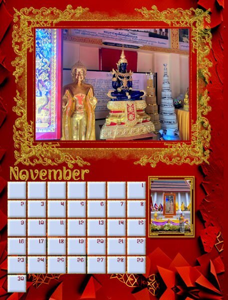
Slowly getting there. Thailand pictures suit my proclivity towards gold and glitter. Red seems to be a prominent color in many of the pictures. The background is Adobe Express AI, but I did make a few adjustments. The ornate frame just called out to me for glitter. The bottom picture is of the King and Queen of Thailand with my future daughter in law in the forefront. I used the same mask that I created on a previous page.
- 430 replies
-
- 10
-

-

-

-
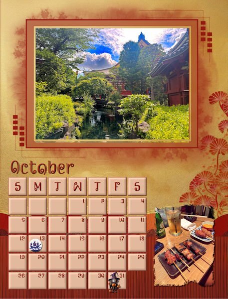
I finally finished October. The background is from Adobe Express just lightened a little. Photos are from David. Columbus Day clip is from Canva. I had to mark Columbus Day because I am Italian and my father would never forgive me if I called it something different. The little witch is from CF. I hope to fiinish today, but now I have to go and exercise.
- 430 replies
-
- 10
-

-

-
I love that Ralph Waldo Emerson quote, and I love flowers. Yours are beautiful.
-
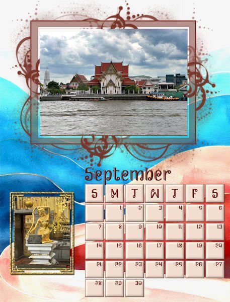
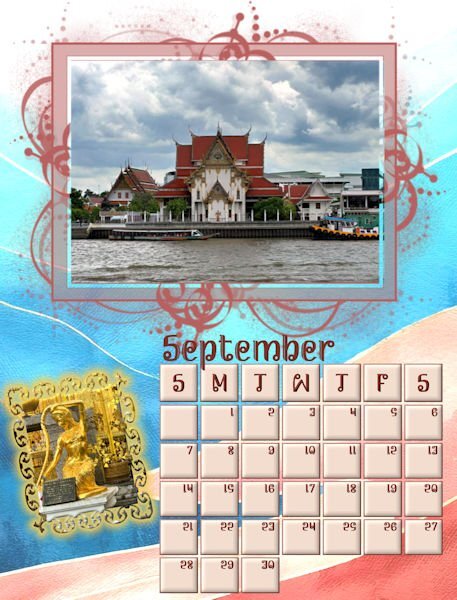
My final September page: I made a new mask for the golden lady, changed template resolution to 300, and everything worked well. Thanks for advice about saving as a png since I am intending to have the calendar printed as a Christmas present for David and Rachel who sent me all the beautiful pictures that they took in Thailand. I had to make the template mask a little small so that the month could be seen.
-
September put me way behind and will get a do over. I changed the resolution to 300, and then my calendar was way too big. That will teach me to leave things alone. Then I had a horrible time deciding on a background and finally resorted to Adobe Express. I had to lighten it a little. All the photos are from David. I made a mask for the golden lady and highlighted it in gold using layer styles to make it more visible. Hopefully, I will finish in the next few days.
- 430 replies
-
- 12
-

-

-
One thing that I noticed when saving as jpgs is that the resolution was 100 px. I checked the other templates, and they varied from 100 to 200. Carole, should we be changing the resolution to 300 if we are planning to have our calendar printed?
-
Susan, thank you so much for your kind comments. I sometimes have a tendency to over decorate. AI and Filter Forge are really fun to play with. Sometimes, it is hard to give the correct prompts to AI and have to try over and over. I have three that I use MyEdit and Adobe Express which are paid programs. I also use Microsoft Designer which is free, but requires credits which somehow just appear in my account.
-
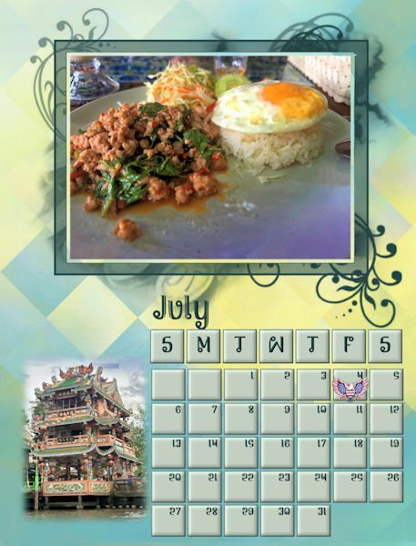
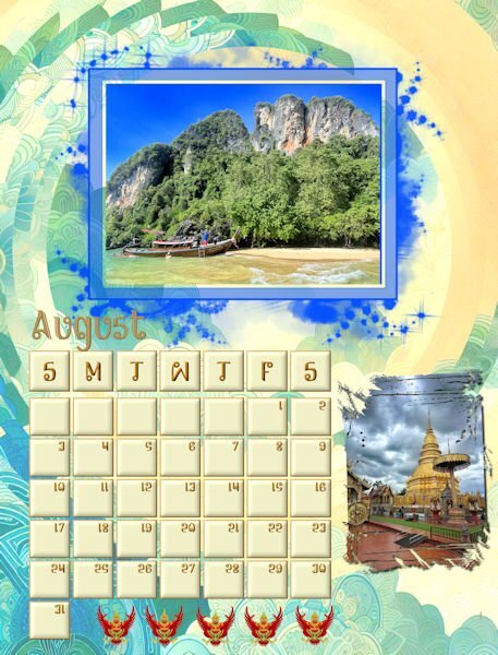
July and August The backgrounds are both from AI modified with FF distortion filters. I know that my backgrounds are fussy, but from what I see in David's pictures, Thailand patterns are vibrant and filled with patterns and colors. All the pictures are from David. One thing that I noticed when saving as jpgs is that the resolution was 100 px. I checked the other templates, and they varied from 100 to 200. Carole, should we be changing the resolution to 300 if we are planning to have our calendar printed?
- 430 replies
-
- 12
-

-

-
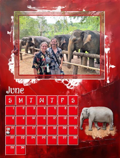
June 15th is Father's Day
-
My finished June. I have been working on my calendars to make sure that they are consistent and adding major holidays. I decided not to use birthdays and anniversaries. I am not sure of the colors for June, although I love red, so this month may be changing. The elephant is an Asian elephant from Canva. My original elephant was African. David gave me a lesson on the differences.
-
Julian, I only use this bevel on the squares. I have a lot of different bevels as presets for different items. Most of the presets are from Carole's tutorials, e.g. I have presets for different types of flowers, glitter, fonts, frames, etc.
-
May I had to resize the mask since the photo was not a landscape. I merged the group and horizontally centered the image. The background was created in Adobe Express and modified with FF. Changing cass calendar font colors once the file has been merged is not possible. I think that I have saved some of the original files so I will be experimenting this afternoon. The mask for the cement statues is my own. Both photos are from David.
- 430 replies
-
- 11
-

-

-
-
Done! Thank you, Carole. I will have to be more alert when using AI.


