-
Posts
4,589 -
Joined
-
Last visited
-
Days Won
170
Content Type
Profiles
Gallery
Forums
Everything posted by Susan Ewart
-
I love corvids. This is beautiful. If you want to follow a corvid (and other) photographer with a wonderful blog full of crow characters from Vancouver, BC (Canada) check out June Hunter. Her work is amazing and I'm lucky to have a few hanging in my house.
-
It does have more impact with the new element.
-
Whew! I watch too much giant-insect-eating-people movies. Geez, I'd hate to see how they harvest them. The package said mealworms so I thought they were worms. Either way, they look creepy and smell weird too. The things we do for birds/squirrels eh?
-
Did you make that plaid, it's very nice. So are the flowers. I have those finches too. Never occured to me to try grape jelly. I'd like to give them a treat, something different than the same old Wild Birds Unlimited seed and the yukky dried mealworms they get during nesting and cold times. I always think they are going to come back alive....in my house!
-
That is good to know. I tried it and it worked, sort of. I work with two screens and it screenprinted both. I googled how to do only one screen and none of what any one said worked. So the snipping tool is the best one for me so far. I do use the snipping tool a lot and am comfortable with it.
-
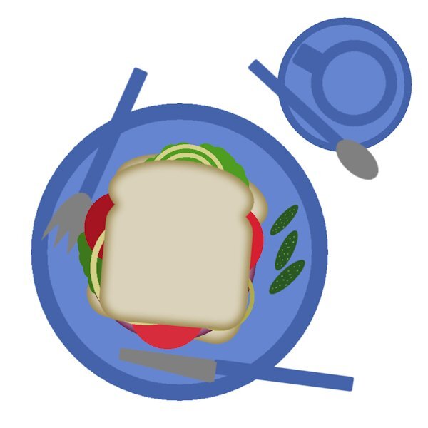
Beautiful table Cindy. Love the marshmallows and really love the monitor. I think I heard that see-through bread has less calories too! ?
-
This looks great Anne. Indeed you are in the right place. If I cant find the forum from the campus I just go back to the lesson and it has the link ("the forum") at the bottom, it says something like this, " Then, go to the forum, and show us... has. Believe me, we have all had to a lot of help from Cassel, when we got started. It was so new to me I didnt know or understand what anything was, keeping going knowing I had Cassel to be there when I got stuck was/is an amazing experience. And it's the first time I didnt get frustrated and quit PSP. I look forward to seeing your layouts.
-
What a pretty table cloth. Love how it's faded or textured slightly. really pretty. You nailed the coffee color!
-
Awesome Ann! Your tablescapes are always a delight to see. This is very realistic. I love seeing the possibilities. You have the bread baked (the technique) to perfection.
-
It's funny you mention Instant Effects. I'm on my 8th time and keep forgetting it's there. Since you mentioned it I just added it and chose Hide as well. I am considering the scripting course too. I'm hoping it's not too hard to understand.
-
I call this "Dinner and a Movie". I watched a movie (tutorial) and made dinner (or in this case breakfast) at the same time. Yummy! I made duplicates of the onions to help as pep to my oncoming workout and instead of big pickles which I ate the last of last night, I chose those little ones (by resizing smaller). I think they are called gherkins? they are so yummy. I like them on the side. You might see my top slice is smaller. You know how it is when you get the end of the bread and you have a nice full size piece and the only other choices are the end piece or a smaller size one next to the end piece. I wouldnt normally have a knife and fork with my sandwhich, but today I will live on the wild side and try to use them to eat my sandwhich. All kidding aside, this is always a fun exercise. I totally forgot about dragging from the layers pallet one layout to another. it only took me 8 times through the bootcamp to remember, well, er...that is IF i actually remember this time. ?
-
I really like her templates and put the globe on the wishlist. Birthday coming so I'll treat myself. thanks to you for recommending her and The Lily Pad to me. There is some really great designers there.
-
Here is my set up. Workspace is dark gray and Background space is medium grey. I use the UNtabbed window. I closed the organizer and the help centre and I also have PSP open to the Edit screen upon start up. For the life of me, even with the blog post on how to do a screenshot. I can not do it. I set it up and then what. I click on start. It minimized but there is no screen shot at all. Well, actually it screen shot my windows desktop, dont know how it did that. I set it up to save in a file, which it did... but it was of my desktop and not PSP. So I used the windows snipping tool. It's fast and easy. though I wish I knew what I was doing wrong.
-
I probably did. That park is very small and well over 800 canada geese come to it every morning and fly off every evening. I used to try and go watch both times as I was rehabing my back surgery and had the time. There is all kinds of waterfowl and ducks too. You can walk amongst the geese, they dont even get up as you walk 6 inches from them (when they are out of the pond). It's a well used park by people. the ducks will actually run after (not chase) the little kids because they think they will get fed. You can get very close to the birds when they are on land.
-
This is a beautiful layout, your mom would have been thrilled and proud to receive it. it never gets easier does it. Random moments of sadness for not having my mom or dad to talk to; to make things better when I'm sad or sick and just for being there. I dont like being an orphan.
-
WOW! this is AWESOME! It looks like a lot of work and to have lost it must have being so defeating. That background is superb. We are all lucky you rallied and remade the layout for us to enjoy.
-
J= Jumped to my defence....when I was a toddler in the backyard and a garter snake was in the vicinity. She armed herself with a shovel and tucked me under her arm and was ready to go to war. ? (side note: I love snakes and probably would have being quite happy to "pet" the snake, my mom however was terrified of them).
-
Here is a photo I think I will use. I am going to limit myself to ONE photo date (November 20, 2011) on a visit to the pond at Sardis Park near where I lived in Chilliwack, BC. A very small pond that takes only 10 minutes to walk all the way around. It is on a flight path of waterfowl; mostly Canada Geese. It was only a 10 minute walk from my house and part of my "rehab" after spinal fusion surgery in May of that year. As soon as I could carry my camera and walk for 10 minutes that's where I went. Looking forward to the bootcamp and looking at all the photo's and layouts from all the registrants.
-
Thank you , I just started watching. soon as the housework/errands are done I can finish watching it.
-
These are beautiful. I have a dumb question. Is the font itself transparent? So that any layer below would show through? The look is really eye catching. I'm going to check out that class. I have been watching classes when I warm of for my workouts and seeing that the ones I saw when I first started I didnt really understand. Now that I've learned more I understand the concepts of the tutorials better. Enough to know that I can be successful at trying them.
-
That song reminds me of my parents and their collection of the Time-Life records they had. It's a great layout. Looking forward to seeing the actual physical book you ge made.
-
Awesome! I will gvie this a try. these are great, thank you Suzy.
-
This is fabulous. What a great sign this would make framed and hanging in the house. I wonder what kind of advice my cats would give me. Given their superior and judging stare, maybe I dont want to know.
-
A agree about "A Beautiful Mess" masterclss. As I was cataloguing photo's I came across a few that I could use in the one of the techniques in that class. I will be going back to it with those photo's.
-
Beautiful. I love the story and how she is now living her best life. That gradient is stunning as is your shiny background.


