-
Posts
4,245 -
Joined
-
Last visited
-
Days Won
141
Content Type
Profiles
Gallery
Forums
Everything posted by Susan Ewart
-
That happens to me. I usually save the large jpg then close it and open the jpg again and resize it and the text stays intact. There is another way other members do it and Carole will likely chime in to tell you about. It happens to us all.
-
Corrie, this is really beautiful. I love honeycombs and this stencil is really fabulous. The owls are so cute too.
-
Thank you Julie. I hope i have the grit and determination to see it through. At my current pace it's going to be at least a couple years! I think however you (or anyone) do them is the right way to do them. If you jump around, that's perfect too. In the end...we will have gotten to the same finish line, using two different routes. How fun to see what people are doing in any of the labs, especially ones I havent done that I can look forward to. I do think I will try not and be so ridged about the order if I decide to do one oout of order. Going in order means I dont have to choose which one to do, isnt that lazy of me. Sometimes I dont want to think of where do I go next. I also watched Mary go through them and saw all the techniques she was learning and thought, by the end of them, maybe, just maybe, I will remember the techniques without needing a tutorial. A girl can dream eh?
-
Beautiful Julie. Sorry for you loss. Even if it's expected it's still sad.
-
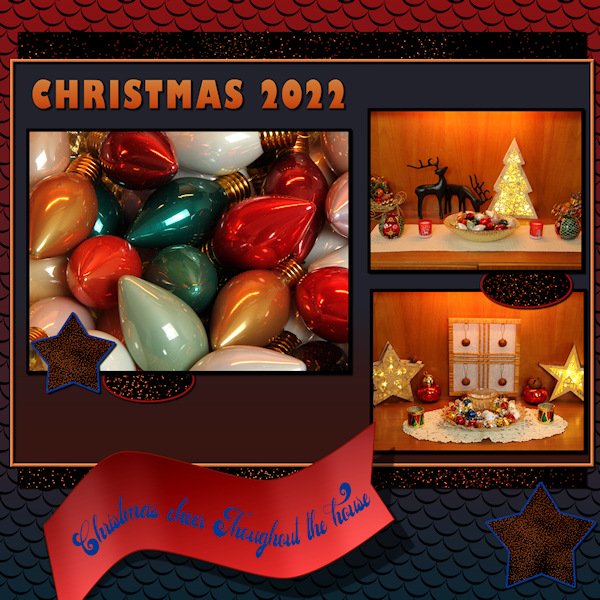
LAB 6-7 Sandbrush Scale Pattern Wavy Flag Inspiration Template W used for this LAB Another fun lab. The scale pattern was my favorite. I played with color combinations for quite some time, it's addictive when you want to see just one more combination...an hour later you are still doing it, and the rice is burning upstairs! I know, it's hard to burn rice when cooking on low. If I can melt a colander making spaghetti, I can burn rice (I have...many times). But you aren't reading this for my cooking advice are you? Back to the Lab at hand. The sandbrush was surprisingly easy to do, yet hard to control it just how you want. I'm thankful for the good instruction on the wavy flag. It took me some time to figure out the "shear" setting on the pick tool I couldnt figure out how to get the middle handle(node?) to change from vertical to horizontal. I got there by mistake and took me time to figure out how to change the directional arrow thing. The background scale pattern (which looks like supermans colors - don't get me started on Henry Cavill doing Supermand and NOT doing The Witcher!) has a gradient background and the pattern has a 14% angle with a scale set at 80. the scales looked best in black. I used the sand brush as a paper and for the stars and ovals. The frame around the whole photo/title area has an inner bevel (#2, width 8, smooth 10, depth 7) to help it stand out. Fonts are Gills Sans Ultra Bold Condensed (title) and Adaniya (Creative Fabrica) on the wavy flag. Photo's are mine.
-
-
- scale pattern
- sandbrush
-
(and 3 more)
Tagged with:
-
Wow! Ann, that is beautiful.
-
OMG! I love that Nuthatch! Beautiful and inspiring. I love that I get to see upclose what comes to my feeders. they are so swift and it's hard to really get a look at them. thanks to you, I get to study them closer up...in the warmth and comfort of home. How you captured this one with such action is really amazing. You have ninja reflexes on the shutter release button. I wonder if the snow is coming this way (Alberta), currently +6 right now, but supposed to be high of -15 on Saturday. The birds were really noisy today, wonder if it was the warm weather.
-
Superb Anne. Great moody shot with the clouds.
-
I love the picture with the trees. And I really like your title, it looks really neat. Also the frames are a really nice touch and the background paper is beautiful. Oh man, should I have just said I like the whole layout.
-
that is very strikingFiona. Love the banner too! I'm doing the LABs in order (starting 6-7 now) but I might have to make an exception and jump to the top of the list.
-
Fabulous layout Ann. I looked up the photographer. HIs work is exceptional, no even better than exceptional. Thanks for crediting his name. I've bookmarked his website for times when I just want to see great art and be inspired.
-
Hahaha I love that Linda. Squirrels are resourceful. I took the dividers out of my hopper style feeder so the squirrels could sit in it in the winter and eat out of the elements. the Magpies taught the pigeons how to land in it as they barely fit. All are welcome in my yard...well, almost all. Only 4 pigeons at time are allowed ( I wish they'd get THAT memo). This morning 16 landed (this is after the first 6 years living here and never seeing a pigeon at all), I usually shoo them off and then let 4 or less stay. They are super poopers. Yuk.
-
What beautiful colors in your layout. To match a stellar photo!
-
Hahaha. I'm going to sit here and hold my breath until it comes.?
-
Very delicate and pretty. Great for spring....I long for spring; the new bright green leaves, the warm sun.....sigh.
-
WOWZERS! She's a beauty. Did you also do the polka dots on the dress. I like how the the dots in the middle are the black and white in one dot. Very cool.
-
I was surprised that I did a layout like that. I never thought I had enough of any information to do a page like it. Surprisingly I ended up with a lot more information and had to narrow it down to what would fit. I was struggling with the design and I kept coming back to that class in my mind. I am glad I did it though. I can now see how useful it can be. Apart from putting too much noise on the background, I am happy with the layout. I never would've done it if you hadnt done that masterclass.
-
They are tiny but leave a huge hole in your heart when they are gone. So sorry for your loss. A beautiful tribute layout for Buddy.
-
LOVE the poem, Ann! Beautiful sunset and beach. Are the horses just walking around where ever they please? Are they wild or tame? Alberta has a wild horse population. One of my favorite photographers, Rick Price, shoots them (with a camera!). His work is stunning and the wild horses are really skookum, not skinny like I've seen in other wild horse populations. You can find his picts on Flickr...he is Rick Price (RED DEER). There are a number of Rick Prices on there so make sure it's red deer. He has really incredible shots of bears and other animals too.
-
Thank you Ann, you recall correctly. It's called "Scrap by Numbers". The masterclass had cool icons too. Remember, Carole used picklball as on of the layouts (in collaboration with Bonnie). Thank you Corrie, I agree and I was surprised that it came to mind to use. I knew what picture I wanted to use but had no idea for a layout design. the measuring tape was foremost in my mind and so I kept thinking how do i tie a measuring tape to this winter photo. That's when i thought of the masterclass I'd seen and of course everyone talks about how much snow they get then it all started to come together.
-
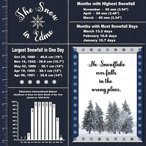
Lab 6-6 Dingbat Riboon (vertical edges of frame) Measuring Tape (left vertical edge) Multicolor Ribbon (top/bottom of frame) This layout didnt take to resizing well. I had noise on the backgound and it came out really light. The full size jpg is darker and the pspimage file is even darker still. The text is much clearer in the full size versions as well. I will post the larger one on FB. The fonts for the Title and the Quote are Abiyah (Creative Fabrica) and Arial Bold for the rest. The quote is a Zen Proverb. My photo of a recent hoar frost day that was also very cloudy and foggy. The city is putting a new water reservoir in this park (where the trees are) so this might be the last time I got to photograph them. I also had a big help from the blog post (July 18, 2016) "Text on a path in PaintShop Pro". And I loosely used ideas from the "Masterclass Scrap by Numbers". The ribbons have the blinds texture added but it's hard to see in the small version. Edmo is Actually Edmonton (Alberta, Canada). My friends who just moved here have taken to calling it "Edmo" and it has kind of stuck with me. I live in the city of St. Albert at the North west corner of Edmonton, we are separated only by streets.
-
Lab 6-6 Dingbat Ribbon (vertical sides of frame) Measuring Tape (left vertical edge) Multicolored Ribbon (top/bottom of frame) Also used Text on a path tutorial from the blog "Text on a path in Paintshop Pro July 18, 2016" and a take on the Scrap by Numbers masterclass. This layout didnt take to reducing in size well. It is much darker and sharper at full size.
© Title and Quote Text: Abiyah (Creative Fabrica), Journaling text: Arial Bold (Windows), Photo: mine. Quote: Zen Proverb
-
- multicolored ribbons
- measuring tape
-
(and 3 more)
Tagged with:
-
Linda, WOW and WOW. For the picture and for the layout. I wish I had that kind of Christmas visitor.
-
I like it just like it is. I'm not in the bootcamp this time around (did 5-6 of them) but dropped in to see all the wonderful creative layouts. I love this one.


