-
Posts
4,589 -
Joined
-
Last visited
-
Days Won
170
Content Type
Profiles
Gallery
Forums
Everything posted by Susan Ewart
-
I'll take them, especially the seed heads. I want to photograph them in the studio, but by the time I get in the house and upstairs, they are lost their seeds. I used the bigger more robust Western Salsify last year (they look like ginormous dandelion seed heads) . Oh, for sure I need a DELETE key for the house too! And I could also use a DO-OVER key to fix mistakes, in whatever form they take in life (eg, leaving the stove unattended and melting the colander, putting the dust pan away like I did EVERY OTHER TIME.....until one time, I didnt and ended up with a torn hamstring) .
-
I have a lot of stuff gathered too, and never used. In a perfect world I'd delete the stuff I never use because it makes it hard to scroll through and find the stuff I do use. But then I think, what if I might need it....
-
what a delightful surprise to find. So nice to see a happy feel-good story.
-
some gardening books on the bottom shelf, since these plants dont need water, they would be safe there. Or extra pots stacked, or a bag of soil.
-
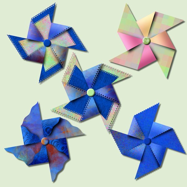
I cant find the post about our purchases from the recent sale so I'm posting here. I had a pinwheel party tonight. There is limitless combinations you can try, it was fun. I used papers from just watching A Beautiful Mess masterclass. And one has gradient on the folded forward part (pink&orange) that I had made previously. It's really quite something to watch it come together.
- 181 replies
-
- 11
-

-

-
Very nice Corrie. Love the frames too, they look like weathered metal. I also like dandelions and cant wait till they pop up in my yard. Your cluster is well done, I particularly like the colorful wire flower.
-
Did you find it easy to use, it looks complicated. Worth getting then? I'm happy to pay for it too, it's commercial use as well that way. Not that I'd ever sell anything but it covers me if I choose to. And there is support. I'm not so smart with technology (unless it's a camera).
-
I decided I will buy the full version and use it as stand alone like I do with FF. the website shows it's only $20. I want to see it in action before I buy it. I will drool over what people make with it. I hope you get it sorted out Mary. You said you got the full version and you are still having troubles with it? At least if you paid for it, the company should be obligated to help you get it straightened out. Still, what a hassle.
-
I couldnt make it work either. Got the Software Informer stuck on my screen. very annoying. I'm taking a hard pass on this one. I could see it when I was in PSP but it had an error and wouldnt work. If I decide I want it, I'll pay for it. There was also so other file it talked about in the readme that said I had to put it somewhere, I didnt really understand it and didnt know where to put it. I didnt know if was supposed to put into 2023 plug program files or a file I have that is a general one under Corel that says Plug ins. That's probably where I went wrong. came home from work with a headache, probably not the night to be trying to figure stuff out I dont understand.
-
Wow, good to know. I have to go to work and hopefully time hasnt run out when I get home. it's downloaded but not installed yet, I would have done it tomorrow. Did you put it as a plug in in PSP or use as stand alone.
-
I went to the website (googled it) and only found a trial version for free and the full version is $20 (presuming it's USD). I couldnt find anything free. Looks cool though, and very complicated as well.
-
Love this layout and the gradient is beautiful. It's hard not to want to take these little spitfires home.
-
That's a great idea Ann.
-
That's so perfect and precious.
-
It's all about baby steps and keeping it simple...at least that's what I tell myself. and walking away when you need to, because sometimes that's just what you need. With PSP and the Campus you always have a creative home to come back to.
-
Very tempting. Is it something I always have access to after the course is done? I feel it will be a steep learning curve for me, but the idea of learning something like that is appealing.
-
So true. I think I might give it try closer to the fall when I want to stay inside (when it's snow and -30).
-
Cristina, I'm so glad you are back at it. I know about a creative slump. It is my norm to start any creative project and go through phases of liking and hating it. Often having to set it aside for days (months and years too). it's frustrating to sit down to create and there is nothing. When I do photography (if I'n not in a current project) it takes me a while shooting to get warmed up. My creative juices arent like tap I can just turn on, more like a slow leak that takes time to become a bigger leak. Often doing something as far removed from photography and layouts gives me inspiration...as does the campus (in a big way). Want some really cool ways to make paper, I just watched the master class A Beautiful Mess. It's really good and it just has you playing around with effects/techniques. I highly recommend it. Sometimes creating with nothing in mind is a good place to get inspired
-
WOWZERS! Beautiful.
-
I'm entertaining those thoughts, but still still a litte frightful of coding. Not in the 'grizzly-bear-chasing-me' frightful, more like when I'm stretching on the floor after I workout and i turn my head...and....THERE IS THE MOTHER OF ALL SPIDERS STARING ME AND LICKING IT'S LIPS. Spider lips are the worst!
-
I cant even imagine how you do scripting and keep it all straight in your head when you are doing it.
-
Thank you Cristina. I does look much better apart than together. Here's one that I clicked the wrong button when I was mirroring (or flipping? the other half) and I liked the shape. it's the same starting label shape but me clicking the wrong button and ending up with a happy accident.
-
Is this it Ann. Coatis (from Tupí), also known as coatimundis (/koʊˌɑːtɪˈmʌndi/), are members of the family Procyonidae in the genera Nasua and Nasuella. They are diurnal mammals native to South America, Central America, Mexico, and the southwestern United States.
-
Beautiful Anja. I have two of those scripts. I dont have the airbrush paper script, it sure looks great on your layout. Another one to add to my wish list! Love that font too.
-
That's great to know...I've already started my wish list for the next sale. ?


