-
Posts
4,245 -
Joined
-
Last visited
-
Days Won
141
Content Type
Profiles
Gallery
Forums
Everything posted by Susan Ewart
-

Anyone have some time to help me get thru a lab?
Susan Ewart replied to cindy harris's topic in Challenges
Joyce, thank you. I did not know this was possible. This is great to know. -
This is so cool Bonnie. Did you take the 5 photo's of the same person in different spots then blend the 5 together. Did you use a blend mode?
-
Mireille, that's very pretty. Your curtains are very well done and look real. I like that touch at bottom right with your initials.
-
Hahahaha, Ann. I have wanted to put a picture up, even got my hubby to take one....ugh! I'm so pasty white that I look like corpse in pictures. I wish I could find a pictue my niece once took. I'm kinda leaning into the picture and I look like I'm a stiff dead body they propped up for the photo. I have to say I love your smile. I will make it my mission to try and find some kind of recent photo. I'm not in front of a camera very often. They are cute. And it's fun, I like stats. It's like that one master class we did on infographics.
-
I just by chance hovered over a name in a forum. Did you know a bunch of stats comes up? For instance, Michele, did you know you are a "Posting Machine". ? You can hover over the badges to see what they mean.
-
Rene, you got lucky. Love it when it's not as bad as predicted. I cant believe how mild it is here (compared to just over a month ago -35 C) .
-
Rene, Anything past Day 5 is a sham! The forecasters are just throwing darts then. hahaha. Google "RMR: Seven Day Forecast". It's a comedy spoof about the 7 day forecast from a show called Rick Mercer Report (Canadian). It's hilarious. Hopefully you can get that from the US. We always joke about it. My opening line is a line in video. I tried putting the link here, not sure if I did it right, if not google it for a laugh. https://www.youtube.com/watch?v=wkDvqQKGgDA
-

Anyone have some time to help me get thru a lab?
Susan Ewart replied to cindy harris's topic in Challenges
I hope it helps at least it has created some ideas for you. I wish I had a study partner too. I'm better though if the partner was in person. Concentrate on the bootcamp first. Hope your power comes back on, at least for the bootcamp! Take care. -
What a great keepsale Corrie. the book looks like it's really nice quality and the print quality looks nice a sharp. What kind of paper is that (gloss, pearl etc and does the paper feel thick or at least substantial that is will stand up to time). Is that a company from the US? Carole, do you know where in Canada there is a good place to use, that makes nice quality books on nice paper.
-
Great layout Anne. I was just looking at that designers work. Holy WOW, he has great stuff. Thanks for telling how you changed it up. You've inspired me to give it a try.
-
Poncho is just stunning. He looks so proud. Beautiful layout, the colors are perfect.
-
We had some freezing rain this past weekend. it was a very thin layer of ice over sidewalks and it was super slippery, but it only looked wet so it was deceiving. We are having very mild weather, near 0 celcius when it should be in the -20's or -30's. January and February are normally the coldest months in Alberta. Your snow looks very pretty. I can imagine ice pellets though, YIKES! We've been getting hoar frost too, but only had one day (only a few hours) with blue sky to go with it.
-
Corrie, that's cool what you did with the water and sky. I wouldnt have known it was from two photo's. The bridges are very interesting, I love the little old one (Amersfoort) and the lines of Dordrecht one, it's very artsy. Nice when architecture can be please to the eye as well.
-

Anyone have some time to help me get thru a lab?
Susan Ewart replied to cindy harris's topic in Challenges
Hi Cindy, I thought of something that really helped me. When I first started with the Campus I would watch the tutorials (or labs etc) and i would have to go back and forth between PSP and the tutorial. I'd watch the tutorial, stop, maximize PSP (that is open) and try to follow the instruction from memory. That never went well for me, I'd forget the instruction and have to tab back to the tutorial and then tab back to PSP...it took forever! So I started to watch the tutorial and make notes. that also took forever and I found I would miss key things in my notes, like what layer I was supposed to be on, what settings for the tools etc. Learning this way was very slow for me. Here's what I did to change how I was able to follow a tutorial AND work on PSP at the same time. I had an older laptop. I put that on the desk (or even on a chair when my desk was really small) and I'd have the tutorial playing while PSP was open on my desktop computer. I could then watch a step in the tutorial and hit the pause button, then go to my desk top and do the step in PSP, and continue back and forth. Having both the tutorial watchable at the same time as I had PSP open meant I could follow along and do the steps as Carole says them in the tutorials. Sometimes, i find it's more what Carole says that really helps as well, and i had to look very carefully at the steps as she did them, and pay attention to settings and what layer she was on. I did A LOT (and I mean A LOT!) of rewinding and replaying. But I got there in the end. I understand though this requires you to have a desk top and a laptop (or two laptops). Another option is two monitors (which I have now) where I can watch on one monitor and do the instructions in PSP on the other monitor. If you have acces to an extra laptop that can go online this could really help you do the tutorial one step at a time at your own pace. Believe me, some tutorials took me hours to get through. Remember the 3 P's. PRACTICE. PATIENCE. PERSEVERANCE. Hope this helps. -
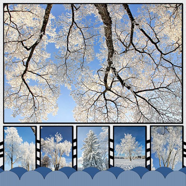
I got 'er done! No words. Mother nature speaks in visuals. These are trees on my street or down the road in the park (the little one second from the right side). And no, that's not an upside down tree in the big photo. that's my favorite of the trhee trees in front of my house. It has a big wide canopy and i always look at it when I'm stretching after my workout. I was standing under it shooting straight up. I added more scallops, not sure why, it doesnt really add to the design. When I lined up the boxes on the bottom I thought, "Yikes! they look like gravestones", until I added the pictures then it started to come together. The ring was the hardest to fit into the design. So I made many duplicates and lined them up on the bottom to make a design pattern with them (between the small pictures). I used the blinds texture on the scallops and a texture on the background that might be too small to see. Photo's are mine from Dec 31, day two of the hoar frost days. That was actually the day it was more crystally type frost (I cant remember the name tough).
-
-
- 1
-

-
- 2023-1
- diy challenge
-
(and 1 more)
Tagged with:
-
Julie, that's wonderful. Love the little guy at the bottom (okay, love them all). I know what you mean, I am in the throws of the DIY too. It was a real challenge to find the design I wanted. I moved stuff around for quite sometime. Then saved it and came back and looked and thought, nope, not there yet. Why is it that later in the evening I finally get an idea gelling....and it's bedtime? Might take me few days get mine done. At least I have a direction to go now. I like these DIYs because they are hard and they really challenge me in a design sense.
-
Now that's the kind of residents I would love to have. Fabulous Bonnie!, I love the one of the tail. Great touch...and it's a the "end" of the layout. ?
-
Helen and Ann, my mom also made them and I inherited them after her passing. Mostly animals and even a "rubber chicken". When my nephew had a baby I gave him a couple of them, including the rubber chicken because he's the clown in the family (just like his dad - my brother). PS, the chicken's body was crocheted around an egg shape, remember the nylons that came in egg shaped containers, I think that is what she used.
-
How cool Mary. I love old trains and train stations (and train museums where you can go tour really old trains that have been restored and set up as it would have been when it was new).
-
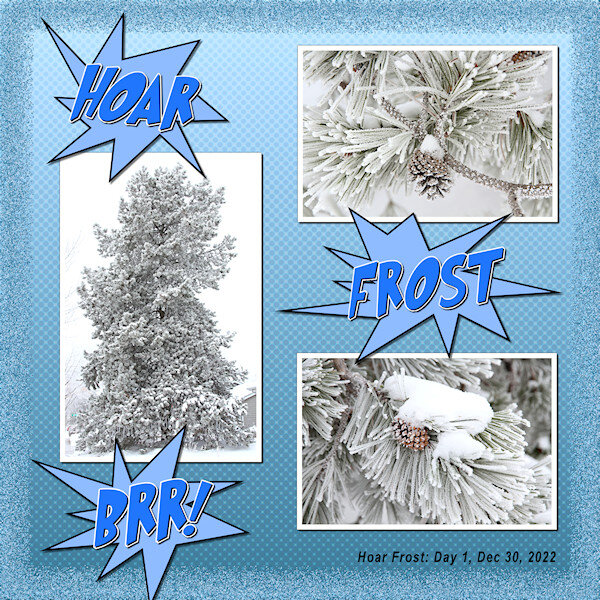
Lab 6-5 Cartoon Words Burst Shape Halftone Pattern Extra: Glitter frame is from the recent Master Class: Borders. I used two frames (on 2 separate layers) that I was deciding between and then when i had them both on, liked that version best (happy accident). Fonts are Grinched 2.0 from Creative Fabrica, fitting because the actual tree is very Dr. Seuss-like. Arial Narrow was used for the the date. Photo's are mine. The "fur" boss was lots of help today, knocking my pencil off the desk about 10 times before taking it in her mouth and running away. After a good chase I caught with her "stash" of her pencil and a pen I didnt know she had taken. it's really easy and quick to drag the photo's to here.
-
-
- gliiter frame
- halftone paper
- (and 6 more)
-
Pikachu! So cute.
-
Michele, I hope you keep posting your illustration type layouts. I love the 60's-70's vibe of them and especially gratefull to see how you achieved it using "ingredients". I think it's important to see all styles of layouts with PSP to open our minds to greater creativity. You the know how it is, "we dont know what we dont know". It's inspiring. I have seen digital designs and often wonder how they were achieved, your explanation really shows how to look at individual elements and put them together in a cohesive package. I love this group for the diversity of layouts. Keep it up.
-
Fiona, this is wonderful. Thank you for explaining the techniques too. I tried the curved photo script with not great results and then forgot to go back to figure it out. I'll try it as a separate image first. I am wow'd by the dispersion script. I had often looked at that script but didnt know how I could use it. What you have done with it is beautiful and really adds depth to the fireworks.


