-
Posts
4,589 -
Joined
-
Last visited
-
Days Won
170
Content Type
Profiles
Gallery
Forums
Everything posted by Susan Ewart
-
Thank you. I tried doing them outside too, but seems like my creativity stops at the studio door. ?
-
Nothing wrong with that, if it's not working, move on and find something that does work. It's not giving up, you solved the problem of those textures and overlays not working, so you in fact learned something from trying it. I know it feels like giving up, but think of it as learning what isnt working often moves you back to what IS working. Dont we learn more from what goes wrong than what goes right. I do know all too well this part of learning is the unfun part of it
-
From the album: Susan Ewart
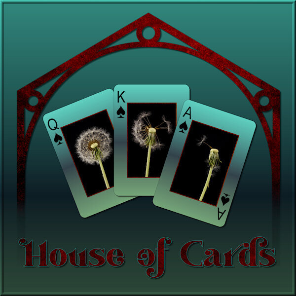
Playing with vectors on the "house" graphic and then building a theme around it. the gradient is called "Underworld" so this is a poker game in the underworld. -
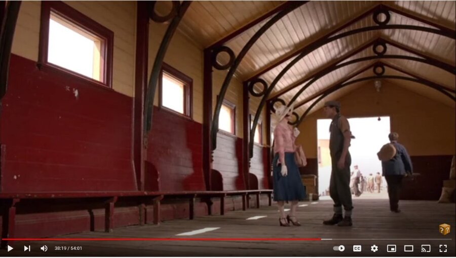
I am watching this Australian Mystery series on utube and there was a scene with a cool design in the building (picture below). I wanted to try and receate the graphic version. I cant wait till we do the Vector workshop. I used vectors to create it and did some problem solving along the way. I'm happy with what I did this time. I didnt quite get the proportions right. When I know better I'll do better. I was playing with what to do with the background when I tried the gradient called "Underworld" so my theme was gambling in the underworld (too much watching the TV show Supernatural). I used the eraser tool to fade out the bottom as if it was descending to the underworld. It was the first time using the Custom Playing Card script from Carole. I LOVE IT. I learned to click "cancel" when choosing a photo and "cancel" again to continue the script and ended up with the layers of, white background and card number/suit. I put the same gradient on the card, lightened, and put my photo's on. I can see a lot of ways to use this script. My original layout was quite dark (my monitor is very light so it's hard to know what it looks like) so I lightened it up for the forum/gallery. My photo's of a recent studio shoot, fun with expiring dandelions. Font is Vanilla Right.
- 276 replies
-
- 12
-

-

-

-
I love this and I quite like the white background. It's a high key layout. I also like the use of the three strips creating triangle which are very dynamic in the composition/design world. You could try a texture but it might not look so good with the sketch graphic. I think it would detract from the cleaness and mimimalist style.
-
Looks like Happy Birthday to Tennessee is in order. Look at how many double letters in a row is in this State. Now that's something to celebrate! I like the information you give in your layouts.
-
I too am at a loss if technology stuff goes wrong. Just like if the lights dont work. My electrical expertise amounts to flipping the odd breaker switch when I use the microwave and the kettle at the same time. Technology is great when it works, when it doesnt, I'm reduced to cave-woman mentality.
-
I just downloaded your kit from Digital scrapbook and everything unzipped and opened fine. There was no preview showing(on my computer) in the blog section at Digital Scrapbook (pixel scrapper), but the link for the preview works. What an accomplishment to be published like that. Give yourself a pat on the back.
-
thank you. I think I'll pass on the deal. I got an email for $159 for the lifetime upgrade too and I'd love to jump on it, but it's $159 USD which would have been okay in CAD but a little too much for me. I dont use it enough and would be better to put the money toward my Campus membership next year.
-
I think it would be very expensive to have one huge drive. There is more risk of losing your data if it's on the same drive as your boot drive. If it wasnt an SSD it would also be slower. I currently have similar to carole 500 SSD for programs only, 1 TB for Data and a 2TB for data. I have over 20 yrs of digital photos and already thinking I need another drive. I dont really know much about this stuff. The information in the first sentences is from my husband. I'm the one who doesnt know how stuff works, but I can work it. Kind of like electricity and plumbing and my car...I dont need to know how they work to be able to work them. I really should know more about how the computer works though.
-
...and we could all become gazillionairs and alway have the latest greatest versions of PSP, Filter Forge and all the rest and best of all be lifetime members of the Scrapbook Campus! lets get on it. Speaking of FF, I was reading people having problems downloading the version 12 with the library and back up thing. I want to take advantage of the offer. Since it expires on my birthday, it must be a sign, right? Just wonder if anyone has it and was there any problems getting it all to work?
-
Washi tape can have words on it. ....and kitties, I have ones with kitties. I dont think we need any other kinds than that.?
-
You have a good sense of knowing when to say..."can you make a script for that". You both make a dynamite team. I like your papers too, also a lot. the patterns are nice, not too big and overwhelming. They are classy; one could say, patterns grown up. And, who doesnt like popcorn? Put butter on your flowers and call it popcorn, after all they did come from a plant. When I try out this script I'll have to refer back to this post. I'm looking forward to seeing where you go with the kits. You are very creative and I love your energy.
-
Dont worry, You got this!
-
Just got home from work. Posted and it went to digital heaven, so replying again. I downloaded all the files separately and the kit itself. Everything opened and worked and is FABULOUS! Love the kit. I can see why you needed that word strip script for faster work. I see lots of kits in your future. there is so much I love about this kit, the papers really blow me away. Super creative, super job Suzy.
-
That's some good and fast thinking. Hope the reveal is soon before the cat's-out-of-the-bag.
-
Okay, mums the word, no commenting on FB...not that I'm on FB that much.
-
Let's hope she isnt secretly following this forum. I am looking forward to her reaction. I know I'd be in tears at receiving something like this.
-
Discovering the little details is really a delight and surprise.
-
I'm speechless! the detail is amazing and so much fun to look at each one and see more and more litle details in them, like the Harry Potter books and framed photo. I am blown away by how real the flowers look and that silver watering can is perfect. Your daughter will be blown away. I look forward to seeing your layouts from this.
-
We have love hearts in Canada and I loved them. I'm not sure if they are are still available though.
-
I never noticed this topic before. I'm not sure how to post stuff with a link. Would I need to use something like Dropbox that I'd like to for me people to download? I'm going to have to look into that.
-
This is so pretty. Love that plaid! I too had to sign in twice. I wonder if it's from a Windows update.
-
So cool isnt it Mary? And so easy. I have been embarrassed I couldnt figure it out on my own, but tonight I had to mention it. I'm glad I did.
-
OMG! The PSP angels are singing! Thank you beyond belief Sue. I have been wanting to do this for a very long time, it's embarrassing. I have been using the magic wand to select the whole image, then feather and I'd see nothing. Well, because obviously there is nothing beyond the edges to feather. These instructions were as advertised...Fool Proof! Thank you again. I am happy camper tonight. Glad to see Mary got into the lesson too.


