-
Posts
4,589 -
Joined
-
Last visited
-
Days Won
170
Content Type
Profiles
Gallery
Forums
Everything posted by Susan Ewart
-
I love the color version.
-
These are so awesome. I never thought to do that to a completed layout. Great idea.
-
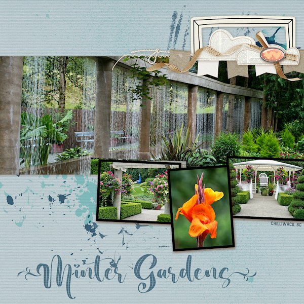
QP Lesson 4 I'm still doing a deep dive into old photo files. This was (and is no more ?) a garden close to where I lived in BC. It was a beautiful place to walk around even without a camera. It was very peaceful there. I did not change anything on this layout and only added text. Fonts: Beauty Nature and Amnestia Normal (creative fabrica) PS Beauty Nature has some nice glyphs, it's described as a "leaf" font. I used a glyph on the first and very last letters. It's from Creative Fabrica I believe.
- 382 replies
-
- 11
-

-

-
This is stunning! love the colors. Photos are perfect for this layout and a glider on the loose I see (out of bounds technique?). Great idea.
-
Wowzers Mary, beautiful and great color combo. I might have to make that FB header.
-
They are so cute! Yes, I need to remember...this is supposed to be quick. But it's oh so fun to change stuff...cause we can(more likely we cant help ourselves). Have tools, must change "stuff". ?
-
-
- quick page extra
- quick page workshop
-
(and 1 more)
Tagged with:
-
-
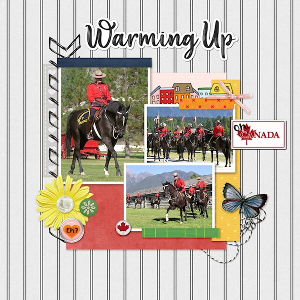
QP Lesson 3 More from the RCMP Musical Ride. These are some warming up shots and one just before they get lined up to parade in to the arena. I used extra elements from KMRD-The great White North (brad 1 and CANADA with Maple Leaf) Fonts: Afifla (words 'Oh' & 'Eh?') and Aesthetic Violet for the the title, both from Creative Fabrica.
- 382 replies
-
- 14
-

-

-
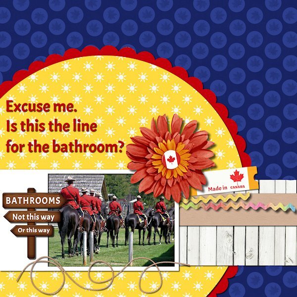
QP Extra Lesson 3 I managed to get one made today. Came across some old photos circa 2005 (pre-DSLR days) from Ft. Steele Heritage Town in the Kootenays (British Columbia). I used the brush tool to put circles over the anchors as it didnt fit. I added a maple leaf to the circle for some texture. Changed the sign (I used the clone tool) and added a few Canadiana items. I had fogotten about these photos and laughed when I saw this one. Looks like they are all lined up for the bathroom. Font is Acme, I think it's a google one that came with my font viewer. Onto the other lesson 3 QP.
- 382 replies
-
- 11
-

-

-
Aww, thank you Suzy. I followed the See-though tutorial, but this font mis aligns, so having a script would be awesome. I forgot to say BIG THANK YOU for the making the cracked paint image whiter (and the blacks blacker) and you fixed the out of focus spot too. I think I need to get that script if I want to keep making overlays.
-
I do have 2023 but have gone back to 2022 and that's where it didnt work. I wondered if it was the font that could be an issue. I've had other font issues where part of the font is cut off so it could be the same thing. I did it before in 2022 and in 2023 so it must be the font.
-
I've tried (just now) all the links in the forum and the email. I only get the collage. I'm quite happy to have that instead as my trade off for a FB header.
-
Really nice color combo.
-
Adding the rectangles and fonts look great.
-
I know, right. Keep them coming!
-
-
- quick page workshop
- lesson 2
-
(and 1 more)
Tagged with:
-
-
-
- lesson 2
- quick page workshop
-
(and 1 more)
Tagged with:
-
QP Non-Scrap Lesson 2 I didnt have any people to congratulate, so I put a floral shot instead. One could say it's congratulations to getting through all it's stages of life and sending it's babies out to the world before the lawn mower got to it.
- 382 replies
-
- 12
-

-

-

-
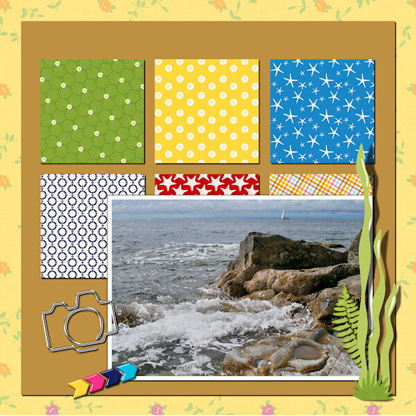
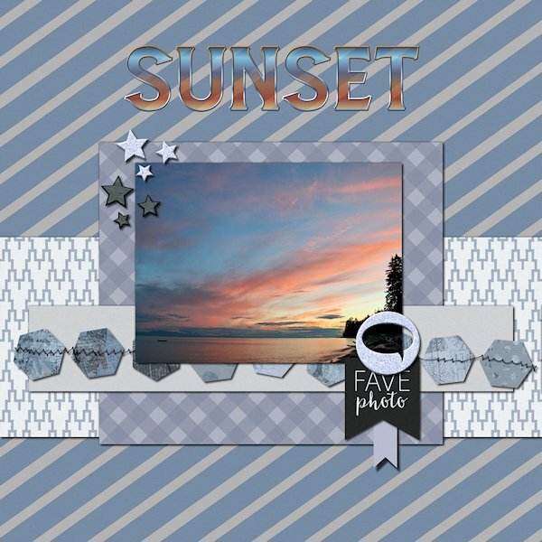
Quick Page Xtra - Lesson two I did so much stuff to get to this color (for the Quick Page) that I wouldnt be able to replicate it. I just tried different tools to make changes and went back and forth to see where it would go and ended up here where I liked it. I did duplicate the QP and added a blend mode and ended up with a nicer blue than I had and a whiter white on the one paper. I tried to use the see-through-letter technique which I used recently with no problem. today the outline misaligned everytime. I ended up getting it to work a different way so I could add a bevel to the outline. I've done it several times with no issues, but tonight I must be missing something. Photo is from the same beach as the other quick pages. Font is Amnestia Normal (Creative Fabrica)
- 382 replies
-
- 17
-

-

-

-
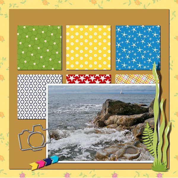
Lesson 2 same locations as lesson 1. Fun times walking all over the rock formations. I think you have really interesting rock formations where you live Carole. They seem bigger, or older or something like that. I didnt change the QP at all on this one.
- 382 replies
-
- 13
-

-

-
Contratulations Ann!
-
Wow Fiona, stunning photo! And the bugs are a perfect fit, even if I'm a bit squeamish looking at them.
-
That house finch is a "ginger". I love the flip flop cake, that would be perfect for my sister-in-law and niece who live in flip flops (how do they walk in them, I'm always tripping over my feet in them). I never thought to enlarge the photo space, good idea. Love the black and white photo.


