-
Posts
4,245 -
Joined
-
Last visited
-
Days Won
141
Content Type
Profiles
Gallery
Forums
Everything posted by Susan Ewart
-
Here is the 2nd page as a layout. It might be easier to read it here. Ugh! I see a typo. That will have to wait until tomorrow. FIXED!
-
Lesson 6 with the "Open Book" script. What a fun script. How does everyone save it to keep the transparent background? PNG? (I mean as well as saving pspimage file). Fonts: title is British Columbia rough, there are several styles of this font which i had to have, since I born there. Arial is used in the journaling since I used white I needed it to be very readable. This is a pretty way to showcase to pages. This packaging for the gift took a couple weeks to do. Lots of components and time waiting for things to dry or glue to set up. The card is the same, first I have to make a mock up to make sure it's going to unfold properly, then comes measurements (ugh, my nemesis) and then cut the piece and do the build and hope it all comes together.
- 203 replies
-
- 10
-

-

-
Anja, what beautiful layouts. The Karneval layout is superb!
-
Good tips, thank you.
-
It looks great to me. thanks for the infor about splitting and saving each half. Did you get to choose the cover color too?
-
I love this. I bought it too! Cant wait to use it.
-
I wanted it too, but had to put it on my wish list for next time. I got my load and blew the budget. I'm most pleased with myself.?
-
Thank you so much Carole. I really enjoyed Lesson 3 and like the look of that type of layout.
-
-
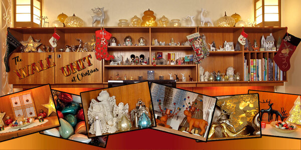
Happy Birthday Carole. I celebrated a little early as I was up late last night(or rather early this morning). I enjoyed your birthday very much, thanks for inviting me.? Lesson 5. I had no panoramas that I could find and my photos when enlarged covered all the 3600 x 7200 so I ended up cutting off the bottom of the wall unit and putting in the gradient. Which weirdly looks the same color as the lights that shine from under the upper part of the wall unit. I like the style of this layout, at least the ones everyone else did, but this is not my greatest work. This was a fail, but I loved the tutorial on the text, converting to curves and character shapes. that has a real nice look as it uses the whole gradient in one letter. This is a wall unit (teak-Danish) that my uncle owned and I inherited. I decorate it differently each year at Christmas. Mostly this is where my old camera collection lives. It's the 60's-70's style I love. The fonts are DDCooldness and Amoreta from Creative Fabrica.
- 203 replies
-
- 13
-

-

-
This is so swesome.
-
Thank you so much Corrie. Your mountain layout is really amazing. You live and visit the most picturesque places and your photo's are a delight to look at. Expecially your flower photo's. I've being so inspired by everyone in the campus (their design sense and their photography) that it has rekindled my love of photography.
-
You never know when or where those angels pop up....if you are familiar with the "Weeping Angels" from Dr. Who, you best not take your eyes off them. Kidding aside, it was in a garden at by the house. The cars and the trucks were my favorite. Just parked and never moved for 30+ yrs or longer, I should have asked. I love that kind of stuff. I wished I found more rusty stuff though. I was going to head back there but Covid happened and then I found out my hamstring issue was a torn hamstring (1.5 yrs prior!) and sitting for 9 hours in a car was out of the question. Maybe this year or next I hope. One of my pipe dream holidays was to go to Connecticut and what I heard was called the North East Kingdom area. Especially in the fall.
-
-
An exciting adventure you and your family, bride, groom and guests who made it, will never forget. Thanks for sharing.
-
I was so busy looking at all the cool layouts that I forgot to post mine. Here is Lesson 4. I used Amerio for the font and grunged it some more with the eraser tool and lowered the opacity slightly. I had to composite two of the wood slat papers together. It had on each side of the paper, ends of the wood with nails, which would had both sides wit the nails smack in the middle of the layout. So selected the middle of one and pasted over the middle portion and lined it up. I cold see a line on one side so I used the eraser tool large and very soft with very low opacity and and erased over the line and it disappeared. Yay, nice to have success. More from my cousins farm, me wandering around shooting whatever caught my eye. Coffee stains are from a brush set (or two) at Digital Scrapbook.
- 203 replies
-
- 11
-

-

-
I agree with Mary, I love these Drive in layouts. It's got to be one of the most beautiful Drive-In settings I've ever seen. I didnt realize you were that close to NYC.
-
I really love all the colors in this layout. What a great palette you could get from here.
-
This is beautiful. I love the title and that script sounds interesting. I better add that to my list. the sale starts tomorrow!
-
-
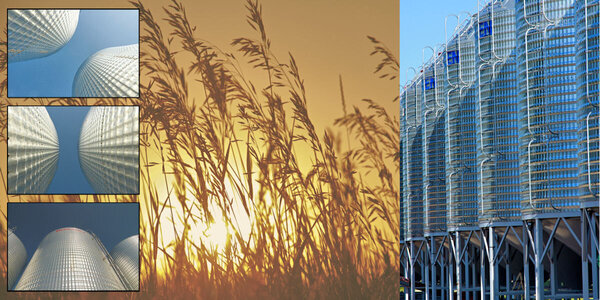
Lesson 3 in the bag....or in this case in the silos. Photos from a 2017 trip to Saskatchewan to my cousins farm. I found the silos endlessly interesting and somewhat abstract. the sunset there were really amazing (which I didnt take advantage of -a regret). as the crops were not tall I used grasses as a stand-in for crops. I might title it but havent thought of a name yet. I enjoyed this lesson and managed to combine them okay, thanks to tutorial. I used a very light yellow layer below the grasses and reduced the opacity so that I could maintain the yellow-red of the sunset otherwise with the white it got too desaturated.
- 203 replies
-
- 14
-

-

-
This is wonderful Kasany. I live in a very snowy part of Canada and I'm shocked at how many people still ride their bikes in snow and -30 celcius. they have studded winter tires for them, who knew such a thing existed. I think it's crazy, but then I dont care for the cold.
-

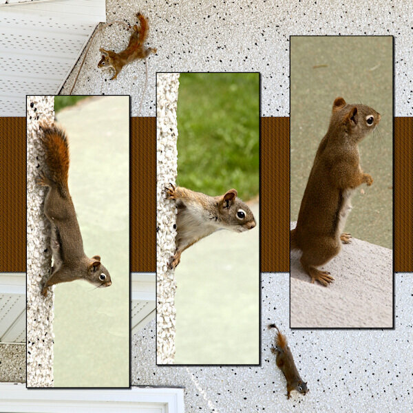
DPWS-Lesson 2-pg 1 Spider Squirrel-600-gallery
Susan Ewart posted a gallery image in Double Page Workshop
-
- double page workshop
- lesson 2
-
(and 1 more)
Tagged with:
-

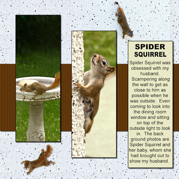
DPWS-Lesson 2-pg 2 Spider Squirrel-600-gallery
Susan Ewart posted a gallery image in Double Page Workshop
-
- double page workshop
- lesson 2
-
(and 1 more)
Tagged with:
-
-
- double page workshop
- lesson 1
-
(and 1 more)
Tagged with:


