Susan Ewart
-
Posts
4,252 -
Joined
-
Last visited
-
Days Won
141
Content Type
Profiles
Gallery
Forums
Everything posted by Susan Ewart
-
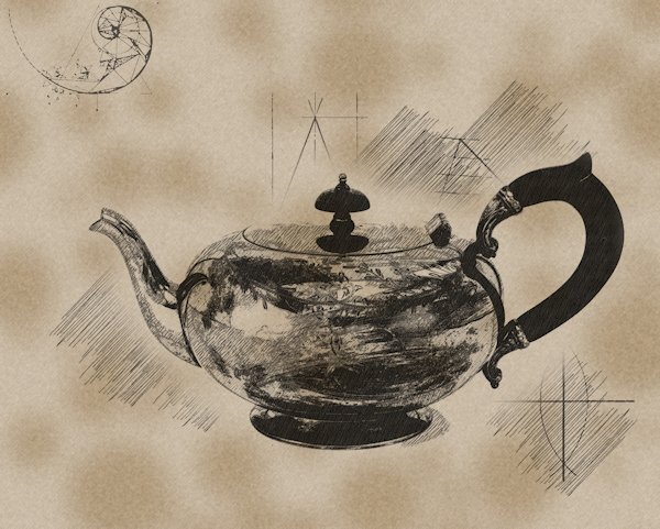
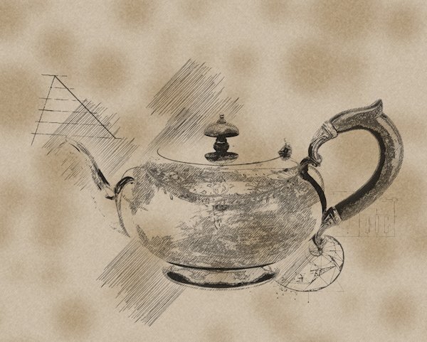
So I put the two together in layers with the light one (script2 using photo2) on top and used a blend mode of screen and opacity at 73. then I put the darker script1(photo1) on top and use dissolve and 40 opacity.

-
The darker photo 1 resulted in a darker end product and the light photo resulted in a lighter end product. the dark was too dark and light was too light is some areas where I lost detail.
-
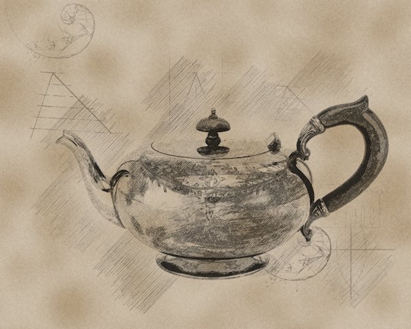
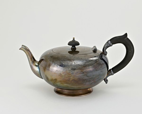
I managed to salvage some of the day (now late night) to try the PencilSketch2 script. Since I tried a few things I'll have to post a few times. here's the two photo's. It's the same photo, and I originally edited it darker, then went back after the first run of the script because it was too dark. Also here is photo 2. the next post will show how the script ran on it's own with these two images. Photo 1 is the dark one, Photo 2 is the lighter one. these are just the edits before the script.
-
Nothing so far, my day off, and I wasted it on trying something that didn't work out. 😪 Hopefully tonight I will get to try it out.
-
I love the quote!
-
Thank you for the tips. I had planned on playing with the script tomorrow.
-
Possibly this: but I thought there was a different (more modern) name for it. (the bold part below wasnt me, it was from google, it's like it's yelling at us). What are the characteristics of cloisonnism? (from Fr., cloison: 'partition'). Style of painting associated with some of the painters who worked at Pont-Aven at Brittany in the 1880s and 1890s, characterized by dark outlines enclosing areas of bright, flat colour, in the manner of stained glass or cloisonné enamel. Or possibly this one? Toon style, also known as cartoon style, is one of the oldest and most recognizable comic book art styles. It is characterized by exaggerated, simplified, and often caricatured characters with bold outlines and vibrant colors. Or Pop Art often features hard, defined edges and thick outlines, which can be achieved using stencils or masking techniques. These edges give the paintings a graphic quality, emphasizing the flatness of the image.
-
Doska, your frames are outstanding. I look forward to seeing more of your postings here in the forum. How sad that in your other forums they are so focused on little details and seems they've totally forgotten about the art that is being created.
-
I really like the look of them. This could be fun. I just bought the script Mosaic Maker and I think it would make similar type layouts. I'm inspired to play with it.
-
That is a monumental achievement Rene. It looks wonderful. And that template is really nice. Did you do the alpha as well, or was it part of the template? It's very nicely done with the clusters. This is like a contact sheet of a group of layouts, a person could do that for all their layouts or themed layouts. I was thinking of posting a 13 layout wrap up every 13 weeks for the P52 challenge. I had envisioned doing 12 layouts around/beside/under/over (in other words, where ever) the 13th layout which would be, maybe, the favorite of the first 13 with a little title on it. this idea has never made it past a passing thought stage, but this layout is motivating me to consider it.
-
You will do well, Carole teaches it so thoroughly and you are a Diamond member so you'll have access to it afterward too.
-
I have that on my list to do. I'm quite behind in adding to the gallery, but I will make the time soon as I want to get it up to date.
-
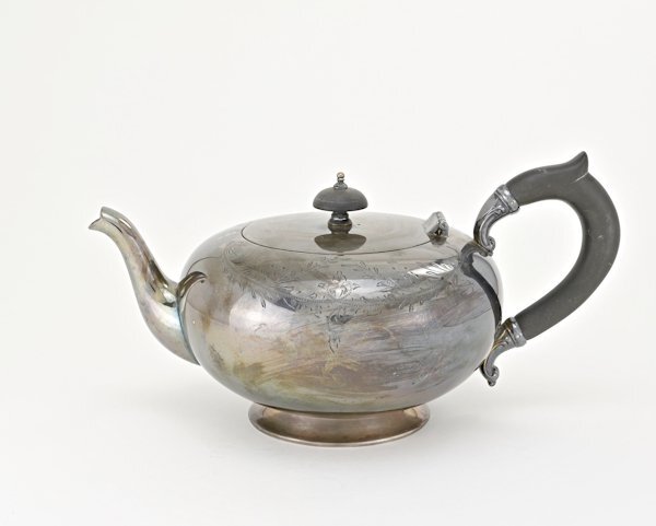
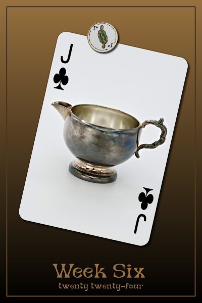
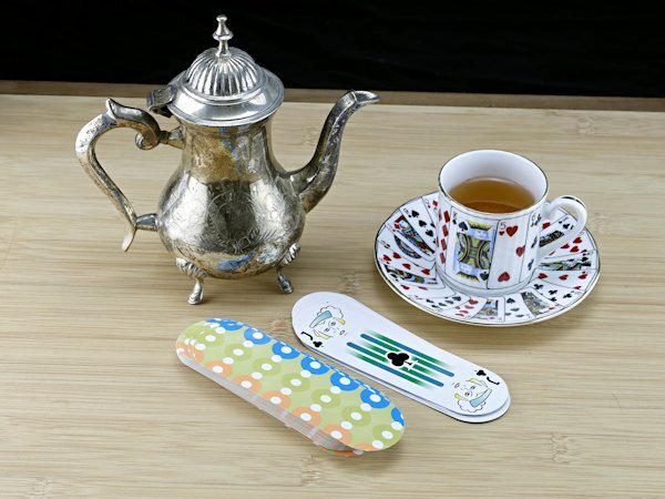
P52 Challenge Week 6 Today I have a Jack and Jacks = creamers! I had wanted to show a nicer one I have but it has terrible reflections on it (bad photography) so I'm going to try them again. I have 3 more Jacks to do. And since it's the new month, I'll show where I'm at in my deck of cards. That tea is getting really cold by now. hahaha, I actually had to really water it down for it to "look" like tea. The font I used is called Dept from Creative Fabrica. Not super curvy, but just enough curves...like the little creamer. BTW the cutie little t-pot will show up as one of the Queens. I used a gradient (foreground-background) for the background and for the frame too, but I inverted the gradient on it. there is a tiny spot in the middle that is the same color so in effect disappears a bit. And I had to change the color of clubs, as this strange round deck had green clubs (Ewww). Oops, I forgot to straighten the card deck shot.
-
Sounds good. I'm leaving it there if that's okay. I'll start Feb as week 6. I can understand dividing it up. If it was one long post it would 100's pages by the end of the year. I should've used my head on thinking about that. And I'll be careful to watch for the transitions.
-
Week 5 isn't still January? Oops. I'll have to go retrieve mine too. actually I thought it was all one long thread. This is a good reason for me to be late in posting going forward. After a thought, I"m leaving it there. Because for me the week starts on Sunday making more than 1/2 the week being still January. and it's physically the 5th week of the new year. That's my lopsided logic.
-
Wow! I love this photo! I know topsy tervy well, but not upside down and inside out. I'm going to use it! Well, I'm feeling a little foolish, I just checked it out. One of my favorite singers when I was a teenager was Diana Ross (I saw her in concert in Vancouver, BC). I am known for not knowing words to songs and wouldn't you know it, here's one of the verses: Upside down Boy, you turn me Inside out And round and round Upside down Boy, you turn me Inside out And round and round My face is a little red right now; it was one of my fav. songs, that I haven't thought about in years. Sooooo, I stand corrected, I do know that term after all.
-
I had a good laugh when I opened this post. What a cutie. And more attentive at the wheel than some humans!
-
First: WECOME BACK! secondly, I was thinking yesterday, when is Sue coming back? Imagine if I had wished for a million dollars! I'd be on a whirl-wind tour to meet everyone in the Campus. And lastly.....you must be very flexible...I'm impressed.. "upside-down and inside out". You crack me up, glad to have you back. Yoga antics aside, your images are as brilliant as ever. Love how you did the January 2024 part, really nice touch.
-
Sometimes what I get is the inability to react to a post and I scroll up and it shows I'm logged in. Only in some forum posts does this happen and always from when I click on the link in the email notification. And sometimes I have to re-log in because it says I'm not logged in. I always check "remember me" for your website so it's easier to just click the favorites bar where I have you. I chalk that one up to MS updates resetting things it has no right reset without asking first.
-
I wrote them down too as well as did the screen shots. then I had a point form very short cheat sheet that I used. Then i just tried it by memory and missed a step. Seeing the step I missed made me remember that particular step. Now I can do it without referring to the notes. That is only the one style of making a mask. this year I want to to commit to memory another style that we learn in the workshop. I remember Sue T. telling to do one thing over and and over until I can have it memorized. Good advice because that is what I did. making the mistakes was really what helped me to learn the order of the steps.
-
I love this. Seeing the tree change over the months is so interesting. I really love that middle long line of trees. I must say, they are perfectly shaped too. I was surprised that the leaves were on for about 7 months!
-
I looked up Gill Sans and it's creator has a questionable past and that's why Microsoft dropped it from it's line up. It's is horrendous what the creator did (and he even documented in his diary). Having said that....we can't change the past but we can use the good they did cant we? Can you imagine if we find out the inventor of electricity did something heinous in the past would we all be required to give up electricity. What about the inventor of the phone? Are we going to give up any form of phone we have? that is moving backwards and not forwards with trying to wipe out these heinous acts. Sorry, no more politics or soap box rants from me.
-
How cool!
-
Thank you Fiona. This is nice quick challenge, finding the fonts are the hard part.
-
I just go the welcome email. although the link to say Hi in the forum took me the 2023, but I got it so I'm happy.