-
Posts
4,589 -
Joined
-
Last visited
-
Days Won
170
Content Type
Profiles
Gallery
Forums
Everything posted by Susan Ewart
-
I read the blog post too and had never thought about a "table" as a starting point. Great idea and you executed it to perfection. That shadow on the folded edge of the photo is outstanding. There is a little bend(arc?) near the corner of the shadow and really "makes it" seem so real. I must admit to wanting to hug and cuddle and get my face all up in their fur. I know they'd "love it" too. hahaha. Poor guy, it would probably give it a heart attack. I saw on a wildlife rescue show that any wild rabbits, hares etc is hard to rehab because they stress easy (being a prey animal and all). BTW, love the quote.
-
I really love the rose photos, I do hope to see more from you.
-
#5 You can see I didnt quite nail the backgrounds. To much light contamination and different colors in the flowers and glass reflecting. even with a custom white balance in-camera. I've just started to experiment with using Kelvin settings instead to see if that helps. (I'm using constant light so light contamination from my yellows walls and a window in the room can be an issue since I'm shooting at a slower shutter speed - one day i'll have strobes (studio flashes) and that wont be an issue as much)
-
-
Thank you so much Ann. I initially liked it, but then realized how much the details get lost in such small boxes. Love your pun BTW. Gave me a laugh.
-
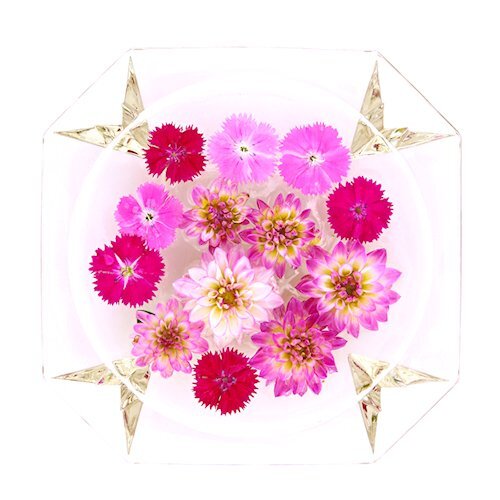
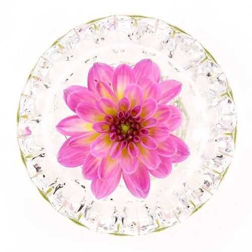
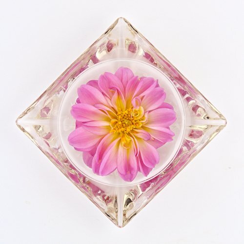
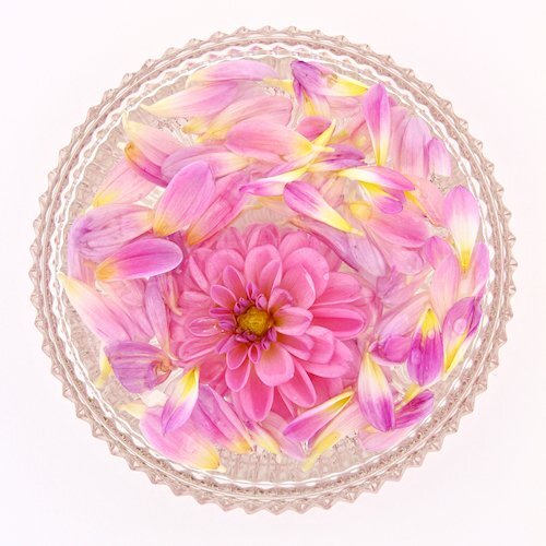
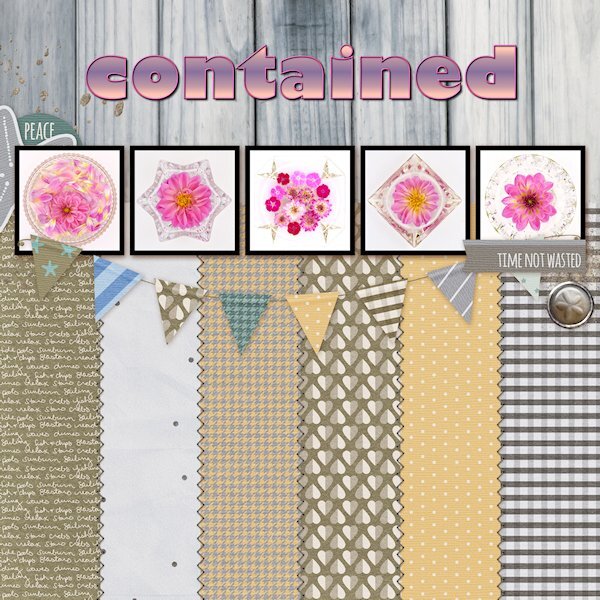
Day 7 Diamond Extra Photos from 2022 when the world was being contained (or were we coming out of containment by then?) I started doing flower flat-lays and well, I contained them too. I had to buy the flowers as I have never grown them before. 2023 was my breakout year for learning to grow flowers. Font is Gill Sans Ultra bold (formerly from Microsoft) that I had to scoop off my laptop since Windows 10 didn't have it anymore. I used the technique we learned in the Text Workshop (and there is a blog post on it too) where the outline can be used separately, which I added a bevel too. Side note: I think my brain has turned to mush. My shadows, even at 80% have been looking soft and lighter and I thought, oh oh, something is wrong with my eyes. Today I just noticed the shadow color wasn't black but a dark grey. Geez, when did I change that and why?
-
Wow, that is awesome.
-
Oh no Michele. I hope you get a fast resolution.
-
Day 6, More of the mundane things I found around the house to put on the little baby plinths. Maybe I'll dig out some beads to show what they were really for. Fonts are Sea Gardens and Shintaku from CF.
-
Interesting stuff, I didn't know. I just dealt with baled hay and straw for stalls (for the momma's and babies not for the racehorses...they'd eat the straw, they had to be on shavings).
-
here's a close up of the screws (on plexy) just to show you that I really do have a "few screws loose". I call it 'Art in the Everyday' or "Art in the Mundane'.
-
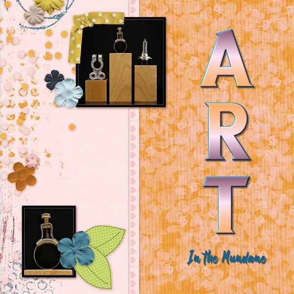
Day 5, plugging along slowly. These photos arent really meant to be shown small, detail is lost in the lack of size. And why on earth am I photographing screws. Hubby torn apart all the hard drives I brought home from work (they have holes screwed into them so they cant be used again) so I could use the insides for photo projects. I walked into the room and saw the screws had attached the very strong magnets inside hard drives and thought, that looks like industrial art. The wood plinths (two are laying on their side) are reject left overs from wood stands I used to make for glass bead makers (lampwork) (some with knots, some without). They remind me of the big plinths you'd have in an art gallery show, but in miniature. Font is Nathalia (title) and Neuton (Extra Bold) both from CF I think. I changed the color of part of the QP using a layer mask (actually two masks; one for the band, one for the above and below part). I need to learn how to duplicate and invert a mask, I tried but it didn't work.
-
I will give it a try. I'm thinking it might be way more convenient to have it there.
-
Mary, THANK YOU! this is brilliant. And it looks fabulous.
-
Thank you so much Michele! My heart is singing right now.
-
I agree with Mary, this background is fabulous. I thought the paper came like that. The first thing i noticed was the different frames on each photo. What a great idea.
-
Mary, that sign fits perfectly in this QP. Nice and colorful too.
-
I remembered from Build A Kit - Alphas about making the text into characters. I felt pretty happy that I remembered it. About Filter Forge, currently it's a stand alone product for me. I didnt want it in PSP because it used to really bog down my system when it was rendering the effects on it's own, I thought it would make PSP crash. But now my system barely has to lift a finger to use FF. Here's my problem. I don't know how to make it a plug-in in PSP. Does the masterclasses show how to do that?
-
That top photo is stunning Mary!
-
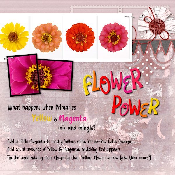
Day 4 Diamond QP Here is a color flow from the subtractive color (absorbs light as apposed to RGB which is additive and reflects light) color system CMY commonly used for printing (inks, paint etc). Starting with Yellow (very low on the value scale) and strong willed Magenta (fairly high on the value scale). Note the colors of the flowers are not PURE colors, in fact if all all three primaries are present and not any one of them at full strength, it's a tone (Hue+grey). Just keeping up with my color practice along with my PSP practice. I changed the color of the back ground with either Hue Map or HSL or likely both. the Fonts are Flower Love and Friendly Cactus. I used Objects>Convert Text to Curves>As Character Shapes for separate the letters so I could move them separately. Then rasterized and inner beveled.
-
I see now, thank you.
-
As a Black cat owner I love everything about this layout Donna. The quote is so perfect.


