-
Posts
4,589 -
Joined
-
Last visited
-
Days Won
170
Content Type
Profiles
Gallery
Forums
Everything posted by Susan Ewart
-
Beautiful Mary!
-
It seem like that to me too. Shouldnt it be the other way around. I used to say, sleep was wasted on the youth and now I should say, Time is wasted on the youth. All the time I wasted when I was young, I wish i could have that back.
-
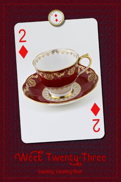
Week 23 Are we already this far into the new year. Where did the time go? I used lots of techniques that I now forget, on the background. There was a number of Effects piled on top of one another and noise was added. In the end the background looks a bit like fabric. The font and outline were treated to Effects or a blend mode (I'm sorry, I cant find my notes, I think I recycled them) so it looks somewhat painted on, although might not show up with this resolution. Yup, it's pretty blurry looking. If I get my act together I'll start posting on FB starting from the January classes. Time seems to be slipping through my hands these days.
-
Wowzers Ann! Good thing the cloud is roomy like you say. I still want to visit this "cloud" someday. My hubby is a voracious Sci-Fi/Fantasy reader, he has about that much, but it's physical books.
-
Wow Dawn! These are amazing!
-
Welcome back Dawn. I hope you have overcome your challenges. PSP is a great stress reliever too, glad to hear your are getting back in the saddle again. Looking forward to your posts.
-
I do love Canada Geese, but seeing different ones is a real treat. Only usually see other ones at game farms or zoos.
-
OMG! this is precious! So sweet.
-
I wonder how they got there. I was shocked to see you had pictures of them. They do love the farm fields. When i lived in British Columbia there was farm fields around my house and they spent their nights there. But hey, free fertilizer for the farmers. We used to go the little park with a small pond and counted over 800 one night as they were taking off. When they were up on the grass part of the park you could just walk amongst them. I miss that park, I only see a few geese here and there where I live now. I know the farmers dont feel the same. And I get that it's not good to have an invasive species as it upsets the balance in the areas they shouldn't be in. It's like the starlings that were brought to Canada.
-
I love this layout. The quote and the images backing it up are so fitting. 90 books would take up a lot of room if they were physical. My hubby watches techy shows on Youtube and I happen to be in the same room one day while he was watch one. I had always wondered about "The Cloud". what is it? Is it floating around in the cyber sky, on a fluffy white cyber-cloud? Then the host of the show he was watching says: :There is no cloud, only your files on the someone else's computer." hahahaha, I never thought of it that way. I liked the mystery of my info happily floating along on a fluffy cloud (the cloud is smiling of course).
-
Thank you so much Michele. I wish I could take credit for the design but I saw it on a website somewhere. The trick was to kern the letters to make sure they all touched. I like the look. It's great for things like; Happy Birthday, Congratulations etc and I made the the upper and lower layers mask groups.
-
Oh wow, sound like a nightmare to me. Good luck. I'll be at the Q&A tomorrow
-
Me too. During the class you feel like, "Oh ya, I got this".....then weeks later, you are like, "Vector, what's a vector?"
-
Great to be back to posting. This was the post I tried to post on June 6th. so glad is stayed on the Editor...and good thing it didnt post because I forgot to add a shadow the Weel Done and the frame. I had looked on "professor" Google to see what do Scottish people say for "congratulations" and it came up with a slang term, "Weel Done". I have no idea if this is legit or not. Just a quickie I did tonight...because I left it to the last moment. My friends moved to Scotland on the Moray Firth (Moray Coast?) in Nairn (close to Inverness). Tomorrow (from my point of view - Today from theirs) they get the keys to the new house and their new adventure. I had originally thought I'd be doing something with the text and the outer frame, but it seems to look better in black. I found the highland cow on Unsplash (Sasha Matic is the photographer) and since it was on a snowy white background I used the Darken blend mode to made the background disappear into the garage door. I found the highland cow in the circle frame on Creative Fabrica and used text on a path as shown in the last master class. I see that I didnt get the bottom word as far away. I'll fix that later, I need to send it now as they should be just about getting up for the day...as I'm about to be going to sleep. I am showing it in black (as it came), on the layout I turned it to white so it would show up.
- 145 replies
-
- 12
-

-

-

-
Wow! this is cool. It really looks rounded.
-
I'm in. Thank you for the extras too!
-
So cool! I love it.
-
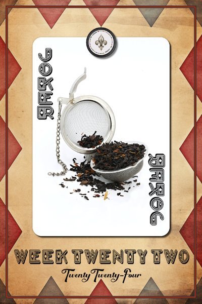
Week 22 I didnt have a joker card and the joker in the round cards I use for the magnet element was hideous so I made one if each (card and magnet). I duplicated the text for the opposite corner. You'd all have a good laugh watching me try and wrap my head around the correct sequence: flip this, mirror that...argh, that's not right. Must've done it 10 times, when it should only take two moves.
-
What a pretty flower Sharla. Mother Nature makes the best color palettes
-
Great idea!
-
One of my cats is obsessed with watching the toilet flush. A previous cat I had could flush the toilet.
-
Wow Mary, you are on a roll. Send me some of your Mojo, please!
-
What week does May go up to. I see only 19, 20 and 21 so far. Is week 22 part of May?
-


