-
Posts
4,589 -
Joined
-
Last visited
-
Days Won
170
Content Type
Profiles
Gallery
Forums
Everything posted by Susan Ewart
-
Wow, thank you so much Ann. It's such a good tutorial too, easy for anyone to follow and get a cool button.
-
-
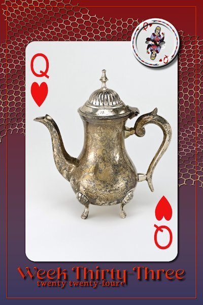
Week 33 Tiny little T-pot, only about 7-8" tall, but oh so cute. Gradient background, with no texture because I just realized I forgot. I was so into playing with the netting! From the new book; Digital Scrapbooking Made Easy with PaintShop Pro. In the Scrap With Me - Scraplifting section, Project 2. The netting is really easy to do and tackling the warp brush is easy with the instructions in the book. I added a tiny bevel and the shadowing settings from the book (which I now saved in the shadow presets). Fonts are Neug Asia and Neuton from CF. I also added a small bevel to the three Vectors (should've made the outline thicker first) and a drop shadow. Forgot to add, there is a gradient on the netting, I think next time I wont do that as it looks like shadowy spots, it's distracting.
-
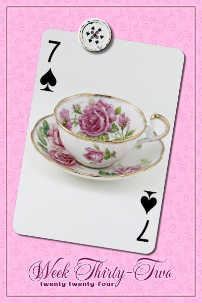
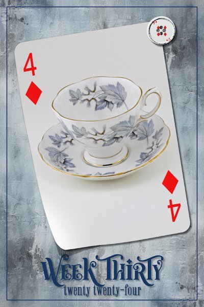
Week 32 This was the pattern my mom's t-set was, although this is not from her set. I got this many years later when I realized t-cups were little pieces of art I could afford. Fonts are Mea Culpa and Medina from Creative Fabrica Background is a PSP pattern that I added a very subtle round dot halftone effect to. The three vectors got a tiny outer glow layer style for a bit of contrast around them. It and the texture might not show up here.
-
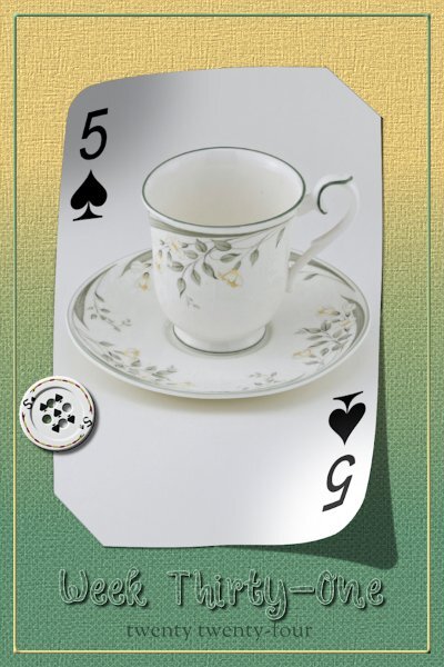
Week 31 Slipped in corners technique from the book (Digital Scrapbooking Made Easy with PaintShop Pro) Scrap With Me - From Scratch section, Project 2. Lifted Corners from the script. Button, again from the tutorial called "Button". Background is a Background-Foreground gradient. I added a halftone (squares) to the gradient and a texture on top of that and I think a wee bit of noise. Fonts are Winter Story (CF) and Sorts Mill Goudy, which sounds more like a Google font, but I'm not sure. A pretty little delicate cup that I am keeping.
-
Week 30 One of my "keepers". Such a pretty cup I couldn't part with. Background by Riley B. Graphics (Creative Fabrica), duplicated, rotated 180 and darken blend mode to get the dark areas in the corners. Followed the button tutorial for the button, I've done it now a number of times...I still cant remember the steps yet. I can follow along faster though, so that's progress. The Lifted Photo script was used. Fonts are Winter Vibes Regular (different that the other font of the same name) and Winchester Regular from CF.
-
We have a door to the basement that has a cat door. It's translucent but not really see-through. It allows them access to the basement where one of the litter boxes are. One cat goes through fine, the other not at all. It's a swing door so we've had to use a chain going from the cat door flap to the door to hold it up so the other cat would go through it. The door to the basement is usually open as that's where the laundry room is and one of my studios. And even when the door is partly open they will go through the cat door and not just the people door. We also built floating shelves(with carpet on them) for them in the upstairs "cat room/ my husbands office" they are set in a ascending stairs that lead to the top of built in bookshelves, where they sleep and on the other side is two more stairs coming down. they will race through the house, up the cat stairs and down the other side. Other than cat trees by the windows we put a permanent shelf behind the couch which is in front of the living room window, so the cats can sit on the shelf (about 5 feet long by 8-10 inches wide) and watch outside. It is a very well used. And this older gentleman that delivers the flyers will stop and talk to the cat through the window.
-
Those kitty walks are so cool!
-
Love the reflection on the text.
-
That is really blue! We had a house shaking thunder and lightening storm this morning . The the skies cleared and it's a blue sky, but not as blue and glorious as yours!
-
I put it on my wishlist in the store so I wont forget.
- 8 replies
-
- 1
-

-
- paper
- background
-
(and 3 more)
Tagged with:
-
OMG! How precious. Love the layout and the Word Frame is a really nice touch
-
This is very cool! I will check that script out.
- 8 replies
-
- 3
-

-
- paper
- background
-
(and 3 more)
Tagged with:
-
I love this. Julie is right, it's almost like fireworks. I like this technique and like Corrie, I wish I had more time to explore how to do this so it looks as nice as yours and Julie's do.
-
When I was young (grade 4, I think) we lived on a lake with not a lot of other homes (let alone full-time residents). We only got two channels on TV and Sunday night was the Wide World of Disney. Often there would be a show that was two hours so we had to wait a whole week to see the second part since it was only a 1 hour show. On one Sunday we watched "The Parent Trap" (with Haley Mills playing 2 rolls as twin sisters) part one. The next week my brother and I had our baths early so we could be all set to watch part two. That night we had a big storm and the power went out, so we missed the second part. It would be more than 20 yrs later that I saw the second 1/2. The Wide World of Disney was my favorite TV show. I remember one Disney short called "In the Bag" where a park ranger enlisted the help of the park bears to clean up the park...to this day me and several people my age can remember, "pick it up, put it in the sack, bump bump" (those aren't the correct words, but similar to that). At work anytime someone says "pick that up" my co-worker and I say, "put it in the sack, bump bump". the youngsters think we are loopy.
-
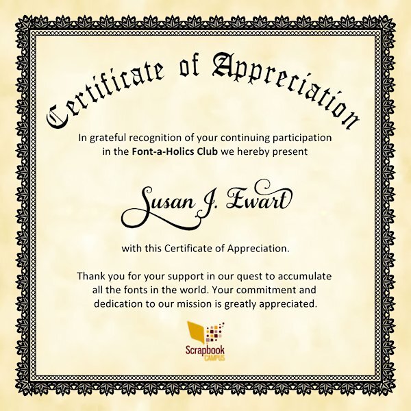
I wish i could take credit for this beautiful certificate, but I can not. The heavy gun was brought in, thanks to the the Creative talent of Michele. Yikes, I hope I dont see that big bad red word on mine!
-
The paper and charm are gorgeous, Mary. had to laugh at PSP-aholic. I looked it up in the dictionary, and there was a picture of YOU! 😂
-
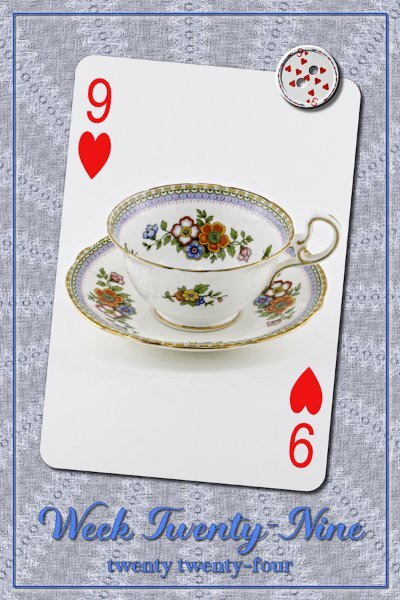
Week 29 Fonts are Magical Dream and Magical Source (Creative Fabrica) Background from Riley B Graphics, which I used Kaleidoscope effect on, then a texture effect and a bit of noise to make it look like fabric. It's supposed to be a warm cup of tea and a cozy sweater on a cool winter day.
-
Oh man, I was pinning my hopes on all this time opening up for me. Guess I better get better at managing it now.
-
Master scriptor and hedgehog wrangler, you are truly a renaissance woman Corrie! What a wonderful experience with a happy ending and safe new life for this sweet little thing.
-
Wow, he's a stunner. Those eyes! I love that tail, the colors are so beautiful.
-
I do the very same with the tutorials on screen and PSP on the other. I used to have a laptop running the tuts and PSP on the desk top. this is more convenient now.
-
Glad you forged on Corrie, I think your ropes look great. and with shadowing they will really pop. I'm interested to see how that will be done, as there must be a lot of selections (promoted) to deal with shadowing on. Beautiful flower!
-
I'd like a view that is bigger, almost full screen, full enough but able to see the chat at the same time. I had previously talked with Rene about 2 screens and watched my husband as he also works with very large spreadsheets. he said the same thing, his work flow increase. I just learned from Rene when she recently mentioned she can drag right to the layers palette, so I tried it and it works and keeps the file name. That was so cool. I work with 2 screens now and like my hubby and Rene, would have a hard time going back to one. I'm fine with coming in early, maybe 15- 20 minutes so we can chat more. I really like the idea of the graphic of the class we are doing. I hope the transition to the new company is seamless for you. Oh, the one thing is when members cant get logged on. I don't know if that's a matter of individual's computer settings (full browser cache etc) of if Webinar Ninja can change anything to make it easier to log into.
-
Here's my Certificate. No more hiding behind my monitor...I'm a proud font-a-holic! Now Michele....it's time for the Movie poster. the challenge is on. "Font A Haul -ICS" ***A Heist Movie*** Stolen Fonts! Text Take-downs! Nefarious Non-Font-ers! Starring: The "Prez" (aka: Michele F) The "Moderator" (aka: Carole) The "Editor" (aka: Ann S) The "Scriptor" (aka: Corrie K) The "Red Shirt" (aka: random dude that doesn't make it to the end....yet to be cast) (Red Shirt = Star Trek reference) With Appearances from Celebrity Fonts such as: Helvetica Arial Calibri Verdana and many more!


