-
Posts
4,589 -
Joined
-
Last visited
-
Days Won
170
Content Type
Profiles
Gallery
Forums
Everything posted by Susan Ewart
-
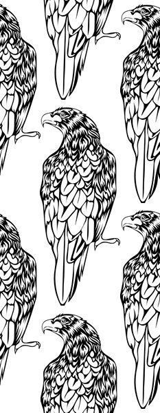
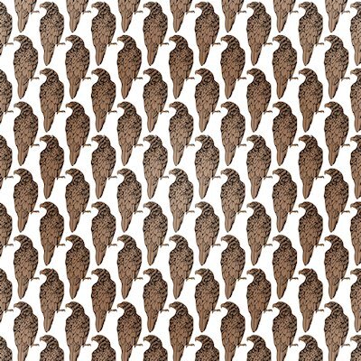
Here's what the tile looks like and I colored just the hawks by selecting (magic wand -opacity) the transparent parts and inverting the selection, then flood filled on separate layer with a gradient.
-
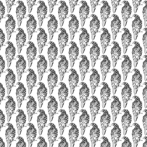
here is the outline version of the what the Tight Diagonal looks like. I would be a very busy paper at that size.
-
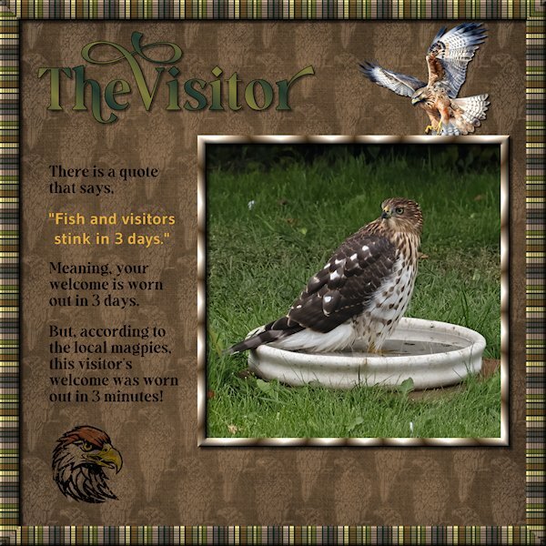
Lab 14-9 or Sketch 13, you decide. I started out doing something for the sketch challenge and ended up watching the tutorials for the most recent Lab (14-9). the items are: Striped Ribbon (2) Tight Diagonal The Striped Ribbon turned into the frame around the outer edge. I added a texture (blinds) and some noise and then duplicated and made a frame that I beveled. This is a quick and very easy to do tutorial. I kept my layers separate so I could decide on the background color (dark green looked better than white - it looks like black lines in the frame, but it's actually a dark green). The Tight Diagonal is really cool and easier than I expected. I did graphic of a hawk line drawing I found at Creative Fabrica. Then I used a blend mode and lowered the opacity as it was really busy and dark. Remember this tutorial when you do the Build A Kit next year, it will make for great papers. The hawk flying in and the hawk head are from Creative Fabrica and I changed the color of the feather on the head, used a blend mode, lowered the opacity and used the eraser tool to grunge it up a bit. Fonts are from Creative Fabrica; Gravity Wanders (Title and the journaling) and Gudea (yellow quote), Gudea might not be from CF. Background paper is Brook Gazarek (Digital Scrapbook). The birdbath I had took off the pedestal for a crow that had a bad leg a month ago. It turned out to be the favorite of the birds and squirrel this yr. This hawk flew in and stayed in the bath (it was hot out) for more than 20 minutes. The magpies gathered and watched very intently and then a lone little blue jay flew in to a branch 3 feet above the hawk and gave it a good talking too. All the birds were well behaved as this was big bird. When the Merlin flies in, the magpies endlessly taunt it and nip at the tail feathers. It's a much smaller bird. It was very exciting. I don't know what kind of hawk it is.
- 175 replies
-
- 11
-

-

-
me too! But I'm a disaster when it comes to baking.
-
I- Ice Cream Sandwiches
-
This is awesome...and YUMMY!
-
We've done DIY stuff for years. Lots of house stuff, I guess that's more reno than DIY, still it's stuff we did ourselves. I have done DIY stuff for photo lights and scrims (diffusion screen). I used chicken coup lights for my first lighting set up that I had to add diffusion to it with foam core as the light bulbs stuck out past the dish part of the light. and being the duct tape queen, I taped it all closed and had no way to change out the light bulbs! I also made foam core frames to attach diffusion material to. And I've done the normal kind of stuff, like using picture frames to make a magnet board (still in use in my studio). And when I did craft shows, I made most of the display props because buying the was not in the budget. I'm lucky to have a handy husband who is good with plumbing and electrical (he took a home owners electrical course at the university which helped immensely). But the money saved in car repair has been the best for our finances. His dad was a heavy duty mechanic so my husband was brought up learning how to rebuild engines, which is what he has done for our vehicles in the far past. And being in the tire industry (first in service and now in logistics) we have acquired a tire changing machine and balancer so we don't have book an appt for tire change over when the snow flies and everyone else is trying to do the same. Now, though, it seems like a chore to have to do DIY stuff because getting it done for me(or buying the right thing) is so much more expensive than it used to be.
-
Wow, what a transformation Corrie. Can you send him to my house too!
-
Anja and Corrie, these are really beautiful layouts. Corrie, I can see the difference in the shadows on your cluster, good work! And I love that edge punch. Anja, I really like the look of your layout and how each section is well defined with the shadows and the spaces between the sections (papers). You have lots of touches that really make it a WOW layout.
-
Wonderful news Ann. She will have the best kitty life living with you. Glad to hear your cat girls are coming around to her. She looks very soft, I love that rust colored line down the middle of her face.
-
What a nice surprise for you. That's looks like a really fuzzy bee.
-
She is beautiful Ann. Will she go back outside or will she be rehomed? That's amazing that you put that much weight on her. 3 pounds seems very undernourished. I have to ask, how does the tape worm come out.
-
my quiz link came in an email like the lessons emails came. Maybe check your spam in case it went there instead.
-
14/15 I got #15 wrong too. I just remember we reduced the opacity but there was no answer like that. So I just guessed.
-
The texture looks great, it's neat to see the texture in the shadow too.
-
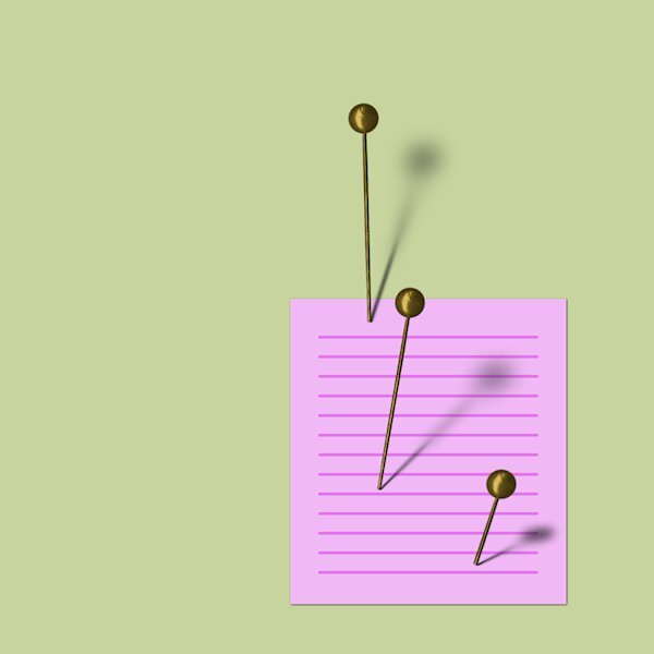
Lesson 7 I liked this lesson and even remembered the steps along the way (cause they were short). I finally understand how to use the feathering. Thank you! I never would have thought how this is done. It's pretty simple and fast as well. I tried different settings. I would have liked to try more pins but I'm getting a new hard drive and the data needs to be transferred over so I'll be down for a while. Thank you Carole, for a another informative workshop. I'm sure beyond a basic shadow I would not have come up with these techniques on my own. I'm glad to know them and have access to the videos as well.
- 262 replies
-
- 10
-

-

-
I'm top to bottom too, using a mouse, a craft knife and and glass cutter. I'm a lefty and have more control coming toward myself.
-
Thanks Jeni, I love fonts too and learning more about them is interesting. I only happened to read this book when my friends were moving and thought I might like it. I didn't know that about Serif fonts, that's neat to know. I've learned about X-height, baseline, wasteline, ascenders, descenders, majuscule and miniscule etc, from doing Calligraphy years ago but know very little about fonts, typefaces and rest of the lingo that goes along with them.
-
Thanks for the reminder for hiding the shadows. I only did it the once. I had to laugh, this concept and it's steps are logical and easy for you and I struggled to keep it all straight in my head. Doesn't this remind you of how we each were with Scripting (you got it, I didnt). 😅
-
Often, the harder (or pickier) tutorials turn out to be some of the most important ones I've needed to learn. I think this one is an important concept to understand. I can see there is a pattern to the steps that I need to get straight in my head. That will come with more practice I hope. Or...is this the "Shadow" version of scripting for me. hahaha
-
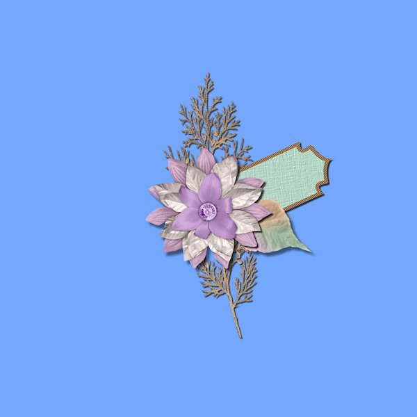
Lesson 6 Extra Wowzers people, this is some kind of hard stuff! I got pretty mixed up and I made a cluster (I wont be quitting my day job anytime soon) that some of the shadows wouldn't show up because of the angle. oops. I finally had to name them with the names in the video (tag, ribbon, frame, background) because I was getting so mixed up with where I was at. I had a leaf, a tag, a plant sprig and a background. I did the shadows even though you couldn't see them (because of the angle). I like knowing how to do this technique, and I know I need to get a lot more practice. It probably wont show up, but I do see the difference on sprig as one shadow on the sprig is darker than the shadow (from the flower) on the background.
-
The font is Neug Asia, probably from CF and most definitely more readable the bigger it is. I just learned that. I'm reading a book called Just My Type, about fonts and a bit a history, politics and some humor about fonts and how they all started. One of the things when Type designers were designing was how readable the font(typeface?) is when it's small. Some fonts are great small and are great fonts, but only when they are big. I noticed if this got too small it would make your eyes go wonky.
-
That's awesome Rene. I always love to hear your insights. And a big take away from what you said it to experiment. Being able to make a butterfly fly is what it's all about isn't it. And what a feeling to achieve a look you wanted too.
-
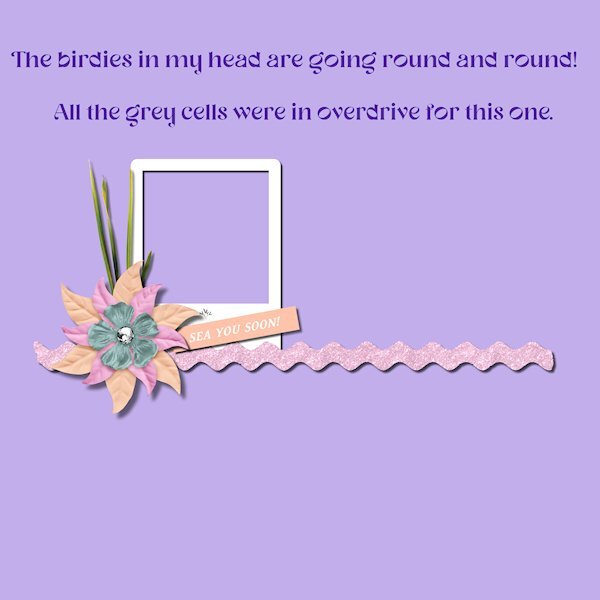
Lesson 6 Whew! Call the fire department, cause my grey cells are sizzling! I'm going to try a number 2 version, but I need to put my head in the freezer for a bit. I too, kept going to the wrong shadow layer and I'm looking at the shadows thinking I don't see a difference. I knew right away I wasn't doing it right. I started again and paused the video for each step, kept track of the settings and named the layers as well. I'm glad to know how to do this, despite not using clusters very often. If I could make nice ones, I'd like to be able to shadow them myself in this way. I think this is one of those techniques that if you do it a lot, then it makes perfect sense. You really have know where you are at all times and don't get distracted by cute furballs wanting a cuddle.
- 262 replies
-
- 12
-

-

-


