
Cristina
-
Posts
2,130 -
Joined
-
Last visited
-
Days Won
4
Content Type
Profiles
Gallery
Forums
Posts posted by Cristina
-
-
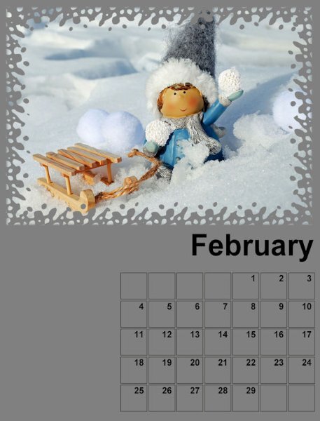
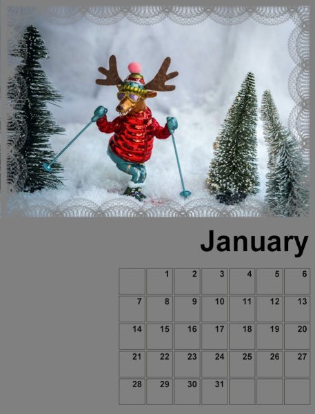
Here are the first steps for the January and February calendars.

-
 6
6
-
 2
2
-
 4
4
-
-
On 11/9/2023 at 9:03 PM, Corrie Kinkel said:
I find it much more inspiring to do this with a (now small) group than on my own.
Me too, Corrie... We also learn from each other, as one question/comment from a participant can open our eyes to something we've not thought about.
-
2
-
-
54 minutes ago, Michele said:
I resurrected an old one from 2016 for the Daily Look and made some adjustments. I probably got the ladies from Google, but I didn't record the illustrators back then. The first one looks like Inslee Haynes Farris' work, but I'm afraid I can't give credit to the other three. I used various frames and flowers from Pixel Scrapper. The font is Runy Tunes Revisited.

I love your work, Michele, and your choices of illustrations.
-
4
-
 1
1
-
-
I am also in! Every year, I make a calendar to give to my mother-in-law, as she likes and expects.
She likes something cute and something she can laugh about... So, that's what I have in mind when choosing images at Pixabay/Unsplash/Pexels...
It's getting difficult to find something new in this category. 🙂
-
4
-
-
On 11/6/2023 at 7:49 PM, Corrie Kinkel said:
Seeing all the above OOB's I will have to go and search for some mockups that I like and that will go with my photos.
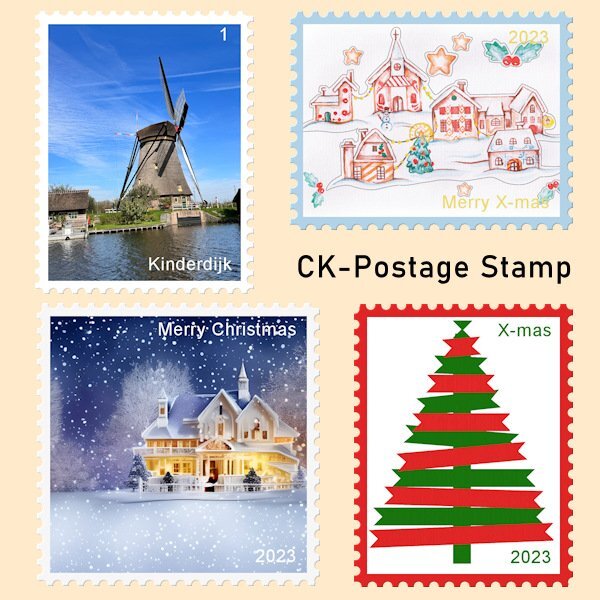
In the mean time I like to show what I have been up to with the scripting course. I have posted there my result but that is only visible for the members of the course, so I will post it here too. I have been making my first "real" script, not something for practice only. I made a postage stamp script that can use landscape, portrait or square format with a border for which you can choose the color. You can choose to have no text or with a simple text for which you can again select the color. When testing I used some X-mas related images, so I can use them this year. I have used the "ribbon tree", that Sue T has generously shared with us last year, for one of the postage stamps. Thanks again Sue! The Kinderdijk postage stamp was the one I used to code the script so I could adapt it for the other formats, colors and text.
Corrie, great use of the Scripting lessons! Those stamps look really amazing.
-
2
-
-
I do hope you get well soon, Helen. Sending you my best wishes!
-
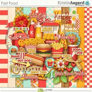
Fast food is something we seldom have... But when we travel by car, we always have breakfast at McDonald's, usually two hours after leaving home... It started to avoid traffic on the highways and became a tradition... When my niece and family come here, and we travel together, we do this, and they like it too... It's also something they usually don't do.
We used to have the Sausage McMuffin, and, who knows why, for a few years, they don't offer this here anymore. 😞
Although it is not something we usually do, the first kit I bought (even before knowing Carole) was a Fast Food kit from KAagard that was offered 50% off at The Lilypad... I was just starting to get familiar with scrapbooking.
-
5
-
-
Nothing related, but I've noticed that now Markus is officially employed here. ?
And always trying to help! ?
-
6
-
-
On 10/9/2023 at 1:44 AM, Sue Thomas said:
This font isn't one I would have chosen myself. I can see that it would appeal to some for a particular Halloween project. Halloween has never appealed to me, probably because it isn't that popular at home, certainly not when I was growing up, as it is in North America. I wanted to participate in the challenge. I edited some of the letters to my liking, added leaves from another font. The letters A and E, I resized, moving the letters before them closer, by changing the text to character shapes. Inner bevel. Photos were taken yesterday. Background paper is a photo, 2 overlays, and a texture.
Sue, another beautiful page... And repeating myself, I love to observe every detail, like one of the admission tickets below the frame.
-
1
-
-
On 10/8/2023 at 5:12 PM, Corrie Kinkel said:
I already did a Halloween layout for the theme of this month. We don't have a long tradition of Halloween festivities, nowadays it is more common, but it doesn't appeal that much to me. The grandkids are in the States and they of course participate. If I was there at this time of the year I would take a lot of photos, but over here no....
The Witch Mystery font however is a nice one and I used it for this layout featuring the "Windmills of Kinderdijk" (Netherlands), a Unesco World Heritage Site. Funny enough my cousin, who came along, and I, have never been there! We have both live not very far away from Kinderdijk, but as it is with things that are nearby we never got there because we thought: oh we can always do that. So last week we went to see those mills for ourselves and had a great day with fantastic weather and being offseason it was not congested as it can be in the summer. We didn't have to wait to take the little boats that ferry you along the 19 mills that are there. I have photos of the inside of one of the mills that we could visit, may I use those in another layout. Oh and all the mills dating from the 16th century and up are still in working order. They are designed to pump the water out of the canals to the river to keep the land dry and the other way around. Nowadays there are 2 pumping stations that do the same with electric machinery and the mills are a backup system.
For this layout I used template Lab 12-11and 4 of the photos I took that day. When we arrived, it still was a bit hazy and I used one of the hazy photos as a background, copied it and the used the blendmode Burn which made it more like a silhouette, but not as black. Then an overlay called Windy Pastels (Inky deals) with the blendmode Difference. I was trying different overlays to get something interesting and I like this result, it gives a sort of painting effect. Some embellishments from my stock and the other font is Aura.
Corrie, this must be a great place to visit, and you created a lovely layout.
-
1
-
-
15 hours ago, Julie Magerka said:
The last day of September, so the last layout for What are you working on this month. I saw a layout I liked, played with interpretation of it, and got this. Used a photo of my niece and her daughter in the leaves from many years ago. The background stripes are mine and the masks I used. But not much else.
Lovely layout, Julie!
-
1
-
-
Welcome, Doska!
-
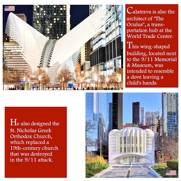
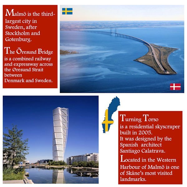
Last week, I stumbled upon a video suggested by YouTube, and it was about the reconstruction of Ground Zero... I was surprised to hear the architect, Santiago Calatrava, was responsible for the designs of two buildings... It's interesting because before looking up the Öresund Bridge, I'd never heard his name before.
In the USA, he is also the architect of the Margaret Hunt Hill Bridge in Dallas, Texas, and the Milwaukee Art Museum, Wisconsin.
So, I decided to include this information and create another layout page for Day 2. Now, it will be a Double Page.
It's not exactly complying with the Day2 template, but being the "editor-in-chief" of this magazine, I think it's OK this time. ?
-
 1
1
-
10
-
-
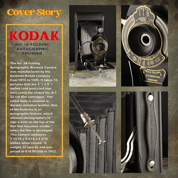
7 hours ago, Susan Ewart said:
Day 6
Thank you to Sue and Rene for giving me some ideas using the blending modes. I used a white layer above the paper layer (Brook Gazarek, DigitalScrapbook.com) and used a blend mode (I forget right now, sorry) and then reduced the opacity a bit so I could control how much of the layer below showed through. The red kodak word is a bit overpowering (as Red tends to do) but is the color kodak uses - perhaps I should have desaturated it a bit. The yellow frame is the other Kodak color. On to Day 7. I think it will be one page though. I didnt photograph enough cameras and the night is coming to a close.
For practice, I did do the lesson where we made it one mask. here I used all 4 as it was better suited for this layout. I'll try and get these posted on FB in the next week as I finish them all. I see blurry Kodak and Cover Story, but they are arent blurry in the full sized image.
Susan, I also enjoyed a lot going through your pages, showcasing all these old cameras. Great work!
-
1
-
-
8 hours ago, Shirley said:
Day 7, side 1 and side 2. I made a couple of minor changes to the first side to correspond with the new design. I enjoyed this workshop, I have learnt a lot about those dreaded masks that have tortured me for all this time. Thanks Carole for your kind remarks on my pages.
I agree with Susan, and I learned a lot about this art that I didn't know before. Great work, Shirley!
-
2
-
-
18 hours ago, Sue Thomas said:
Playing around last night. I used the book cover mock up template from the blog. The spiral binding really isn't suitable for a magazine. I created my own ad for my magazine.
Yes Carole, I featured everything stated on the front cover, at the time of creating the cover I added features on a whim, which I did manage to carry to fruition. A nice touch I thought to finish the workshop with. Another successful workshop, thank you.
Beautiful work, Sue, as always!
-
1
-
-
21 hours ago, Michele said:
Day 3 ~ This is one of Hayden Williams' Vogue covers. Of course, I removed the "Vogue" title and did my own.
I'm loving your magazine, Michele! As I mentioned before, I don't know how you find these great illustrations having so little time to work.
-
1
-
2
-
-
Everyone here is doing such a great job!
The good thing about this workshop is that a magazine can be about anything; there are no boundaries.
And we are lucky enough to learn about all the different subjects posted.
-
3
-
-
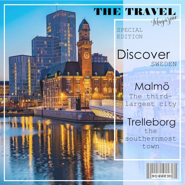
6 hours ago, Cassel said:
@Cristina That is a fun use of the text for that front page!
I got inspiration from the internet... There are many pages of travel magazine templates, titles, etc...
Ultimately, I did my own, based on my needs but using them as inspiration.
-
1
-
-
14 hours ago, Corrie Kinkel said:
Day 2 and I changed the template for my photo and put the blue mat to the bottom. I kept the blue color because in my cover the text had that color too. I have a bit of text and I used Arial so all that text is easier to read. I will probably keep the light green color as a background for all my pages, it goes well with most of the photos I plan to use.
Corrie, this must be a very interesting place to visit.
-
2
-
2
-
-
16 hours ago, Susan Ewart said:
He looks so regal
He sure does, Susan! ?
-
1
-
1
-
-
17 hours ago, Marie-Claire said:
Day 1
Marie-Claire, Poncho is so handsome! He sure deserves to be on the cover page! ?
-
1
-
1
-
3
-
-
And Day 2. The next days will be done later as I am juggling other workshops and a course.
-
1
-
10
-
-
-
1
-
13
-


.jpg.1bb5470a42587e56953bc09191d77697.jpg)


Calendar Workshop 2024
in Showroom
Posted
They are so cute, Michele!