
Cristina
-
Posts
2,130 -
Joined
-
Last visited
-
Days Won
4
Content Type
Profiles
Gallery
Forums
Posts posted by Cristina
-
-
I already learned something new today... Never noticed that the icons have the corresponding shapes and that they changed once Converted to Path... I Only paid attention when it was Text. Cool!
So, here are the heart and arrow.

-
 6
6
-
 11
11
-
-
After a few tests, I am glad to report that everything is working fine for me... Carole, what a relief for you... You sure didn't need that.
-
1
-
-
Corrie, what a beautiful layout and this font is perfect for it... I downloaded it, although I have plenty of fonts. ? Quoting Michele, I am, too, a fontholic. ?
I am not getting tired of your stories as I travel and learn through your layouts.
Ann, I like this layout very much... I like this combination of a black and white background with the color photo... or vice versa.
-
 1
1
-
1
-
-
As we were traveling only today, I logged in this week.
1. Immediately after entering the email/password, it still showed LOGIN – REGISTER, not recognizing it.
2. Reading the Blog post, it showed: log in to REPLY... So, not considering that I had previously logged in.
3. Only after clicking the FORUM TAB is that my name appears.
4. But, like others, I can't access Diamond classes, the Lab, and other tutorials.
-
9 hours ago, Julie Magerka said:
I just played around with it and got some nodes another way. Don't ask me how! Boy, do I need the Vector Workshop!!!!!
Julie, those nodes can be really tricky to get.? Sometimes, I get them on the first try, but other times I keep clicking back and forth until they react as they should.
Never saw Carole having an issue with them; I have to practice a lot to get to this level. ?
-
1
-
-
4 hours ago, Susan Ewart said:
I still have several years (at my pace) before I get up to the Lab 11-2
I am sure you are going to finish before me, Susan! ?
-
 1
1
-
-
6 hours ago, Mary Solaas said:
And on to Lab 11 Mod 2. Requirements: Letters dangling from a string - I chose to do Happy Birthday and I will save it to use later also - it was a challenging work; Cutout word on a letter - I chose Sammy who is the person celebrating with that humongous cake that spilled out candies - how sweet is that!!! Also required was a stitched vector shape: since I have used that tutorial in creating my alphabet for the 2022 Alphabet Challenge, I chose to use a round paper I had made previously which I had decorated with a crocheted lace (also made in a previous lab) and then stitched it (using a tutorial also). The candles were made in another previous lab; the ribbons are made from a Cass script - which I've colored and recolored and used over and over again in layouts; the stained glass brads I made from a stained glass pattern obtained from CF Spark. The background paper is Donna Sills Shimmer Paper which (if you recall) some months ago we colored and played with.
Mary, this is a lovely layout! Sammy looks happy with the cake; who wouldn't be? ?
It's amazing all the great techniques and scripts from Carole are included. It made me think of how much I have learned since I joined the Campus... and still counting!
-
2
-
1
-
-
I just registered. This will be fun!
-
2
-
-
10 minutes ago, Michele said:
Thought I would have fun with the theme today. I applied the mosaic weave effect to a plain background. The font is *TINTIN*; my Windows File Explorer is being finicky tonight so I can't search for it to tell you where I got it. Ron Payne posted a link on the FB page to a cool batch of seamless glitter patterns from CF. I used one for the text; it came along just at the right time! I found the flapper girls years ago by, I think, Mallory Carlson.
Love it all, Michele! So bright, colorful, fun...
-
2
-
1
-
-
15 hours ago, Suzy said:
Cristina! What an awesome layout! Thanks for all the directions, specifically that background paper! But it also gives me ideas for some of those scripts I also own. Well, it’s just awesome.
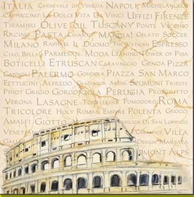
Thank you so much, Suzy! I created the background paper inspired by one I saw on Etsy. I erased the sky of the Colosseum photo before adding the effects and blending.
This is the paper I was inspired by.

-
2
-
5
-
-
19 hours ago, Ann Seeber said:
Here's a project I've been working on the last few days as a remembrance of a friend that passed away last week from a malignant brain tumor at the age of 43. He and I are part of this rather large Facebook group that were fans of pop culture and started with Game of Thrones. We're all devastated at the loss of Ray. We knew he was not in the best of shape, suffering total blindness, but the end came quicker than we anticipated. We had been recording book readings for him as a way to stay in touch. I gathered all the photos my friends were sharing on their individual posts for his friends and family (we call it our Fandom Family). I used the cass-hanging photos script because I had 12 photos to showcase. The background is from a photo of a chalk drawing one of our group did at a convention in Europe. I had two photos of Ray, alone, and tried out the new Corel engraving-brown script on them. After trying the saturation layer effect I was quite impressed. I'll let you see the originals, also. I spoke to Ray on the phone a few years ago, before he got ill, as he was looking into moving to my area. R.I.P. Ray Fiore, you'll be sorely missed. ?
EDIT: Forgot to mention, the font is Cabin Sketch.
Ann, this is a touching tribute to honor his memory... He left way too early.
-
1
-
-
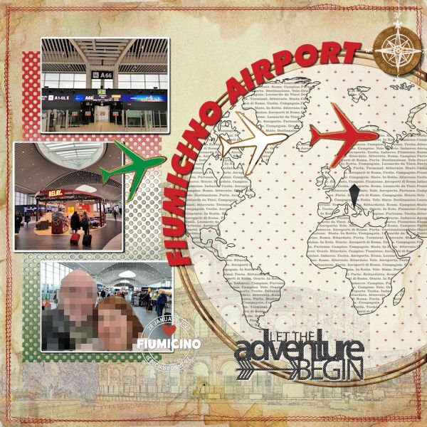
Here is one layout I finally managed to finish.
Again, I used a Scrapping with Liz template (SwL_AroundtheWorldTemplate3). Also, from her, the SwL_LettheAdventureBegin cutout.
The background is a blend of a photo of the internet (Effects>Art Media Effects>Colored Pencil) on top of a vintage paper.
Border stitch is an old freebie from Kristin Aagard (KAagard_July17CCM_BorderStitches_5)
From Cassel: Photo mat (Lab13-06 - punched paper) -- Custom Coin Script -- Date Stamp8 Script - Text Overlay (Lab5-09)
Font: Futura XBLKIT BT EXTRA BLACK ITALIC.
EDIT: Also included the polka dot pattern.
-
2
-
9
-
-
It looks like this has become a trend everywhere. I think it's a good idea.
Here, I saw an old telephone booth turned into this little library. This is sponsored by the city.
I also saw a "little library" in front of a private house a few years ago.
I have the photo of the telephone booth, and will try to take one from the other.
-
2
-
4
-
-
Hi, Everybody!
Great ideas, tips, and layouts. It's hard to keep track of everything. This thread is never short of inspiration!
I am still tweaking the layouts I posted some time ago.
-
2
-
-
4 hours ago, Michele said:
Today's daily look gave me the opportunity to use one of AnnieC's templates from a blog train a few years ago. I might have used it previously as I totally love it; she's one of my favorite designers. I found the woman's pic years ago while googling for another project. The font is Wanted Signature.
Michele, this is a beautiful template, and so is your layout. Both look great.
-
1
-
-
12 hours ago, Cassel said:
I have considered doing a class on making fonts, but it would involve a paid program so I am not sure how well-received that would be (I got some complaints when I did classes on Filter Forge). On the other hand, making an alpha is so much simpler and very accessible to all. Maybe that can be another class!?
For me, both classes would be great.
Even if it is a paid program that I don't have or cannot afford to get it now, it could be in the future. Perhaps, It will show something I don't know and never thought about doing.
IMHO, it is not in our best interest to have your creativity limited.
-
3
-
-
14 hours ago, Susan Ewart said:
It's at the blog train for june at Digital Scrapbook. Hope this link works. Scroll down and you will see Suzy's kit. the photo doesnt come up on my computer, but the links worked fine for me.
Susan, thanks for the link and all the info!
-
1
-
-
18 minutes ago, Suzy said:
Thank you, Christina. Hope to see you in the Designer's section, but honestly I do not even understand what they're looking for until at least 3 other people post, then I kinda get it. ?
Which Designer's section? I guess I'm not familiar with it.
-
7 minutes ago, Susan Ewart said:
Oh yes, and it's just the best show. Jack has the most beautiful voice wouldnt you say. And Phryne, her clothes and just the way she is, love it. It's a fabulous show. We are getting it (in Canada) on utube...until our powers that be cut us off that is. We were watching Poirot, Miss Marple and other Agatha Christie movies and now our govt has blocked those due to new legislation. FUN POLICE are alive and well at the CRTC (our regulatory body).
Thank you for your comments. Do you watch this show as well. We are almost binge watching in case we lose it. Currently on Season 2 around episode 10 I think. The set is so richly decorated and fashion is stunning.
I do watch all of them too. Poor Jack... He has no say in his own precinct, as she is the one asking the questions. LOL... We watched Behind the Scenes Season 3, and they talked about her clothes... Another old show from Australia we liked is The Doctor Blake Mysteries... But they are not always available.
I think you can download them from YouTube... not sure.
-
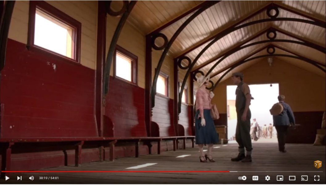
18 hours ago, Susan Ewart said:
I am watching this Australian Mystery series on utube and there was a scene with a cool design in the building (picture below). I wanted to try and receate the graphic version. I cant wait till we do the Vector workshop. I used vectors to create it and did some problem solving along the way. I'm happy with what I did this time. I didnt quite get the proportions right. When I know better I'll do better. I was playing with what to do with the background when I tried the gradient called "Underworld" so my theme was gambling in the underworld (too much watching the TV show Supernatural). I used the eraser tool to fade out the bottom as if it was descending to the underworld. It was the first time using the Custom Playing Card script from Carole. I LOVE IT. I learned to click "cancel" when choosing a photo and "cancel" again to continue the script and ended up with the layers of, white background and card number/suit. I put the same gradient on the card, lightened, and put my photo's on. I can see a lot of ways to use this script. My original layout was quite dark (my monitor is very light so it's hard to know what it looks like) so I lightened it up for the forum/gallery. My photo's of a recent studio shoot, fun with expiring dandelions. Font is Vanilla Right.
Susan, I really like what you created. I think the result is great!
By the way, any chance this was a Miss Fisher's Murder Mysteries you were watching?
-
On 6/1/2023 at 3:28 AM, Suzy said:
If you want to help me, it would be ideal, Susan or anybody, really. I di d a kit for the Pixelscrapper BogTrain, but I don't habve a blog. Or a store or anything,. LOL1 So I think I used Dropbox, but if anybody would like to see if it works, i woukld be beholden to you! The ugliest preview I have ever seen, but I'm not sure how to make one.
Here is the link for the kit.l I'm worried about three things -- people can mess with my other folders and files at Dropbox, &/or people can delete or mess around this this kit. OR there is nothing there to download because I did it all wrong!
https://www.dropbox.com/scl/fo/938obtx011pzkpliijw2m/h?dl=0&rlkey=r97c19okadh1sjmekc3osi2t7
Suzy, I love your kit. Great work!
-
It already looked great, but with the new additions such as the framed photo, etc., it looks amazing to create all of this on such a small scale.
-
5 hours ago, Suzy said:
Here's what I've been working on - well, since Cassel did the color palette for the Digiscrap.com Blog Train, I added the freebie palettes, er, swatches, to my materials palette and then since it was open I went ahead and did some papers. I'm not sure how to host them, and I have never posted there before, and I only have 2 1/2 days to make any changes. The red color was one of the choices, but when I had all the papers together I wasn't sure I liked the red with the other colors. Now seeing it, maybe I do like it.
So basically, I made papers and will probably never post them. LOL!
I love those papers, Susan!
-
On 5/27/2023 at 7:49 PM, Mary Solaas said:
S is for St. Nicholas. Finally getting back to my alphabet challenge from 2022. The font for St. Nicholas is Ballpark. Santa Claus is from Creative Fabrica and his coat was colorized red because my daughter said it looked like a motorcycle jacket. The holly leave and berries are mine from a previous lab as a paint brush (so I colored the berries separately), the poinsetta is a picture tube. The silver glitter paper is from Donna Sills stash that she shared with us earlier this year which I colorized as silver - the red one I colorized wouldn't work here. The font for Santa Claus is Brandish. I think the St. Nicholas statue picture was from Wikipedia. The frame around it I developed with selections, etc.
Lovely layout, Mary. I like the Stitched S as it calls attention to the title. Also, the font Brandish you use for Santa Claus. I checked, and I have it. ?


Vector Workshop 2023
in Showroom
Posted · Edited by Cristina
Hi Libera,
The one you saw before was a Customized Text Overlay and was based on the Lab 5- Module 9 (Text Background Paper).
For this one, I used the pattern that comes with PSP. There are 5 Text patterns in English and 5 "Texte" patterns in French (right your alley ?). In this case, I used the Text 1 pattern.
About the technique, Sue Thomas explained it in a much better way than I would have thought. The details are important, and I never think of mentioning them...Thank you, Sue! Your work is, as always, beautiful!