Sue Thomas
DIAMOND-
Posts
2,726 -
Joined
-
Last visited
-
Days Won
81
Content Type
Profiles
Gallery
Forums
Everything posted by Sue Thomas
-
September 2024 - RANDOM Challenge - Back and front
Sue Thomas replied to Cassel's topic in Challenges
Perfect! Simplicity at its best! -
September 2024 - RANDOM Challenge - Back and front
Sue Thomas replied to Cassel's topic in Challenges
I agree, in this case you didn't even need to put a postage stamp. It's almost out on a limb. The pencil sketch and title is all it requires. It's nicely balanced. -
September 2024 - RANDOM Challenge - Back and front
Sue Thomas replied to Cassel's topic in Challenges
I appreciate that! By converting it to black and white, and tweaking it to maintain clarity and detail, which is my preffered way. As I couldn't bear the thought of loosing details. Especially when I go to great lengths to get the best shot possible. I'm almost certain you take the same approach too. Actually in this case, the background black and white image, draws the eye to it, and not the framed coloured photo. -
September 2024 - RANDOM Challenge - Back and front
Sue Thomas replied to Cassel's topic in Challenges
Your sunflower is positively regal, standing tall. May I be as bold as to make a couple of suggestions, as after all you are the creator. I think you may have muddled the letters on what I think should read beauty. Also check the kerning, as the letters aren't joined. I like the background effect, but it does drown out the Sunflower and the text. Try lowering the opacity, and add a little blur. These are only suggestions, as I'm not critiquing your work. As we all have our own styles and personal preferences. -
September 2024 - RANDOM Challenge - Back and front
Sue Thomas replied to Cassel's topic in Challenges
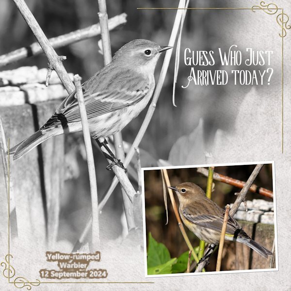
Challenge, using the same photo twice. I simply changed the photo to black and white, with some minor tweaking. The other background paper was created using the blend mode, HSL on two papers. I did mirror the original photo to give the page balance.- 46 replies
-
- 13
-

-

-
It certainly was a puzzling paperclip. When you get around to using yours in a layout, just look at mine, even though, to me they still don't look right. 😉
-
That is an impressive structure.
-
Mine too! I walked away twice, going back thinking that I would approach it and work on it in a way that would make it look realistic. 😆
-
This paperclip has really made me think. Am I correct in saying that it can be used in one way only. I even got out a paperclip and a piece of paper. Lol
-
I hope so, perhaps between us we can come up with a solution. Just to let you know, I tried removing over and under. My brain is telling me that what I am seeing doesn't like right.
-
Arrow paper clip from the recent masterclass. I have made several different ones. When I went to use these to attach several pieces of paper my mind went blank. I can't for the life me work out what goes behind to get the realistic effect. Surely there has to be 2 options. I don't have any problem with conventional paper clips or different shaped one. Any ideas!!!! I'm going to look very foolish if its a case of either erasing, or using the promote to selection tool on selected areas. But what selected areas I ask myself!!!!!
-
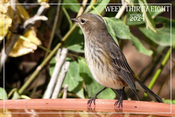
Another week has simply flown by. For this week I decided, after much deliberation to showcase the Yellow -rumped Warbler. As they have been the most numerous of all the migratory birds.
-
Your photo sums up the UK and and some of the European countries weather. Amazing! The rainbow coloured frame is a perfect touch.
-
Every day now, new birds are arriving as they congregate before making their long journey south for the winter. The trees are once again bursting with song. So many juveniles are returning. They all make use of the bird baths, and fill up on the seeds I scatter on the ground.
-
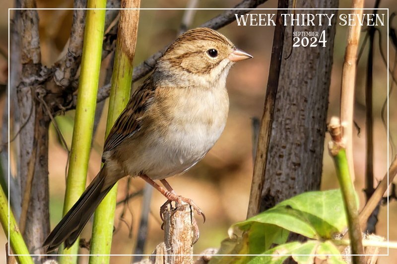
Week thirty seven. The migratory birds are arriving on mass. They must know something that we don't, when it come to the weather. The leaves are turning and falling quickly. A most delightful small native Clay coloured song sparrow. I am currently in my element.
-
Susan, and anyone else, may I make a suggestion. When I use a puzzle, or create photo block, I always make sure that the face, in particular the eyes are not obscured in any way. You can use many ways to rectify that, after running the script for the first time, to see what is where. Awesome photo of the Blue Jay.
-
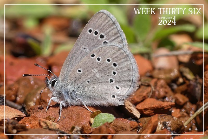
I was to early posting week 36, which meant I posted it in the month of August. Week 36 of 2024, is from 2 Sept to the 8th Sept. Earlier weeks should be posted in the month of August. I like to adhere to the right weeks in the right months. I have deleted this photo in August. Teeny tiny Silvery Blue Butterfly ( male) Photo taken this week. Macro photography.
-
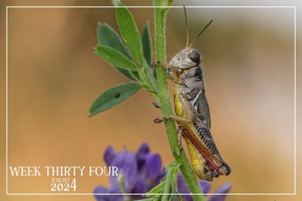
I was pleased with the grasshopper shot, it's wonderful when they cooperate and pose for me. Even the fine hairs running down the Prothorax are clearly visible. I'm going to try and catch up, especially the challenges, as I like to participate in those.
-
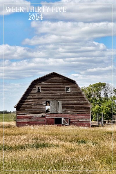
Week thirty five. I pass this old barn on a regualar basis, yet the other day it compelled me to take yet another shot of it. The sky, the golden grass, some of the tree leaves were starting to turn and the majestic barn was begging to be captured in a photo. So I did.
-
I am behind, as I've been away trail riding in the Grasslands. I've been back since Monday, but it has taken me a couple of days to get back into the swing of things. Macro shot of a tiny banded grasshopper. It has everything going for it, colour, textures, patterns, even gradients. There isn't anything that can surpass Morther Natures palette.
-
I love the colours you used. Beatifully done!
-
Those are great! Several techniques used
-
Thank you. I'll go out to check the the wind direction, if it's blowing west, I'll shout for you, to see if you come running for treats! lol
-
To me, you did a grand job! You do surprise me about not knowing about the feathering, then blur. I also make a selection and feather, to brighten the lifted corners a touch on the photos, using brightness and contrast tool. It doesn't always show up well, it depends on the photo. I didn't use that technique on these photos. As Carole may demonstrate it later on this week. OOOps! Perhaps I shouldn't have said anything.
-
I'll post it on faace book, as posting on here really doesn't do the page justice, due to such compression.


