Sue Thomas
-
Posts
2,726 -
Joined
-
Last visited
-
Days Won
81
Content Type
Profiles
Gallery
Forums
Everything posted by Sue Thomas
-
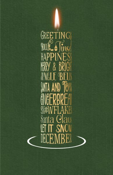
Michele, this is what I have done. Actually I like that added touch to the bottom, rounding the base of the candle. It's quite subtle, yet visible, as I followed the line of the oval base.

-
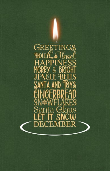
Haaaa! Now I understand. I have just done this. But I can also follow the shape of the base, like in your image.
-
I'm not quite sure what you mean. You want the base of the candle to fan out. Can you give me an example. I can make, say the last two words words taper out like a Christmas tree. To create a base, while still maintaining the cylinder shape.
-
To satisfy my own curiosity, I will do another one, using my suggestions. At least when I do need to create another one closer to Xmas, I will know what steps to take, to create something I will be happy to place on a card. I was also thinking of using a word art candle on a birthday card, it could be a funny one even. As we get older, one candle is sufficient. 😉
-
I certainly did! Thinking about it, what I should have done before I started the word art, was to create the word art almost as wide as it is high, in order to create the tube effect. As this one now appears to be much taller, which it isn't, because I have narrowed it to get the rounded effect giving the illusion that it is. Another thing to take into consideration, is to not to have such wide gaps between words on the same line. I will know for next time.
-
What do you think? Initially I didn't add shadows, which makes it look better. If you ask me, I'm still not overlly happy with it.
- 145 replies
-
- 10
-

-

-

-
In all honesty that was my initial intention. I started to create a cylinder or tube, but not having a background, in my view it didn't look quite right. As I want it to be transparent. Later on I will turn it into a cylinder shape and post, letting you be the judge of it. I feel that a patterned text, or background for the text would give the best result.
-
I'm up to date with my cards, also some of my Xmas cards for 2024. I'm back on the Xmas cards and general festive creations which I can add to cards. Here is a Xmas wordart candle, I started last night. The flame is from CF, a selection of fonts and a base I made using a vector shape, and the pen tool. It will easy enough to change colours to adapt to any card.
- 145 replies
-
- 14
-
-
-
I have to agree with Julie, everything about this layout is absoloutly superb!
-
That they are, in their fine fluffy coats. Now that they have the room, its fun to watch them play.
-
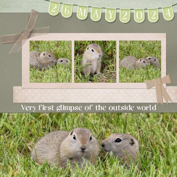
After reading the latest blog post about using a split page, I downloaded one of the templates, and came up with this. Organza ribbon, (used Carole's bow script), paper bow. Banner from the masterclass. I was fortunate enough yesterday to witness these two 5-6 week old ground squirrels emerge from their undergound nursery for the very first time. They were so tiny, one would fit comfortably in the palm of my hand. Unfortunately, that wasn't likey to happen.
-
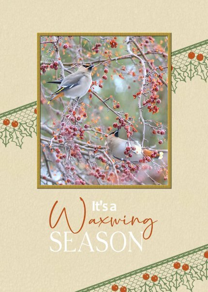
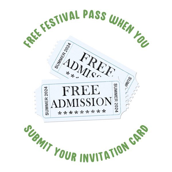
Even though I participated in the first greeting card challenge in 2022, it's always nice to have a refresher. Congratulations to all the participants, who submiited their pages, each every one is a masterpiece, to be proud of. The standard of creativity submitted is exemplary, even from the newbies. Not only that we are an inspiration to each other. Day 7. I kept it very simple. I used a lace brush. Colourised the berries red. I decided not to use a shadow on it. Using it as a stamp. I often use, well not often but always use a bird photo when I create cards for my birding friends. Same goes for my friends that have a passion as I do for insects. The surprise on the inside page for those that receicved invitations to festivals.
- 356 replies
-
- 14
-
-

-
-
I found the font. I Will be playing with different letters, along with other simillar fonts that I have. As if I don't have enough lace fonts, as I have all of Carole's. Nice to have something a little different. I agree the lace edging works really well with image.
-
I love what you did with the font around the image, it's quite ingenious. It would pass for delicate lace.
-
I went with the second horizontal row. File tab, Arrow paper, Halftone brush, Fuffy cloud, paperclip. I created a different paperclip, 2 circles with a line joining the two circles at the top. I had already created a halftone brush, which was in my brushes folder. Same goes for the File tab, and fluffy cloud, I had templates for them all. I had to create the arrow paper though. I didn't really know what to do with the cloud, so I created a sprayed effect using a grey coloured watercolur brush. The cloud is actually a rain cloud. Carole's lace font, and canvas patch I had in my stash.
-
All bird photos taken face on, as you put it look goofy. I tend not to use face on shots, as many look very angry, which doesn't do them any justice.
-
I really apprecite your kind words sir! The main ribbon is one of Carole's lace ribbon script. As you can see, it's very easy to manipulate and colourize.
-
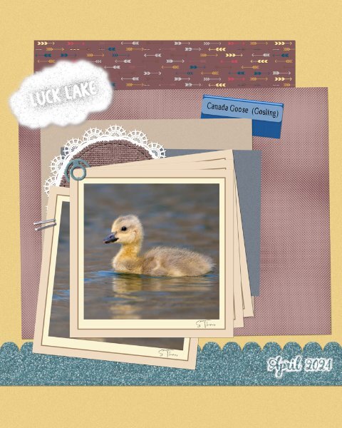
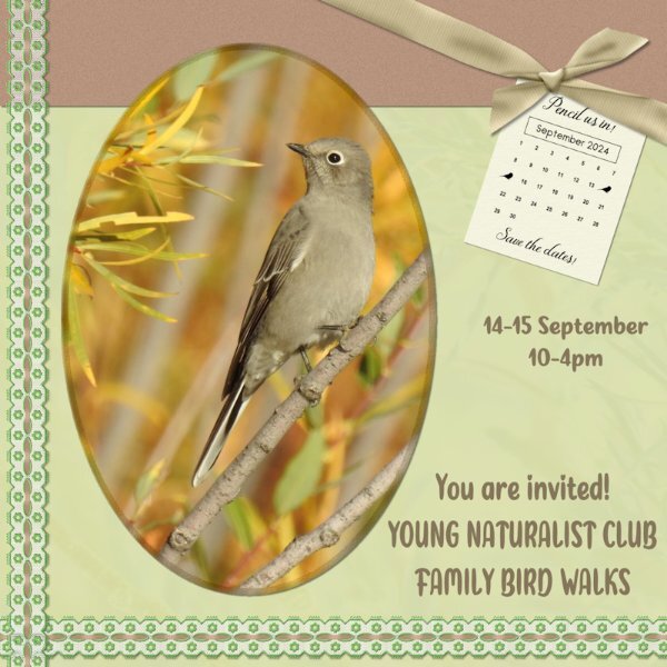
I had to rotate the whole layout, in order to accommodate the photo that I wanted to use. Used cass custom calendar, which I edited to suit my needs. Used the hue map, which I use a lot anyway, to change the colours on the ribbon. Taking a colour from the photo I then used that colour in the bow 3 script. For the background paper I used the photo as an overlay. Townsend's Solitaire. Birds migrating for warmer climes, as winter sets in here. (Autumn)
- 356 replies
-
- 16
-
-
-
We would love too see your projects. This site amongst other things is a great source of inspiration. There is a new challenge, BINGO. Perhpas you would like to participate. Susan has summed up how to post. Any questions, shout out. If there is anything that catches your eye in anyone's pages, and you would like to know how to create the effect yourself, well that is what we are here for. We learn, always learning, inspire, help, support and encourage each other.
-
I love the dots on the background papers. I thought you had created what looks like embosed dots. Great efffect however your created them.
-
My pleasure, a well deserved comment.
-
There isn't anything to say, other than 'what an exquisite layout. You have surpassed yourself'
-
Wonderful, congrats! You won't be disappointed, don't forget to take your wellies and camera!
-
That is one way to do it. Which looks lovely. May I suggest a quicker easier way for you to try? Place a white, or colour of your choosing (lightish) below the main the photo, and lower the opacity of the main photo. You could even add a very small blur to the main photo.
-
Awesome! Same template layout, yet our pages couldn't be more varied.