Sue Thomas
-
Posts
2,923 -
Joined
-
Last visited
-
Days Won
93
Content Type
Profiles
Gallery
Forums
Everything posted by Sue Thomas
-
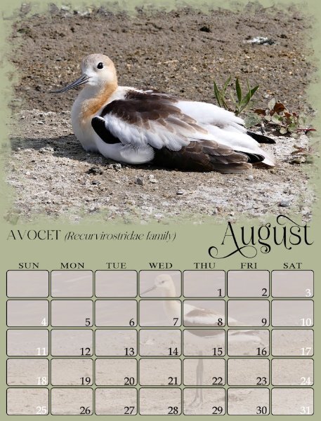
I haven't got around to filling the date boxes as yet on this year's calendars. This one is from a previous year's calendar. It's a nice way to use more photos of the same subject. Anyway, again it is down to personal choice, but I like the recipient to be able to write, or mark the dates, which in my opinion means keeping the date boxes soft. There are always many ways to achieve an effect with PSP, transparancy is one, but may I suggest you try using the blend mode. I would promote the background layer, add the image, then apply a blend mode. I as like to keep the texture, if any on the background paper only. You can also change the promoted background colour etc, to get the desired effect.

- 430 replies
-
- 12
-

-

-
I love the theme of your calendar. I have a passion for lichen and fungi. Unfortunately, there isn't the variety out here, as there is at home.
-
Gerry, these are brilliant. I also like the consistency of each page. Which is what I aim for with my calendars.
-
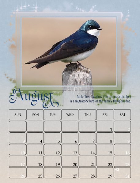
Carole, if I'm not mistaken the French movie industry will write the first letter of a christian name in lower case, and the surname's first letter in upper case of the actors names in the credits. As their surnames are regarded of more importance. As for my photos, no I rarely edit my photos. In order to achieve maximum depth of field, I use an aperture setting, set at f4 with the metering focused on the bird. Mind you in this shot there wasn't anything immediately behind the swallow other than the wide open field.
-
I'm currently creating two calendars. This one is my bird calendar, the other is a mixture of landscape photos. I will still have some minor editing to do.
- 430 replies
-
- 12
-
-
-
I love it, the water and the wings have a shimmer about them.
-
Absolutely! I always value anyones views and preferences, the beauty of the campus is that anything creative is always open for discussion. I find it dificult to veer away from my style, although I do on many occassions, which is good for me.
-
Not using a capital letter to start the month is a nice idea, paricularly if a glyph or a swash is added to replace that capital letter like Susan did.
-
I am of the same thought as you Corrie. I have tried several techiniques using the mask, replicating many of what I have seen being done on here with the masks. In all honesty and it is my own personal opinion and preference not to create frames, or even elaborate to much on the masks. Again , as far as I'm concerned masks are meant to be subtle adornemts to any layout, if that is the right word to use. In this case, the calendar for me, the focus is then taken from the photo and placed upon the decorative/beveled etc masks. Calendars are meant to identify dates and events, adding (my own) photos are a great way to add a peronalized touch. Calendars are also like magazines, they are flat, withouts shadows, bevels etc. Hence it is my view to keep the focus on the photos, and the date boxes, whilst decorative and pleasing to the eye. Please don't anyone interpret what I have said as being critial.
-
What can I say Cristina, other than, and here is that word again! Ineffable! Everyone is creating such wonderful pages, they are all a credit to your creativity. There are far to many to individually comment on.
-
It has to be a vector in order to make any adjustments. In order to adjust the kening, you need to highlight the letter/letters you want to move.
-
I love the simplicity and cleanness of your pages!
-
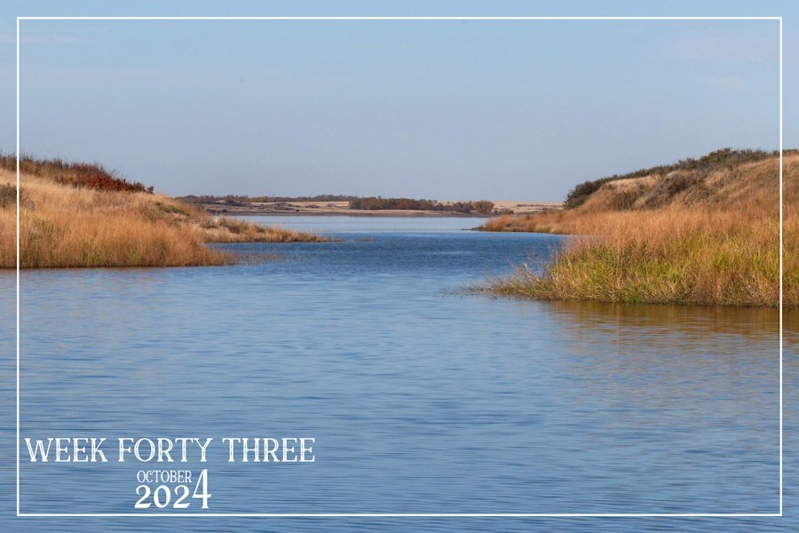
I am a day early posting, as my week for this challenge starts on a Friday. I did manage one more afternoon on the lake in the kayak, which was last Monday. Since then we have had heavy frost, with some light snow showers. Winter, here on the Prairies have arrived!
-
I agree Carole, the models I find to shoot are the best, saying that the majority aren't always cooperative to pose for a photo shoot. Those that are make the time and effort all the more rewarding. Lol
-
I'm not at the lap top, I believe it's called sparky dream. I like clean legible fonts, not to frilly so to speak. More importantly legible for anyone to read.
-
I can't think of an explanation, as to why you are not showing the same mask, unless it's due to 2023. I use 2022, for the simple reason that 2023 has so many issues.
-
What I tend to do is to duplicate the font, close the one and change the other to character shapes, making the adjustment manually. In my opinion the result is better.
-
I didn't do anything Ann. They are part of the mask.
-
Art, go to the vector layer, and open it. Double click on the layer below, and the the bar showing in the screen shot will appear, you will then be able to edit that text.
-
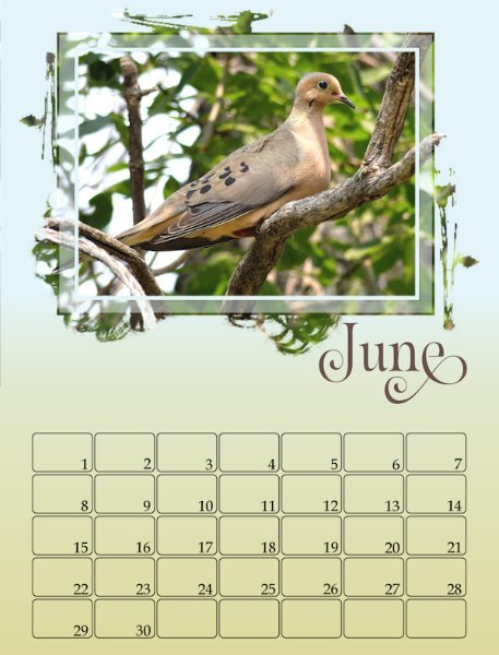
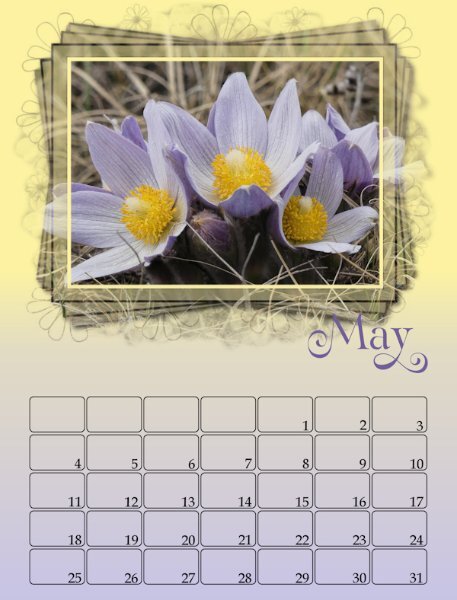
Here is May and June
- 430 replies
-
- 12
-
-
-
Ann with regard to the font being in points, all you need to do is to highlight the font and change to pixels if you prefer to work with pixels, as most of us do. All of mine are showing Bold pixels. I don't quite understand what you are meaning when you say you delete the Photo here layer. That layer can't and must not be deleted, it is needed.
-
I simplified my definition. Yours was far more detailed. Lol
-
A riding is an electoral district, also called a constituency. I presume the Canadians adopted this word from the British, more specifically from the English.
-
Cheers! It's a sunset. Although I have and do use the calendar script, it's quite quick and easy to create my own dates/boxes. Carole demonstrate creating calendar date boxes and more in her Corel you tube video. I remember it because Carole uses some of my photos to demonstrate different layouts.
-
I like the idea of using the fading white gradient. Like you I will choose to use a subtle texture later on the background. Your photos are great.