Sue Thomas
DIAMOND-
Posts
2,726 -
Joined
-
Last visited
-
Days Won
81
Content Type
Profiles
Gallery
Forums
Everything posted by Sue Thomas
-
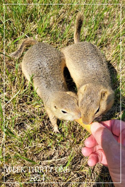
Week thirty one . I can only ever add one image to each post. I've tried editing the post to add another image, but it will not allow me to do so. Anyway, I would like you to meet some of my many seasonal wild friends. Richardson's Ground squirrels. Many come to the call, for a treat. I do not attempt to touch or handle them. I let them come to me. Although they are very teritorial, somtimes they will share a treat. Which is quite rare. As it usually sparks a fight, with the dominant/older one winning seeing off the subordinate. The other image is of a baby, following in the steps of older ones. I'm unable to take shots with the camera as I can't operate it one handed. Using a tripod or monopod doesn't work either, as they won't pose for me in a specific spot. These were taken using my mobile phone.
-
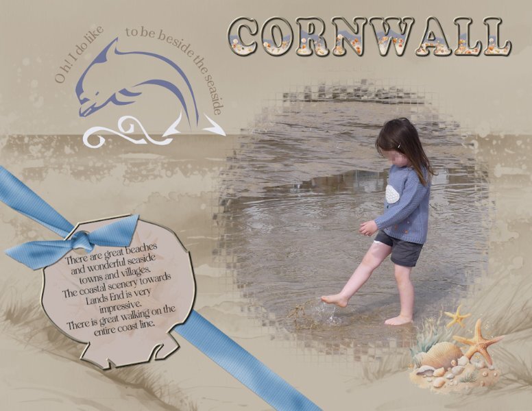
We have one similarity, in that we both used one of our granddaughters. I had thought to create a frame in my usual way of using dingbats on my frames, but there wasn't anything that suited. Hence the mask. Either way I thought you created a lovely page. I would have liked you to have used the same dingbats to see how you would have used them. It was a challenge for us.
-
I used a photo I took of Ffion one of my granddaughters at the beach when I was home last. They live in Cornwall. I used a mask from one of the calendar challenges. I used the Dolphin and one of the shells from the font to create the tag, and text on a path on the dolphin. I filled the word Cornwall with water, sand and seashells. The bow is Carole's bow 3 script. It's not the easiest of dingbats to work with. Although it is a fun beach font.
- 10 replies
-
- 13
-

-

-
Beautifully executed. In my opinion, simplicity is the best.
-
A tip for anyone thinking of doing a lifted corner on a corner where that corner is lifted above the frame. Don't use the selection tool, promote to a new layer technique. Use the duplicate and eraser tool technique. The other technique doens't work so well, and is tricky to do.
-
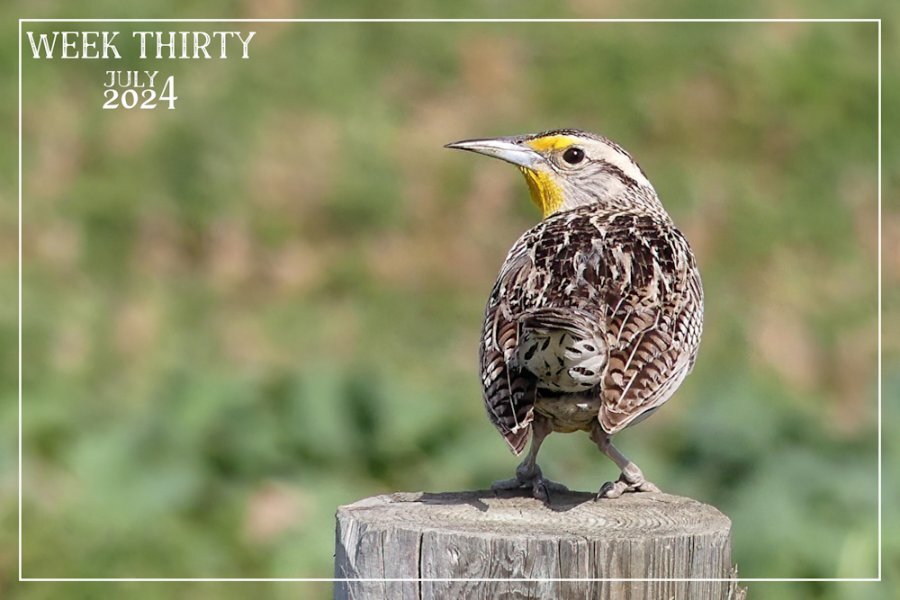
It is always rewarding when I can get a nice shot, when I'm least expecting it! lol
-
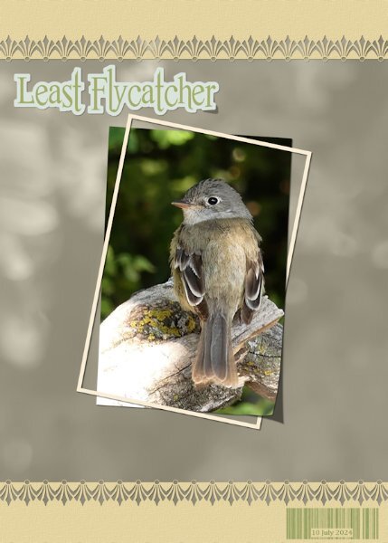
Here is one more for this challenge. I used one of Carole's edge brushes, as it resembled the bird's slightly fanned tail feathers. For the background I used the photo as an overlay. I created a barcode in order to date when the photo was taken. The Least flycahtcher is such a beautiful little bird, not much bigger than the Wren. I have several pairs here, they are very secretive birds, keeping low in wait on branches, catching insects on the wing.
-
I'm always trying to think of different ways to do anything. Not that I watch much telly, but when I do I look for interesting material that I can recreate and use, especially in adverts.
-
-
Good thinking Julie! I often use that technique, especially for something which has straight edges. There is always more than one alternative way of doing anything in PSP, to get the desired result.
-
Is this a brand new Workshop? I'm intrigued!
-
Well done, your persitence has paid off. I see you have mastered that technique. I bet you are now looking back and thinking what was all the frustration about. 🙂 lol
-
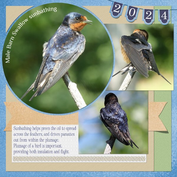
I should have also mentioned that I used Carole's banner 2 special font, which I bought. I'm hooked on creating banners at the moment, especially after watching the more recent master class on banners and pennants. Also used one of her punches, which I love. For the circle photo I used the technique I have demonstrated before. Personally, I prefer to use it on oval and circles rather than square or rectangle shapes. I did give instructions on how to create that effect, using vector shapes, to maintain clean sharp edges. As using the selction tool creates very jaggy edges on anything that isn't square or rectangle.
-
It really pains me to reduce an image to 600 pixels and under 200kb. lol Saying that I understand completely why it is nescesary to do so. Although I did reduce the imgae for facebook from 6mb to 1.5mb. As you say facebook is a handy alternative on occassions. When the wild fires started last year, there were two hundered and so, this year when they started there were over 300 fires. Unfortunately, the wild fires have to be controlled due to more and more people wanting to live in rural areas. Wild fires play an important part in renewing and recycling ecosytems. Many of the trees planted today for commercial use, are quick growing, and are unable to withstand the fires like so many of the native plants and trees, which depend on the fires for their survial. Fires open up the forests canopy to sunlight, to encourage new growth, including tree saplings.
-
I'm having to change the birds bath water several times a day. I also have 2 small solar fountains which I have in what were shallow animal mineral tubs. The birds love a shower. I even have bowls of water out for the ground squirrels, rabbits and other 4 legged mammals. The corvids are social birds, also highly intelligent. They willingly interact with others as you have witnessed. I have to clean out the horses watering bowl daily, as the birds not only use it to drink from, but as a bath. Then there are the birds that use bird baths to dispose of their young droppings. Taking attention far away from the nest. We really don't need to provide food or water for birds, we do it purely to attract them for our own enjoyment. It's a huge lucrative industry.
-
Here is my page for the Tut /tech challenge. I create the page a week or so ago. I added, by creating the date banner, lifting some of the pennants, also I added a ribbon, and lifted one edge. I replaced the date stamp with the banner. Head on over to the facebook page, if you want to see a much less compressed layout, to see the details and colours in the photos. I rarely edit my photos. If I find there is a need to, all I tend to do is use the brightness and contrast, and crop tools. In this case the photos weren't edited. Also, for those that may be interested, birds are like dog, they don't perspire, instead they pant like dogs. For the past fortnight the temps have been in the high thirties, again today it is 37c, and hazy, due to smoke blowing in.
- 25 replies
-
- 12
-

-

-
https://www.facebook.com/groups/441451292922964/user/1421371617 There has been a few posts since I posted the Mourning Doves, you can either scroll down as Corrie suggested, or click on the link above. I too have been taking pics of Thistles. Your page showcasing this one is awesome. It would pass for a macro shot. Tremendous contrasting depth of field too.
-
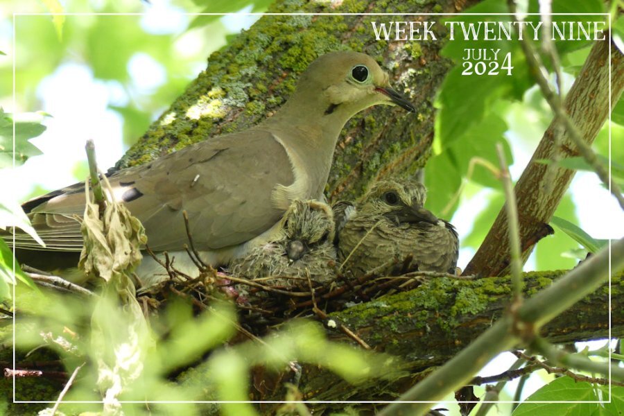
I will eventually get around to showcasing many of this season's photos. At present I'm taking a break, ejoying the summer, kayaking, cycling, riding, and of course photographing wildlife, of all kind. Head over to the facebook page, as I have posted some images of the Mouring Doves, which although I sized them down, not as much as I would have to on here, in the campus. I have never had so many Mourning Dove pairs as this year. I have six nesting pairs that I have found. THis family, although high up in a tree, it was fairly accessible, to take photos off.
-
Week twenty nine. There aren't many nestlings now. To my knowledge I have this family and the last of the Robins. A newly fledged Robin came to the dinner table this morning. This was the only easily accessible Mourning Dove nest I could find. Mind you I still had to get the ladder out, prop it up against an ajoining tree to take shots, without distubing the dove family.
-
As am I. Many of the birds have such vibrantly colourful colours. Would you believe it, if I was tell you that they are incredibly difficult to spot, as even with their bright colours they blend into their habitat perfectly. Usually, especially with the orioles, as they are always very vocal. I listen from where the song is coming from, and then look hard for them.
-
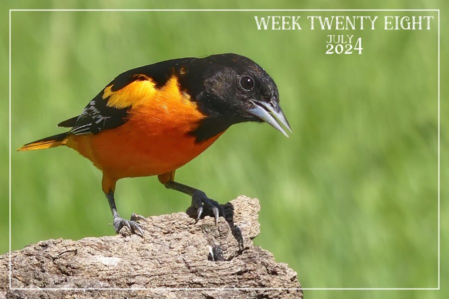
week 28 Cheeky handsome male Baltimore Oriole. They are such little amusing characters. My week almost always starts on a Friday. I'm a day early.
-
What a delightful photo. It has so much going for it, colour and movement
-
Included in the script zipped folder you will find a read me document. Within that text document it will tell you where the script is to be placed. Restricted or trusted folder. Along with other information relating to the script.
-
The UK and European badger are one of the same species. In canada they too are endangered, not through hunting or trapping so much but through loss of habitat. In the UK there is a totally different view to the badger, they have been persecuted for hundreds of years, through badger baiting as sport, which has been illegal for a long time now, but still goes on under the cover of darkness. It is barbaric. Farmers will trap and kill them as their cattle and dairy cows can contract TB. Farmer have to have their cattle tested every six months, at their own cost. Over 220,000 badgers have been culled to date, blamed for the disease. Actually the TB bacteria lives in soil and water. East Africa is the home to TB and it's human host. Yet, the badger bears the brunt of the blame for transmission. which I don't agree with.
-
It would have been wonderful to have seen them when they were much younger, and smaller. Still you can see that she is still suckling them, even though they are as big as mum. I was so excited to see them, a real treat.

