Cassel
-
Posts
5,738 -
Joined
-
Last visited
-
Days Won
17
Content Type
Profiles
Gallery
Forums
Everything posted by Cassel
-
To start, you have a "buggy" version, and other major bugs will be obvious if you use other commands. The correct version would be 25.1.0.32. The ONLY way to get that correct version, is to uninstall the current version you have and reinstall it. It would then pull the correct patch from the server. I know that is bad news because it is always annoying to have to uninstall/reinstall. Once that is done, hopefully, your current issue with the DELETE command should be fixed.
-
What is the exact version of 2023 you are using? You can find that number under Help > About.
-
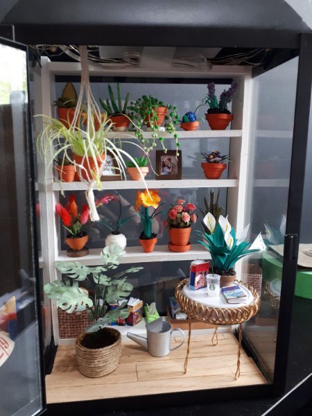
Yeah, initially, the photo my daughter shared was only with green plants. No flower. But I got a little caught up in making flowers and kept going!
-
The main problem with your Layers palette is that you have Text instead of Icons. Do you want to keep them as text? or get the icons (which would take less space)? To get the icons back, go to View > Customize, and while the Customize dialog window is open, go and right-click on the text (ex: "Collapse all layers"), and select Icon in the list that will come up. Repeat that for each of them (annoying, I know!) You can repeat the same thing at the bottom too. Now, if you really don't want some of those commands, you can click on them and drag them to the middle of your workspace. That should remove them from the palette. Once you are happy, remember to save that workspace (with the version number in the name) so you can re-load it as needed in the future.
-
And you can combine that with a gnome house too!
-
Yes, that is the name of one of the tutorials HERE. You can search all those elements in the list of tutorials.
-
As we have not had a BINGO in a while, so I thought we could revisit this activity as it gives a lot of flexibility in what you want to use in your next project. I am providing you with a card with 24 elements that can be included in a layout. You can make a bingo by using any element in a straight line that would make a bingo, whether it is a horizontal line, a vertical line, or a diagonal line. That means that you have to include 5 (or only 4 if you use the FREE in the center) elements in your layout. Of course, you can have more than one bingo if you want to create more than one layout. Once you post your layout, tell us what 4-5 elements from the Bingo card you are using (it is just easier for everyone to check on you! ? ) So, here is your card, for May 2023. If you are a DIAMOND member and want to create those elements, you are more than welcome. All the elements listed have a tutorial inside the membership. If you don't have access to those tutorials, or if you don't want to do anything from scratch, you can also use ready-made elements. There is no rule for or against that. The only rule: have fun and be creative!
-
@Ann Seeber It does not look that little for a cabin. It looks GREAT!!! @MoniqueN. You are right: a script font would not be too suitable to replace one letter in a word! @Anne Lamp You should contact the site that offers those video streamings. They might be interested in what you did with those photos. The result is stunning. Hard to believe it is from videos as the images are so clear! @Gerry Landreth I love the font you used for the text. It is easy to read, despite being even in height (which is not always the case). @Susan Ewart Your story made me smile. My husband LOVES the Madagascar penguins short and when we would watch a movie, he ALWAYS wanted to watch the Madagascar penguins first. EVERY TIME!!! You are just missing Ricco! @Sharla Great finale to the bootcamp. I bet you can continue and create more pages on the same theme! @Randy I am glad you enjoyed the bootcamp. To answer your question about snap to guide, did you make sure you didn't "snap to grid" instead of "snap to guide"? If you have the correct ones checked, remember that it acts like a magnet: there is a point where it won't snap anymore if it is too far (you can change that value too if needed). BTW, too bad I might be in Fredericton that weekend! ? @Anne Burgess Great work. You know, if you are using paint spatters, you don't need to add shadows to them as they would be completely flat on paper. If you have not posted your projects, maybe you still worked on them on your own. Don't be shy. Share them! You still have time.
-
If I remember correctly, this was a new feature added to PSP2023. What version are you using?
-
The last lesson is on Day 11 (today).
-
The last one was sent this morning.
-
Did you happen to make some "clean up" after the Q&A session where we looked at that? Or did it just happen randomly?
-
@Susan Ewart That is a LOT of birds! That must be quite noisy too as they are usually pretty loud birds. @Randy Glad you reposted the image! Did you take those pictures? Maybe you were taking pictures of the same geese as Susan! @Ann Seeber My eyes might be playing a trick on me but is there a shadow (or a bevel) on the left side of the word "Wings"? @MoniqueN. My brain is happy now! LOL Simple layouts have great advantages: they are faster to complete and can be just as effective in showing off the photos! As for the snap, yes, it should work vertically and horizontally. I am glad to see that you used a different shape for the "pinked" edges. As you can see, any shape can be used. That is actually the basis of my edge punches in the store: just different shapes. @Gerry Landreth That is such a cool font!! Looking at your layout, it reminds me of the one I used for the Scraplift challenge, where I have pictures of my grandmother, holding 3 generations in her arms. I was just lucky to have the older pic. @Sharla It is nice to see that although you have the same theme and topic for every page, each of them end up looking different. It would not be boring to browse through your list of books because of that!
-
I am not sure what you mean by this. Which options? Are you talking about other palettes? Or specific tools?
-
Getting your layouts printed by a professional printing service has one big advantage over printing at home: the binding and cover. If you do it at home, you would likely have to put them into plastic sleeves that are either in already bound books or in those binders where you can add/remove sleeves. That would serve a double purpose: to protect them and to bind them. If you are to bind it yourself with a spiral, consider that you would be punching holes in one edge of your pages. If there is no important detail there, that is ok, but just be careful. As for the cover, I am not sure what I would use. Maybe foam core board to make it thick and solid? Otherwise, keep an eye on those printing places as they would often have sales and specials and it might end up being less expensive than you think. I heard of several people who just keep their layouts "ready for printing" and take advantage of various sales when they come. I personally have only printed one book, and had it done locally, many years ago.
-
No, never heard of that. I happened to have some E6000 glue (which was recommended for my gnome house project, which is outdoor) and I used that. So far so good. The green room is on my desk and the battery pack hasn't moved!
-
I think it is done. I ended up having created more "plants" than can fit. I have another hanging plant but I think it would be too much. For the floor, I am still considering adding a carpet, but I think the wood floor looks good on its own.

-
Yeah, sometimes, it is uncooperative and when you restart PSP, it is back. Maybe you would need to reset to default and re-customize your workspace ?
-
@Anne Lamp The first time you mentioned the cam, I thought it was YOUR cam, but now, with all those animals, I know they are not on your property! Good work! Good extraction on the bird! @Randy I have some versions that tend to do that and change to text instead of icons. But you can change that. Go to View > Customize and while that window is open, right-click on the text instead of the icon and select Icon in the list that will pop. Your project #4 does not show. Can you repost it? @MoniqueN. Great page. The only thing that "annoys" me is the flower showing behind the paper. Even if it is showing as a "paper image", my brain still thinks that the flower should be on TOP of the paper! ?
-
So, what are we chatting about? More about the green room? or something else? Let's chat.
-
@Anne Burgess Good choice of elements for that page. I would suggest you review the tutorial on resizing the images as that little boy looks a little squished on the first photo! @Susan Ewart It is so interesting to see three different water colors. I guess the angle of the photo and the sky reflection can give great variety! @Randy If you ever get someone to help with taking pictures, they can take one of YOU, with the residents only showing their back. That is one way around privacy if you want to give it a shot. If you want more musical elements, check out this blog post. @Sharla I guess you are building a nice "book shelf"! @MoniqueN. It is never too late to get started (and yes, life can be busy at times). @Gerry Landreth If you have a link that you would like to share, you can do that in the post, but you can also include a QR Code on your layout too! Check out this blog post.
-
Definitely one way around the limitations! I read often that working within limits tends to generate more creativity. This is a great example!
-
@Sharla Next year, you might be interested in the Build-a-Kit workshop! It is all about creating coordinated papers and elements from all the tutorials inside the membership. You can have a look at that section in the private area for DIAMOND members to see what the participants did a couple of months ago. @Ann Seeber Nice way to display a panoramic photo! @Rene Marker Thanks for the tip. I don't have dual monitors so I would not have been able to help anyone on that topic.
-
@Susan Ewart Dark colors make that photo stand out. And for the next one, it is ok to challenge yourself to not colorize, but follow your feeling when you get to it. @Anne Burgess Great page. Did you make that background paper? @Ann Seeber Good work. Interesting how you angled the custom gradient. @Sharla If you end up making an album about all those books, you might consider either adding some journaling, sharing your thoughts about each book, or even making them into double pages, if you have a lot to say. @Anne Lamp Adding a paper under the text is a great way to customize the layout to make it great. That means you understand the principle instead of "just" following the instructions when the situation requires a tweak. There is still a whole week to work on the projects. Calling the dozens of silent registrants. Come on and show us what you made. If you are having difficulties, let us know. We are here to help you.
-
This challenge has had great success in the past so we can continue to have it on a regular basis, don’t you think? Just like those “some assembly required” kits that you can buy for a shelf, a chair, or a picnic table, I am including a 3600×3600 pixels canvas with some shapes. You HAVE to use the shapes in the size and proportions they are. You can move them, rotate them, flip them, and rearrange the layering if you want but you cannot resize them. You need to use ALL the pieces but you can add more if you want. So it is like all the pieces to build a DIY shelf: you cannot change the size of the pieces but you can use them creatively. Obviously, you will want to recolor them or replace them with papers, photos, etc. We just need to be able to recognize the initial shapes. Here is a preview of the shapes involved. Because of the size of the shapes, there will obviously be overlaps. Will it be for papers or photos or both? That is up to you! Click here to download the layered template. Post your projects in the gallery.