Leaderboard


Popular Content
Showing content with the highest reputation on 04/30/2024 in all areas
-
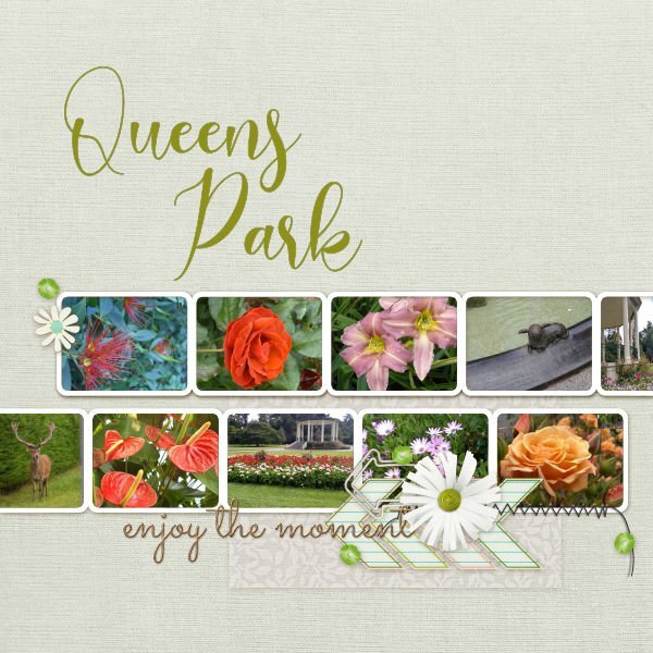
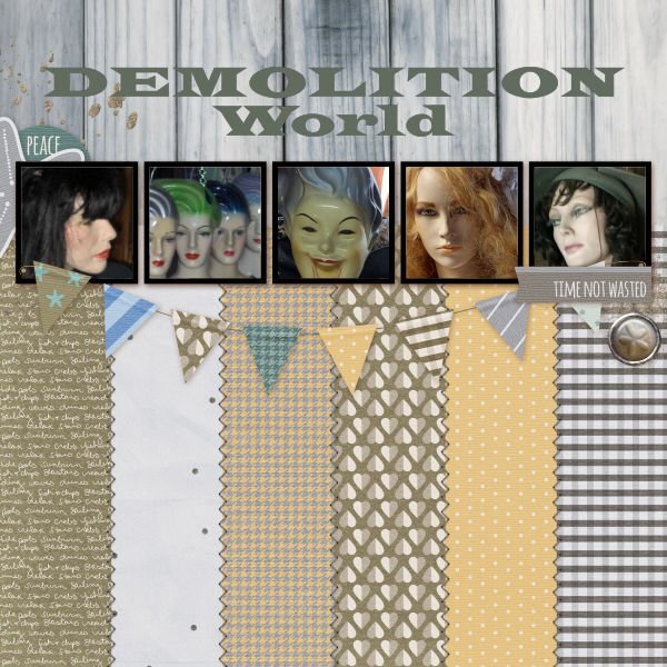
In Invercargill, Southland, New Zealand, we have a beautiful large space for all to enjoy, children, sportspeople, gardeners. The park is a mecca for those who enjoy the natural and the planned. Its numerous gardens and botanical attractions provide vibrant displays whatever the season. I love Demolition World in Invercargill. Although the business sells pieces from demolished buildings, windows, doors, lighting, corrugated iron, etc, Lee and Dave have created a wonderful retro village. For years I have used an image I grunged up as my avatar online, and the mannequins are a delight, as are the gorgeous plastic clothes hangers found in the village, 2nd and 3rd from the left in my image below. I had a few photographs that might have gone in this no-scrap image, however, I thought they would all compete against each other, so I used alternate spaces with scrap paper instead. The area is on the Southern Scenic Highway, through Tautuku [pronounced similar to toe-too-koo] and on towards Owaka and onward to Dunedin, Otago. Through the bush are some beautiful sights, the magnificent Tautuky Beach and McLeans Falls, and Cathedral Caves where there is a slim chance of wandering along the beach to walk to the caves. They are only open for a short time each day. I used hue saturation and lightness to match the colours of the photographs used. These quick pages have been fun to create. Thanks, Carole, and everyone, I've loved the creations of everyone. Jeni
 6 points
 -
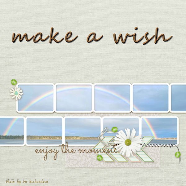
This photo by Irv Richardson was posted on the Substack: "Letters from an American" by the historian, Dr. Heather Cox Richardson. He is her brother. It was taken in Maine, where they are based. The title font is Segoe and treated to an inner bevel and shadow.
6 points
-
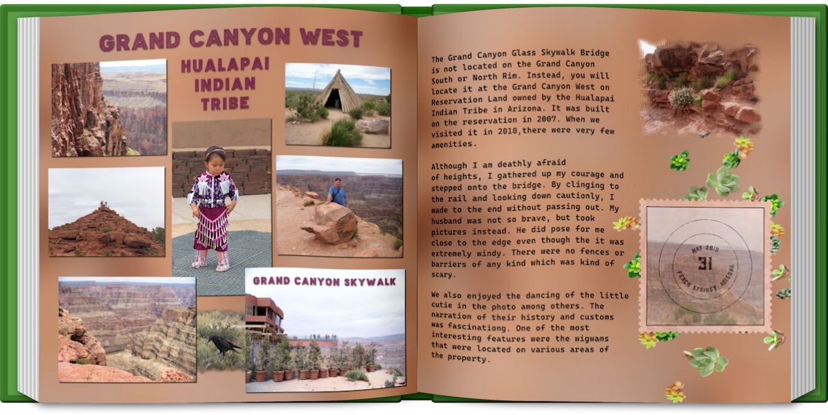
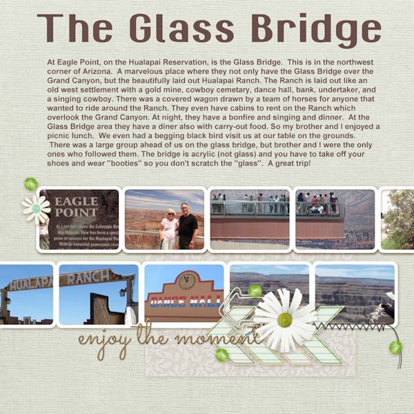
Mary, my husband and I visited the glass bridge several years ago. The whole reservation was amazing. Walking the glass bridge was so frightening especially because I am afraid of heights. But, at least I did it, my husband chickened out.
6 points
-
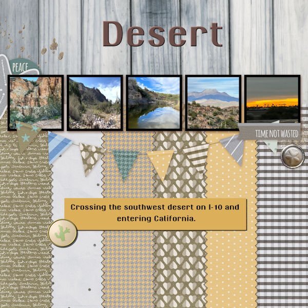
And the extra for lesson 7. The font is GranaPadano for both the title and the journaling. The extra brad is from my desert kit.
6 points
-
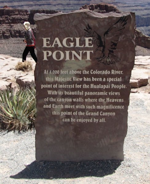
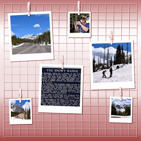
On to lesson 7. These are a few of the pictures of the trip my brother and I took to the Glass Bridge in Arizona. It was a great trip and this was the final destination of that trip. We were gone from home about 3 weeks and enjoyed many stops on the way (followed Route 66 from St. Louis, MO to Miami, Oklahoma) and left the old road and continued on I-40. I will post the picture of Eagle Point separate because you can't see what is on the sign in the QP. And, that is 4,000 feet above the Colorado River at the bottom of the Grand Canyon. The title font is GranaPadano, the journal font is Arial.
6 points
-
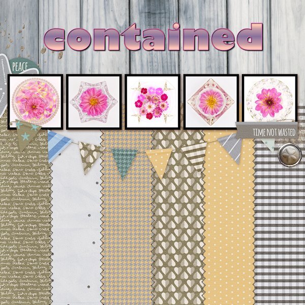
Day 7 Diamond Extra Photos from 2022 when the world was being contained (or were we coming out of containment by then?) I started doing flower flat-lays and well, I contained them too. I had to buy the flowers as I have never grown them before. 2023 was my breakout year for learning to grow flowers. Font is Gill Sans Ultra bold (formerly from Microsoft) that I had to scoop off my laptop since Windows 10 didn't have it anymore. I used the technique we learned in the Text Workshop (and there is a blog post on it too) where the outline can be used separately, which I added a bevel too. Side note: I think my brain has turned to mush. My shadows, even at 80% have been looking soft and lighter and I thought, oh oh, something is wrong with my eyes. Today I just noticed the shadow color wasn't black but a dark grey. Geez, when did I change that and why?
4 points
-
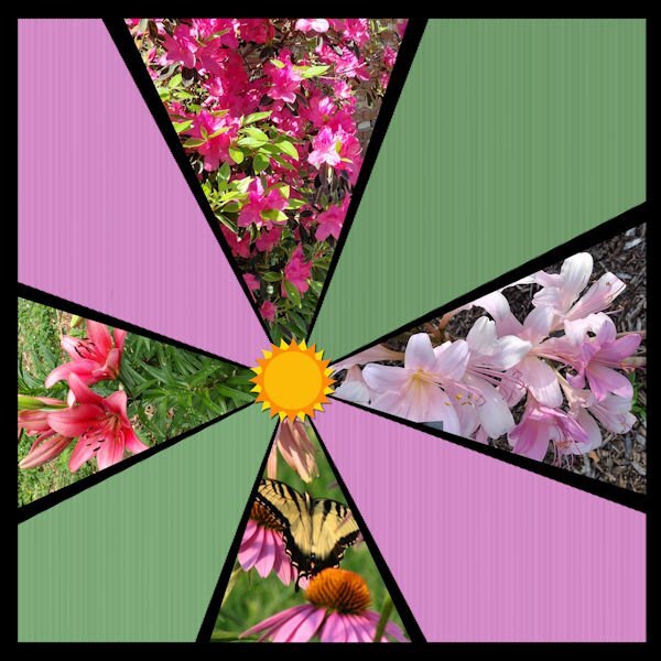
Non-scrap 7. End of the QP Workshop! Been so much fun. Thank you, Carole. The flowers are from different gardens: present garden, previous home garden, Church garden. The sun sticker is from my Beach kit.
4 points
-
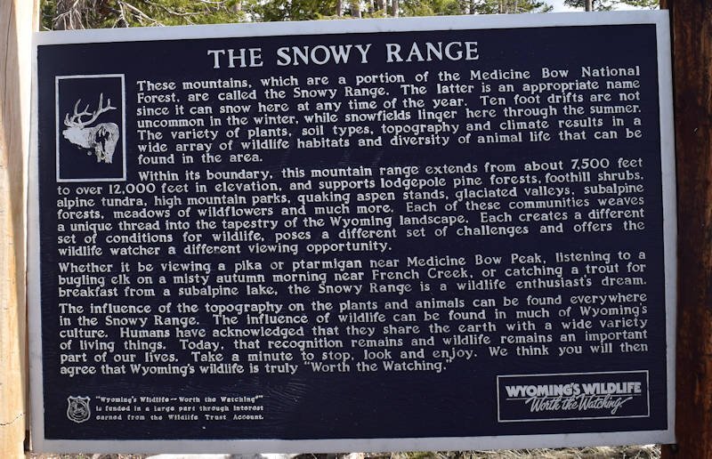
OK, Ann. This is a picture of the sign in the park. I will post first @ 800 px to see if it goes. I cropped it from one of Laurie's photos which are really huge to begin with.
3 points
-
Day 7 I spent a lot of my time deciding which pictures I should use and revising the template to match my colors. I think that is why I don't like quickpages unless they are layered. The photo are my own taken while visiting Las Vegas and the Valley of Fire. Las Vegas has the Ethel M candy factory which has a beautiful cactus garden, not to mentions the best chocolates. Ethel M is the upscale brand of chocolates from the Mars family, Ethel being the mother. The font is a colored font from Creative Fabrica and does not work in Paintshop. They had a bonus file of pngs which I used for the title. The font does work in Photoshop, even my old one.
3 points
-
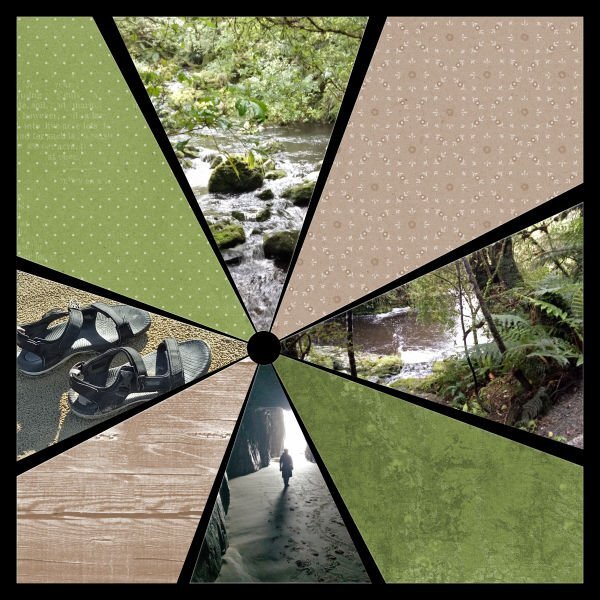
And the non-scrap for lesson 6. I changed the background with Adjust>Color and Adjust>HueSaturationLightness to contrast with the blues, whites, and greys of the pictures.
3 points
-
Extra 6. I used Arial for both the title and the journaling.
3 points
-
I, too, am afraid of heights. But - if my brother was going to do it, by golly, I sure was going to do it! Bravo to you! I loved the singing cowboy. I stopped and listened to him (noone else was) and I asked him if he knew any of the old cowboy songs - Water, Tumbling Tumble Weeds - he did and so he serenaded me!2 points
-
Oh no Michele. I hope you get a fast resolution.2 points
-
Before: After: Done very quickly. I'm sure I could do better with a little more effort. I also removed an age spot from my forehead. 🙂2 points
-
Those are so pretty, Suz! I wasn't a fan of this layout but you've "contained" it well! 😉1 point
-
I like the color contrast, Mary. I am having trouble trying to read your text in this reduced version. Could you post it separately? Thanks!1 point
-
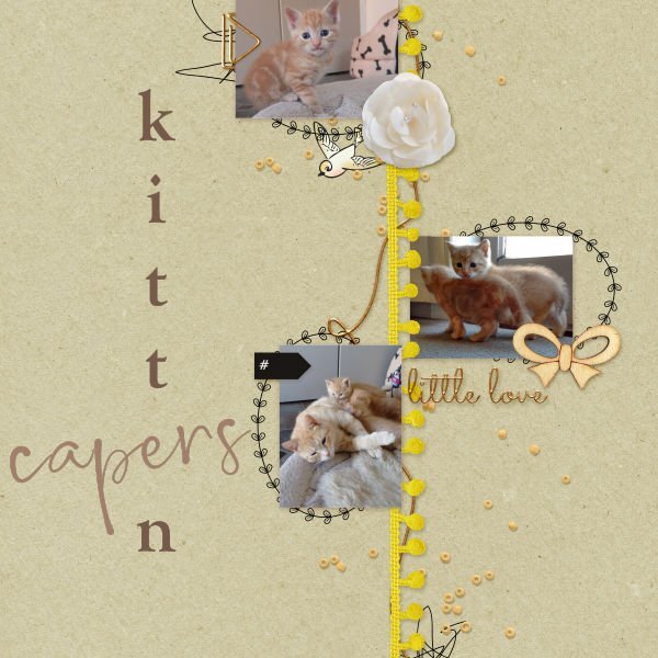
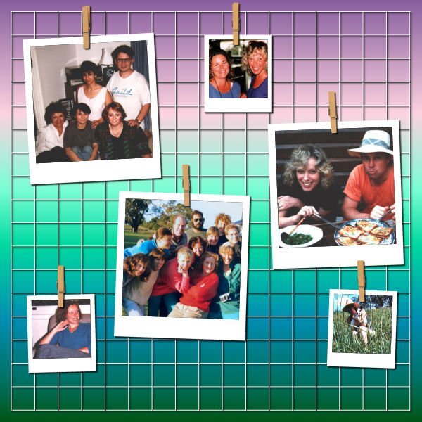
Kittens are such a delight, these kittens belonged to friends. Photographs of roses. I do love the scent of roses. I'm unsure how to re-colour some elements, so I just did the piece I could easily change. Photos of friends taken back in the 80's.
1 point
-
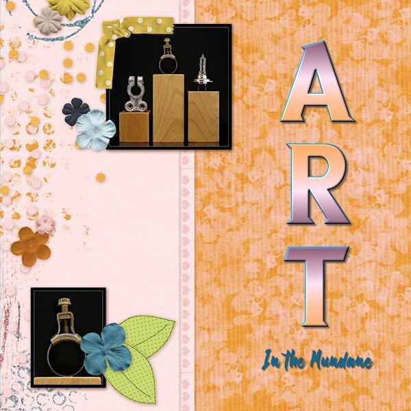
Day 6, More of the mundane things I found around the house to put on the little baby plinths. Maybe I'll dig out some beads to show what they were really for. Fonts are Sea Gardens and Shintaku from CF.
1 point
-
I'm having a problem with PSP so I can't make anything. 😢 I'm waiting to hear from support.0 points


Resized.thumb.jpg.d25811db03a63358cedab1e79f527635.jpg)