Leaderboard


Popular Content
Showing content with the highest reputation on 05/13/2025 in all areas
-
Well your wish is my command 😉. I just had to convert it to jpg, because for obvious reasons I have it as a png and a psp.image. At first I applied an emboss to it but I decided against it because now I can use it on almost any background and bevel or emboss as I think fit. All my photos are shot with my iPhone therefore I searched for a free image of one and found a font that I liked and erased some of the lines with a feathering. I didn't want something that is too overpowering or obvious.
 5 points
 -
Template 7 - Diamond I just shot these photos last weekend, now that the dandelions are out. The Alpha, the prongs and the two clocks were from my Build A Kit 2024. The one clock is on the brown circle which I used one of my papers from that kit. The clock is a cutout which I saved and did you all know you can resize the cutout? So cool! The other two circles I tried for a couple hours to find a paper anywhere that I liked and didn't find anything suitable. I just colored them thinking I'd add a texture from PSP but ended up blending them in. I chose to cut off the rest the one circle. I use Shift D and Duplicate a lot when I'm playing around with different techniques. Especially Duplicate when I'm testing out which texture I like and I can compare. I used Shift D to duplicate the the layout when i want to test out big changes or make a version two. Which is what you see here. I used the Lifted Photo Script. The font for the quote is Banerton. the brick wall is PSP with a gradient, duplicated, free rotate 180 and sliced diagonally-deleting the unwanted 1/2 (and yes, I kept the full size duplicates and hid the layers). I didn't quite get the BG lines to hit the corners or both the edges and the blue paper. Life is like that, so I left it. ...and if you thought the "s" in changes looks far away, it is...I forgot to move it back into place. ugh!
5 points
-
Lesson 5 and I really want to do this workshop one after the other, just as if I was participating at the actual dates. When finished I can go on to make a photoalbum of my trip and get it printed. Again flowers from my trip from different spots, some I took one on a walk around the neighborhood where my family lives and some from a daytrip we took. I used a bright background, very unusual for me but somehow it works. All the papers and the flowers are from DigiDewi's Kumbayakit. Instead of the swirls on the template I used 2 hexagon rows that I made some time ago and I colored them with a gradient just to give that option a try. I kept the 3 horizontal papers just solid, all the attention has to be on the photos. I didn't use a title but just the vertical paper for a list of the names of the flowers. Before I went on my trip I had a conversation with Sue T and some others about having a watermark for my work, especially if I would want to use it outside of the campus and the result is in the bottom left corner.
4 points
-
that's a neat watermark. I'd love to see it on it's own so I can get a good look at it. I have a design I used in the past but it was drawn on the work itself physically. I must sit down and get to making one of these. Although, I'm pretty sure my layouts are training some AI somewhere, not much I can do about it. If only the AI could come and work off using my data by cleaning the toilets and washing the dishes etc. You, know, doing something really useful to us.3 points
-
This post is for anyone who might have an old software called Craft Artist 2 created by Serif but was discontinued and not supported a few years ago. Although the programme still continued to work it seems to be having problems working on Windows 11 from comments i have see on the internet. I started to have problems with it working a few months ago and recently it started to cause bigger problems so i uninstalled it. I kept all my Craft Atist Digi Kits that were made for it and purchased from Daisy Trail ( no longer exists) hopeful for a time when there would be a way to convert these .pack files to something that i could use in other programmes. Happily and by accident i came across youtube channel Juney Martins Rua and she had a video called Craft Artist Digi Kits to Affinity Designer Assets where she explains and shows how to convert these .pack files to pngs. I have tried her instructions on 2 .pack files so far and the process works. You do not have to put them into Affinity Designer or Photo if you don't want to, i keep mine in the folder in Pictures on my computer that way can access them for any programme as they are converted to png's. After file is converted one thing extra i do is delete any of the images i know will never use or don't like, to keep the file size down a bit. Also when following her instructions used a copy of the oringinal pack file to use for converting so to keep the original intact for future need if necessary. i am so happy it worked for me because i have a few kits now that i will be able to continue to use in projects here in the campus. i forgot to mention that there are 2 videos for this on her channel, 1 was about 2 years ago and 1 that is about month old, the month old video is the best to use, that is what i chose to follow. hope this info can be helphul to anyone who has these .pack files from Craft Artist, as I did ask Carole if it would be OK to post it. Dawn.3 points
-
Thanks Jacques thats a nice clear jpg to read and very useful, thank you for all your hard work.2 points
-
I love it! Very creative.2 points
-
Gwen, I think you are correct there. Thank you. I saw the blue dot higher, and looking at your image, it looks like the lower blue dot...I missed that one.2 points
-
I would say it corresponds Jacques
2 points
-
These are great, Gwen. I'm impressed.2 points
-
I did a scraplift for this busy layout - found it to be a challenge! LOL The title fonts are Algerian and Bremen. I got a kit from DS by Esperanza - Paradise Splash Bundle. The photo was taken by the nail salon owner for her social media. This was years ago and the first time I had my nails done. I actually provided the art for the cat.
2 points
-
lovely composition works really well together.2 points
-
Lesson 4 - Here I used some of the photos I took recently on my trip. Stanford University has a so called Arizona Garden with a lot of cacti and succulents. It is not big but worth while to see those plants outside in a more natural environment than a heated glasshouse. For the background I use a paper from the minikit Wintertropics by Jessica Dunn. The font is Cambria and I used a bevel on it.
2 points
-
Lesson 3 and because it is mother's day over here I used a photo of a rose😊 All the papers are from a kit by Chantahlia Design Be Encouraged and the font is Hello Christmas.
2 points
-
i have been playig with affinity again this time I have been trying to make a flower element but not sure about the results Your comments would be appreciated .
2 points
-
I have been getting to know my way around Affinity Photo by watching videos I came across a one to turn your image into a pencil sketch .I downloaded the wooden background with the note book on it copied the note book on a new layer and then placed my pencil sketch into it and resized it to fit the notebook page. I placed it on top of the notebook that was on the wooden background and this is my finished effort.
2 points
-
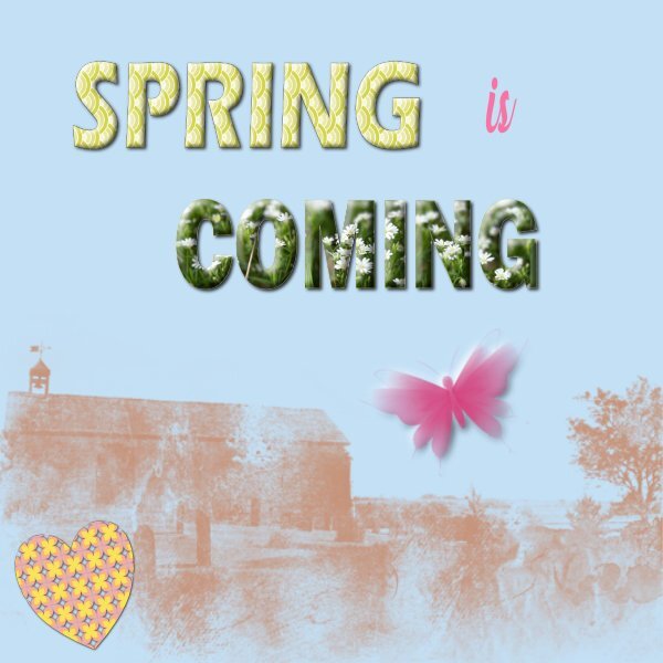
I have been playing and trying some things; here I placed some of my experiments together on a backgroundpaper. There is a tutorial from the LilyPad on how to use jpg pattern tiles and I have some jpg pattern tiles by Carole that placed in a folder called Assets (in the Window menu on top). Then I made a custom shape, outline no fill and with the gradient fill tool (I had to find that via customize and placed it on the lefthand side toolbar) active click on the pattern and by magic it is inside the shape. Afterwards it is possible to change the size of the pattern. That was the heart, then I tried it on a text and it works the same. Then I used a text and filled it with a photo which works just like we did in the Bootcamp with text filled with a paper. The word Spring has a small bevel and Coming has a very thick one, just to get more familiar with the settings and both have a dropshadow as well. Before using two different effects on a same layer(text) I had to duplicate and use the bevel on the top and the shadow on the bottom layer of the two. The heart has a shadow and a reverse shadow, also on a duplicate layer and then group them. This is something I have to get used to, more duplicating layers! I have a lot of abr. brushes imported in PSP but luckily I kept the zipfiles too and now I can use them in Affinity as well. I tried to use 2 of them as a stamp and recolored them just to practice. I find the colorpicker very difficult to use, especially picking a color from a photo because it uses 1px by 1px size. Not doable with my unsteady hands but in the lefthand toolbar is a colorpicker icon too and if you click on it, there is a toolmenu on the top where you can set the size of that picker to your liking or needs. That is it for today, I think next I will try text on a path and reverse text, wrapped text and whatever comes up to explore.
1 point
-
Lesson 6 where I want to show the beautiful irises I saw in California. I used again the diamond template because of the portret size of my photos. And again Jessica Dunn's bundle Meadow. I love that one it so versatile, especially with flowers which I love to take photos of. For the textured paper I used the blend mode pinlight and the font is Astrid.
1 point
-
Beautifully done Susan and thank you for the detailed information on how you achieved your end result.1 point
-
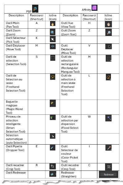
Some additions and English labels for Affinity Info-04 (En).jpg1 point
-
the jpg can be enlarged (I can do it with the mouse wheel)1 point
-
I think No 18 is the brush tools, the Erase brush, the Background brush, and the Flood erase tool. I wasn't able to read the tools in jpeg form, the writing was quite small, I'm afraid.
1 point
-
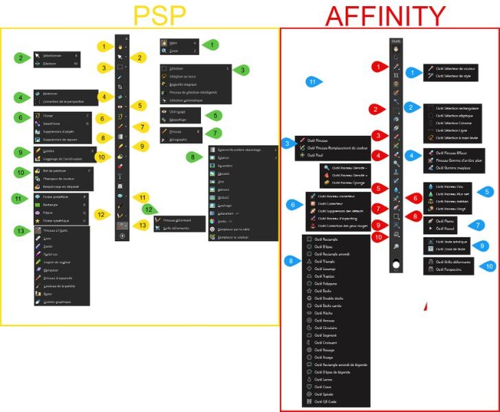
I'll continue to compare PSP and Affinity and post my findings here. See you soon.1 point
-
Thank you, Jacques, and Cristina, for asking the questions and doing the research. I'm impressed!1 point
-
Thank you and it is always a joy to get the composition well at least if it goes my way ........😉1 point
-
Susan thank you and it is good to be back to scrapping! The photos I showed here are just a couple of the lot I took photos of.1 point
-
Thank you so much!1 point
-
So beautiful Corrie. I really love the background photo.1 point
-
Corrie, I am loving your pages, and the descriptions, wonderful, keep it up1 point
-
I just love this. Your description of the pair was funny (smartest and naughtiest 😄)1 point
-
For lesson 2 I used 2 photos of my family's dogs. They are so cute and they remember me when I come to visit, even after a year! Dante is a poodle and the smartest; Koko is a schnoodle, a crossing of a schnauzer and a poodle, and the naughtiest. All the papers are from Jessica Dunn's kit Furry Cuddles, the title font is Berlin Sans and I used the adjustment layer HLS on the dark layer with diamonds to show the diamonds better. I wanted to use the adjustment levels as in lesson 1 but that didn't give a good result.
1 point
-
Template 6 Papers and elements from Digital Scrapbook (Gina Jones, Jessica Dunn, Sheila Reid and one paper that says ABM-Christmas Joy). the background paper is Creative Fabrica. I used also a pattern paper that i blended into the texture layer and added a PSP texture on top (Striation). I selected the light bulbs in the string and promoted them so i could add an outer glow to just the bulbs. Title font: Christmas Ink (CF) and I blended it into the background as if it was written with a felt pen. Journal: words of the song...oops I forgot the authors (in the layout) Lee Mendelson and Vince Guaraldi and it's one of my most favorite Christmas songs. Photos are mine from driving around the neighbourhood. The lights on the fence I didnt have to angle the photo to match, as the fence is on a street that has a pretty steep hill and it fit perfectly.
1 point
-
I used a template to showcase the houses I've lived in. From 1941-1960 was my childhood home in Rutherford, NJ. From 1960-1966 when I was first married but still living in Rutherford. From 1966-1976, shown separately, we had moved to Wantage Twp, Sussex County, NJ. From 1977-1997 after my divorce and remarriage we moved to the Village of Warwick, NY. (It was a close comparison to my old hometown of Rutherford.) We then lived in New Hampton, NY from 1997-2008. We moved back to Warwick for the years 2008-2018. We then moved to a 2 bedroom/2 bath condo in Middletown, NY from 2018 to the present. My husband passed away in 2019, but I still live in the same unit.
1 point
-
PSP works similarly to Infinity. The location of the "autosave" files is known in "File | Preferences | File Locations | Undo/Temporary Files folder". These files are destroyed when the edited files are closed.
1 point
-
For Affinity, the "File Recovery Interval" option ensures that for each file opened, there is a file of type ".autosave" in the subdirectory ".../AppData/Romaing/Photo/(Version)/autosave". If the file is closed, its corresponding file is deleted. If the program stops abnormally, the file remains and upon restart, Affinity asks if you want to recover it. For PSP, the "Enable Auto-Preserve" option creates a subdirectory where the file is located, and an original version is placed there and remains there at all times. This allows you to revert to the original version if you want. I'll look into the "Autosave Setting" option (but I think it should be similar to Affinity's option).1 point
-
This topic is of an interest to me. What is the difference between auto action and auto preserve? is auto preserve an auto action? I have had to go into the auto preserve and recover a file, it was a from several step prior to losing what I was working on. I was grateful to have it as I didnt have to start all over again. I dont know if I ever enabled it from maybe instruction from Carole in tutorials or if it just came like that. A stupid thing I used to do (not knowing what that folder was), was delete the folder...until I looked into it one day. I dont do that anymore. When I use the save (not save as) button while working on a layout does it put that save into the Auto-Preserve folder and does it put the last final save (presumably when you are finished the file) into that folder. Could it almost be like a back up incase the main file gets deleted by accident? Should I put this into the Q & A?1 point
-
Jacques, I saw your question and looked into it. I found a site that shows where to locate the Auto-Save feature in Affinity Photo. 15 Tips for Getting Started With Affinity Photo
1 point
-
The more I watch Affinity tutorials, the more impressed I am. I'm going to make a comparison guide to help me:
1 point
-
I have made my first a4 paper pattern [small hearts on the diagonal] I was wanting to know if it can be uploaded to the forum as a jpg , as is the file size is too big If I try rezing it using Quality it's still too big even at a Quality of zero. Any idea what I am doing wrong?1 point
-
Thank you Sue.1 point
-
You won't be able to post it in the campus as an A4. You will need to resize it by pixels, 600 pixels maximum. Then save it as a jpeg no bigger 290kb You could post the original size of the A4 on the campus facebook page. That way the image will not be degraded through compression.1 point
-
Yes you can. Window > Studio > Add Preset.1 point
-
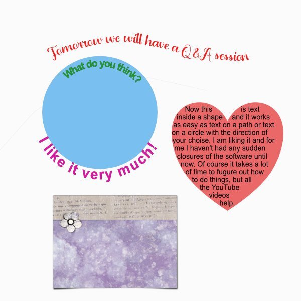
Today I looked at text on a path, text on a shape (circle) with the text inside the shape on top and outside on the bottom. For wrapped text in a shape I choose I a heart and I'm so happy that in Affinity I can finally use this feature again! I like it very much and am still a bit disappointed that PSP 2023 won't do this any longer and that this bug will stay for ever now PSP is terminated. Furthermore I tried the tutorial from the Lily Pad about a simple warped shadow with the mesh warp tool. I used a journal card from Jessica Dunn for this, but I could have used a photo as well. I found it very much like the mesh warp in PSP. In Affinity you have to set all the lines for the mesh yourself, which is a bit tedious if you want to use many. Maybe there is a further setting that takes care of this, but I haven't explored the tool settings much further for now. However I have the same problem with both PSP and Affinity; my hands are not stable enough, I have to redo many times until I get something that is acceptable. I don't complain, it is a fact that I live with it for almost 30 years now and I make the best of it🥲
1 point


.afphotocorgipencilcleanedup20258thMay.jpg2x.jpg.440831b86305a104aac778a0cd635c9c.jpg)