Leaderboard


Popular Content
Showing content with the highest reputation on 08/07/2023 in all areas
-
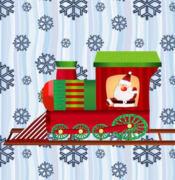
Still playing with vectors. The basic train shape was a preset shape from WmTransport font. I changed it quite a bit. I made Santa several years ago from a PSD tutorial before I really knew how to use the pen tool. The wheels are from Harold's pips font imported as preset shapes. The train tracks are from a vector dash line. I just noticed a few things that I have to tweak.
 3 points
 -
I used Cassel's WordSlats script for this one. I started with a black background and ran it three different times for each row of text. Copied one on top of the other and moved it to where I wanted the second line of text to be. Using the magic wand selection brush inside the new words, I switched to the original layer and hit delete. Once I hid the second layer, both lines were on one layer. Lather, rinse, repeat for the third row of text. Finally, all three were on one black layer with the words cut out. I used the magic wand again to choose the black and copied/pasted into selection the picture of the woman on the rock. The font is Hobo Std which is what Carole used on her free samples.3 points
-
Thought I would go for an old photo album look for this theme. The photo corners are by Sheila Reid from PixelScrappers. The main font is Tomatoes (free from Fontspace), but I used Lazy Ride (free from FPTFY) for the numbers. I've had the background for so many years that I can't recall where it came from. Given more time, I could have created my own paper with everything I've learned in the Campus. Also don't know where the party pic came from. I've been doing a much better job recording the origin information in the last several years, but the old ones are from who knows where.3 points
-
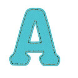
Ik was op zoek naar deze pagina, maar ik tel hem te vinden. de letter is gemaakt van denim maar is bij een groter formaat onzichtbaar. Ik heb een beetje vals gespeeld. 1items was niet zoals in de film. De selectie voor de kleinere letter is niet gemaakt door te dubbelklikken maar in het lagenpalet 'maak een rasterselectie'. de rest oké. Omdat veel naaimachines tegenwoordig siersteken hebben heb ik bij de tweede een variatiesteek gebruikt. OP de bevel na af. Ik ben al heel blij met dit resultaat.
2 points
-
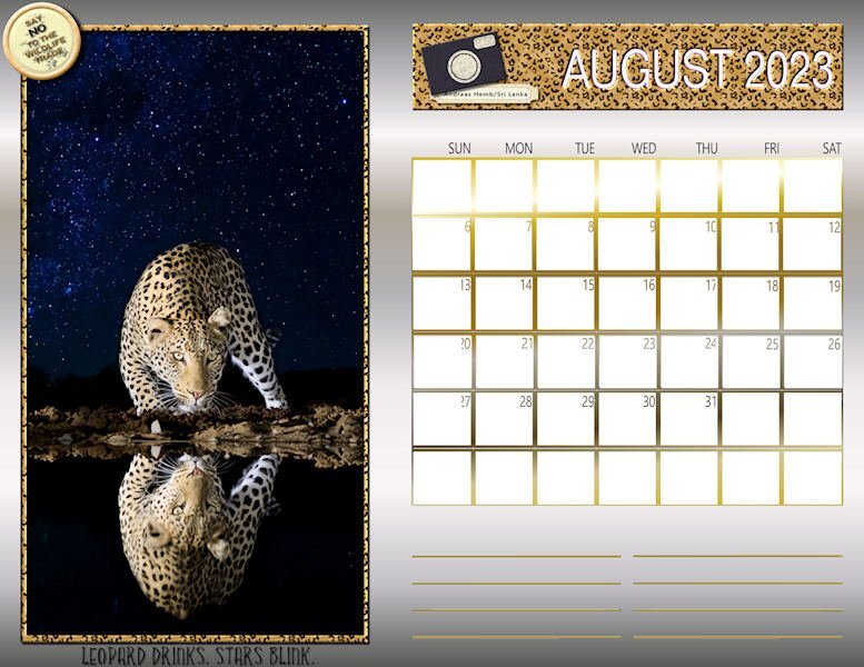
Happy August! Here is my August Wild Cat Calendar for 2023. The layout is from a template shared by Cassel last fall. The photo of the leopard is by a photographer from Sri Lanka named Andreas Hemb. The photo frame and the title strip are enhanced by the Effects/Sculpture with a leopard pattern. The chipboard camera art and label is from a mega kit called Cambodia by Marisa Lerin. The bottom title font is Yellow Fresh and the Say No brad was created from a brad template from Pixelscrappers. The calendar grid and lines for notes were treated to a gold gradient and I filled the background with a silver gradient. I also posted this full size in our Facebook files.
2 points
-
Q = Quick - when a tooth has to be extracted hopefully the dentist does it rather quickly1 point
-
thank you Ann Sheeber for the right location.1 point
-
I've been working on the creative scrap tutorials and I love how this one came out. The first one was adding noise with monochrome checked which was cool. But then I did it with monochrome unchecked and what a nice surprise!1 point
-
Wow, I didn’t realize there could be that much difference between the two! Both of those are cool, but the second one is truly wonderful!1 point
-
The flood fill tool icon looks like a bucket so I'm guessing that is what she is talking about but just using different terminology. A money bucket would be nice too....1 point
-
Okay, I'm not getting this. Where is this "fill bucket" and what is the "paint bucket" . I just know about the "flood fill" tool, I cant find any buckets. Is there a "money bucket"? I could really use one of those.1 point