Leaderboard
Popular Content
Showing content with the highest reputation on 05/11/2023 in all areas
-
7 points
-
4 points
-
Finally finishing up the April Double-Page Challenge #6. Here is Shadow, one of the star black leopards at The Wildcat Sanctuary in Sandstone, MN. She's quite a gal! I used the Vector Tube script on the title and the font is Ravie. The journaling font is Kleymissky. The background is my own Shiny Paper and the stars are from my Rustic Kit. The paperclip is from Marisa Lerin and I used the Open Book script with a gradient cover.4 points
-
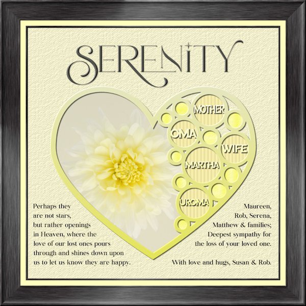
I havent made a tag yet. An unexpected passing away of my sister-in-law's mother on Sunday had me working on my condolence layout instead. Whew, that goodness I was able to go back to the Build A Kit workshop to the frame section and follow the instructions again. I used Lab 13-1 again for the shape, hearts looked weird inside hearts so i used circles. Frame is using Add borders from the master class Framing 101. My photo, and fonts are Romantic Serif (title), Sea Gardens (words in the template) and Audaciti (journaling). The title does have a bevel to help it stand out a bit, also has a very small shadow. reduced opacity on the title and journaling because black was too contrasty. I used the selection tool to fit my words in on the left side. the right side I just used a right aligment as it looked better that way. Nothing bad to report with PSP 2023. today it outshined me and any issue's I had was my dull brain at work and not paying attention.4 points
-
3 points
-
Just seen Susan's pinwheels which are fun and has reminded me that 'A Beautiful Mess' is one of my favourite Masterclasses. Must go over it again. The Serenity sympathy card is a lovely peaceful design. Too often these days, the cards you buy can be too glitzy as sympathy cards, I feel. Also love Mary's neat layouts. You are all encouraging me to do more and we seem to be keeping Carole busy with technical issues too. Thank you; all of you.3 points
-
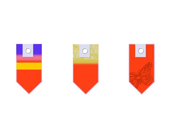
I am going over the Tags Masterclasses and just trying to create examples of tags. I haven't had time to apply to any designs. When I made the rectangular selections for the striped effects I used a ‘Feather’ value to blur the edges. My VectorPaint script did not work to start with until I realised, following the first Tags Masterclass, that after drawing the rectangle, I needed to right click on the rectangle image and ‘Convert to Path’. I didn’t see the ‘Convert to Path’ instruction in the latest Masterclass so I wonder whether it could be a difference in the versions of PSP we are running? I am on Ultimate 2021. My F11 key wasn’t working but I looked that up in View/Palettes/Brush Variance or Palettes/Brush Variance. Note to self!3 points
-
3 points
-
2 points
-
I think this is so perfect. What a wonderful tribute you made. Well done, Susan!2 points
-
Oh, these are easy for me to make -- maybe 5 minutes? The biggest time sucker is choosing the fonts - so many, so little time! and the colors. I could crank them out all day long a a matter of fact.1 point
-
Here ya go, Susan, you can make your own! But you should probably wait until Friday. Do any of these sound like your cats? Advice from a Cat always land on your feet disdain the unworthy meow softly enjoy a good nap in the sun be playful stretch often pounce on possibilities be frisky enjoy the hunt leave presents for your loved ones learn to chill be independent no one is purr-fect These came from a website - myadviceforlife1 point
-
A agree about "A Beautiful Mess" masterclss. As I was cataloguing photo's I came across a few that I could use in the one of the techniques in that class. I will be going back to it with those photo's.1 point
-
Beautiful. I love the story and how she is now living her best life. That gradient is stunning as is your shiny background.1 point
-
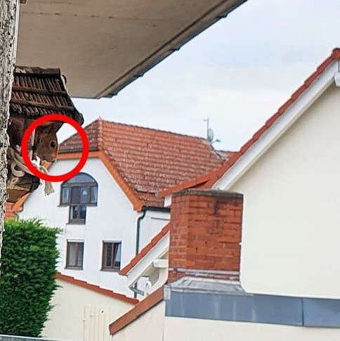
Lovely layouts are posted here! I like big cities but also like very much to be in contact with nature... Watching these little creatures can be very relaxing and entertaining. Sue, I can only imagine how thrilled you are when being only a few cm away from them... The same goes for Susan and Ann, seeing them so close... Bonnie, no appreciation at all! ? Our regular squirrel customers, as we call them, not only eat from the usual feeders but also have to squeeze into the birdhouse feeder. I had to stretch my arm with the cell phone through the door to get this shot. Corrie, have a safe and great trip! ❤️1 point
-
LOL!that reminds me of the time when Windows first came out….I wanted to learn to type. My husband could type, but not I. So I painted all the keys on the keyboard black! Turns out my husband could type, but he looked to see where to place his fingers. Oops! So neither of us could type on my new keyboard. I thought he was going to kill me, because back then, a keyboard was kind of expensive!1 point
-
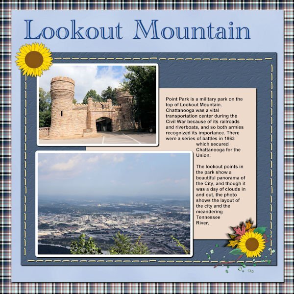
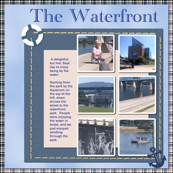
So, here is my next Chattanooga Trip layout. The font is Academy Engraved LET and I filled the open areas with a pattern taken from the water of one of the pictures. The anchor element came from NicePng and the lifesaver element came from pixel scrapper - Jessica Dunn (One of my favorite designers).1 point

