Leaderboard


Resized.thumb.jpg.d25811db03a63358cedab1e79f527635.jpg)
Popular Content
Showing content with the highest reputation on 03/13/2023 in all areas
-
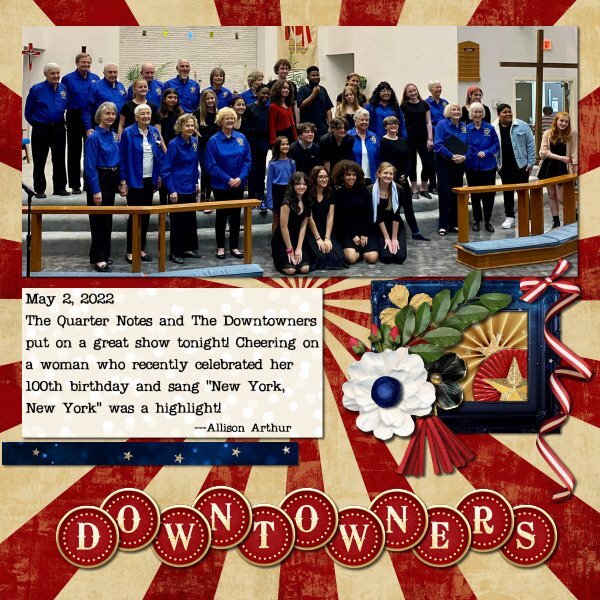
I spent the day yesterday actually scrapping. I was catching up on the backlog of photos for my cousin's family from April 2022. I decided to think outside the box on one of the layouts. I don't use frames very often and the kit I was using had a lot of frames. The template I used was very basic since it was more to do a magazine type layout so had no clusters on it. So I kept the photo spot and one paper strip then did what I wanted. Starting with using a frame as a basis for a cluster - some items behind it, others on top of it. The template is Scrapping With Liz Zine Double (set 2) available at The Lily Pad. The kit used is "Center Stage" by Kristin Cronin-Barrow available at Sweet Shoppe Designs.
 3 points
 -
I love all of Cassel's punch brushes, but I just got the new Edge Punches - B - PSP Brushes. I couldn't wait to try them out and I didn't have a project, but I certainly had some fun just playing around!2 points
-
This week, I found an old layout I made for ... a challenge. So I will challenge you too. I want a layout that will help us know you better. Your layout needs: Two photos of you (an older one and a newer one) 10 attributes/qualities to describe you (I know, that is always hard) Some brushwork Incorporate your favorite color so it will be all about YOU! So, what will you create? Here is the old layout that is the base for this challenge.1 point
-
Rene - really well done - like what you did to create the cluster - interesting idea to use the frame as the base - and the alpha is great = a great idea for the new project in the build a kit workshop. My step-mother had been a singer in a group called the Sweet Adelines here in Memphis. We always enjoyed their show.1 point
-
W = wearing of the green1 point
-
I can't give credit for the illustration because I couldn't find the original on Google. Layered a couple of papers by Gina Jones from PS and played with the opacity to get the hue I wanted. I used a rounded rectangular selection to change the shape of the pic and added a couple of select selection borders on separate layers. Some clipart from DSS to add some interest. The font is Sexy Beachy from DaFont.1 point
-
CF had some amazing watercolor carriages; it was hard to choose just one. I added my avatar from the game just for fun. This is a little late for the seamless topic from February, but I clipped some floral elements from the original carriage pic and used Cassel's seamless pattern script. I flood filled a new layer with it and lowered the opacity above a solid layer. The font is from DaFont and it's called Atziluth.1 point
-
Found this lovely illustration by Yigit Ozcakmak which I thought fit the theme very well. I got the paper and elements from DSS several years ago. And the font is, of course, Little Mermaid from fontmemes.1 point
-
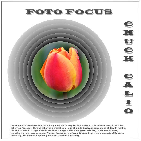
Chuck Calio posted this on March 3 on our public Hudson Valley in pictures gallery on Facebook. I'm trying to showcase it in the demo Carole gave us for the Offset Cutout.
1 point