Forum Replies Created
-
AuthorPosts
-
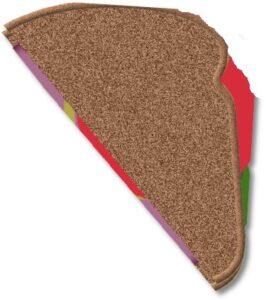
Cassel/Carole: No, I did the shadowing on the plate and saved it before adding the sandwich. When I added the sandwich, I did it in layers of components: first bread, then lettuce, then tomato, etc., each on its own layer. When the layers were added, they all looked quite transparent through the color, and I could see a hazy plate underneath. Very odd! I’ve never seen that effect before! I even duplicated the sandwich to try to make it more opaque. I had not changed the opacity on anything except the background. Ah, I bet that’s what it is! You think? Maybe not because change the opacity doesn’t seem to help. Here’s the half-sandwich that looks bent on the plate. Without the plate it’s not bent. None of my shadows are separate.
-
This reply was modified 2 years, 5 months ago by
Ann Seeber.
Suzy: I suspect you are using the “alt” upload button located on the right end at the top of the message area. That would give you the large image. If you scroll down a bit, there’s a large, gray “Upload Images” button on the left. If you use that your image will look a lot smaller but will be “clickable” so it opens large for inspection. Hope this helps!
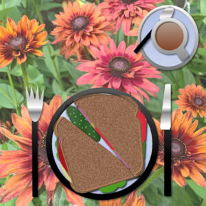
Cassel/Carole: I have a question. If you look at my sandwich on my plate you can see where the bread, etc. seems to be pushed up from underneath by the rim of the plate. I did apply a buttonize effect to the plate rim but that was long before I added the sandwich! Never encountered this phenomenon before! :-\ (here’s my image again so you don’t have to go looking for it)
Here’s the sixth sandwich and table setting I’ve made through the years for this class. A flowery cloth and played with the setting and sandwich ingredients. Yum!
Lisa: What I do is go up to Windows and Uncheck Tabbed. Then each image will have its own window. Each image can be minimized to the bottom where it’s accessible for further work or most times I just scale them down small so they stay open but not “underfoot” ( 😉 ) Hope this helps!
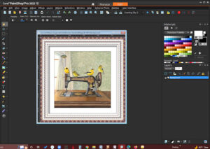
Here’s a screenshot of my workspace. I decided to fiddle to see if I could do this and it’s easy-peasy. Go to File/Screenshot, click Start (PSP will minimize), re-open PSP and right-click and voila, there’s your screenshot image. I had to reduce the size for posting here.
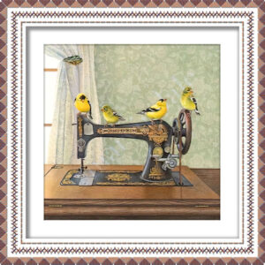
I was just playing with a little framing, using this gorgeous watercolor a friend showed me. The artist is Cori Lee Marvin. I used Cassel’s stitching frame, echoing the sewing theme and played with drop shadows, mostly on the mat, and I like the illusion of depth that I achieved. I have this on my desktop. I’ve named it Singer with Goldfinches. 🙂
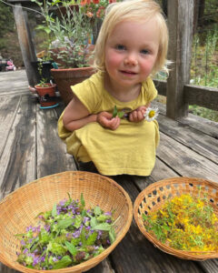
I forgot to post a photo. Here’s the latest of Magic, my great-granddaughter who just turned 2 on June 4th.
Jannette: Here’s the info for the first lesson:
Ready for that first step?
Go to this page and use the password – install – to get access to the video tutorial and the cheat sheet.I’m here, again! Looking forward to joining you all in Bootcamp! I sign up every time it’s offered as I work best with frequent assignments to motivate me.
Nice to meet you, Jannette! Welcome!
-
This reply was modified 2 years, 5 months ago by
Ann Seeber.
Suzy, your newsletter is very impressive. Great job! I enjoyed it and I’m not a daffodil enthusiast. Do you use MS Publisher or Word for the page layouts? Looking forward to joining you in Bootcamp! I sign up every time it’s offered as I work best with frequent assignments to motivate me.
Carole: Yes, I looked over your tutorial on the Gradient Fill but would still benefit from a demo. Thanks!
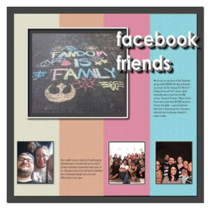
Here’s my entry in the July Friendship Challenge. Most of my friends are Facebook friends that I met through a book club group there. We have since gotten together in real life also. My layout is based on a sketch I had in my files and I transformed it to a template. I have fun doing that! I hunted for the real font for Facebook and discovered I had it. It is Century Gothic Bold. My title was supposed to be done with Block Type but it didn’t work for me so I used multiple layers of the raster layer of it.
Edit: I see the journaling is too small so here’s the text:
We all met as members of the Facebook group called ASOIAF that was dedicated as a book club for George R.R. Martin’s “A Song of Ice and Fire” series, which eventually was turned into the HBO series, “Game of Thrones.” When I joined there were more than 80,000 members all over the globe. I appreciated that with such a large group the rules were enforced, and no one was allowed to make trouble. Our smaller group, made up of mostly group administrators, traveled and got to meet in person at fantasy conventions every year or so. They were lots of fun and fond friendships were developed though there are vast differences in our ages.
-
This reply was modified 2 years, 5 months ago by
Ann Seeber.
D = deep
Susan, thank you for your kind words. Made my day! 🙂
-
This reply was modified 2 years, 5 months ago by
Ann Seeber.
B = Besties!
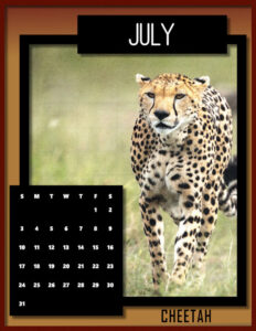
Oh, good. I get to post my July Big Cat Calendar first! Here’s Cheetah, the fastest animal, able to overtake fleeing antelopes! This is from templates that Carole gave us last fall. Just add your favorite photo, colors and frame.
I also posted this on our Facebook page and put a full size (8.5×11) copy for printing into the Files.
-
This reply was modified 2 years, 5 months ago by
Ann Seeber.
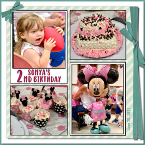
Finishing up a project from May, here’s the Sketch Challenge. I used my photos from Sonya’s birthday party Sun 6/26 at the local firehouse. Sonya is now two. The font is Baby Olivia. I actually took the sketch, enlarged it to 3600 and created layers of all the areas, turning it into a template. Then I used the Raster-to-Mask script to place the photos and papers.
-
This reply was modified 2 years, 5 months ago by
Ann Seeber.
Rene: Thank you for that reference. It seems Carole has a really good search engine in there! Thanks again!
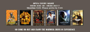
Brian, I’m admiring your website work. I think my favorite is the Symbols page, followed closely by the Postcards. Here’s an example of what I do every week for our little business, the Warwick Drive-In Theater.
Hi Carole: No, I never saw that tutorial before. Wish I had! I looked on your Index but couldn’t find anything about Gradients.
Hi Carole – I just discovered the new Gradient Fill tool in PSP2022. I saw the Corel video but need further instructions. Could you do a more comprehensive demonstration?
Here’s the video I watched. Creating Gradients in PaintShop Pro
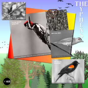
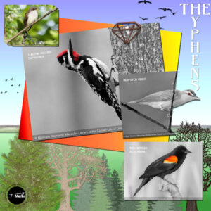
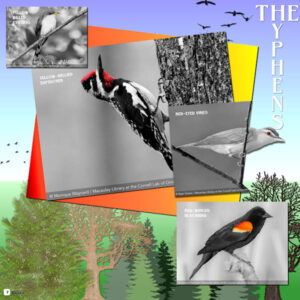
This is for the Scraplift Challenge. Another array of Merlin’s birds. I used the Out of Bounds and the Selective Color techniques suggested for the challenge. The font is Belisha.
Edit: I made quite a few tweaks. I’ll leave the first one also so you can compare.
-
This reply was modified 2 years, 6 months ago by
Ann Seeber.
SCRAPLIFT CHALLENGE: Here are The Hyphens, photos courtesy of the Merlin app recording their calls in my yard. I chose each bird, so it had a spot of color to use for the Selective Color technique. I did the Out-of-Bound technique on the Red-Eyed Vireo. I pretty much followed the layout style of the Scraplift example. The background is a gradient called Landscape. I had the various trees and flying birds in my Elements collection.
EDIT: I’ve made quite a few improvements since I first posted this, so I’ll post the new version alongside the old to show the differences.
-
This reply was modified 2 years, 6 months ago by
Ann Seeber.
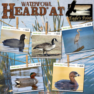
Carole helped me get this hanging photos script working. I set the layout up for four photos and then, today, I acquired a fifth one for this collection. I’m a little surprised that quite a few waterfowl pass by my condo in the mornings when I’m out filling my feeders and recording any birdsong (or quack/honk) with my Merlin app. It wasn’t that hard to edit the initial layout. The background photo is from Pixabay.
That’s lovely, Michele! What sort of games do the Fab Divas play?
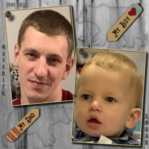
Maverick, the groom-to-be and his son, Logan, my great-grandson, who was one in February. The wedding’s coming up in September. The bride-to-be is my granddaughter, Ilana.
Edit: Noticed I forgot the shadows on the photos and forgot to activate the brads that were there but in hiding while I worked on the frames.
-
This reply was modified 2 years, 6 months ago by
Ann Seeber.
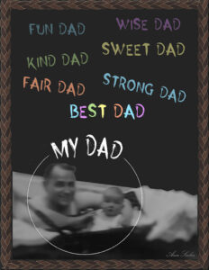
I’m still celebrating Father’s Day. I considered doing a Word Art layout but instead went for a chalkboard effect with the same font (Horror Story) but colored with pastels similar to chalk. The frame is called Leather in the PSP file. And I have to thank Corrie for the phrases, she used them recently, too.
The font used is Neon and I played with the Warp Brush a bit on it. The photo is within a graduation freebie frame from Corel which I edited a bit with a watercolor eraser, so its edges melded in with the black background. This is my daughter, Laurey, and her ward, Kate Snyder, who is actually her step-niece.
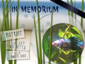
I’m sorry I’ve been quiet lately. I have been a little distracted because I was fighting to save my pet fish’s life, but it was not to be. S.I.P Patriot – gone too soon. 🙁
Pirkko: Thank you for that research! I went in and started a family tree on that site and they offered to switch me to the USA site. My daughter does this on Ancestry.com but I don’t think she has much from that branch of the family, so thank you, again!
-
This reply was modified 2 years, 5 months ago by
-
AuthorPosts


