Home of the Scrapbook Campus › Forums › Challenges › June TUT/TECH Challenge – Multicolored Text
Tagged: TUT/TECH Challenge
- This topic has 53 replies, 13 voices, and was last updated 2 years ago by
Sue Thomas.
-
AuthorPosts
-
June 17, 2022 at 5:59 pm #78132

The Campus is the perfect place to learn more about photo editing, various techniques, or PSP in general.
This challenge will give you an opportunity to practice some of those techniques or use some tools.
This time, the Tut/Tech Challenge should be an easy and colorful one; create some multicolored text, whether it is for a title, some wordart, or journaling. You can follow the tutorial in this blog post to help.
Show us what you learned.
June 18, 2022 at 2:20 am #78137Anonymous
- 335

- Enthusiast
wow wow … This is the Must to do 🙂
here is my result
Font: New Poseand – This is for Alphabet Album – L at same time
June 18, 2022 at 9:28 am #78142Pirrko that is quick and I love this!
June 18, 2022 at 10:55 am #78143Awesome Pirrko!
June 18, 2022 at 12:12 pm #78144Pirkko, that is fabulous! What is the fill? I think those itty-bitty, see thru flowers take it from smashing to brilliant!
June 18, 2022 at 3:28 pm #78155Anonymous
- 335

- Enthusiast
Suzy – the Font New Pose itself has floral decorations. I just added a twist with Warp Brush 🙂
June 18, 2022 at 4:17 pm #78156I am on this!!! Wow! Thanks! It was an inspired choice for your project!
June 18, 2022 at 6:06 pm #78160Prikko, very nice page.
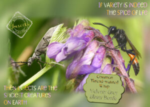
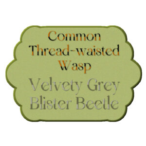
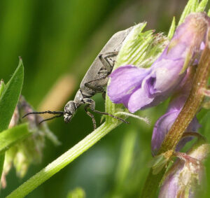
My day started at the crack of dawn. I managed to get 2 hours of kayaking in before 8am. By which time the sun was ideally high enough to go in search of insects to shoot. Here are 2 that graced me with their presence. It’s fantastic to see such beautiful familiar faces again. I created a mask to blend 3 photos together. Seeing as the photos were taken with the sun behind me, and all three insects were on the Purple Milk Vetch plants, they blended pretty well. It’s always a bonus to shoot native insects on native plants. In case you are wondering where the third insect is, it’s in the middle at the bottom. A newly emerged Lacewing. The wasp is 8-10mm, and the beetle is slightly smaller. The velvety grey blister beetle is my favourite blister beetle. It really does have the most velvety feel to the touch. For the tag, I did something a little different to the tag text, but it’s still multi coloured. Again, due to resizing, the page is degraded.
June 18, 2022 at 6:17 pm #78162I alternated orange and black, switching every other letter, and the same for the two shades of grey. To match the relevant insects. All the colours for the page were taken from the photos.
June 18, 2022 at 6:51 pm #78163Wow! Sue, that’s awesome. Very complex too (to me). I love how you did the coloring on the all the letters, all with varied techiniques. It’s fun to really look and discover all the ways you colored the lettering. I love the idea of photo blending, would make a good master class. I have started playing a bit with blend modes and learned about the tools having their own blend modes too. I would love doing the same with masks to blend photo’s together. Am I correct in understanding your layout is 3 different photo’s, each with one insect on them, that you blended using masks to uncover the areas you wanted to show through? Did you have to keep the framing of the flower the same for each photo?
June 18, 2022 at 7:07 pm #78164Anonymous
- 335

- Enthusiast
Sue I see that you really like insects 🙂 Yes they are very charming – even cute most of them. It would be really interesting to admire your images in their natural size – have you thought about setting up your own web site for them .. or save to the web folder.
June 18, 2022 at 7:27 pm #78165Very nice! Well, except the crack of dawn part, and the 2-hours of kayaking part, and the insects part. LOL! (In other words I like the flowers and the type techniques.) I agree on the website, too.
Good work, though, and it’s very pretty!
June 18, 2022 at 11:23 pm #78172Suzzy, I don’t quite know how to respond to your comment, LOL other than, early mornings are the best part of the day, especially when woken to a dawn chorus. As for insects I have always found them fascinating. I observe, document, and photograph their very complex lives. Purely for my own pleasure. I also enjoy the night sky, observing the constellations, shooting the moon phases.
Pirkko, I use my photos in greeting cards, and calendars, which I email, or print off for family and friends, and like minded people, that have the same interest in insects, and birds. I have always had a passion for everything nature.
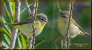
Susan, thank you so much. Using the blend mode doesn’t really work, even though I said that I blend photos together to make one image. The best way is to create a mask, and yes, it is important to retain the original size of the photos. Also taking perspective into account I find it works best, when the background has a lot of depth of field. Like in this image. It is also important to take into account the shadowing, it won’t work well if you have the light source coming from more than 1 direction. In this image, I used 2 photos of the same same bird, luckily the bird turned around, and I could blend the two photos together. I’m always pleased when the viewer is unable to detect the merge. It really isn’t that difficult once you have learnt how to use masks. I have said it before, when posting images like this, two photos, same bird, one image, that’s the magic of PSP.
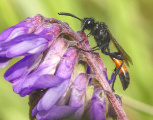
June 18, 2022 at 11:34 pm #78174Yes Susan, I added the lacewing to the blister beetle, before I aligned the blister beetle alongside the wasp, I then matched the two photos the best I could. This is the original photo of the wasp. There are several mask tutorials, and masterclasses in the campus, there is also one that Carole did for Corel several years back.
June 18, 2022 at 11:47 pm #78176Feel free to download both photos, to play with using masks, using my finished page as an example. I have added the lacewing, and left it in the photo. Of course I have had to greatly resize, in order to post in the campus.
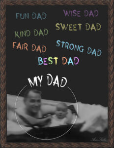
June 19, 2022 at 6:34 am #78179The font used is Neon and I played with the Warp Brush a bit on it. The photo is within a graduation freebie frame from Corel which I edited a bit with a watercolor eraser, so its edges melded in with the black background. This is my daughter, Laurey, and her ward, Kate Snyder, who is actually her step-niece.
June 19, 2022 at 9:43 am #78180Thank you Sue, for the explanation and for graciously adding the practice photo’s. If I didn’t know you blended the three photo’s I’d have thought it was one photo.
Ann, that is a beautiful page and I love the picture. That font is awesome and really looks great colored the way you did.
June 19, 2022 at 11:01 am #78181Fun stuff, everybody!
June 19, 2022 at 11:07 am #78182I love what you did with the New Pose font. I tried to download from Creative Fabrica, but there was a virus in the file.
Trojan.GenericKD.38682519
Just wanted the readers to know in case they want the font. I have emailed Creative Fabrica to let them know, as I have downloaded fonts from here before with no issue.
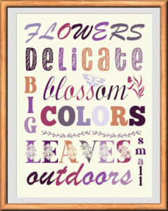
June 19, 2022 at 11:38 am #78184I did something completely different for this challenge. Because it is about multi-colored text I decided to go with some wordart. It is a while since I did some, In the recent Labs is a mention of colorpalettes and there are 2 called Blooms which I used for this layout. I used different fonts, the elements are fonts too. I used a frame, that Sue Thomas so generously shared with us a couple of weeks ago. It had the exact size I needed and saved me some time!
Sue your layout is gorgeous as always with those photos!
June 19, 2022 at 11:50 am #78186I’m still celebrating Father’s Day. I considered doing a Word Art layout but instead went for a chalkboard effect with the same font (Horror Story) but colored with pastels similar to chalk. The frame is called Leather in the PSP file. And I have to thank Corrie for the phrases, she used them recently, too.
June 19, 2022 at 11:57 am #78187Corrie, what can I say! Wow!! It’s perfect. I love the colour combination. Very natural. You even matched the colour of the frame to some of the letters. I also like that you didn’t use a white background, but a slightly off colour. Something I often do, it doesn’t make the page so starkly bright.
June 19, 2022 at 12:00 pm #78188Ann, another lovely page, I like the chalkboard effect.
June 19, 2022 at 3:00 pm #78196It still is a great pleasure to look over all these layouts in every challenge. Creativity never ends …
Congrats to Lynda and Sue for being among the finalists, I keep my fingers crossed :)!
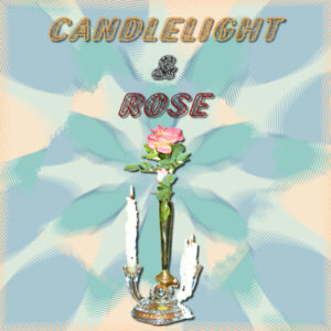
June 19, 2022 at 4:37 pm #78198I made this for the tut tech challeng and usted the June color pallet colors as a base to create the background. ( I can’t even remember what all I did to get that background, I was just playing with my PSP. The rose and candle picture is one I took years ago.
June 19, 2022 at 7:26 pm #78203Ann, that’s a cool background. Isn’t that the way? You are playing around and do something cool, then you don’t know how you did it so you can recreate it again.
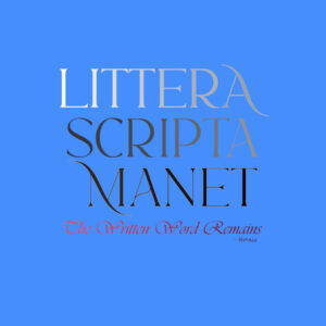
Here is my tut/tech challenge. Gradient on the bottom quote and, well, not so colorful (in fact Hueless or Color-empty) use of Value going from White to Black on the value scale in random increments. Seeing the Value of Hue in my Color Course was the hardest to learn and still an on going struggle. That is why the ‘A’ in ‘Scripta’ is barely discernable as this cyan/blue background is very close in value to the letter ‘A’. Painters are really good a reading the value of a hue.
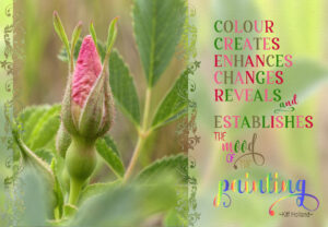
June 19, 2022 at 7:57 pm #78206The native Prairie Roses are ever so delicate, they are very small and low to the ground plants. I used a mask I had previously created using a decorative brush. Word art. Macro photograph.
June 19, 2022 at 8:52 pm #78207Wow! It doesn’t get anymore motivational than everyone’s layouts. Delightful to log in and see all the creativity. I’m trying to soak it all in (the creativity).
I also meant to add that my project is meant as a “poster” so I didn’t add shadows.
June 20, 2022 at 2:25 pm #78230Sue thank you for your comments; I learned a lot from looking at your layouts and it is all in the details, isn’t it!
Your Prairie Rose without the quote would make a great card too!
This “simple” TUT/TECH Challenge has a great result with so many so different layouts!
June 20, 2022 at 8:07 pm #78234Corrie, absolutely, one small detail can take a layout to the next level. More often than not, the detail is quite subtle,
I masked the rose to send as an ecard to a friend who is now unable to get out and about to shoot insects and wildlife, so I send her some of mine on a regular basis. She’s far more knowledgeable than I am when it comes to IDing some species. So I rely on her when I’m stuck. I wasn’t overly impressed with the word art, but that’s OK. It was coming up to my bedtime, and I didn’t give it much thought. The quote was quite apt, for the challenge. -
AuthorPosts
- You must be logged in to reply to this topic.
