Ann Seeber
-
Posts
3,339 -
Joined
-
Last visited
-
Days Won
80
Content Type
Profiles
Gallery
Forums
Everything posted by Ann Seeber
-
Don't feel bad, Susan. I can't find it either.... ?
-
Mooi paars is niet Lelijk - Google says: Beautiful purple is not ugly ?
-
Beautiful, Monique! Though it would help me out if you gave an English translation, also. ?
-
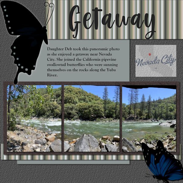
 Panoramic photo by Debbie Lennox; stripe design using colors from left photo, following directions to create a plaid but only going half-way; title font=Berlin Kitchen; journaling=Goudy Old Style; butterflies from pngtree.com; background paper created using gray flood fill and asphalt texture
 -
Scrap Bootcamp: Lesson 5 - Yuba River Getaway - Daughter Deb took this panoramic photo as she enjoyed a getaway when she joined the California pipevine swallowtail butterflies who were sunning themselves on the rocks along the Yuba River outside Nevada City. The title font is Berlin Kitchen, the journaling font is Goudy Old Style. Background color fill with asphalt texture, photo mat wood tile01 pattern with hardwood texture. Butterflies are from internet searches for pipevine swallowtails. EDIT: Forgot to mention the stripe pattern; used the directions for making a plaid but stopped before adding a second, rotated layer. The colors are from the portion of the photo that shows on the far left.

-
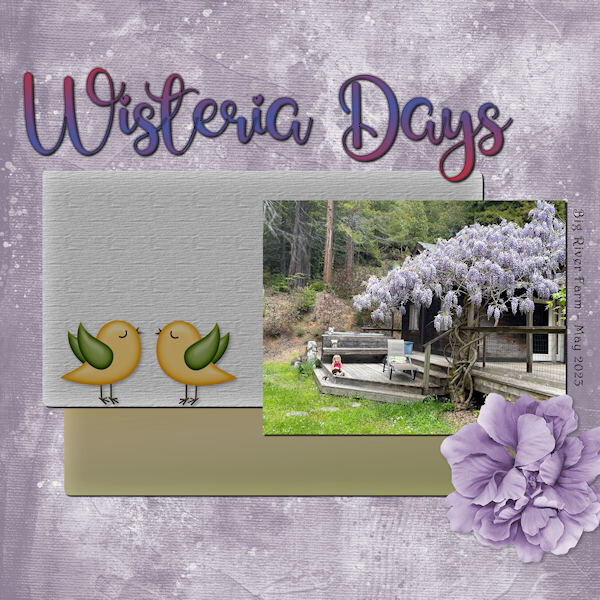 Title Font - Glamlips w/custom gradient, Background paper-Marisa Lerin (colorized), Photo by Debbie Lennox of her granddaughter Magic in Mendocino, CA. Detail font - Harrington, Flower - AFT-Love Life, Bird art - found in my BIRDS folder.
 -
Using the photo I displayed earlier, I toned it up and it's now the star of Wisteria Days. Title Font - Glamlips w/custom gradient, Background paper-Marisa Lerin (colorized), Photo by Debbie Lennox of her granddaughter Magic in Mendocino, CA. Detail font - Harrington, Flower - AFT-Love Life, Bird art - found in my birds folder.
- 172 replies
-
- 10
-

-

-
Randy: Here's a little tutorial that Cassel just published all about making borders on photos. https://scrapbookcampus.com/2023/05/6-ways-to-add-borders-with-paintshop-pro/
-
-
-
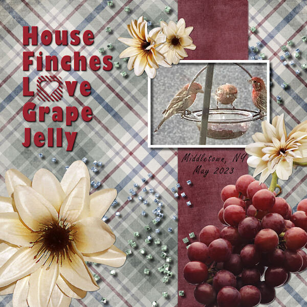
I realized I forgot to report the details: Title Font = Gil Sans Ultra Bold + Heart Things 2 / ID Font = Freestyle Script / My photo = iPhone XS - 4/2023 Scatters = ps_marisa-lerin_34745_be-mine-squares-scatter / Flowers = SDE_AnAutumnView / Grapes = NicePNG Background plaid = AHA_somewhereintime_papers04 / Vertical strip = AHA_somewhereintime_papers11
-
I just deleted my image and replaced it with one that I added new art for the "grapes" in the lower right corner. Wasn't happy with the watercolor grape art.
-
they are not actually worms, they are dried insect casings and not likely to "come alive" LOL
-
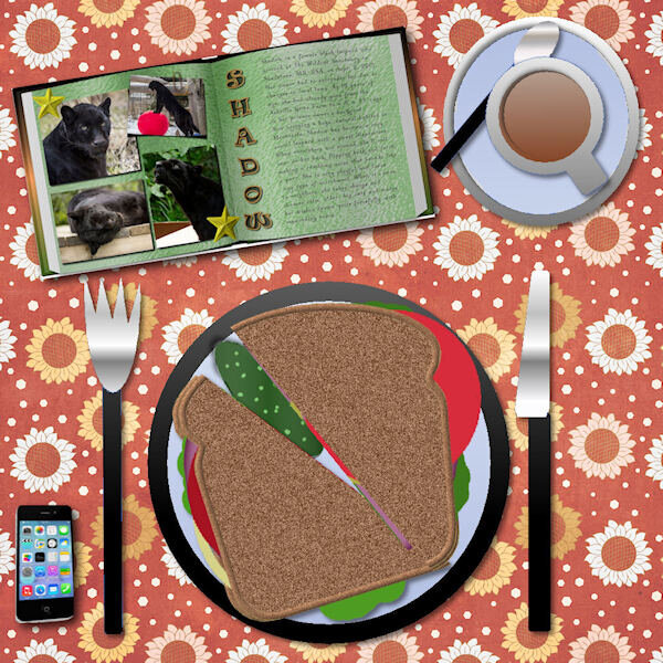
LESSON 3 - My House Finches Love Grape Jelly ... who knew? I thought it was for the Baltimore Orioles who are not here yet. Meanwhile the finches are loving it!
- 172 replies
-
- 12
-
-
-
Hi Corrie, good to see you enjoy the lessons.
-
Hi Isabel, Welcome! ?
-
One of the reasons I keep taking this class is I love to play with the tablescape. This time I added a piece from the Double Page workshop last month as I like to read with my lunch!
- 172 replies
-
- 10
-
-
-
Thanks, Cristina! I found the template on The Lily Pad. Now I gotta go PLAY ?
-
Well, at least I wasn't alone, Cindy! ?
-
Well, since I was late signing up, perhaps mine went out separately, whereas the rest were in a group? I don't know the mechanics involved with member's emails. Whatever, I hope the other people on this course are finding this page ok.
-
Here's the LINK from my email.
-
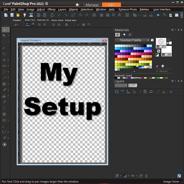
I've illustrated my setup with a little infographic. You'll find there's a Master Class for that, too, though mine here is not the same style. I just clipped a copy of my workspace using MS Office One Note. Cassel - I couldn't use the link to this Forum in today's email. It went back to January, 2023.
-
I'll possibly be using this photo on one of my layouts. The wisteria is blooming at my daughter's farm in Mendocino.
-
Good to see you back here , Jannette. I think you'll enjoy the new Campus format. We chat more than we did before. Welcome!
-
Beautiful, Cristina! You are an INSPIRATION! ?