Ann Seeber
-
Posts
3,806 -
Joined
-
Last visited
-
Days Won
102
Content Type
Profiles
Gallery
Forums
Everything posted by Ann Seeber
-
Yes, but I'm terrible at precise drawing with the cursor. I guess I need to practice! LOL
-
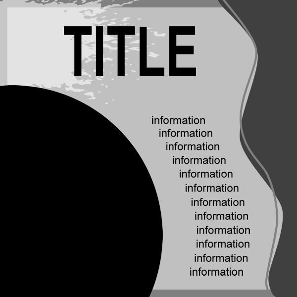
@Cassel - Help! I'm trying to do Lesson 2 but flummoxed as to how to achieve the text configuration. Any advice? Here's an example of the template...it's the wavy text down the center that I want. Also, I got a new, larger monitor and text is acting strange. Is it to be set to pixels or points?

-
Great, Lynda! So glad you're back. Your layouts are the best, as usual.
-
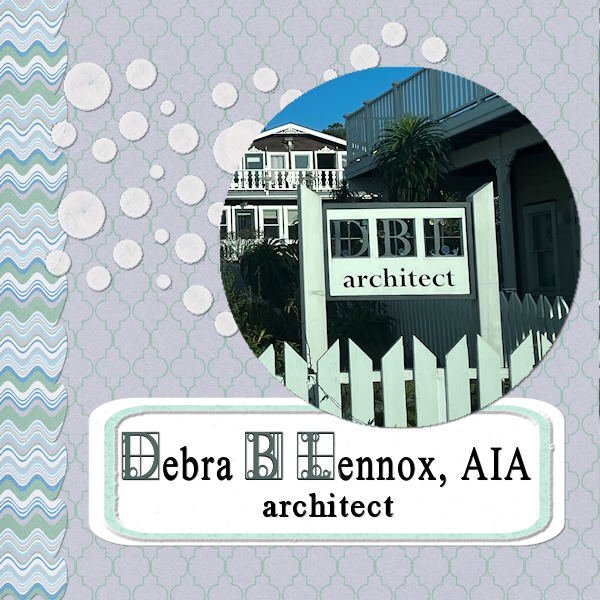
My daughter, the architect, has a new sign. I went out and found the font "walrod"
- 426 replies
-
- 21
-

-

-
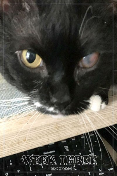
Week Three, and my little Tuxie girl, Eve, is dominating my thoughts. She has had what the vet eye specialist calls a corneal ulcer (or possible Feline Herpes Virus-1) since November. My daughter and I have had to drive her an hour away to the vet hospital in Brewster, NY twice now and another time next week. Keeping my fingers crossed that he will see healing when we go on the 23rd. He says she can see all right.
-
The following week after the snowstorm, we had torrential rains and flooding. (Luckily, not near my home.) This is a shot of the river at the Mid-Hudson Bridge near Poughkeepsie, NY., taken by Deedee Lumb on 1/10/24 and posted on our Hudson Valley in Pictures Gallery on Facebook. She said: "Come sit for a spell, enjoy the river views." 😉
- 115 replies
-
- 11
-

-
-
-
Mary, this is a delightful layout! The only thing I would change is to make the title all in caps. Perhaps using Mona Home from the Font Challenge would work, also.
-
My contribution to this challenge...😉
-
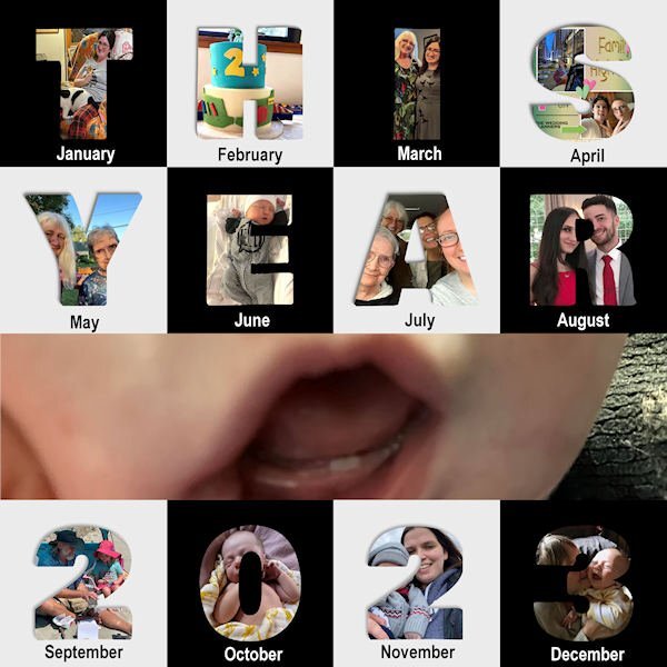
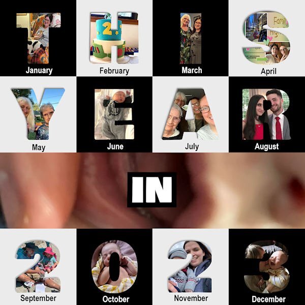
After a consultion with daughter Deb I have revised the photo Year in Review; changed the central strip photo and removed that text. It is of young Jonah''s first teeth.
-
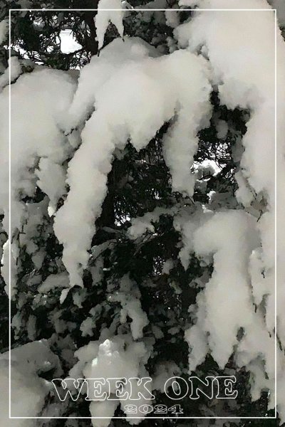
We had 12 inches of snow dumped on us over the weekend. This is an iPhone shot out my kitchen window of the close-by juniper.
- 115 replies
-
- 10
-
-
-
-
Time to get out the skates!
-
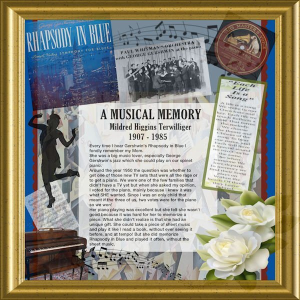
My mother made sure I had lots of music in my life. She played the piano beautifully. When I was a child, I was asked which I would prefer, a television or a piano, and with my mother in mind, I chose the piano. In her youth she was a ballroom dancing champion. She was raised in the Jazz Age and was a lover of the composer George Gershwin - his orchestrations and musicals. She took me to movie musicals every week since my dad worked nights and had to sleep. I took piano lessons for 7 years and couldn't get past the 2nd grade book. Mom read sheet music like a book and could play anything, at tempo, on first sight. I think I was intimidated. I did love music and every Saturday the Metropolitan Opera held forth from our radio. After I was married, I went to Adult Education classes and took up the guitar; came home and repeated the lesson for my husband. Mostly we played The Beatles. LOL Here's a tribute to my musical mother that I created during my first year here on the Campus.
-
My Year in Review - featuring family photos. The center strip is Jonah's new teeth!
- 145 replies
-
- 11
-
-
-
Wow! Thanks Anja - love the colors!!
-
Nice, Bonnie. I'm going to try my hand at this one, too.
-
You do beautiful work, Mary! Those Labs and your hard work really pay off!
-
Thank you, Corrie. We did get through all the Christmas celebrating so I feel lucky. I am fully vaxxed so that helped to make it a mild case.
-
I felt ill on Dec 27 and tested positive for Covid on the 28th. It has now been 10 days and I'm finally clear. I had mostly upper sinus involvement with a little coughing. No fever just felt sleepy all the time. Looking forward to the Q & A and the new template workshop. Hope everyone else feels better, too.
-
Very pleasant layout, Mary! All that Lab practice is doing a great job!
-
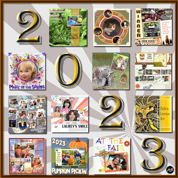
From the album: ANN SEEBER - MISCELLANEOUS
I went back to a former Year in Review layout and edited it for 2023. I picked out my favorite projects from each month of the year but, because the illustrations are confined to a square format, I didn't include our calendar project from November. The date is a font: Algerian, with a gold metallic gradient and an inner bevel. -
I went back to a former Year in Review layout and edited it for 2023. I picked out my favorite projects from each month of the year but, because the illustrations are confined to a square format, I didn't include our calendar project from November. The date is a font: Algerian with a gold metallic gradient and an inner bevel.
- 145 replies
-
- 13
-
-
-
G = Goat Yoga!
-
That would be in 2022? Your illustrated examples look different:
-
I'm in! Looking forward to something new. Thanks, Carole!