-
Posts
3,339 -
Joined
-
Last visited
-
Days Won
80
Content Type
Profiles
Gallery
Forums
Everything posted by Ann Seeber
-
Oh, good. Your arrow looks just like what I achieved, which eventually turned into my "arrowhead" ? I definitely need more practice and putting up guidelines is a great suggestion!
-
Now there's a good idea! I'll have to try your "breaking heart" Libera. I had a lot of trouble with the arrow, myself. As you can see, it ended up as an arrowhead??
-
- 714 replies
-
- 17
-
Corrie just reminded me; I should have posted my raccoons under this challenge. I started out trying to so a scraplift but it just didn't work out that way....
-
Wow, my Alexa tells me that 15m is 50 feet! Wow again!! Spectacular, Corrie, and that curly lines works well as does the font. Keep them coming!
-
Yeah, I printed one or two and never looked at them! ? I've now become pretty adept at having PSP and the PDF open at the same time. My monitor is 30" wide so that helps.
-
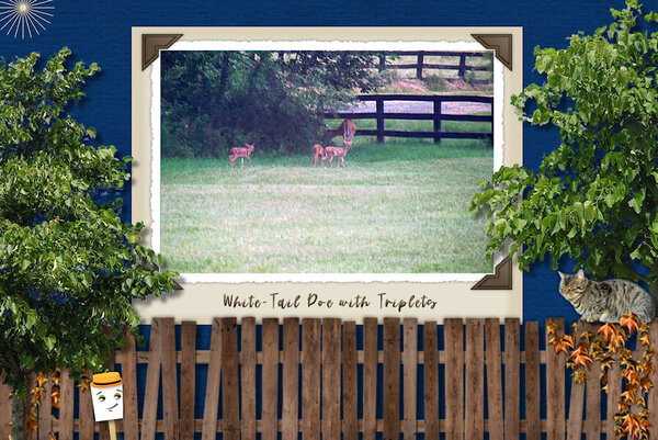
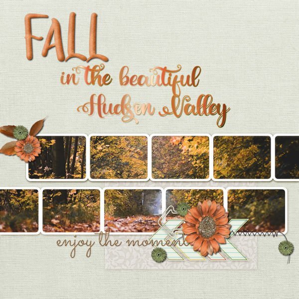
Here's my take on my animal visitors earlier in the week. The font (top and bottom) is Fredericka the Great that Carole sent earlier. The background photo was taken in Pine Island, near me; it's technically part of Warwick. The frame is from my stash, the camera is a watercolor from my Animal kit and the photo was conjured up by Adobe Express.
-
Q = Queso Dip - Here's a spicy Mexican queso dip that's easy to put together and melt on the grill outside. Yum! Ingredients 1 pound chorizo sausage 1 and 1/2 pounds (24 oz.) Velveeta cheese, cut into chunks 1 cup chopped fresh cilantro 2- 10 oz. cans Rotel tomatoes and green chiles (liquid included) 2 jalapeños, sliced
-
I went and downloaded it. Want to try out the background removing part but for now played with the AI generator which came up with a usable photo of an animal I saw outside my window yesterday but had no handy camera at the time. Score! ?
-
Cassel: I have a quick question about this workshop. Will we also be using photos ... or not?
-
Great takeoff on a Dr. Seuss rhyme. His jingles are addictive! This photo looks great in grayscale on your scraplift page. You seem to have a lot of fun, Bonnie! ?
-
Wow! Congratulations, Bonnie, well done!! ✊ Your scraplift is quite handsome with the black and white photos. I"ll have to go look and see which design you copied. I'm still trying to decide on one of them.
-
Actually, since Facebook will fill in the left and right sides with a complementary color, I find my square layouts don't always look the best. I'm going to transition to Michele's suggestion of 3000 wide x 2000 deep since Facebook doesn't fiddle with them in that format. It seems it insists on landscape format for the ratio. Not sure about iPad or moble because i rarely use them for design. When our company started putting out an emailed newsletter I discovered that over 80% of the subscribers were using their mobile to view our art so the platform we used would design for that format.
-
Oh my goodness, Susan! This is absolutely gorgeous!! I now want to play this game! Any chance you could post it full size in the Files section of our Facebook group? I really want to see all the text, nonsensical or not. Poor little K may be feeling left out... Maybe you'd better patent this before Hasbro grabs it!? I now have to experiment with that Lab. I'm awarding you the Winner Ribbon of Excellence! (art from TopPNG)
-
I scrolled up and had another look. I do see the gradient now but it is very subtle. Somewhere, there are lessons on making your own gradients. I like your design and visualize making the back petals darker than the front and adding something to the stamens in the center.
-
Nothing special; just that every time in the past I didn't know whether the top or bottom color was stroke or fill. I now see the top, on a preset shape, is the outline and the bottom is the fill, where you can see I experimented with color, gradients and patterns.
-
-
Are we supposed to stick to the Grilling Theme or can we just use the suggested layout with a totally different theme?
-
-
Just tried experimenting with the cass-preset shapes-vases. Actually figuring out how to set up the Materials Palette so I get what I want with a vector. It finally sank in that Vectors are really very similar to the Text Tool! Here are my 5 vase shapes:
-
I think I'd like to try a gradient or two.
-
Q = Quail - small bird, found wild or farmed. Great on a grill and featured in Texas. The ones pictured are sold mostly boneless because the birds are so small the bones are difficult to eat around.
-
-
-
K = Kielbasa & Sauerkraut (What my daughter grilled for the Fourth of July! ?)