Susan Ewart
-
Posts
4,252 -
Joined
-
Last visited
-
Days Won
141
Content Type
Profiles
Gallery
Forums
Everything posted by Susan Ewart
-
Not yet, hoping for Christmas. I understand I dont need the latest greatest models just the smaller one that doesnt have all the bells and whistles.
-
Holy wow, have your weekend, then come back and fix it. When do you get to rest and play and not cater to us? I'm pretty sure there is a rule about not editing code on a Saturday or Sunday. You dont want to anger the techy Gods.
-
Oh Jannette, I am not very techy and I downloaded it 4-5 months ago. I cant remember if I had to install it or if it just happened. The weird thing, is in my Set Up Files for 2023 I dont have Particle Shop.exe but I do in my 2022 Set up Files. I wonder if when i downloaded 2023 I told it to keep the files from the last 3 PSP's I had. I'm really sorry I am zero help in things like this. In fact once I download, I'm never sure where anything is and if I need to do anything else to make the extra's work. I wish there was more clear direction on this. I went several years without installing the extras because I presummed it was automatic. shouldnt it be? They are giving it to me and there should be a checklist on the download page asking what I want to download, I shouldnt have to go hunting for it. If Ann is reading this, she will know as she just downloaded 2023 (ultimate I'm talking about for me and for) recently. And she has more a grasp on these things than I do. Ann, please help us.
-
WOW! this is a stunner! it looks like the fur brush, is it? You look like you've been doing it for years. Do you think a tablet would be better to use?
-
Mine works too and i found the extra pack when PS opened it had a pop up for brushes you could buy (where I had to register too) and at the bottom was the free pack. this could be a fun tool to play with. but I sure need A LOT of tutorials or practice. controlling that brush is like riding a bucking bronco.

-
I can wait too. I have a long to-do list this weekend so I wont be needed access. I am happy the forums are still active...you know I love to chat.
-
I just downloaded a PDF on clarity, texture and dehaze so I can report back once I actually know something (cause I dont usually know much about anything these days - sucks getting old). All of those are "contrast" tools that targets different areas (eg, highlights, midtones, shadows etc).
-
I guess I was generalizing it compared with doing it the long way. turns out maybe editing in a editing program isnt longer after all. I did use the haze tool and the sliders. It is nice and I'm sure I'll use it. I will try and see what it does to that one shot I got with the sun getting past the lens hood. I'm waiting for the day when I can just "think" what I want and PSP can do it. but then we'd have to be physically wired in. That might short out my tin-foil hat. I dont mean to sound ungrateful about the tool, I'm not at all, I'm stoked to get all the help and options I can get. Just wanted people to know it can be done without the tool in case they arent going to upgrade to 2023.
-
Baby anything is so fun to watch. well, actually "anything nature" is fun to watch. (except wildfires). Do you live on an acreage? I miss living out of town, so much more quiet and dark on the farms I lived on in the past.
-
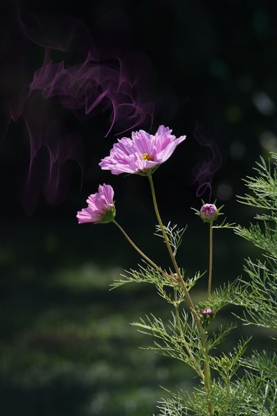
I was talking to Elvis the other (YIKES! Right?) and telling him all about The Scrapbook Campus, PSP and the Forums. And you know what he said to me...."A little less conversation, a little more Action". Kidding aside, here is my latest lab. I dont like the purple color in the tags and might go back and redo it at some point and add some brown or stick with green, in the layout. Lab 7-1 Concentric Rectangles Filled Text Photo Mosaic Even if I'm not happy with my layout design I loved this lab. It's quick and easy to do. I had to use the shift key and make straight(ish) rectangles because drawing with a mouse creates a very achy hand and it's just plain hard. I was a skeptic, but once you use the tile to flood fill your page it looks pretty darned good. Everything is mine except: Fonts: Annie Use your Telescope (google I'm sure), Raftera (Creative Fabrica) Screwheads: Creation Cassel (cass-screwheads freebie) Pink Flower, White Flower: corel picture tube I even made two Vector tags (made previously, but after the workshop) and the Vector flower. Contrary to popular belief, and because I said I did this; no flower heads were cut off in the making of these photos. They are in their natural element (if being in a Pot is "natural"). I hired a lighting designer for this shoot, she came highly recommended by the neighbourhood crows...her name: Mother Nature. The Fine Print: This post has been "Elivs" approved (I think I've had too much sun)
-
this is lovely and I'm about to post after not seeing this forum. you will laugh. We have the same title. I forgot to click follow and wondered why no one was posting in the What are you Working On forum.
-
I love your backyard too. I just wish it was MY backyard. So lucky you are.
-
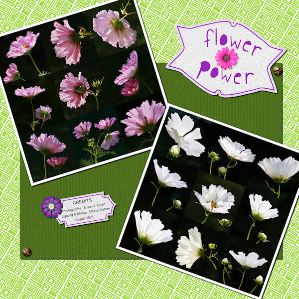 Lab 7-1 Concentric Rectangles Filled Text Photo Mosaic
 -
Me too.
-
When I was watching an ON1 (Raw Editor) tutorial they actually showed how to recover hazy photos, it's not a big secret, but having a one stop button sure makes the workflow faster. And Particle Shop, it's so cool and another thing I need to add to the long list of learning.
-
Very cool. I did try it one a photo (not hazy but looked cool). I do have a shot that I was looking towards the sun and the lens hood let some stray light by...(not to worry, I gave that lens hood a good talking to) so I will try it on that. I also reshot the photo after checking the preview. It will allow us to use more of our photos we thought we'd have to throw out.
-
 Thank you. I'm going to copy this and start formulating a plan......code for: one day I'll get it done. Kidding. I cant keep going like this, the thought of wading through 1000's of fonts to find the right one for my project makes me stick to Arial and Gill Sans Ultra Bold for everything.?
 -
AWESOME! thank you. This is what I need. I have always downloaded the preview too. This year I want to organize all the supplies because my current system isnt working for me. I love to hear how everyone else does it, it gives me ideas and motivates me. I like the idea of catagories, it seemed like I'd end up with a lot of them, but maybe that's what i need. I really only know the basics (serif, non serif, display etc) even though I read the font guide from CF. I didnt know that the licence doesnt stay with you, bummer. Seems like a little bit of false or hidden advertising there. And seriously, who is copying who, have you looked at their fonts (all the same yet diff. designers and then same as ones I see at other font places). You are right, it would be hard to enforce, in fact it would take a team working 24 hrs a day to search for infringement. If I ever did anything for profit I would be buying a licence for the font. This is my hobby, I dont want it to be "work".
-
Aaaah, I get you now. I hope your surgery clears your brain fog. I have not excuse for my brain fog..clearly I am in one. I hope all the new stuff came in with the patch too. I seem to be in a mental lull at the moment and looking to see if I have everything seems like a daunting task. Must be the dog-days of summer. Do you have your surgery date yet? (sorry, is that too personal - apologies if it is).
-
View>Customize>Commands>View> scroll down and find "Snap to Object" and Grid, Guide Object Snap Properities I just clicked and hold and move it up to View which will drop down and then I placed it where the other grid stuff was. trouble is I then had two different properties. When I didnt use my saved workspace I see that the missing stuff was in place. If you use the Repeat Comand then it's under View>Customize>Commands>Edit> scroll to repeat (it's near the top) and click/hold and move to where you like it. I have mine next to the lock transparency icon at the top of the Layers palette. The bound scripts I found either under View>Customize>Scripts> it shows the bound ones, grab them and put them where you like. another place I found them was View>Customize>Commands>Bound Scripts> way at the bottom. I'm not sure which is the right place to get them from, it worked whatever I did. (This is presumming you had bound scripts - if you didnt then you have to bind them and this paragraph can be ignored (except you read it, to find out you didnt need to read it). Since you use the JPG/PNG optimizer you know where that is. I'm hoping when I do my re-install on the new 'puter that all this will straighten out. I am sure I did something wrong on my original install. since something happened and I had to uninstall and then reinstall.
-
Does PSP 23 give you a list of the 50 additional fonts they are including?
Susan Ewart replied to Suzy's topic in PSP stuff
I agree! For some reason "I" moved them to another location. You all know that location you put something so you never forget where it is.....well, I always forget where it is. Yeesh. I am my own worst enemy. -
Wow, you all know so much about fonts. I do use a font viewer (font base) and chose the paid option so I could just click on the glyph and it copies to the clipboard. I do turn it off when I'm not using it as it can slow down the system (it came with a bunch of google fonts and I had a bunch - too embarrassed to say how many), my system is faster now and when I forget to turn it off I dont even notice the difference. What I'm doing now (to gain control over the masses of fonts) is clicking on the favorite icon (in my viewer) so I know which fonts I use and like. Suzy you have a really good understanding and knowledge of fonts/font families. I want to catagorize mine as well but it seems like a daunting task. Still, I keep collecting them. I do have them stored on my HD in case I decide not to continue with a font viewer. I like the font viewer I use because the glyphs are bigger and easier to see than other viewers I looked at. I do wonder about what happens if the company folds. I have heard terrible things of people having their photos on clouds that folded and they lost everything. Perhaps doesnt happen as much anymore, but in the past. Like Suzy, I like to have control of my assets (pictures, fonts, supplies etc).
-
I found my fonts...in a random folder not called Set Up. I think I might be the culprit...I usually am. Wish I was more techy. But at least I found them. I'll have the fonts too. I too have the zip folder and unzipped it but probably forgot to install them. Duh!
-
Objects, snap to object, and properties for those (it has all three listed ). I had to get the bound scripts to their locations (open a layer-rename. open a copy, repeat). I did not have to rebind them, just get them and move them in place.
-
Does PSP 23 give you a list of the 50 additional fonts they are including?
Susan Ewart replied to Suzy's topic in PSP stuff
And thankfully you are. Or we wouldnt know we are missing things we paid for. Or rather in my case, I'd know I did something wrong on the install.