Susan Ewart
-
Posts
4,589 -
Joined
-
Last visited
-
Days Won
170
Content Type
Profiles
Gallery
Forums
Everything posted by Susan Ewart
-
Love the top tree, it's got an alien face, actually the middle one does too.
-
This is interesting, what to keep and what to throw out.
-
I haven't been to anything like this. I do know of them, they have them in Edmonton. I would love to go in person. I really liked the music in the video you shared.
-
I think it's just right. Love the color! And what you did with the gradient is really neat. I would not have thought of that, it sure put the focus on the girls.
-
I love the drawings, hand done ones, they are like art to me. My friend and I used to draw houseplans when we were 12-13 yrs old. I can imagine how bad they must've been. One course in drafting(in high school) told me, I couldnt visualize the 3D space. We had exercises where we had to draw the exploded 2D view of a cube with indents in the cube, or we have to draw the 3D version from the exploded drawing. I couldnt do it. I wished I'd paid more attention and wasnt so shy that I never asked for help. I never really was taught how to "see" it both in 2D and 3D.
-
I do love "naked" tree silhouettes. In "Tree Architecture" is that moon I see peaking through the tree on the left. AWESOME!
-
I think your magazine needs become a hardcover coffee table book. What beautiful photos and the architecture is like large permanent art installations. My hubby's parents were from Denmark.
-
I did a drafting elective in high school and penmanship was one of the things we had to learn. I love architecture. But I sure bombed at drafting. My Calligraphy teacher has the most amazing handwriting and printing. Calligraphy is considered drawing letter and not writing, that's probably why I was so bad at it, that and I was a heavy handed lefty.
-
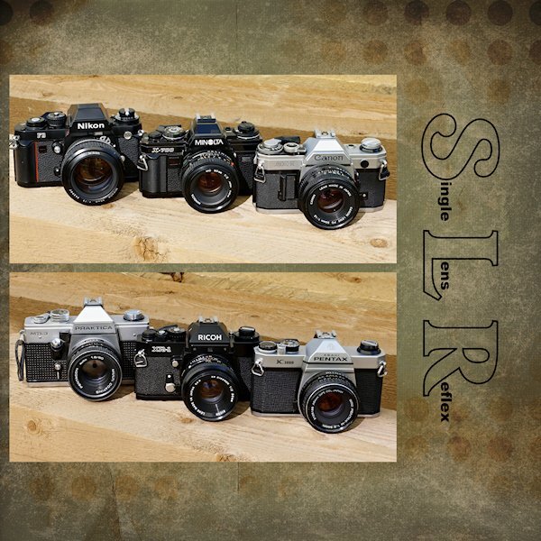
Me too! Some came from my Grandfather and some I've collected. I was shocked to see the vintage (yikes, that's my era) SLR's are gaining in value. I used be able to get 70's or 80's SLRs at thrift stores for less than $15, now some are in the hundreds.
-
Day 7 Working more with blend modes with the same background paper. I might see if I can use that paper throughout. In the coming week(s). Work is still needed on this one (and most of the rest) but I wanted to get it up tonight. Tomorrow, back to my scripting homework and work on these layouts in between. Thank you for a wonderful workshop. I learned a lot about manipulating masks and really liked Day 7 mask technique.

- 374 replies
-
- 11
-

-

-
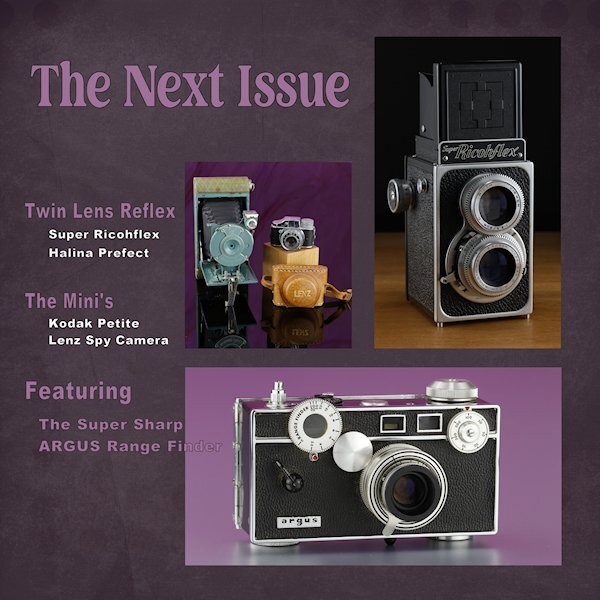
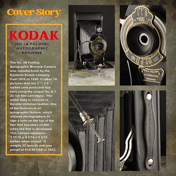
Day 6 Thank you to Sue and Rene for giving me some ideas using the blending modes. I used a white layer above the paper layer (Brook Gazarek, DigitalScrapbook.com) and used a blend mode (I forget right now, sorry) and then reduced the opacity a bit so I could control how much of the layer below showed through. The red kodak word is a bit overpowering (as Red tends to do) but is the color kodak uses - perhaps I should have desaturated it a bit. The yellow frame is the other Kodak color. On to Day 7. I think it will be one page though. I didnt photograph enough cameras and the night is coming to a close. For practice, I did do the lesson where we made it one mask. here I used all 4 as it was better suited for this layout. I'll try and get these posted on FB in the next week as I finish them all. I see blurry Kodak and Cover Story, but they are arent blurry in the full sized image.
- 374 replies
-
- 12
-
-
-
it has been such a pleasure to see your art. Your layouts are so consistant and the project as a whole is beautiful and cohesive.
-
WOW! Ann, this is really beautiful. What a diverse artist Debra is. And an architect, she must have beautiful penmanship as well.
-
That's why I want to get back to it too. But it's too laggy if I have more than one large photo open and my project open. Soon I hope to be using it again.
-
these are really good ideas for me to try. going to copy/paste these posts so I dont forget.
-
I was flipping back and forth and they do stand out more. I do need more contrast in the background and the mask layers. I will try all the suggestions I'm getting...probably next week if I get all the workshop days done and caught up on the scripting. I'm quite behind now.
-
Thank you. I'm not sure why it didnt even occur to me. I was playing with opacity with the gradients that I tried (with white below or black below) but always seem to forget about the blend modes. I will play a bit with them...probably after the workshop since I'm a bit behind.
-
Excellent idea. Thank you.
-
My first camera was a Ricoh KR10, that my brother gave me for Christmas (That's his Nikon F3 in the photo - he just gave that to me for my collection this year), but what I really learned on was the Pentax K1000 in high school. In fact that camera was in many high school photography classes. It's a real workhorse and all manual, no Auto or Program modes. I got that one this year as I had wanted one for my collection for a long time. I'm thrilled to hear your dad had one and that you (and hubby) used it for many years. I sold my Ricoh years ago and am now trying to find one for sentimental reasons. The Minolta, Canon and Ricoh (KR5) came from my sister-in-law (married to the same brother who gave me the Nikon F3) as they cleaned out all their old photo gear and only use their phones. My sister-in-law was a manager at a camera store for years. I had a number of other SLR's over the years (I worked in a Camera Store for 7 yrs as a photofinisher) but you always remember your first (first owned, first learn on).
-
Day 5 This is the one I tried a gradient (it's a light one) with a Effects>Texture Effects>Texture it's a bit bland, okay, A LOT bland. I tried dark ones too, but the photos were too glaring. Looking at the two of them, the darker version is better so i think I will explore a darker background version. Thanks for the help, more sets of eyes are better
-
Thank you Carole. I did play with backgrounds on my day 5. I think I tried every gradient I have and I textured them and left them untextured. I ended up with a background paper. I also played with red color in the small type of the logo as well (Red) but in the end the black seemed better. Would have like a letter with an O or if there was S, L and R in the lower case I could have just did those letters for a little surprise pop. anyway, I used a paper for Brooke Gazerak for this one...for now.
- 374 replies
-
- 11
-
-
-
These are so beautiful. I love the watercolor one.
-
Look at that beautiful blue sky. Did you get a look at the moon tonight! Wowzers, it's half a moon, and tipped over a bit...must be drunk.
-
I also shot mainly slides, the color is what the color is. With print, as a printer it was my interpretation of what the negative should produce. I rarely shot film once I got into photofinishing because it was cheap for me to buy slide film. although we had to sent it to our head office in Ontario. bummer, I would have loved to learned that aspect.