

Susan Ewart
-
Posts
3,884 -
Joined
-
Last visited
-
Days Won
119
Content Type
Profiles
Gallery
Forums
Posts posted by Susan Ewart
-
-
4 hours ago, Bonnie Ballentine said:
Hello, Everyone! Amazing work here. Carole must be very proud. I have been pretty quiet...my caretaking duties are increasing. I have completed my calendar and hope to have time tomorrow to resize and post. Have a great evening!
I hope your caretaking isnt too onerous and you remember to take time for yourself to re-charge. We will all be here when you have the time.
-
 3
3
-
-
5 hours ago, Gerry Landreth said:
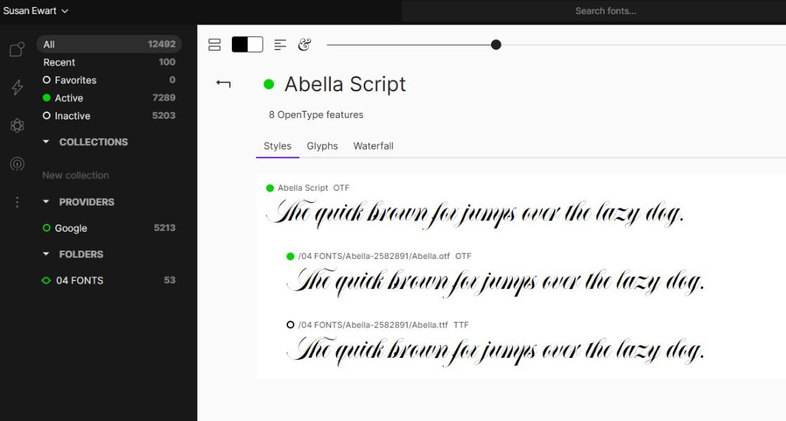
I use Fontbase. There is a free version which is fully functional. The paid version is $39 a year, which is what I use. It has features that let me sync fonts between my two laptops. The viewer does a good job of giving access to the glyphs.
I use this one too. And you can make your font folder (in Explorer) be a "watched" folder so it updates when you add new fonts to the folder.
-
1
-
-
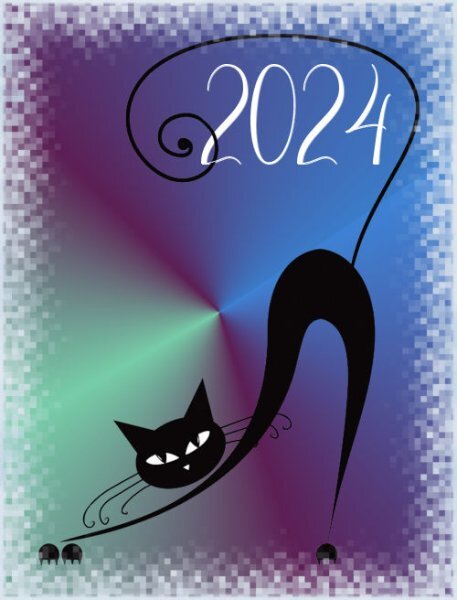
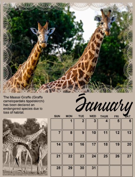
9 hours ago, Shirley said:
Calendar 2024.Cover Theme "Its a cats tale" Thanks Carole, I enjoyed this and picked up good tips. Maybe I will be first to post the cover, as we in NZ get to see the new day first.

Oh wow, this is FABULOUS! I love the graphic.
-
3
-
-
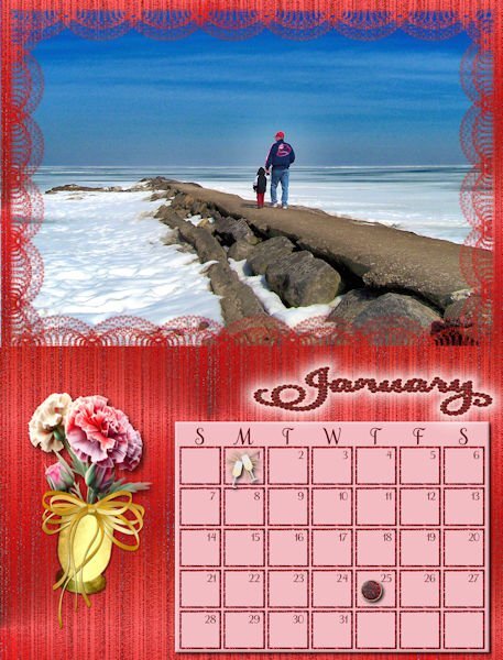
3 hours ago, Sue Thomas said:
Thanks, I didn't ever consider trying that. I'll make a note and try it the next time I need to post more than one image.
sometimes I just post twice so I can use the max size. One thing is weird. When i resize in PSP then 'save as' and make it 450-ish or 250 ish for two uploads it is actually smaller when I upload them. I had three yesterday that were well over 500KB total but I was able to add the third one and the sizes it said didnt total to 500KB. I took off the third anyway and posted separately.
-
1 hour ago, Donna Sillia said:
So far, I have created January thru June. The font is Samantha Upright from Creative Fabrica. I use the Vectorstroke script to add the birthstone for each month. The flowers for Jan and Feb are from Creative Fabrica and for March my own photo and bow. I used layer styles to highlight the month. The background is my own which I call glitter streaks. I redid the months using the cass custom calendar script which was just updated. Thank you Carole. All the calendar photos are my own or from family. Jan is a picture of Lake Erie in winter, the second is from my grandson on his way to snowboarding and the third is my picture of Detroit taken from across the river.
I love your use of color. what a good idea to use birthstones and the Vector Stroke. Wait till you get to November, it's a deco-looking frame, do you think?
-
2
-
 1
1
-
-
3 hours ago, Mary Solaas said:
Susan - I am with you! Love you to pieces!
The feeling is very likewise. My heart is singing right, and glass is breaking!
-
 1
1
-
-
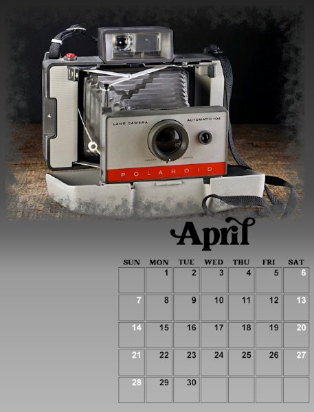
2 hours ago, Cristina said:
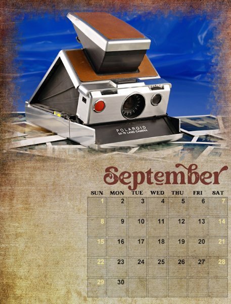
Susan, I like your calendars very much, showcasing all the different models of cameras... They have changed over the years, haven't they? 🙂 Do you collect them?
I agree; the blue background is not everybody's cup of tea. 😊
Not that I am a Fontaholic 😬, but could you disclose the font's name? 😇
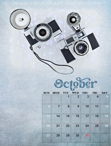
Thank you so much Cristina. That means a lot to me, Carole, you and most everyone else in the Campus are my mentors with PSP. It is amazing the changes in cameras. I do collect them. Mostly because I received my parents old cameras and then my grandfathers. It appears he did a lot of photography in his younger days. I started with photography in high school and it was a hobby for many years. Then I put it down while doing glass work (fusing and lampworking) and silversmithing. That actually led me to pick it up again to photograph what I was doing. I found I like doing it more than the current arts I was doing. I love the really old cameras, they are beautiful. And ones from the 80-90's from when I first started. Wish I had kept my first ones. I'm reshooting that awful September month. the Polaroid SX70 isn't my favorite so it's no surprise the photo didn't turn out.
Well, clearly I am a Fontaholic and I will tell you the font name is hopes to convert you 😋. It is called Creative Vintage which I believe is from Creative Fabrica. It has regular version and a draft version which is the one I choose for the end bit. I lowered the opacity on the months(along with changing the backgrounds) to make it older looking. I'll be adding the changed ones once I get them all done with the text I want to add, holidays etc.
-
1
-
1
-
-
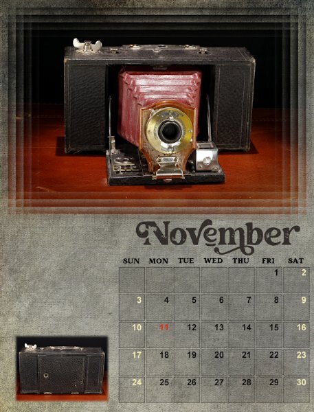
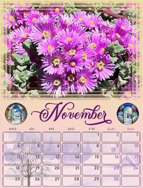
Lesson 6 November
I like the feathering technique in this lesson. I added a small photo of the camera closed. It looks rather like a brick, hard to imagine that this is a camera. I will be adding text above it, to fill in the space. Oh boy, not being able to right click and move the selection is a real bummer. I'm just not that precise and I rely on that. I hope that gets sorted out soon. November's template is really nice.

-
1
-
3
-
-
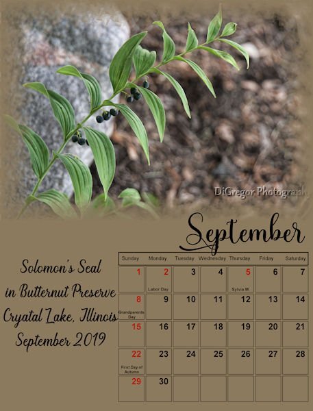
lesson 5 - September & October
I darkened the boxes on these two. I like the effect and will go back and do that to the other ones too. I will be reshooting the September camera. What was I thinking with that background..YIkes, it's seriously ugly! I did try changing the date boxes grid lines and then decided to keep it all black.
-
 1
1
-
6
-
-
1 hour ago, Corrie Kinkel said:
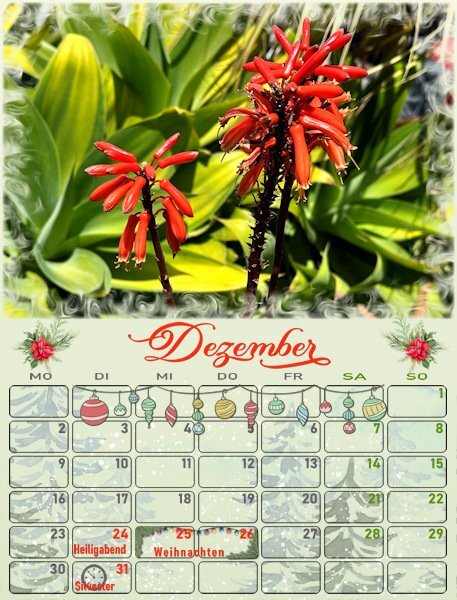
Here are my finished pages for November and December. I intended to use the same technique of "find all edges" on a duplicate of the photo, but I found that it works great on some photos and their pages but not on all! I want to be consistent so I skipped that idea and did something else instead. I search through my stock for images relating to the particular month or season and put that image under the boxes. Of course I have to use a blendmode to give the desired result and the blendmodes are different for each page depending on the colors of the image and the gradient on the page. For December I maybe overdid it with all the decorations but it is the month you can go over the top! Now again I have to alter my other pages as well, luckily I hadn't done them all yet! After that I have to alter some of the pages from German to Dutch and not all the extra holidays are the same. But that will be peanuts. Only the German calendar has to go in the international mail, the rest stays here and I bring those with me when we meet the intended recipient.
You can never go over the top with December! Beautiful layouts. I like that technique of images in the date boxes. It's a nice touch.
-
1
-
1
-
-
Oh, is it a blend mode? That's the only spot I see luminance. I'm getting mixed up with PSP and ON1 who does use filters and also has blend modes (same ones as PS) so I was looking for something that says Filters. Incidentally, PS also has 'filters' as a drop down menu and I watch a lot of PS tutorials, so I think filters in that term. I'm going in circles with all these programs using different names for the same thing. ON1 calls "merge visible to a new layer" a "stamped layer". I prefer PSP's name. Stamped layer doesn't rely imply "merged" in any way to me.
-
1 hour ago, Ann Seeber said:
It's the one feature of PSP2023 that I really appreciate. I can just scroll through the filters and see the effects quickly. Similar to scrolling through the fonts.
I'll look for it and give it a try
-
5 hours ago, Michele said:
On the subject of fonts, which font managers does everyone use? I desperately need one. I currently add the different categories to the zip filenames. It's a terrible method as it simply brings up the zip files which don't show the fonts. I'm sure (?) I would download fewer fonts if I could organize them better.
I use Font Base. I use the paid version (I think it's about $50 a year) so that I can get the glyphs like you see on the 3rd picture, you just click the one you like and it's copied to the clipboard and you got back to PSP text layer, highlight the letter and right click and paste. Google fonts came with it, I think you can go to google and download a ton more of their fonts too. I usually have them turned off. In fact you can turn them all off and just click on the ones you want active. I always turn the viewer off when I'm not using it (it's always on the bottom task bar on windows using a short cut icon). You need to remember to turn it on when you are using PSP or you get a pop up saying the font isn't available. Actually, I forget to turn it off a lot and I haven't noticed a decline in speed or lags in my computers performance. There is more features I'm sure and a different view that shows more fonts at a time but I seem to forget how to get that view again. There is some tutorials on utube about font base if you want to see it in action. I do believe they have a free version too, but you don't get the ease of using the glyphs like in the paid version.
-
3
-
-
7 hours ago, Ann Seeber said:
I'm testing out how to fill the extra space. I do have some related photos, and in this case, I applied the Luminance layer filter and I like the monochrome effect.
That luminance filter layer is cool. I never even noticed there was one.
-
8 hours ago, Cristina said:
Susan, I am enjoying very much seeing your calendar with the different cameras... And I agree, a vintage or grungy background would fit perfectly.
Thank you Cristina. I found some grungy backgrounds I'm working with, hope they are too grungy. Yours along with everyone else, has such beautiful cohesive calendars. They are doing really interesting changes to them that I would never have thought of. I'm getting lots of ideas and inspiration.
-
1
-
-
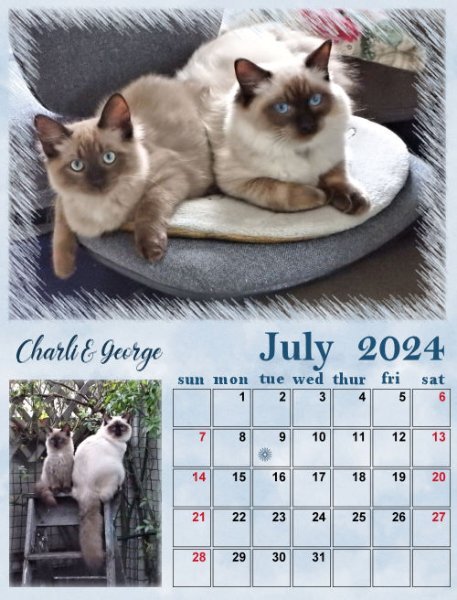
7 hours ago, Shirley said:
Calendar 2024 My boys July and August
They are so beautiful. Are they ragdolls?
-
1
-
-
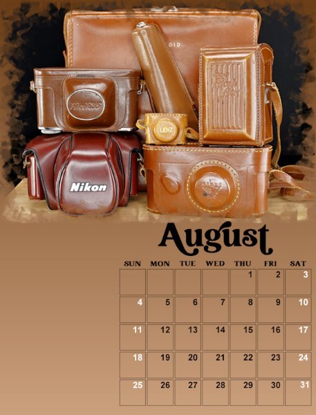
Lesson 4 - July & August
Not exactly a vintage camera in these shots but accessories to the cameras are important too. Okay, maybe not cases. Who uses them? I remember starting out and always used the case (on the SLR) and it would flop around and get in the way when I was taking pictures. They don't even give you those types of cases anymore, heck Canon doesnt even give you lens hoods unless you buy the "L" series lenses - after you mortgage your house to buy them that is!. The big case in the back is a polaroid 800 Land camera I forgot had. I might photograph it and switch it out with the other Land camera in month 4. I'm on a roll and having fun. Just got a text to head to work 2 hours earlier so my fun is over. Never enough time for PSP.
Carole, as my teacher can you write me a note saying "Susan can't work today, she has important assignments to finish.
Oh, and a question: In PSP 2022 if I open the calendar template and activate the Month vector it showed the size in points (32 points), and when I changed it to pixels is showed the correct pixel of 133. But, when I use PSP 2023 (which is what I'm using for the workshop) and activate the month vector is shows its in pixels and yet still says 32. Clearly it's not that size. Is it supposed to know and show the size in pixels once you double click on object ("T") layer inside the vector layer?
-
2
-
5
-
-
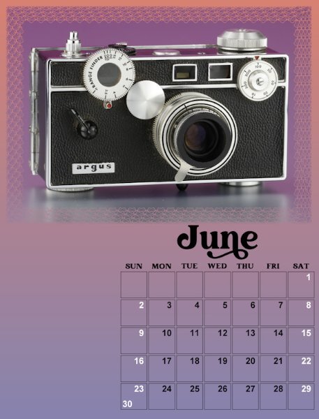
Lesson 3 - May & June
I really like these templates (I mean all the ones so far).
-
3
-
7
-
-
Lesson 2 - March & April
I am not keeping the backgrounds, they are stand-ins until I decide on a background I like. Since it's Vintage cameras I'll look for vintage or grunge type backgrounds. Hope it comes to me. I centered the months on the date boxes and add days-of-the-week along to the top. NOTE: yes, I see I posted the wrong March month before I centered the months. Oops. I'm leaving the boxes and will decide at the end if I changed them. I might add text beside for information about the cameras in the photo. And I might move the photos around to different months. I did change the size of the first letter in the Month like Carole showed in one of the videos (I've gone back and got the early months caught up)
So many good ideas from everyone. I will be trying them out along the way. I especially liked moving the Month and adding days-of-the-week. Thank you all who did that.
-
2
-
6
-
-
1 hour ago, Lynda DiGregor said:
Fonts used are Yoshieka, Greater Amberjack and Arial.
I love your choice of background. I'm still deciding on backgrounds.
-
1
-
-
1 hour ago, Sue Thomas said:
Cor Blimey! I'm aghast at the number of fonts some of you have. I genuinely feel we need to set up a Fontaholic support group, where we can help you to refrain from clicking that font download button. I see now that Michele isn't an isolated case. I see this is a real problem for some and it needs to be addressed immediately. I'm with Rene on this one. If I see a font which really catches my eye, I firstly double check to see if I have something which is almost identical, if I have, I leave it well alone. I have my favourites, which I use repeatedly in my pages. I think my disposition may have something to do with it, as I don't like, clutter, whether it's in the kitchen, in the office, or on my laptop. I think I may have over dramatized a bit, but I couldn't resist. 🙂
Heeeelp me....I need a 12 step program. Too much choice means not being able to choose at all, I know it's an issue. In some areas of my life I am analy over over organized and some, I'm a bloody mess. Your post gave me a good laugh at myself.
-
4
-
-
1 hour ago, MoniqueN. said:
Installed 1115, according to Nexusfont, so I'm just a beginner compared to you 🙂 😄I have a lot more, but not everything installed.
It's really too much to have, but I keep adding more. I am hopelessly addicted. I keep thinking I'll compare similar ones and pick the best and narrow it all done to 1000 or less....but I never do it.
-
1
-
-
1 hour ago, Jannette Nieuwboer said:
I will be the looser of the club. 😁, I like fonts too (who does not do) but they must have something special for me.
I need to be more like you.
-
1
-
-
5 hours ago, Michele said:
We need to start a meeting of Fontaholics Anonymous.
I currently have 12,492! Do I qualify for FA? (full disclosure - 5213 came from Google fonts that was on the font program I use)
-
4
-


Calendar Workshop 2024
in Showroom
Posted
Here is my revised September and my remaining month; December. The original photo I was going to use was too wide so this one became the stand in for December. the 3rd photo is the one I couldn't fit. I had wanted a festive vintage movie camera shot for December. I was painting with light. 20-25 second exposures in pitch black and using a very small flashlight to highlight areas. Best with no background but this was on my wall unit so I left it as it and my flashlight is that horrible blue color, but it was fun to to experiment with the technique. I made 4 shots, and used lighten blend mode in the layers.
Tomorrow I'll get to the cover. I still have lots to go back and polish in the previous months and text to add and research to do about the camera. (I collect them cause they look cool, not because I want to know about them. Now, I'm getting more interested in getting some knowledge about them....yup, a sign I'm getting old 😔) .