Susan Ewart
-
Posts
4,589 -
Joined
-
Last visited
-
Days Won
170
Content Type
Profiles
Gallery
Forums
Everything posted by Susan Ewart
-
Ann, this is beautiful. I always think of Christmas when i think of Currier and Ives.
-
This is STUNNING Corrie!
-
Second row from the bottom, 4th from the left. Cant wait to have bragging rights, I know I nailed it this time!
-
You'd make a great Canadian (sorry).
-
heading to FB now, thanks. Enjoy the summer....we'll enjoy the fruits of your labour soon enough.
-
I've never seen doves or dove babies. My hubby and I was talking about having never seen Pigeon babies either, even though I seem to get a yard full of them.
-
Red Dress in the front. Love the layout!
-
yes, Michele....enquiring minds want to know.
-
This is great, I love the contrast of the black and white. I gives the feeling of long ago. You are tall, how lucky !
-
Yes, wasn't there a question somewhere what our fav. tool was? I answered something else. But, really it should be Blend Modes. I know, not technically a tool, but so useful.
-
More like, crazy out of control....if that's what "down pat" means. 😄
-
For me either (on a laptop)
-
That was the prime sale or maybe just a reg. sale. I'm not a prime member. It's around the price of LEE 216 diffusion paper I want for my photo studio, and weirdly, it will also last as long as Carole's bamboo. And I'll get more use out of it. One thing I'd love in a kindle is being able to read at night, while hubby is sleeping beside me yet not have to have a light one. I got to say, that might be worth the price right there.
-
Thank you Ann, for this description. I had no idea they were that useful. Perhaps a re-think on the kindle, down the road after the mortgage gets renewed. I've also never owned an ipad. I hardly use my cell phone so I figure I'd hardly use these types of things. Perhaps I've been missing out. Still, for the money, there is other stuff I'd use more (photo equipment).
-
Wish I could buy one, but it's still a bit pricey for me ($174 CAD ), it's mortgage renewal year...rates have tripled since the last renewal 5 yrs ago.
-
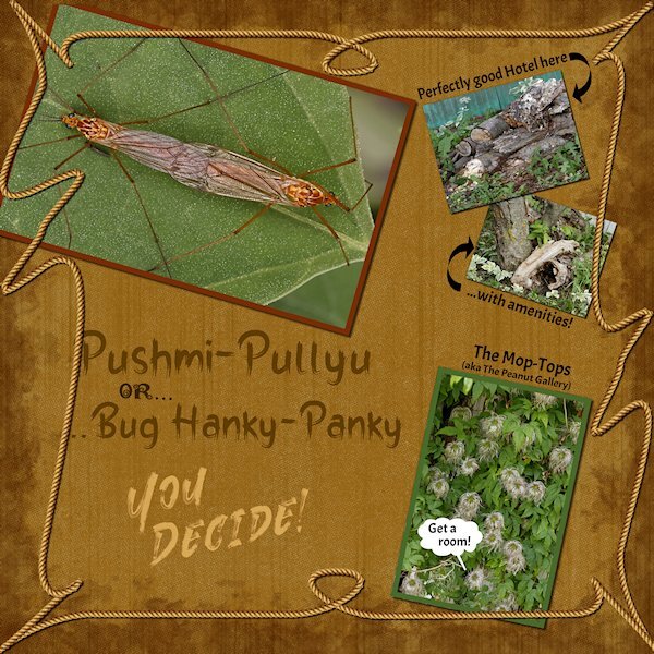
Lab 7-2 Loopy Frame Scratched paper Grunge Edge 2 More practice with Vectors on the Loopy Frame. The Scratched Paper was really enjoyable. It was hard to get a nice Grunge Edge so I kept making layers and then changing the opacities of the layers and then used a blend mode and ended up happier with it than i expected. I used the Vector Tube script and added a rope to the loopy frame. And I used preset shapes;the Callout bubble and an arrow, which I used twice. The photo isn't great as was an overcast and windy day and i was weeding the garden and saw this funny business going on and grabbed my camera. Not sure why they did use the the hotel, it's open all year! I'llpost the bigger version on FB.

- 151 replies
-
- 10
-

-

-

-
Great news Corrie!
-
I also used to be a avid reader and I prefer a printed physical book. I like holding a book and turning the pages. And i like being able to see the whole page at once. Not like digital where I have to scroll up and down, and if I want to see a whole page at once I have to make it too small to read. I can get relaxed in any position with a book and take it anywhere with me. whereas the only thing I have to read a book digitally is my desktop. I find because the screen is big I lose my place on the line and it's quite bright to lengthy reading.
-
I am working on a layout....but more importantly I'm working on my Amazon order. ETA July 20th!
-
What?...no prizes. Don't we all get a gold star just for showing up?
-
that's fascinating Ann. And really inspiring.
-
Possibly the late '70's or early 80's. This is a really nice layout.
-
I am also quite captivated by this photo. You can see so much detail in the part below the bloom. It's so interesting.
-
What a beautiful color!
-
I have done that, even to the point of separate letters, move them into place (rasterize of course), then do something different to each and merge visible when we want to use the magic want to select the top or bottom portions to make into a mask. So many options. it's true they fast to make, but take a looooong time to do because of the some many options and the kerning to get it where and how you like, which is just as you mentioned. You often have take out a letter, put it on it's own Vector, and then since you did that, it's back to the kerning again. Still it's fabulous technique that non graphics people say WOW!