Susan Ewart
-
Posts
4,270 -
Joined
-
Last visited
-
Days Won
144
Content Type
Profiles
Gallery
Forums
Everything posted by Susan Ewart
-
Oh thank you, I reposted in May and deleted from April. I even wrote that down that 14-17 was in April and 18 was in May because I thought I'd forget. The weird issue distracted me I think.
-
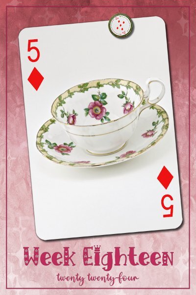
Week 18...caught up enough to get behind again. 😁 Background paper by RachelLm-seth paper15 (Digitalscrapbook.com). Fonts Emil Love (Wk18) and Emely Love (creative fabrica) and reposted here after posting in April by mistake (even after making a note that it should be in May).

-
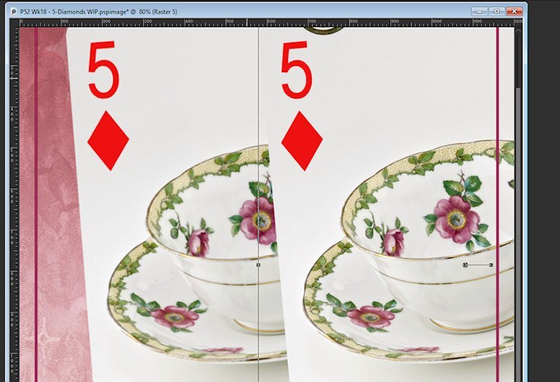
Can you help me. I must be doing something wrong. I noticed this in 3 of my layouts as I was about to save it that the card and magnet seemed blurry/out of focus. I had to actually copy/paste them in again. Here is a couple comparisons. when I make my layouts. I have the blank template with the frame and text. from there the order is: add card to layout add magnet to layout work on background layer (lots of adding and delete, trying out gradients/textures/blend modes etc - not touching the above two elements at all then work on the text layers save am I doing something in the wrong order for this to be happening. My elements are whatever the card size is, I dont up or down size except a small amount and usually smaller and not larger. the magnet is HUGE so is downsized with the pick tool and therefore should retain it's sharpness. And they are sharp when I first add the elements in. It's after when I'm done the rest that I notice they seem blurry. Playing card original (blurry) on left Magnet original (blurry) on right
-
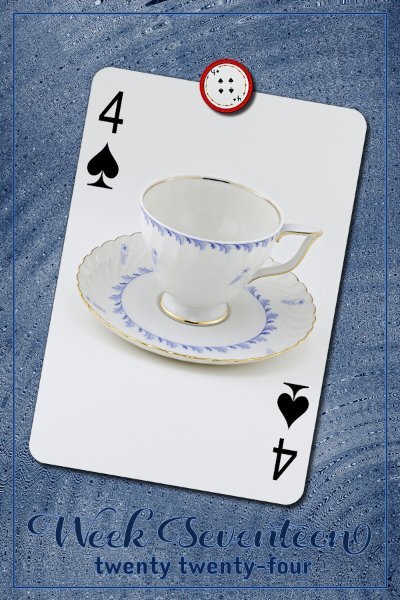
Week 17 I used a background from Janet Scott (digitalscrabook.com); Christmas Memories-blue wood. then added an effect: Effects>distortion>Spiky Halo. Fonts are Daughter (Week 17) and Dangrek from CF or Google
-
Week 16 All my ducks line up in a row (centered actually). Except the T-cup which I tipped over a bit. Papers from Creative Fabrica: the Dutch Lady -Daphne Populiers - Watercolor Inc Splash Backgrounds, Sandy Shores. Two papers with a blend mode surprise for me that it matched the magnet and the t-cup. Fonts Country Wedding (Week 16) and Couple Heart from either CF or Google.
-
Week 15 White, Gold, Black is the theme. The fonts are Compress (Week 15) and Cormorant Unicase, I think these are google fonts (my font viewer came with 5K of fonts (some families have 3-7+ fonts in them). Gradient background with a texture added (Texture>texture effects).
-
Michele, that is so demoralizing (and frustrating). Don't you wish you could just phone them and have them log in to your computer and just fix it. I sure hope they look at you as a long standing members(read: continual BUYER of their product) and snap-to-it when it comes to supporting you. I wonder what country their tech support is in, could that have an explanation why the communication is so slow?
-
Awesome Anne!
-
Week 14 Version 2.0 Well, I posted this once already only to notice I used a T-cup that I used before. I had to compress this quite a bit so it's super blurry looking here. I'll try and post on FB if I get more caught up this weekend. I changed up the magnet holding the card in place for the 2nd quarter of this challenge. The Lifted Photo script was put to good use and most thankful for the shadow that accompanies it. The background is one layer of a gradient, duplicate it and I think I might have added lots of repeats, then Effect>Reflection>Kaleidoscope and stopped at this one which looks like a textures cement wall at night with a spotlight (gelled blue) on it. I used a blend mode on that second dup layer (Hue). I kept the outline frame and text the same red that comes with the script and applied a blend mode (Hue-Legacy) to make it look like it was painted onto the "cement" wall. Font is Asher Punk (CF likely). It actually looks more dramatic with the original wrong cup I put on it.
-
P= Pink flamingo floaty tuby thingy
-
N = Noodles.....pool noodles My back yard borders on the elementary school field and the gym teacher Mr. Wilson spends 20minutes explaining the rule of a game (to grade 2-5 kids) and two of the rules were (that day). No biffing each other with the pool noodles and No biting the pool noodles. So, after the 20 minutes explanation of the ins and outs of the game (that even we couldnt follow), he blows the whistle and what do the kids do.....they run around biffing (hitting) each other with the pool noodles. Mr. Wilson is a little high strung, but very entertaining to listen to when we are out in the backyard.
-
Looking forward to seeing it when it's done. Then looking at the before and the after.
-
That's me too. Clothes especially. I cant seem to buy new ones, the prices are insanely high and the job I have wrecks clothes, so I don't want to see money go down the drain. Besides I can buy clothes that I'd never pay new for (jeans that are over $100 CAD! Crazy!) and often hardly even worn. A stop at the book section is a must as well.
-
Yikes, I bet it was tedious and eye straining, especially around Brambles (dog on the right?) face, so many little hairs.
-
L = lounging by the poolside
-
me too. Time to clear stuff out and keep what I will use...not what I "think" I will photograph, then never do. too many hobbies and I have managed to cut out two of them (silversmithing and glass beadmaking/fusing). It's hard to balance time to do each of the hobbies, I am failing at that.
-
Thrift stores are dangerous for me. So many cool trinkets begging to be photographed. All my t-cups/sugar&cream containers and t-pots have come from them. the flower vessels (for lack of better word) are usually candle holder and ashtrays....for a non smoker I sure have a lot of ashtrays! 🤪
-
Oh Thank you Michele. That makes we feel so happy that you liked what I did. I had a long absence from photography and had restarted in earnest when my ex-brother-in-law gave me his very nice camera (and we re-connected after years of not being in touch). When Covid happened I started watching online photo tutorials for stress relief and that's where a new passion emerged. I've got a long way to go, and I'm really enjoying the process this time around. i do have many more UNskilled shots that okay shots, its all a learning experience. I'm lucky to see so many inspiring photographers in the campus, it keeps me excited to keep learning.
-
thank you Jeni. I did have fun with them and finding interesting vessels (at thrift stores) to put them in.
-
Thank you Julie. And thank you for telling me what they are. I bought flower by there photo-worthiness. hahahah. Nothing in the garden yet, had snow and zero yesterday. Need to wait a few weeks. I'm really new at this growing thing (except herb, doing them for years).
-
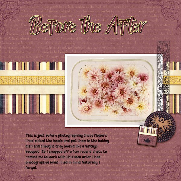
Day 8, looking for a QP at Digital Scrapbook This one is from Marisa Lerin Vietnam QP 13 I forgot to post this before the extra extra Day 8 post. that one (with the single flower) is from Marisa Lerin QP Set 014. This is me using the kitchen devices (baking dish) to carry the flowers I brought in the studio to photograph. I didnt grow these, they were from a garden centre. I had them all in a pile in the dish and thought they looked cool so took a shot of them, wish I'd taken them out of the dish as the dish part is distracting. But , I showed it here so you dont think I actually arranged them them. I could never do it that good if I meant to, I literally just plopped them in after cutting them with no thought at all. I only lightened the whites a bit, otherwise this is pretty much how it came out of the camera. Thank you for the workshop Carole and everyone who participated, I have oogled at and loved your layouts.
-
Here's a Day 8 Extra Extra for you. I did not edit this photo, just stuck it in as it was. It was a failed attempt at floating in a vessel too big for it and it would float to the edges and not stay in the middle. I photographed the vessel/flower on black so i could eventually extract it. but since the rest that I photographed I abandoned the idea of extracting. At least I got to use it here!
-
That is interesting. The hares are so big it seems like if they could gather enough courage they could some damage with their back feet. For the first time this year me and a co-worker have found some of the discarded coats. I couldnt believe how soft it was and you are so right about the wind, just a little bit and it was off flying away from my hand.
-
I read the blog post too and had never thought about a "table" as a starting point. Great idea and you executed it to perfection. That shadow on the folded edge of the photo is outstanding. There is a little bend(arc?) near the corner of the shadow and really "makes it" seem so real. I must admit to wanting to hug and cuddle and get my face all up in their fur. I know they'd "love it" too. hahaha. Poor guy, it would probably give it a heart attack. I saw on a wildlife rescue show that any wild rabbits, hares etc is hard to rehab because they stress easy (being a prey animal and all). BTW, love the quote.
-
I really love the rose photos, I do hope to see more from you.