-
Posts
3,097 -
Joined
-
Last visited
-
Days Won
44
Content Type
Profiles
Gallery
Forums
Everything posted by Corrie Kinkel
-
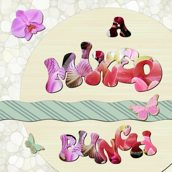
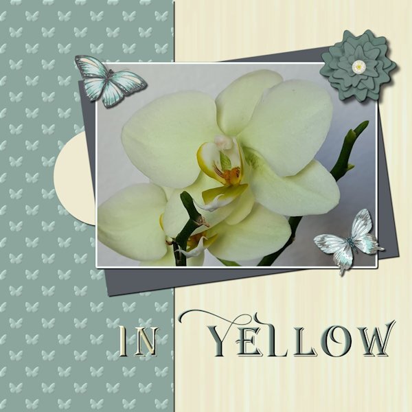
Day 7 and I'm a bit sad that the workshop is finished, but now I can go ahead with the Build a Kit. I have to admit it is a bit busy with 2 workshops at the same time and yes I now I don't have to finish either of them in a specific time but it's addictive! Maybe I should plan a detox period! I have loved seeing all the different layouts, mostly done with the same templates and techniques, so inspiring! For this last one I used a photo, taken in a gardencenter of a bunch of mixed orchids standing on a table and I used it for all the words. The strip on the template is a bit smaller otherwise it was to prominent and I wanted to use that striped paper for contrast to the lighter colors. Again some butterflies and an extracted orchid flower. The font is Bumble. I have done this workshop as the Wise Words Challenge as it was called 2 years ago. It was my first challenge after the basic Scrap Course and I have to say I have learned a lot since that day from the masterclasses, challenges, tutorials from Carole and by looking what all the other members are showing.
- 331 replies
-
- 14
-

-

-
Monique I always add the shadows on a separate layer, for the reasons you said and for editing them if I see that they aren't looking good! I once had to start almost all over with a layout by not doing this! ?
-
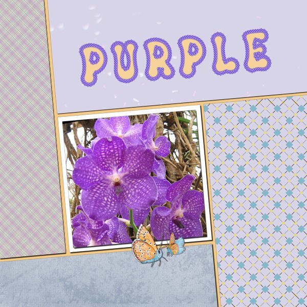
Here is my day 6 with the shadows on the purple ropes. I completely forgot to do them, we got unexpected visitors and I closed my work. Later last evening I just posted it here because I thought I was finished, although it looked a bit flat and I went off to bed.?
-
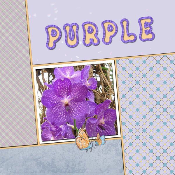
Day 6. Below the left and the bottom paper I placed a second paper and used the blendmode to saturation (left) and darken (bottom) with an opacity to 90 - 95%. I like how I can get a different look with the same papers and it still has nice matching colors with everything in my kit. The font is Groovy Yellow and I have a rope tube in a set by Carole that perfectly matches the orchid.
- 331 replies
-
- 14
-

-

-
Carole, thank you and yes I will take a better look at the fonts in the Lab to get more fat fonts!
-
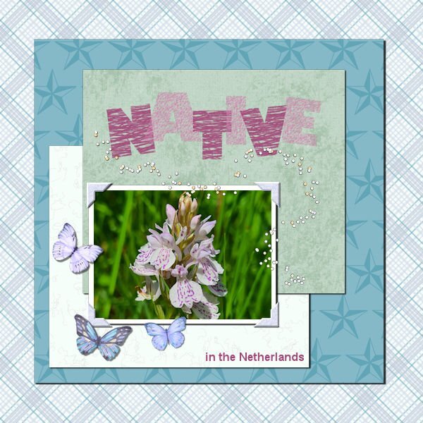
This time a photo of a native orchid in The Netherlands seen on a walk last summer. The background is of a plaid paper but with a solid paper below and the blend mode set to luminance, which gives a different effect. All papers come from my kit. Again I used some butterflies and a confetti tube by Carole. I don't have many bold fonts so I went with Gill Sans Ultra Bold and gave it a heavy texture, otherwise it wasn't very visible.
- 331 replies
-
- 15
-

-

-
Still with my papers and orchid photos. I just made a simple curve with the text. The font is Salmon Queen script with an inner bevel. On all the layouts I have some sort of butterfly as an embellishment. Here in The Nederlands we have a world famous Spring bulbs show called "De Keukenhof" and on the grounds are glasshouses too and in one of those there is an orchid show with fantastic plants and the colors of the flowers go from subtle to vibrant. We have been there a couple of times in the past and each year the displays are different inside and outside.
- 331 replies
-
- 17
-

-

-
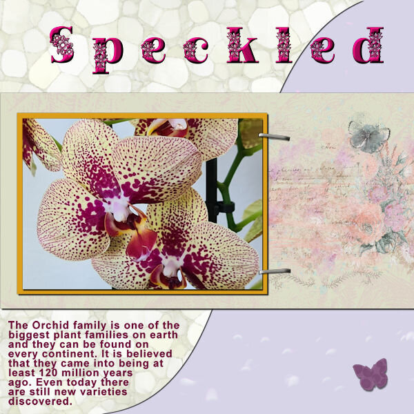
I stayed with my orchids an my papers! But I didn't want much embellishments for this. The font is Peaceful Nature. When I wanted to resize nothing happened; I had my wrapped text as a raster layer, but by close inspection I noticed I had lost one of the staples. It took me some time before I realized that when resizing the resize all layers box wasn't checked!
- 331 replies
-
- 18
-

-

-
This is a trip to memory lane; a long time ago I had that camera too! Look at all those extra lenses etc.
-
I have chosen my orchid photos for this workshop. I haven't that much new photos at the moment as I was the last 5 months not very mobile and now I can go walking again the weather isn't very good, for taking photos, much rain and dark clouds. I used my Build a Kit supplies again with the exception of the butterflies which come from a set of watercolors by Creative Fabrica. For the title I chose 2 fonts in the end, because I tried all different ones but found it not to my liking. Instead I gave the words a different color to stand out better against the papers. The fonts I used are: Arienne and Agreloy.
- 331 replies
-
- 21
-

-

-
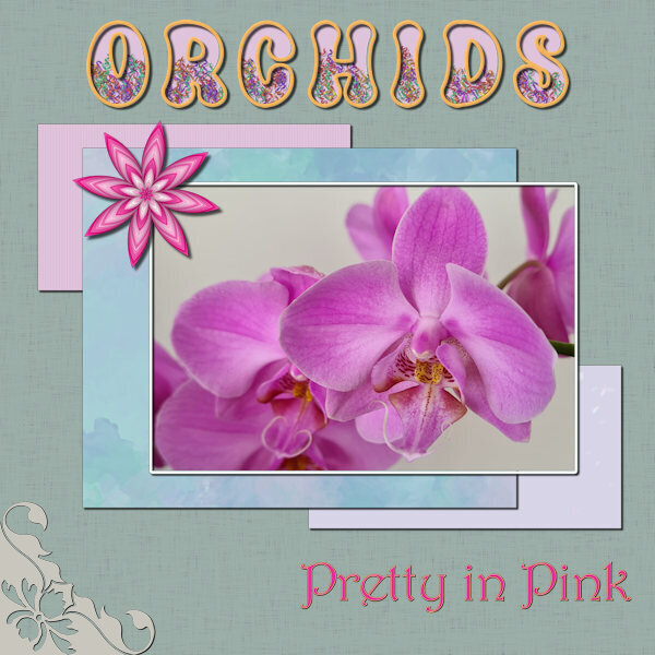
I used the provided template too, but all the papers come from the Build a Kit Workshop and I wanted to see them "in action", so to speak. The star element is from Chanthalia Design
- 331 replies
-
- 17
-

-

-
P =Pub
-
J = Jolly
-
I have done a lot of crafting over the years. Sewing clothes for me and the children, knitting, embroidery, lace making, making cards with different paper techniques. But not any longer now because my hands and eyes don't cooperate any more! Therefore I switched many years ago to making my cards digital. Photography is and has always been a part of my life and now I can combine photography and making cards. Since I stumbled upon the Scrapbook Campus I have made a couple of printed books and photo albums with what I leaned, like the Alphabet Challenge of last year.
-
Between all the work on the Alphamaking for the Build a Kit, I needed another eastercard and was already planning to use the cutout freebie and just added the font and colored it in the same colors as the rings of the cutout. I kept it as a double card for printing and here is a single for email.
-
D = Diatonic button-accordion, an instrument often used by The Dubliners an Irish folkband and one of the oldest and longstanding bands in the world, 1962 - 2012
-
We seem to be stuck, so I tried to find something that is at least related. V = Venue - the scene of a large gathering for some event.
-
Today's newsletter from Creation Cassel is in my spam again, so I looked a bit further into why. I use Chrome and gmail and I get 2 messages. My pc runs in Dutch, so translated they read: "Be carefull with this message. Sender has not verified this message, so Gmail cann't check if it is genuinely from this person." (Then the normal don't click on links etc.) Further more: "This warning is shown above every e-mail which can be a scam but comes from an adres in your list with Gmail-contacts". I have no idea if this is of any help to you at all.
-
I have recently put all my supplies as brushes, gradients etc in a separate folder called My PSP supplies and pointed the PSP version I use to that masterfile which is outside PSP and it is backed-up. And it was a lot of work, getting all the brushtips and matching scripts there from the different PSP versions I have. When I started PSP in the beginning of 2020 I didn't quite now how to do that, but now I have managed it! However I'm not finished yet, now I have to tackle how to make subfolders and point PSP to those. I also have asked a question for the upcoming Q&A about where some supplies are hidden by PSP in the program files.
-
I'm in too and I have followed the Wise Words Challenge, but I was such a rookie at that time that it will be a good thing to do this again. I'm certain I have forgotten a couple of things?
-
Seeing all this nice photos and reading the stories I'm almost sad I didn't had pets. When I was a kid we lived in an apartmentbuilding in a big city (Rotterdam), so I only had hamsters and those are not that attractive for kids because they sleep in the daytime and get active in the evening and night. When they died : no new ones. Later, when I was married we lived in a house where we could have had a dog or a cat, but the children we allergic to those. In those years there weren't dogs around like the labradoodle nowadays. The kids left home many years ago and we never came to buy a dog or cat. My daughter has 2 dogs now, both suitable for allergic people and I enjoy them when I come to visit once a year because they live in USA.
-
We missed R! R = Rainbow


