-
Posts
3,093 -
Joined
-
Last visited
-
Days Won
44
Content Type
Profiles
Gallery
Forums
Everything posted by Corrie Kinkel
-
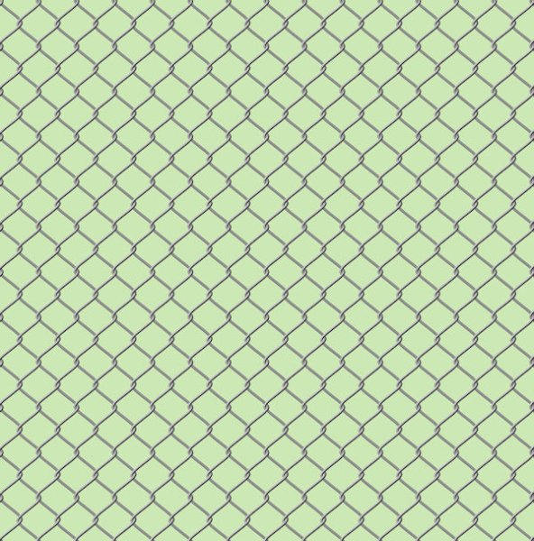
An example of a seamless tile I did some time ago for a layout. Instead of that page I show the tile and a page filled with it. I have made a lot of hem with the kaleidoskop, or of plaids but as they are intended for a particular layout I stopped saving those and simply make new ones that suits the new project. I found that I never reuse those, so I save only the more generic ones.
-
F = Friends
-
Interesting to read about those birds. Over here we have the "Koekoek" or Cuckoo that lays its eggs in other birds nests.
-
Monique, I think we all have made this "mistake" and learned from it?
-
C = Chocolate
-
A = Ads all over the paper, television, shop windows etc
-
Sharon when you want your text easier to read you can use the brushtool with the color of your background and set it to paint behind. Use a new raster layer under your text to paint.
-
Day 7 and here is the last for my series of fungi. The pattern for the background is made with a leaf brush and the blendmode dissolve. I almost never use that blend mode but here it is fitting to make the leaves looking brittle. This font is Almond Script and I needed some thing to fill the left corner, so I used a corner brush from Carole. Made a sticker out of the fungus in the photo and instead of a white border, gave it a greyish one otherwise it wouldn't stand out on the background. Stickers don't always have a white border.
-
Monique is it possible that you had the picktool not to scale, sometimes the setting goes to to something else without you doing so.
-
W = Without the children, only the 2 of you
-
Anja I like the mask on your Rose very much!
-
Bonnie I think that would be a good idea or put a white or very light beige under it and try the different blends with maybe a reduced opacity.
-
Already day 6 of this workshop and there are so many fantastic layouts done wich such a diversityof subjects! I saved this photo specific for this tutorial; it's not the first time I do this workshop! The fungus in my photo is called a "Sponzenzwam" and if I translate to English it is "Sponge fungus". Not surprising, it really looks like a sponge and I think the linoleum background from the tutorial has something of a sponge too, so it fits. To get the effect I wanted I used a blendmode. Made a simple round frame and put a sponge that I had in my stash as embellishment. This is a fungus that you can eat, for instance just as mushrooms in a sauce or pastadish.
-
Carole you asked about the word "Goudvliesbundelzwam" and it really is one word in Dutch! When I translate to English the litteral translation read as: "Golden skin bundle fungus" which as you see the picture of it, comes very close. Languages never stop to amaze me.
-
Sorry posted the wrong one that wasn't quit finished, the frames were not correctly crossing each other.
-
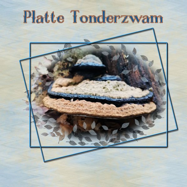
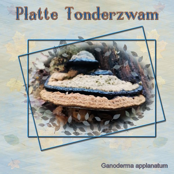
And here is day 5. When making the selection for the mask I used an octagon because of the shape of the mushroom in the photo. This photo was taken in the fall hence the leaves in the mask. The background is made of 2 papers that had the same colors as in the photo with the blend mode set to color and a slightly reduced opacity. After that an overlay with leaves, 2 frames with one over and under the other, thank you Sue T for that idea! The font is Chalk and Friend 4.
-
Another mushroom for day 4. I placed my photo to the left because the mushrooms came out of a tree at its base. When taking that shot I had to be carefull because that tree was on the very edge of a busy road, so I had almost no option but take it this way. It is a funny sight to see these mushrooms coming out of a hole in a still living tree. In the end they will destroy the tree. The background is mad with 3 layers, one a light green blended with a layer with some texture and on top of that an overlay with light leakes set to blendmode soft light. There were a lot of dry leaves around that tree so I put a borders with leaves made with a brush to the rightside, just as an embellishment. Font is Balerina with a bevel.
- 389 replies
-
- 12
-

-

-
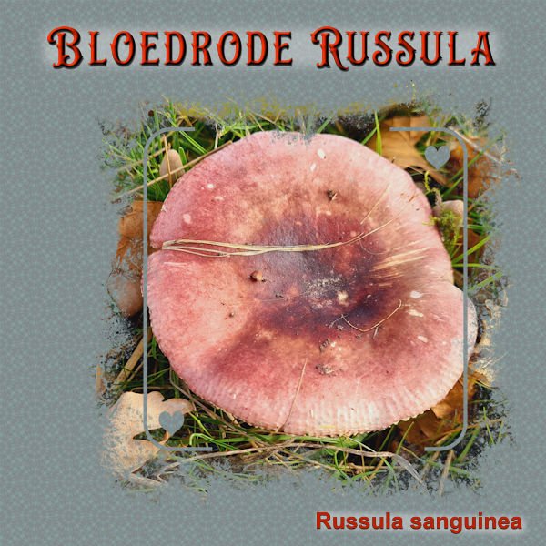
I had already decided that I wanted this photo to use somewhere in this workshop and this is the perfect mask for it. I played too many hours with the kaleidoskop, I forgot how addictive it is as I haven't used it for a while. With all new and exciting things to learn it is easy to forget the older ones. It is a simple layout because when I added some embellishments it didn't work out wel. I think that the photo and the name of the mushroom in bloodred is enough. The name translates in English as Bloodred Russula. To let it stand out I gave it a bevel and the paint behind let it stand out.
- 389 replies
-
- 12
-

-

-
There was an item on Dutch television about these gardens not so long ago on a programme about gardening that I like to watch!
-
Day 2 Extra. In order to display the photo I wanted to use I had to rotate the page and relocate the little photos a bit too, otherwise they would have obscured the big mask. It was nice to make a plaid from the colors of the photo, I haven't done that for a while. Having scripts makes me lazy! The fonts used are Chocolate Sprinkle and Arial.
- 389 replies
-
- 13
-

-

-
During the Love Story Challenge, what is now called the Mask Workshop, I just printed with print screen if I'm not mistaken and have referred to them many times since!
-
This is Day 1 Extra and I made a card for an upcoming birthday, so I won't post this on Facebook otherwise the card will maybe seen before the actual birthday date.
- 389 replies
-
- 10
-

-

-
O = On line messages or cards for Valentinie
-
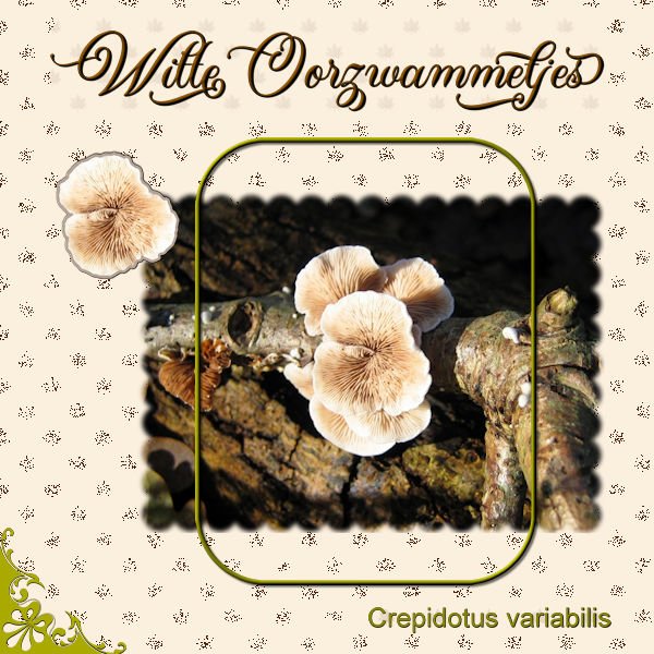
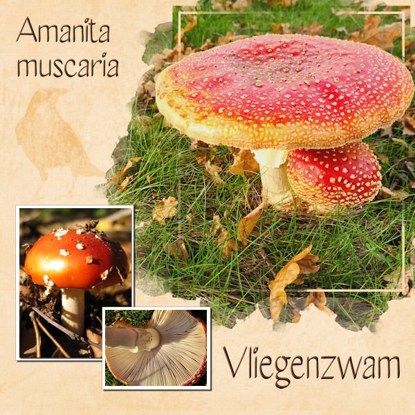
My theme for this Workshop will be mushrooms, I have so many photos of them and often choose flowers instead. I'll add the names in Dutch and and in Latin because I don't know all the names in English and Google nor the dictionary is that helpful for this subject. I didn't have much time today so it is a simple layout and a good rehearsel of the masking technique because most of the time I use Carole's Raster to Mask script.
- 389 replies
-
- 18
-

-

-
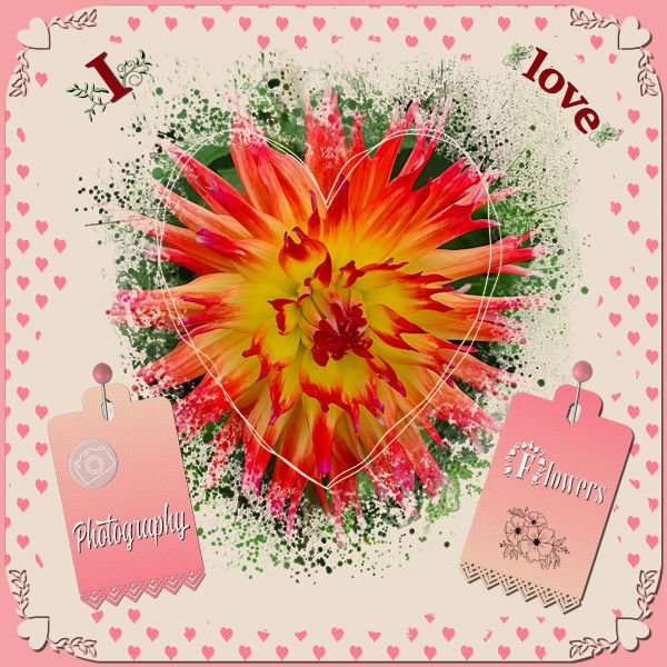
I didn't want to make a Valentine page but the colors lend themselves to a love theme so much! Valentine was and still is not a big thing overhere; it mostly, at least with the elderly people, is looked at as very commercial. Just before Valentiine the flowers are much more expensive and they go down in price after that! It is getting bigger this days with cards and offers of chocolate etc. So I decided to make something with the things I love: flowers and photograpgy which must come as no surprise as you know me by now. I used the Heart Mask that came with this theme and 2 papers from Escale Amoureuze and recolored them to go with the palette. The photo of the Dahlia had much of the colors of the palette in it. Heartpunches from from Caole and the freebie tag from this week; I used the black one and colored it with a gradient made with the palette colors.


