

Mary Solaas
-
Posts
1,389 -
Joined
-
Last visited
-
Days Won
68
Content Type
Profiles
Gallery
Forums
Posts posted by Mary Solaas
-
-
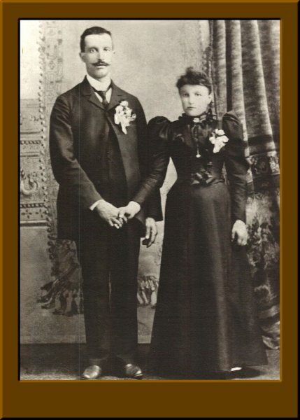
And the frame for lesson 2. These are my grandparents on their wedding day (mom's side).

-
 1
1
-
 5
5
-
-
Back to the FB for lesson 1
-
3
-
4
-
-
The extra for Lesson 3. The font is Ambrosio.
-
7
-
-
Lesson 3. Moved the arrow over - that was a chore!

-
7
-
-
This is my take on the extra QP for lesson 2. Same font.
-
1
-
8
-
-
I'm doing this piecemeal. I did some alteration on this remembering what someone said in the 1st QP Workshop I did about putting a layer above the QP in a color (I used a gradient sky blue in this one) and changing the blend mode (I used Dodge with an opacity of 24). You have to be careful when doing this because it also changes the color of the photo if your photo is alerady there (and mine was). So - it's a learning curve. The font is MV Boli.
-
8
-
-
Ready for 1st QP and 1st QP Extra. Didn't change anything. The font is Cursive Serif.
-
10
-
-
I'm a day late in saying this, but, Carole, you are much loved by all of us. I know you are really a hobit in real life because you gift us on your birthday! I trust you had a very happy birthday.
Thank you for the gift! As you know I've been buying scripts, etc. recently even before your birthday. But thanks for the gift - I bought several more.
-
1
-
3
-
-
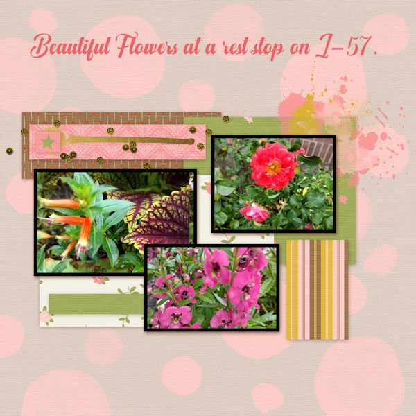
Where does the TIME go? I'm in too, but will probably not start it today, but think about what photos to use. I'm making previews of my mega kit (Bundle?) I won't wrap it up as several zips, but only post the previews. And, as for P52, I've several photos I took that could begin with April 1, but that is also on the back burner as life as a way of interfering. And - your kit is on TIME, Susan. So - where does the TIME go?
-
I use the scratch removable tool to remove wires from pictures. This is an example. I also played with glass texture on the one on which I had removed the wires.
-
2
-
5
-
-
24 minutes ago, Julie Magerka said:
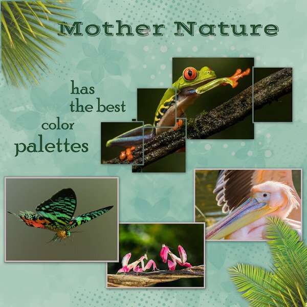
After the chat on here about the Block Photo (Sue Thomas) and a beautiful example of it, I watched the tutorial and came up with this layout.
I had the red-eyed tree frog photo (from Steve Biro) as the inspiration. I looked up others online to get some other colourful critters. Nature is astonishing, whether in her delicacy, her brutality (those hawks!), or her rainbow of colours in the flora and fauna. The most flamboyant of those creatures live in tropical climes, and I have an awe for their dazzling displays, especially since our birds, insects, etc. tend to more subdued hues.
The other critters in this layout are Madagascan Sunset Moth, Orchid Mantis, and Rosy Pelican.
I'm inspired by your layout. Do you mind if I copy the ideas? Unique way of using the block photo tutorial to create a layout. I also like the way you use the palm leaves in the top right and bottom left corners. Really outstanding.
-
3
-
 1
1
-
1
-
-
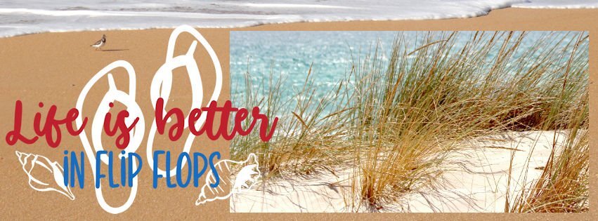
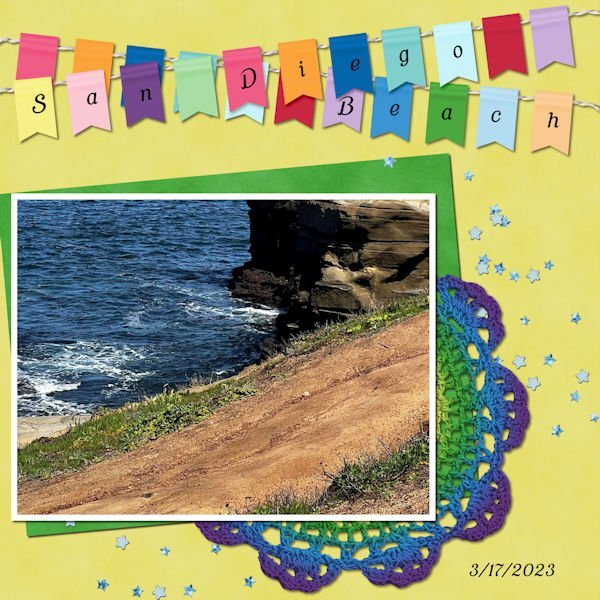
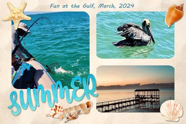
I'm still playing with my Beach Kit. This is a freebie and I believe it is from Corel some time ago. The font for the title is MV Boli. Summer in March at the Gulf!
-
1
-
7
-
-
50 minutes ago, Sue Thomas said:
Cheers! Several little details, which doesn't over crowd, or make the layout appear busy, to distract from the photos, yet makes the viewer's eye wander, to absorb the whole page. Although the Masterclasses are great, and I love them. I have always and still do prefer the tutorials in what was the creative scrap, and now called the Lab. Even though a greal deal of the tutorials are available as scripts. I enjoy creating my own elements. Even though I rarely use patterned papers, I have created templates for all of the paper template tutorials in the creative scrap and Lab. My least favourite patterned paper is plaid.
The Robins are still here, I doubt they will move on until the weather is more favourable.
Sue - but plaids are so much fun to make!!! LOL
Thanks for the tip on the block photo. Just downloaded the Block Photo tutorial. Thanks. Interesting. Watched the video.
-
2
-
 2
2
-
-
1 hour ago, Sue Thomas said:
Slowly the native migratory birds are returning. THis one is a white throated Sparrow. I'd say that all native sparrows are considered song birds. I haven't done a proper frame in quite a while. Colours used came from the photo. One of last night's little projects.
Sue, in addition to what you teach us about the natural world, I love your frames. You turned me on to the transparent frames in PSP Picture frames. Thank you. Guess that's what started me on developing multiple transparent frames of various opacity.
-
3
-
1
-
-
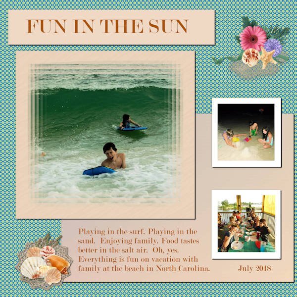
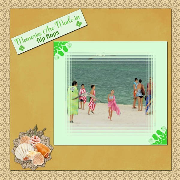
I thought the surf looked bigger than the ones I saw in the Florida Gulf near the shore. That was actually their trip to the beach on the Atlantic Ocean in North Carolina. So, having saved it as a pspimage, I was able to change the journaling. Here is the correct version.
-
1
-
9
-
-
And another layout of that trip using elements from my kit.
-
1
-
10
-
-
I just had to try out my template for the Beach kit to see if that multiple frame held true. And it did. The font is Modern No 20. The elements are from my kit.
-
1
-
10
-
-
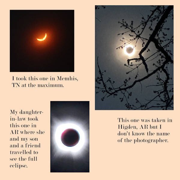
These are my pictures of the 2024 Solar Eclipse
-
2
-
 2
2
-
1
-
-
I'm in. Hopefully will follow through. Planning on leaving on the 20th to be with Joe and Laurie at Hernando Point for 2 days.
-
1 minute ago, Sue Thomas said:
Mary, I'm deeply touched by your words. Yes, the phrase strips tutorial can be found in the creative scrap/lab (the one or the other). I'm delighted my pages serve multiple purposes in the campus. I have to say cutting out circles using PSP is by far easier and quicker than actual paper cutting. I will hopefully improve on that though. Pease don't hesitate to ask for any instruction, or direct you to any relevant tutorials. I like the small details.
1 minute ago, Sue Thomas said:Mary, I'm deeply touched by your words. Yes, the phrase strips tutorial can be found in the creative scrap/lab (the one or the other). I'm delighted my pages serve multiple purposes in the campus. I have to say cutting out circles using PSP is by far easier and quicker than actual paper cutting. I will hopefully improve on that though. Pease don't hesitate to ask for any instruction, or direct you to any relevant tutorials. I like the small details.
Thanks, Sue - I like the small details too - they often make the difference between blah and wow.
-
5
-
-
4 hours ago, Michele said:
Even though I did the original back in 2017 (starting from scratch), I spent a bunch of time editing it for this year. It has soooo many layers now. The fonts are Bernard MT Condensed, JLR Big Girl Bed, and KR Coffee Dings. In order to make it look aged, I duplicated the text layers and converted them to rasters. Then, grouping them into one, I used a grunge brush to erase portions. Carole mentioned recently how grouping makes it easy to resize multiple elements at once. I now use groups for lots of different things. I added the barista character from the game for my group members (they like it when I do that LOL).
Michelle, thanks for the ideas on grouping and the use of screw heads. And, as is usual, you use many layers. I see smudges on the background of the "poster" also and in different colors. My mojo has been lacking this month and I really appreciate the inspiration you and others have given.
-
5
-
1
-
-
15 hours ago, Sue Thomas said:
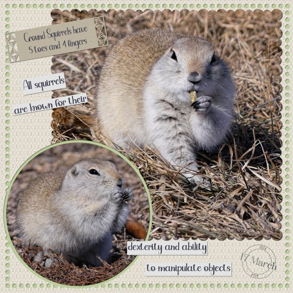
Talking about aging, and all that it entails, I created this page last night, bar for the phrase strips I wanted to do. For the life of me I couldn't remember the word I was looking for. I knew it's meaning and in what context I was going to use it. This morning out of the blue It came to me, dextrous. I immediately wrote it down. Now the page is complete. I consider myself very lucky in the fact that I'm fit and healthy. I do have to wear cheap magnifying glasses, which I have dotted all around the place, inside and out, purly for reading. If my arms were a little longer I wouldn't need them. I have noticed that I am getting forgetful. As Corrie says aging is what it is. We have to accept getting older and don't let it stand in our way. The ground squirrels tolerate me laying amongst them, they still have an imaginary boundery, which I don't cross. I have bought them a bag of rabbit pellets, which they are enjoying. I haven't seen them today, eveywhere is white, although it has stopped snowing now.
Now then, my page. I creared phrase strips, used Carole's page punches again. Created a date stamp. For the scalloped edges and the cut out dots around the background paper I used several techniques, all of which you will find the many turorials in the creative scrap/lab. Multi scallops, double scallops, scalloped mat. I also used a paper template, which I colourized to my liking and sized it down. Carole did a masterclass on paper templates, one of the best classes she has done. Paper templates suits me as I am not a fan of using patterned papers. I used the same technique which I have given tips on for the round photo, with it's cut out frame.
Sue - in addition to the information about squirrels, this is a really great layout. I like the cutout frame on the top layer background; the cutout of the top picture, the faded date stamp, each of the journaling strips (I remember that one of the labs (I think) about telling a story in strips). I love everything about this layout! You are an inspiration.
-
4
-
1
-
-
@Michele I have a curious mind and want to keep learning...anything...until the end.
I totally agree.
I have captured the Layout of @Sue Thomas (Thank you) and the conversations between her and @Susan Ewart (Thank you) that are very informative and instructive,
@Cassel Thank you for this group and your instructions and the group you have formed here.
-
3
-
3
-
-
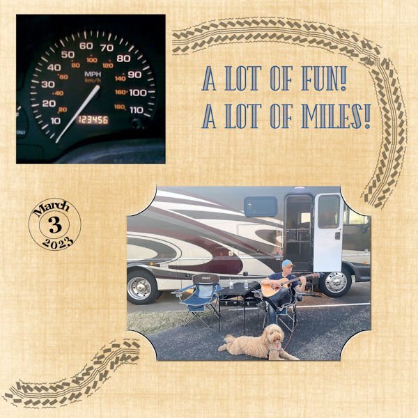
I used the pspimage. Font is The Camping from Creative Fabrica. Joe took a picture of the mileage on 3/3/23. Of course the mileage has increased - don't know if he took a picture when it was 234567 or not, but I thought it would be a good choice for this challenge. The pic of him playing the guitar was taken in April 2021.
-
1
-
6
-


Quick-Page Workshop - April 2024
in Showroom
Posted
And this is from lesson 3 - The font is AR ESSENCE. These pictures I took on Monday - the eagles live in their nest in the top of a tree on the RV park. It was a wonderful day for viewing and trying to get pictures. I have a Canon EOS Rebel T7i with a small zoom lens (EFS 55-250mm) that I did not put on a tripod - but was lucky to get a number of great shots. I do not do the photographer thing (like Susan Ewert, Sue Thomas, and Ann Seebert) but use the automatic settings- this one was landscape. These have been enhanced and cropped. Of course with PSP.