

Mary Solaas
-
Posts
1,413 -
Joined
-
Last visited
-
Days Won
68
Content Type
Profiles
Gallery
Forums
Posts posted by Mary Solaas
-
-
Lesson 2. Make a label from more than one preset shape. I loved the snowman that was shown earlier. So - I decided on a whim to try and make Mickey Mouse. Well this is what I came up with. Since I had made labels before (but not grouping them with different names and as one pspimage) I just decided to show some of them.

-
 1
1
-
 7
7
-
-
4 hours ago, Cristina said:
Day 3 - contour
It is not a great contour, but it serves the purpose of practicing, practicing... 😄

Love that flower!! Really great
-
1
-
-
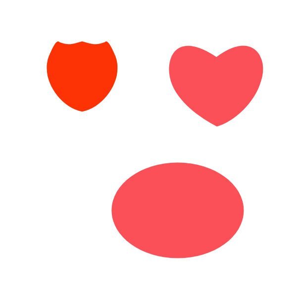
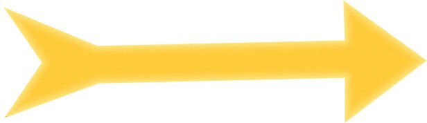
Lesson 1. I did the heart and the arrow, but I also did the splash required for my Lab 12 Mod 8. I fiddled around and ended up using the layer styles - Inner Glow and changing the settings and colors on both the arrow, heart and splash.
-
2
-
10
-
-
@Dawn I'm fascinated by what you have been displaying with these cards. You seem to use brushes a lot and then imbelish them. I'm going to have to experiment working with them in that way. You really rock!!!🥰
-
3
-
2
-
-
39 minutes ago, Ann Seeber said:
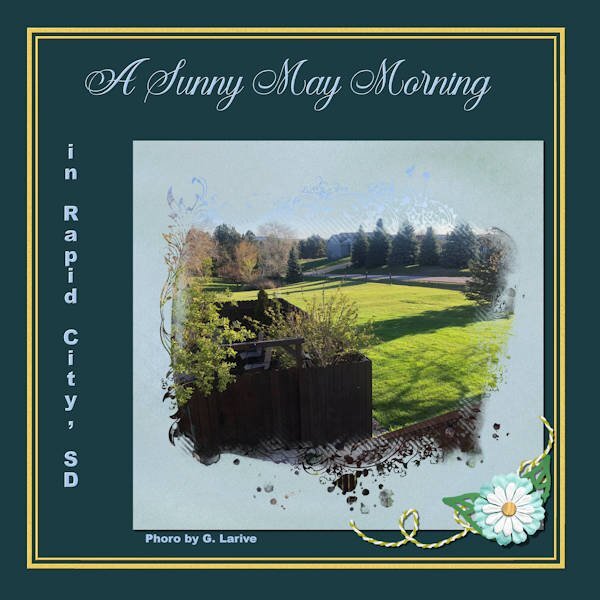
Really nice, Mary! Gosh, how you have evolved from a year ago! It must be all that work you do on the Labs. I think I see a small typo on the line that identifies the photographer. Does it say Photo or Phoro by G. Larive? I'm not sure because of the reduced size...
39 minutes ago, Ann Seeber said:Really nice, Mary! Gosh, how you have evolved from a year ago! It must be all that work you do on the Labs. I think I see a small typo on the line that identifies the photographer. Does it say Photo or Phoro by G. Larive? I'm not sure because of the reduced size...
GOOD CATCH!! my eyes aren't as good as they used to be (nothing really is for this body). Yes, I so enjoy Cassel and this forum. Everyone is so helpful and so inspirational. I've gotten so many good ideas from different things you post as well as each one who posts in the forums. In fact, one of the background papers someone had in a layout led me to make several papers (and ribbons) like the one we are supposed to make for Lab 12 Mod 8 (my next Lab endeavor).
-
7
-
-
Jessica Dunn has a challenge for June on Pixel Scrapper using one of her masks. I am using that mask on this layout. The flower is from Rachel Martin (Pixel Scrapper); the string is a Cassel string in Picture Tubes; the leaves are mine from one of the labs; the Title font is Arshinta Kirania Script; the place name script is Arial Black.
-
9
-
-
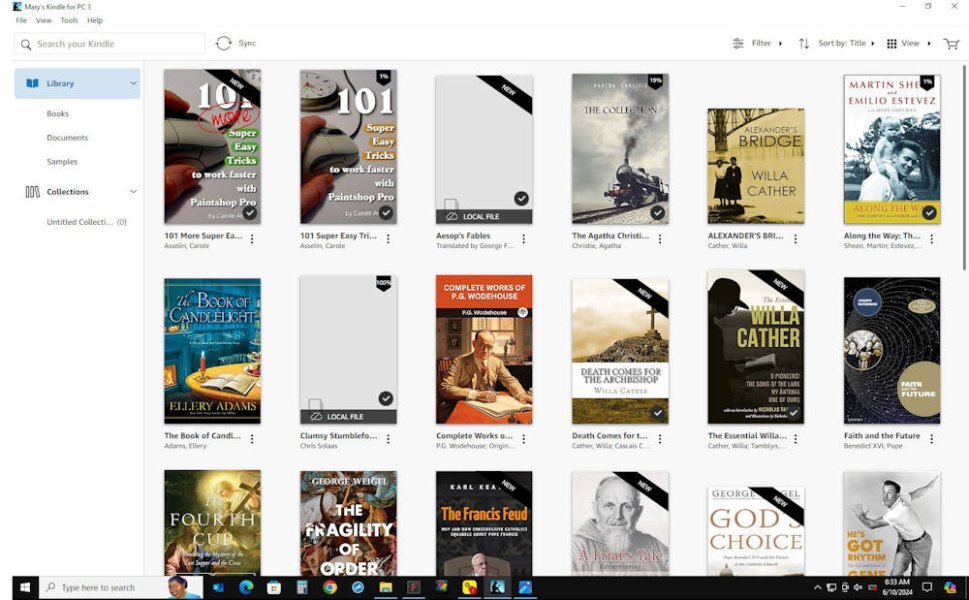
I haven't got a layout to show, but I'll enter the forum and tell my story too. I have always wanted books and loved reading. When I was in grade school and would get little Christmas gifts for my friends, I just assumed that they liked to read too. I would buy the cheapy ones from the dime store and read them before I wrapped them. (I still do when I buy books for relatives). In high school, my favorites were many - I think I remember the ones that I was most fond of: fairy stories (will always love them - Tolkein and Lewis agree that they are important), and romance stories: Jane Eyre, Scaramouch were my favorites. I saw the movie Scaramouch (loved Stewart Granger) and just had to find the book - Wow - greater than the movie. In high school when I was 16 I got a job and the first thing I wanted was to join the Catholic Book Club - great choice - got my first cook book (Meta Givens Encyclopedia of Cooking - my bible for cooking and baking), my first bible, the 1st book in a series on Canada - the White and the Gold, books on different aspects of the history of our country, the USA. Later in life, when I could afford it, I joined the Readers Digest Book of the month club which started me on another path. I have purchased books until I had a library (made a database on the collection since I seemed to be buying duplicates) of about 2,000 books and was running out of room and bookcases. I have since given away about 1,000 to friends, prayer groups, and the local library. My favorite authors are many, for spiritual books, novels, history, historical novels, biographies, autobiographies, nature. I can show you a sample of a screenshot I took of my Kindle books (yes, even though I like to hold a book in my hands (the smell, the touch)).
-
 2
2
-
5
-
-
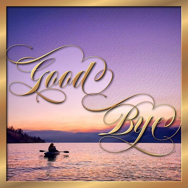
2 hours ago, Susan Ewart said:
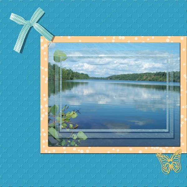
My physiotherapist is moving to the the interior of British Columbia (Kelowna, also part of the what we call the Okanagan area - home of the Ogopogo). I have lived in that area twice in my life enjoying mountains, lakes and lots of fruit (cherries, peaches, apples, grapes) and lots of wineries...even though I don't drink wine. This seems to be my go to e-card style of the moment. they are quick and easy to do...well, I say "quick", deciding on the font is the hardest part and takes forever playing around with it. You will notice the kerning on the word "Bye" is weird. I wanted the swash of B to blend in to part of the swash on the "e". I made masks for each, the upper and lower portions thinking I'd be using two different pictures (Lake shown is Lake Okanagan). I like the original photo, that I found on the internet so I put a copy into each mask but I wanted it to seem like it was two different elements. For the top portion I added two textures and some noise and used brightness/contrast to darken it a bit. That is also the area I added my sentiment on the copy I sent to her.
Wow, Susan! This is absolutely stunning! I love everything about it🥰
-
1
-
1
-
-
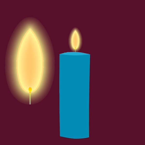
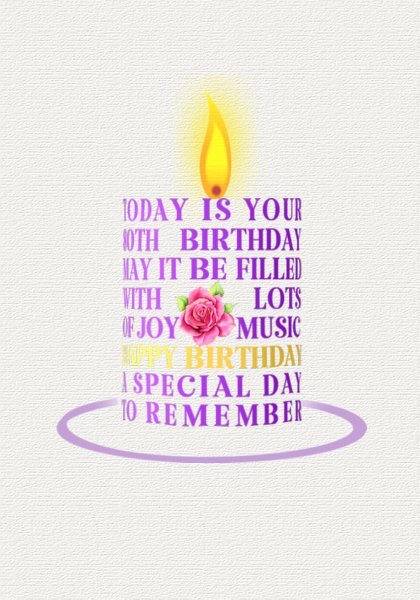
AThis is the flame and the candle.
-
9
-
-
2 hours ago, Corrie Kinkel said:
Two days ago when the Campus was up after that terrible gremlin attack, Sue very kindly gave instructions how to make a candle out of wordart! She has been perfecting her initial idea on this. Here is my try to make something too. To me it was clear it must be done with the warpmesh tool to get the rounding, but that you could use wordart to do so is a genius idea. I didn't want to copy her "card", so I tried a birthday card. I'm not totally happy with the colors I used and I have to try to make a better ellips on the bottom. I didn't have a realistic flame and I haven't a subsciption by CF. When I tried to just buy a flame they want me to take that really nice subscription for a year, which I at this point won't do. I just updated my filter forge and that was my budget for now. I'll see if I can find some flames there, but in the mean time I wanted to post this 1st try. I can see nice, unique cards made this way, Sue thank you so much for sharing this with us.
Really like it. I made a candle flame today - in png format, I am showing in on a "quickie" candle and then separately beside it. If you would like the flame, I can put it on the facebook page. Just let me know.
-
2
-
-
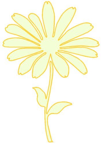
Playing with masks again. This is one I made using one of the flower preset shapes and using the circle to lessen the gap in the petals. the font is AR Julian. Oh, and the heart corner shapes are from Cassel.
-
8
-
-
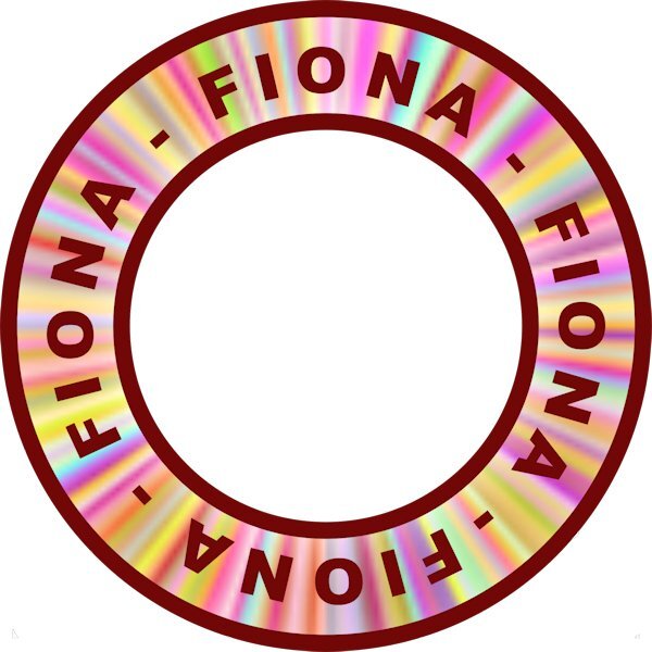
19 minutes ago, fiona cook said:
From the recent masterclasses I liked the effects: 1. creating the stripey effect patch 2. creating a circular element from a straight, flat ribbon 3. The circular stamp from vector text.
As an exercise I managed to combine the techniques in one image of a stamp for my name.
First I created the stripey patch by taking a small image and adding noise as in the tutorial and from that I made a strip. Then I took the stripey strip to form the circular element and used it as the background for my stamp.
What I would like to have is the stripey effect more defined, not so soft. My ribbon strip was 583 x 64 pixels resized to 200 x 64 px.
Actually I like the muted stripe effect
-
2
-
-
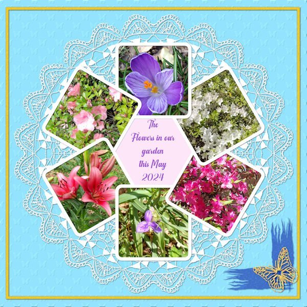
Since this is about our current gardens, I'll repost my pictures of the flowers in our gardens in May. Three of our azalea bushes are pictured: the white, rose and pink which are in our back and side gardens.
-
6
-
-
On 6/5/2024 at 4:39 PM, Anne Lamp said:
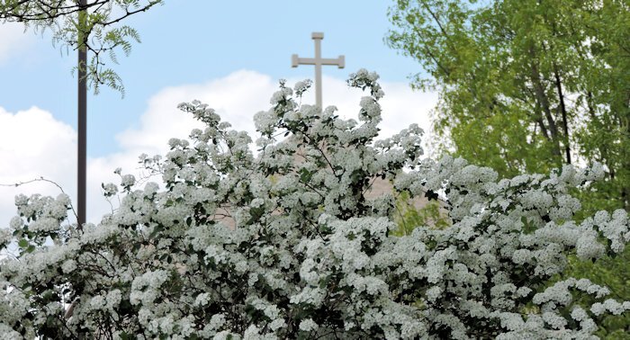
I am not sure what bush this is, but it was taken the end of April at my Church like a lot of my flower pictures are.
We called it Bridal Spirea
-
3
-
 1
1
-
-
I'm in too.
-
2
-
-
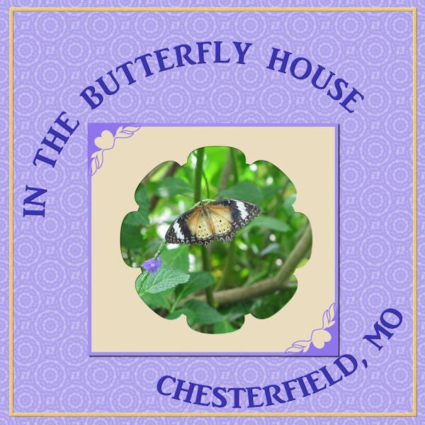
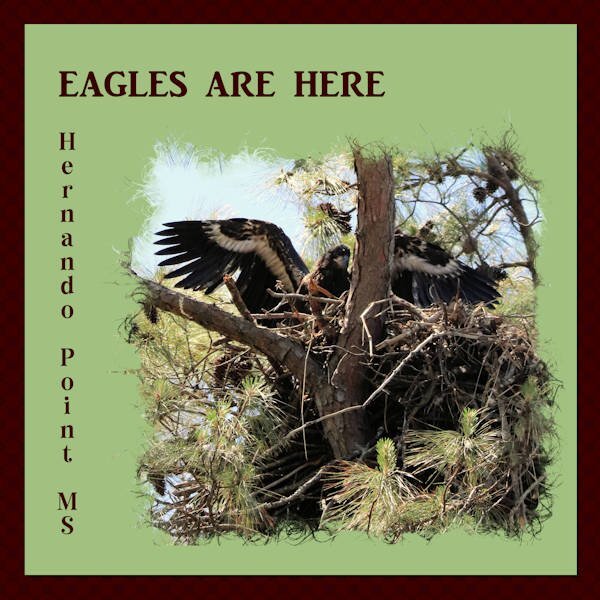
Playing with masks. This is one of Cassel's which I resized for this layout. Love my eagle pictures from Hernando Point, MS. the title font is AR Julian and the place font is Nomadic Dreams.
-
9
-
-
Well, I did go back and finish the 1st attempt. The multiple diamonds background I added the halftone effect; the brad is mine and the chain is a picture tube; the font is from Marissa Lerrin and I placed a background behind it as a frame and it is textured with bark texture; the Title font is Adventure Island SansBold and the journal font is Mongolian Baiti. I assume that both fonts came from Creative Fabrica since that is where almost all my extra fonts come from.
-
7
-
-
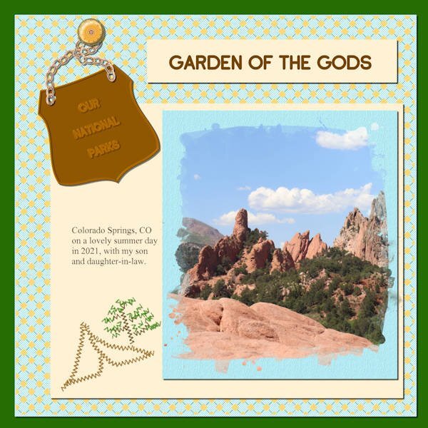
Lab 12 Mod 7. Requirements: embossed metal element - upper right corner; diamonds 3 - background paper; zigzag stitch - tent and tree at bottom left of journal paper. This was my 2nd attempt at doing this module. I was going to do a layout of one of the national parks Joe & Laurie visited on our 2021 trip, and I may do that later. For this one, I used my template designed for the beach kit.
-
7
-
-
Lab 12 Mod 6. Requirements: Mandala - back of the pictures; paint streaks 2 (Not happy with this) behind the gold butterfly; Gold Texture the frame on the background layer. I used Cass Circle Pictures for the pictures and then resized it for this layout (hid the original background layer).
-
7
-
-
Lab 12 Mod 5; requirements: 1. create a paper with random dots - the frame paper around the picture (I created several and chose this one to display); 2. create a pattern of triangles facing in opposite directions (#7) - I used the pattern for a paper, and a ribbon and used Cassel's script for Bow 12; 3. embossed paper - I had quite a time creating the butterfly pattern for the embossing to display it the way I like - but it gave me an idea of how to create patterns for embossing that are not round. I placed the picture in a mask I created when I was fooling around with various transparencies of frames; and I used that sparkled butterfly that I used in the last module.
-
2
-
7
-
-
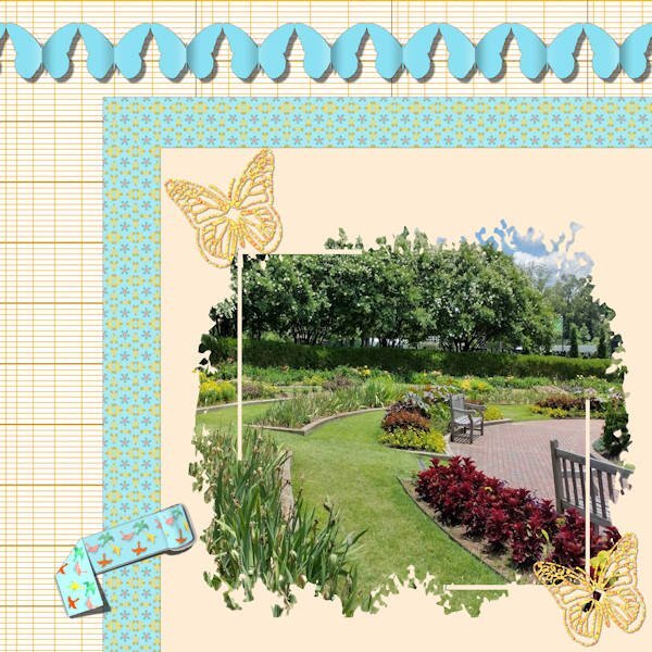
Back to the Labs for me. This is Lab 12 Mod 4. Requirements: ledger paper 2 (my background - I made several different colors and kept the pattern); rolled tape (not my favorite) and I tried folding it - without the tutorial but had followed several tutorials that folded ribbons etc; added sparkled butterflies (using Cass sparkle script). I use the pictures I took in the Botanic Gardens in 2022 a lot!. The blue patterned paper: I used the bird pattern (on the tape) and kaleidescoped and patterned it several times and liked this version the best. The other requirement was to make a folded paper streamer/banner. I chose to use butterflies and not the boy and girl. It was really interesting making the shadow on the fold/crease in the center of each butterfly. The mask I used was given to us in the Mask Workshop.
-
8
-
-
My grandmother kept chickens too. Saturday the oldest hen was taken to the chopping block and was hung upside down on the back porch to drain the blood. Sunday was chicken and polenta. I'll have to admit that I did eat the chicken on Sunday as I wiped out Saturday's view from my mind.
-
1
-
-
1 hour ago, Ann Seeber said:
It's been two years since Annie Tobin left us.
 As she would say: "Thanks for takin' a peek!" (The colorful background and alpha are her own designs. The frame is a cass-decorative stitches frame) ❤️
Annie was such a special person.
-
1
-
2
-
-
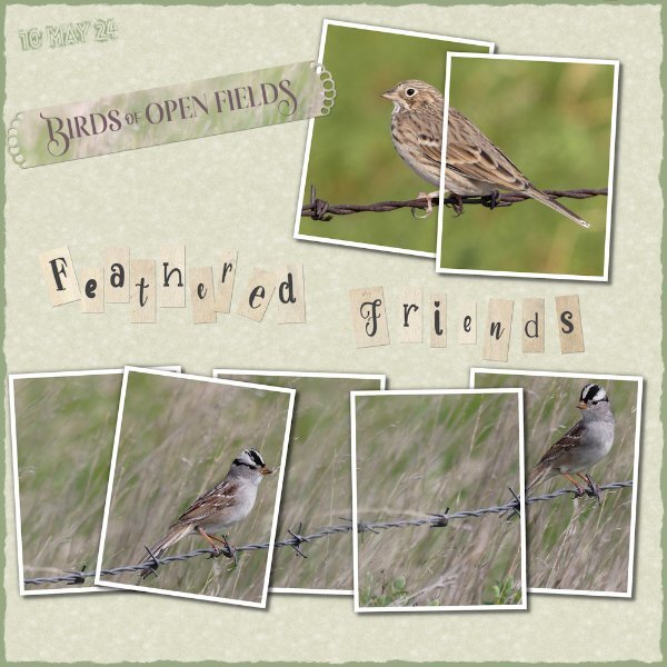
55 minutes ago, Sue Thomas said:
I downloaded Carole's multi framed collage template. I have never used a multi framed template, although I have seen several of them. As I have said previously, I was hooked on this technique after watching the photo split frame technique in the creative scrap. Since them I have created my own, using up to as many as 8 frames per image.
I blended two photos of the White crowned sparrow. Created the Alpha, (can't remember what the tutorial is called) burnt edge, which isn't really burnt as I used green. The background paper is an edited favourite of many linoleum pattern. I don't see many using Carole's corner and paper punches. I love them and use them a lot. I used one of them on the strip. They are ever so versitle, quick and easy to use to add that extra touch to any layout.
It's always great to see your take on layouts!
-
2
-
1
-
1
-


Vector Workshop 2024
in Showroom
Posted
Lesson 3. Use pen tool to outline an object. I chose to do the watermelon slice from the group given of summer fun stuff. I made a preset shape with just the red slice. I then used it to create the slice I could use in a summer picnic layout.