Mary Solaas
-
Posts
1,568 -
Joined
-
Last visited
-
Days Won
68
Content Type
Profiles
Gallery
Forums
Everything posted by Mary Solaas
-
I will give it a try. I made my template and will use it throughout, but will be changing the background color to suit the photo. This is my alarm clock. The description font is AdventureIsland Script Bold, and the Letter font is ChalkZone.

-
Well, at 90, it would divide up into 7-1/2 years. I have 2 pages in 8.5 x 11 format that I created to fit on my physical album I made for my years up to the time I married in 1957. I will post the 1st 2 pages here that I created in PSP. The balance of the years are in my physical album which I will do something with later to be part of this challenge. These 2 pages are my birth in Newark, NJ to the time we left NJ in 1942. So that covers the 1st divide!
-
So enjoy this "chit, chat". Laughter is the best medicine! It's also a great way to start the day. You may have gotten me enlivened enough to join this one. But ....... will I keep at it and actually finish it??????
-
Playing again with my multi-layer mask. The font is Centaur with an inner bevel. I put a light shadow in back of the merged mask group.
-
Jannette, I offer my condolences to you also. It is a difficult time. Remember the good times with him.
-
Merry Christmas to all
-
Prayers for you and your husband.🙏
-
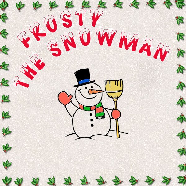
Once more - but that's it. Did download the 2 fonts. The Frosty is in my shapes folder and the Joyeux Noel is in my fonts folder now. Interesting coloring the parts of Frosty. The holly frame is a picture tube.
-
I'm having good luck with PSP 2022 Ultimate. It is my goto for actual work. I'm glad I got the 2023 only for the Vision FX and that is what I use it for. I know there were features in 2023 that aren't in 2022, but I can do without it seems. I'm not going to fight it - 2022 for me.
-
A long time ago (the dark ages??), there was a tv program called something like Stop the World, I Want To Get Off. It didn't last long - I don't know as I didn't watch TV a lot in those days - too much going on - was that depressing???
-
It works fine with 2023. I won't try it with my 2022 Ultimate since that is my goto for REAL WORK!! (HA HA). The Vector FX is what confuses me. How to use it - where it works etc. Carole?????
-
Layout 7. Done. Thanks Carole. It's been fun.
- 339 replies
-
- 10
-

-

-
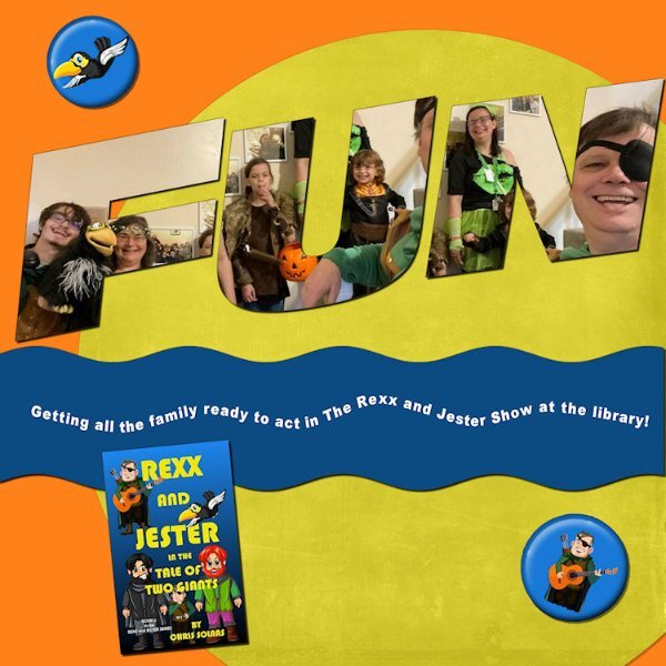
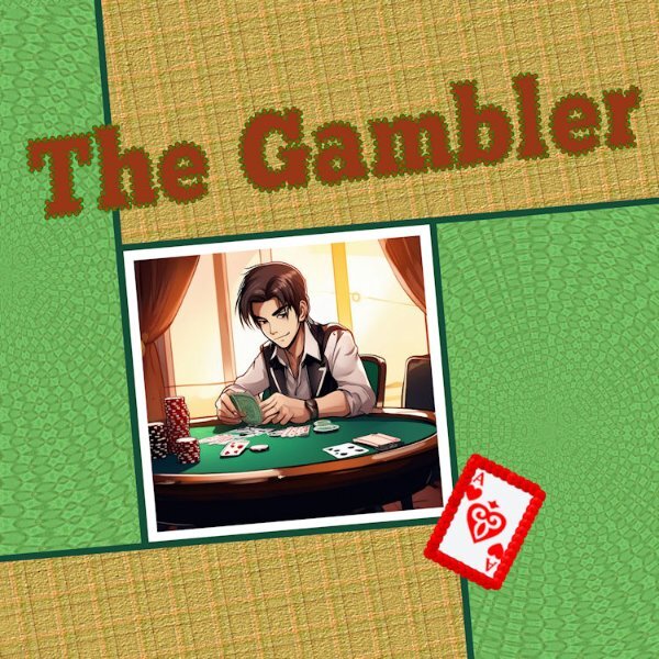
A lot of fun with layout 6. The font is ChunkFive Roman. the picture I generated with CF Spark. the patterns of the papers are mine. Thanskgiving is tomorrow and I really need to get busy. The outline of the Ace of Hearts (which is from CF) is Cass red sequin; the outline of the title is my own
- 339 replies
-
- 10
-
-
-
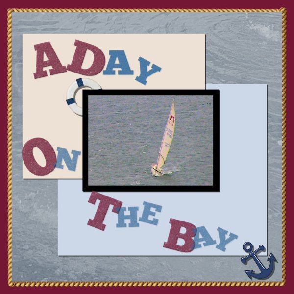
OKAY - 5. Not happy with it, but it is what it is! I took this picture when Laurie and I visited San Francisco and there were a lot of sailboats on the Bay
- 339 replies
-
- 12
-
-
-
Evidently that tool was introduced with 2023 as it is not in 2022.
-
@fiona cook I love that left side paper (photo?) - I've always loved that perspective; I guess when I rode the old Chicago-Northwestern train from Chicago to Ironwood Michigan and stood outside on the last car and watched the traintrack fade into the distance - for some reason that perspective always intrigued me. - I also like the path that has that perspective and curves to the right at the edge of sight - that intrigues me too.
-
@Ann Seeber I really like this - the picture - the pine cone element and the string, the snowflakes - all the colors used. Really great.
-
Day 4. Title Font is Better Valentina on which I used Cutout and Inner Bevel. Gold party hat is from PS Janet Kemp, other party hat is by Sheila Reid, the cake is by Marisa Lerrin. I'm not sure where I got the balloons. I have used font on a path many times; I don't know why it fought me this time, but it did. However I won out!
-
I'm only on day 3. Text in the title is AR Herman from CF. The journaling is Arial Black. Was fun playing with the selection for the journaling text. Had to have 2 goes at it. But it was fun. I Inner bevelled the title and the cream curved paper. To work with the title, I had to select each part - the one that is red and the one that is blue and promote each section to a layer - then color the layers in the different colors, and then merge the 2 promoted layers so that I could inner bevel the whole title. Lot of fun. The picture was taken with my laptop at the time which had a camera - great laptop but not such a good camera. But it was fun playing with John and David. The blue and the wine colors were taken from their shirts.
- 339 replies
-
- 10
-
-
-
I went back to Lesson 2 and redid the title. Looked at the instructions again and tried doing it again - this time I actually highlighted each letter and was able to change the font AND the size as well as the color. Used the sculpture effect on the letters except the beginning letters, the beginning letters I just inner bevelled them.
- 339 replies
-
- 11
-
-
-
Day 2. I used a pic I had AI'd in 2023 (the only thing I do in 2023) -- it's a great pic that Laurie took when they were in Mobile Bay. The background is a paper I created in the 2024 Calendar Workshop that I thought would work well here. the cluster is one I developed for my Beach Kit. The starfish element is from Pixel Scrapper. The font is Arial Black but the M in Mobile and the B in Bay are Baghira. I had a time separating the other letters to make something different of them. If I was making this layout for display I would not have worked on the letters which I kept in Arial Black. But - this is a workshop and so I did do different things with them - sometimes using effects>Texture Effects>Sculpture, sometimes blinds, and then I just used the beginning letters from the 2 words with the effects Inner Bevel. This was an interesting trip. (PSP trip)
- 339 replies
-
- 11
-
-
-
Susan, this is just great. You are not only an artist with your photography, but an artist in using the tools in PSP and displaying your photo work.
-
I'm slow as usual. However, this is a photo of my daughter's dog, Murphy, which she took while they were on a morning walk. The font is - I dont know as I didn't save the text file I just converted it - and I used a pattern where the color was a medium tan for the outline, I used a blue for the transparent inner layer. I used the Lock Transparency tool to put the grass patch picture tube in the bottom of the text and for the birds tube in the "Sky" top of the text. I know, it is hard to see the birds, but they are there. I had to merge the outline layer and the bottom fill layer of the text in order to enlarge the word. the papers and elements are mine. Fun. I don't remember this from the first Text Workshop I did, so this refresher is great. I didn't remember that the sculpture layer not only puts a pattern, but you can change the "light color" color as well as those numbers puts a bevel on the object.
- 339 replies
-
- 10
-
-
-
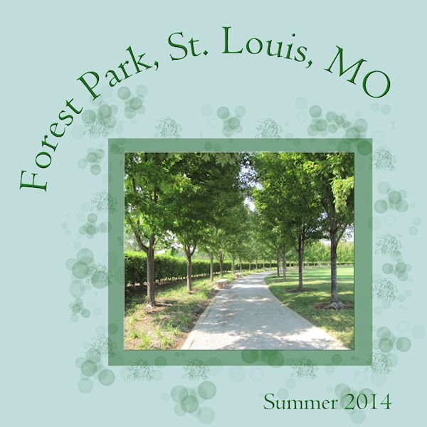
I have always loved that kind of perspective as is shown in this photo with the poles and wires.
-
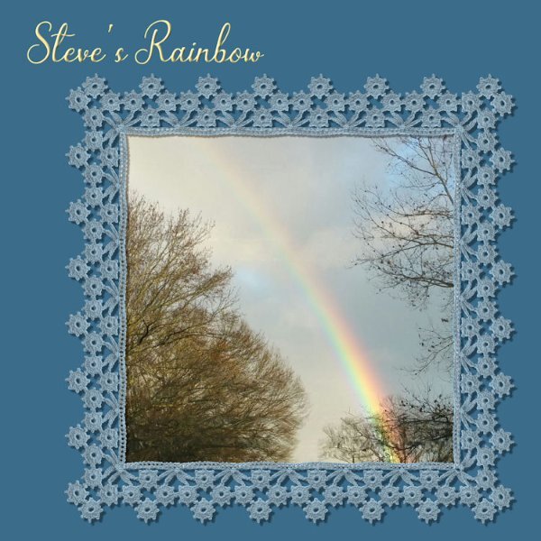
Using my son Steve's Rainbow again. This time within Cassel's Crochet Lace Frame she gave us some time ago.