Cassel
-
Posts
5,873 -
Joined
-
Last visited
-
Days Won
17
Content Type
Profiles
Gallery
Forums
Everything posted by Cassel
-

the thread in the archives : Where in the world are you?
Cassel replied to Marie-Claire's topic in Suggestion Box
I'll check that. The one with the map, I am sure it was carried over. In fact, the whole archived threads were carried over. It is only the images that didn't follow, which is why I kept the "archived version" available. OK, I found it in the Lobby: -
The theme for November is CEMETERY. Did you visit a cemetary for Veteran's Day? Or to honor an ancestor? Or a recently deceased friend or relative? Remember that you can also share older layouts you already made. You don't have to create a brand new one! Let's go! Post your project in the gallery.
-
In November, our monthly theme is CEMETERY. It might be a strange theme, but interestingly, it has inspired many people to do scrapbook pages. Maybe it is to honor ancestors, discover history, or document one major event in any family: the passing of a loved one. This might be a bit challenging to find words that start with the various letters of the alphabet, but maybe we can think of different elements that we could find in a cemetery, decorative element on tombstones, etc. If we we are stuck on one letter, after 24 hours, let's skip it, ok? Let's go!
-
It is a new month and new projects. Show off what you are working on in November be it a scrapbook page, a collage, a tutorial, or anything else you want. We are curious and want to see, learn, and get inspired. These threads are quickly becoming a fantastic source of inspiration, support, and friendship. Keep them coming! Remember to size down your image to about 600x600 pixels and save it in .jpg format before posting it (if you are creating a double page, you can resize it to 1000 pixels in width if you don't want to post the pages separately). Here are a few guidelines for everyone: when you post a project, give as much information on your sources or techniques used. It will help others who are curious and would like to do the same. if someone uses something that you like on their page, ask where they got it. Sometimes, you can go get it too and it will be better quality than trying to extract it (as it would have been resized to post in the forum anyway). if it is something that they did from scratch, ask how they did it. It would be so helpful to everyone! if you like a photo and would like to “play with it”, ALWAYS ask permission. Sometimes, there are some limitations and the person is not allowed to let others use it. Don’t get them in trouble. Usually, people are happy to say yes (if they can) when you ask politely. And if you get permission, you might get a better-quality image than the resized image anyway.
-
Do you want to challenge yourself to take photos every week for a year? Maybe you want to practice your photography skills, or just try to capture "ordinary" daily occurrences. Let's just encourage each other. This is a no-pressure thread, and you can share the photos you took or the theme you are going for (if you are going with a theme). And if you don't want to share the photos yet, and only showcase them once they are in a montage or a scrapbook page, you can just say that you did it. And it is ok to start your 52 weeks at any time. It does not have to start in January!
-
I heard stories of my great-grand-mother who was cooking baked beans in a pressure cooker and suddenly remembered she forgot to put the lard and opened it with the pressure still on. Supposedly, there were beans on the ceiling too!
-
Yes it does, and I think that is what puzzled some users!
-
I actually didn't make them. I happened to have them in my stash from many years ago. I thought they were different than the ones we had in previous calendars. I didn't think it would be that challenging though as I just expected that people would just use a large image and the "extra" would simply fill in the outside. I didn't think participants would go through all the lengths you all did to "separate" the main photos from the "extras". But it could definitely become a class or something like that.
-
Oh, that reminds me of an awkward situation when I was working as a speech-language pathologist. In the 80's group therapies were kind of new and a way to see more patients in the same time period. I was just starting a group and went to the waiting room, called out the four names I had on my paper. So, kids and parents got up and came to the door. One other lady, with a child got up and said, "Can we come too?". I assumed it was a relative of one of the named patients so I said "Sure". As I started the therapy session, I was obviously concentrating on the four named patients, assuming the fifth child was a sibling (or cousin). After about 15 minutes, the extra child's mom raised her voice and asked "How come X is not part of the game?" That is when we figured out she was waiting for her first session with a different therapist. Oops!!!
-
I think it all depends on where you get your calendar printed. Some places will offer a template and you just fit your JPG or PNG file in that template. You might want to change the resolution to 300dpi, but for some printing places, that is not even necessary, so check what is required. I have had books printed and was never asked for a CMYK version, so again, check if it is required at all.
-
Did you ever order something and it took forever to receive? Or a repair that took much much longer than it should? Did any delay come with a funny story? Let's share. We might get a few giggles along the way.
-
@Julian Adams It is an interesting idea to add an image behind the dates. I am always amazed at how participants really think out of the box and show so much creativity. @Sue Thomas I didn't know the non-capitalizing of names was common in French movie credits. I have not watched French movies in many years! @Corrie Kinkel Once you get your calendar printed, take a picture of it, just like you did for your book. It is one thing to see the digital version, but seeing the printed project on a table is another level. @Sharla That will make a fantastic flower calendar! @Daniel Hess It is fun how some of the fonts match either the month or the picture! @Donna Sillia That is a good question about the resolution. I never noticed that they were different as I created all from the same "template". When the template is 2400 pixels wide, at 200 px/inch, it means it would, in theory, print at 12 inches wide. If you go to File > Print Layout and put the image on your page, it will prompt you to resize it to fit the image because your paper is only 8.5 inches (or so). My guess is that if you send it to a print shop, they will also adjust to the size of the paper. However, if you want to do the "fix" yourself, you would go to the Resize command and select "By print size". There, change the resolution to 300 pixels/inch. You will then have to adjust the size above, to 8.5 inches wide (it will automatically adjust to 10.5 in height). I don't think it will make much difference though. I rechecked all the pages and you are right: the April, May and June ones show as 100px/inch. No idea why. @Susan Ewart Your gradient is so subtle and beautiful!
-
@Julian AdamsThe bevel looks good on the days, without the outline (for June). For July, your airbrushing is so subtle that I would not have known if you hadn't said anything. @Mary Solaas I don't understand why you had to use a different technique to colorize the dates? Did you merge the white with the dates? Just locking the transparency would have be enough to change individual date color. @Ann Seeber It looks like those masks have generated very different results than I expected initially. All those ideas are definitely going to go into a class/tutorial/workshop! @Sue Thomas I remember seeing credits at the end of some shows/movies where they didn't capitalize the names. I guess it is a style on its own but as you pointed out, some interesting glyphs can then be used! Curious to know: do you manage to always get a nice "solid" background or do you edit the photo to get it? @Sharla Next time, I should warn people that the photos should be horizontal. I didn't mean to make it harder for users. @Donna Sillia Those backgrounds are very interesting! @Gerry Landreth Great work! That calendar will be lovely! By the way, once you are done your pages, you can then post them in the gallery for everyone to enjoy them! We are almost done!
-
Duh!!! I didn't read the Dad in the sign!
-
Don't worry. The thread won't be locked so you can easily come back to it when you have more time.
-
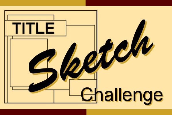
Learning scrapbooking is often done with practice, looking around for inspiration, and trying to recreate projects we admire. Sometimes, we can be inspired by finished projects, but sometimes, we also have to use our imagination to interpret something. This challenge will allow you to envision something from a “boring” base, and you will have to imagine the end result differently. The sketch is only a written idea, and you can fly with it, modify it, and customize it to fit your vision, your photos, and your supplies. And if you want more information on using sketches, check out this article. Post your project in the gallery.

-
@Art Kuiper I keep using and re-using some of those features like the Lock Transparency, and the Character Map for many projects. Those are good tools in your toolbox. @Susan Ewart The minimalism of your photos make simple background very suitable. Those photos are the real stars! @Cristina Two of your images are not showing. I am not sure why (January and February). Out of curiosity, are all those images from the same author or the same theme? @Sharla I am glad those extra months are useful to you too (starting on Monday). @Julian Adams Beautiful effect on your April page. A subtle bevel is great and not distracting. @Ann Seeber It is so interesting that you have the names for those animals. You might want to add those details on the pages! @Donna Sillia What event is on June 15th? Remember that with the last lessons, it is very possible that you will want to revise and edit your first pages. That is alright. It is actually expected so if you end up with a very different page, enjoy the experience and the process. Keep those pages coming!
-
Another workshop will soon start. Are you in? It will start on November 18th. This workshop is FREE for everyone, so spread the word. This workshop is meant to be for those with some experience with PaintShop Pro. If you are brand new to using the program, it will be a little more challenging, although we are here to help you if you still want to participate. Did you find this thread before the registration page? Here it is. Written instructions and extra supplies will be available to our DIAMOND members.
-
@Julian Adams I would suggest to go less with the bevel so the mask effect can show more (more obvious on the January page). For February, did you put the image only in the "center" of the mask? If you have a square image and a rectangular space, you can either crop it rectangularly, or do like you did and "fill in" the sides. If you want to resize the mask, you CAN do it, using the Pick tool, but make sure you will brush in black, the areas that will become uncovered on the sides. For the bevel, I tend to keep the Ambiance at 0 so the lightness stays as close to the original as possible. @Ann SeeberSince the mask creates a partially transparent section, that is why the layer below will show through. Maybe you can tweak it by brushing, with a solid color, where you don't want the pattern to show (or where you would want to add color). To adjust the Kerning, you highlight the character and reduce the Kerning value to narrow the space or increase it to spread them apart. It can be also very useful when you use dingbats, like stitching fonts. Adding color to the outside of the photo area is not something I expected, but all you, users, are so creative!!! @Sharla The white background might sound boring for some, but on your pages, it makes your photos stand out! @Sue Thomas Maybe someday, you could share "not-so-photogenic" models, just for a good laugh maybe? @Mary Solaas The days of the week abbreviated look so much more balanced! These pages are the perfect opportunity to work with gradients! @Art Kuiper Those masks are called "artsy". There are some designers who create great masks of that style. Maybe I should make a tutorial (or a class) on that type of mask. @Donna Sillia I guess you answered Julian's question about modifying the format of the mask! @Corrie Kinkel It is so great to read how you see "errors", and can fix them yourself with PSP. And experimentation also yields fantastic results. @Anne LampIf you follow what others have done, you can add a color that matches the photo on the layer called PHOTO HERE, and it will add some colors around your photos, through the masks.
-
@Susan EwartMinimalism looks great to focus on those lovely flowers. @Sue Thomas You have the most photogenic models of all! @MoniqueN. I think that we will have many more projects posted as the workshop gets closer to the end since all the tutorials will have been demonstrated. Looking forward to yours. @Ann Seeber When using fancy glyphs on single characters, I noticed occasionally that it SEEMS to add a space, which can just be removed manually. Other times, I need to adjust the Kerning for that one character. I don't know if it is the case for yours, but something to check, just in case. I like those subtle papers you are using. @Mary Solaas Have you considered centering the days of the week instead of aligning them to the left? I am not 100% sure, but I wonder if it would make them a little more balanced? Maybe not. @Anne Lamp It is possible that the layers had been slightly shifted before saving them on my end, which might explain why some pages show a little line on the edge. At least, it is easy to fix by expanding the mask layer a tiny bit. @Corrie Kinkel Hopefully, you will still have enough time to complete your pages and get them printed in time for the holidays. @Donna Sillia On your February page, the decorative flower on the bottom corner has its light source coming from the right. Flip it horizontally and compare the shading. Although I plan on making written tutorials in the form of blog posts, you can check out the webinar that I hosted for Corel, a few years ago. Maybe I could revisit it as a Master Class? What do you think?
-
Oh, I think i see what you mean. You put the image in the central part of the mask, leaving the grey sections partially transparent. That means that the background paper will show through that transparency. Is that possible?
-
One thing to remember is that when you highlight the text, it will show a grey background. Unfortunately (that would be on me) it is the same grey as the background. One alternative is to Select All (Ctrl-A) as soon as you see the cursor appear. That will select the whole word and you can edit it. But if you change the background color, it might show the highlighted text easier.
-
PHOTO HERE simply means to activate that layer to add your photo (which will be pasted just above it). That layer does not contain anything other than black so that you can see the effect of the mask above it. You can change it to any color if you want to see the impact. I could have chosen any other color than black. It is just for "visibility" purpose. I am not sure what you mean by not being able to hide/delete that layer. I know PSP2023 has been a bit picky in that. For the title size, which one are you looking at? Mine show in Pixels. It should be 200 pixels, but you can also adjust that based on the font you will use.
-
Thanks @Sue Thomas for the help. I am not very good at all that terminology. So, here is a summary for Canada (obviously, the names would change in different countries) Riding (or Electoral District): This is the main area or region in which voters elect one candidate to represent them in the provincial legislature. Each riding corresponds to a seat in the Legislative Assembly. Each riding elects one Member of the Legislative Assembly (MLA). The provincial map is divided into ridings of about 15000 people, on average. (we have 49 ridings) Polling Division: Each riding is subdivided into polling divisions. These are smaller geographic areas within the riding. A polling division is the smallest electoral unit, and it determines where voters cast their ballots based on where they live. Each polling division has its own assigned polling station (or polling place). In the end, it is all counted in a riding. Polling Station: This is the physical location where voters from a particular polling division go to cast their ballots. There can be several polling stations within a riding, each serving voters from specific polling divisions. Again, it is just a convenient way to allow voters as it is all counted into the same riding total.
-
Elections happen everywhere (I assume) and the process might be similar or different between countries. How are they performed? Is the voting still on pieces of paper? Is the counting done manually or electronically? How is everything tallied? This is NOT meant to be a political thread, but just a discussion about the process in this age of technology. Let's share.