Leaderboard
Popular Content
Showing content with the highest reputation on 06/03/2023 in all areas
-
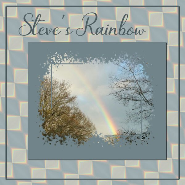
So, I'm playing with Steve's Rainbow again. I took a section of the rainbow and played with Effects>Reflection>Feedback and came up with one I liked; put it on a larger canvas size and duplicated, flipped and rotated it until I had a pattern I liked and then made a background paper of it. Used Cass' Mask from Mask Workshop Extra 3. The font is Bluebell. Canvas frame is of course from a selection and inner bevelled.5 points
-
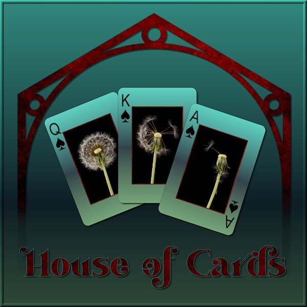
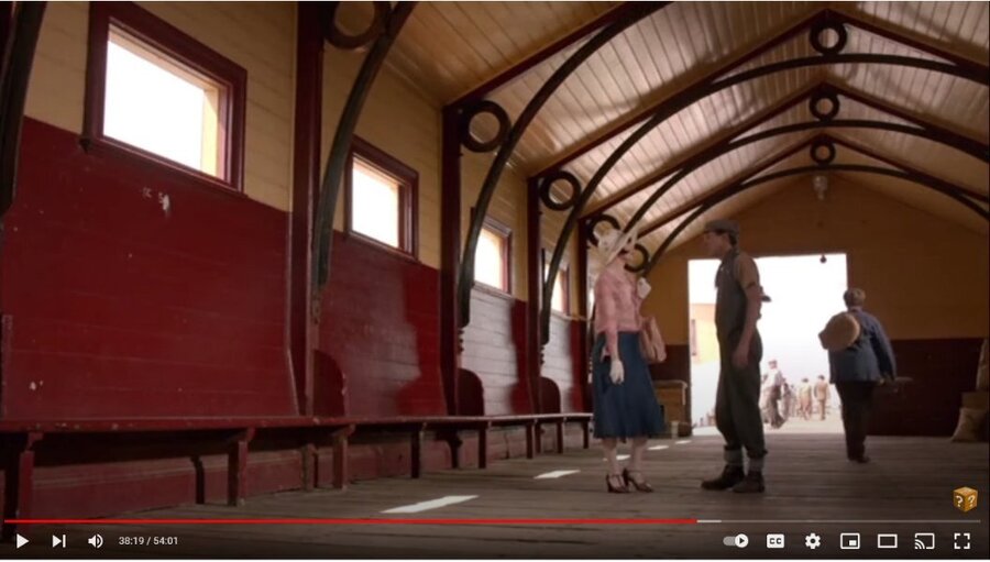
I am watching this Australian Mystery series on utube and there was a scene with a cool design in the building (picture below). I wanted to try and receate the graphic version. I cant wait till we do the Vector workshop. I used vectors to create it and did some problem solving along the way. I'm happy with what I did this time. I didnt quite get the proportions right. When I know better I'll do better. I was playing with what to do with the background when I tried the gradient called "Underworld" so my theme was gambling in the underworld (too much watching the TV show Supernatural). I used the eraser tool to fade out the bottom as if it was descending to the underworld. It was the first time using the Custom Playing Card script from Carole. I LOVE IT. I learned to click "cancel" when choosing a photo and "cancel" again to continue the script and ended up with the layers of, white background and card number/suit. I put the same gradient on the card, lightened, and put my photo's on. I can see a lot of ways to use this script. My original layout was quite dark (my monitor is very light so it's hard to know what it looks like) so I lightened it up for the forum/gallery. My photo's of a recent studio shoot, fun with expiring dandelions. Font is Vanilla Right.4 points
-
Nothing wrong with that, if it's not working, move on and find something that does work. It's not giving up, you solved the problem of those textures and overlays not working, so you in fact learned something from trying it. I know it feels like giving up, but think of it as learning what isnt working often moves you back to what IS working. Dont we learn more from what goes wrong than what goes right. I do know all too well this part of learning is the unfun part of it3 points
-
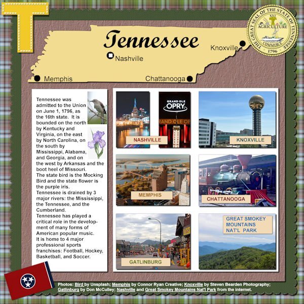
Looks like Happy Birthday to Tennessee is in order. Look at how many double letters in a row is in this State. Now that's something to celebrate! I like the information you give in your layouts.3 points
-
I was surprised to learn I won the Phrase Strips script! I had to play with it which took a bit of time as I made the adjustments to the script itself (as per instructions included) and needed some help from Carole. My deadlines for two projects are now behind me (other stuff) and I can get back to PSP time. I like the "idea" of this layout, but I'm not entirely pleased with the harsh white background. I had to leave it like that b/c I'm not much good at extracting an image and getting a transparent background (the sketch of Mrs. Roosevelt). If I changed or softened the background, then the borders of the sketch were too visible. It's a skill I have to acquire.... Otherwise, I'm happy with the phrase strips and how to use them. Thanks Carole!3 points
-
3 points
-
Leftover Scraplift from May - Six of my grandchildren (the ones who have significant others). The only one missing is Tyler-John who is unattached at this time. The title font is Baby Olivia, the background is color fill treated to weave texture, the curved paper is treated to a pattern using the sculpture texture, the flowers behind the photos are a ribbon called Butterfly Garden-clipart 15. Brad, on the top left, is new to my digital layouts. He and Alycia, top right, are twins.3 points
-
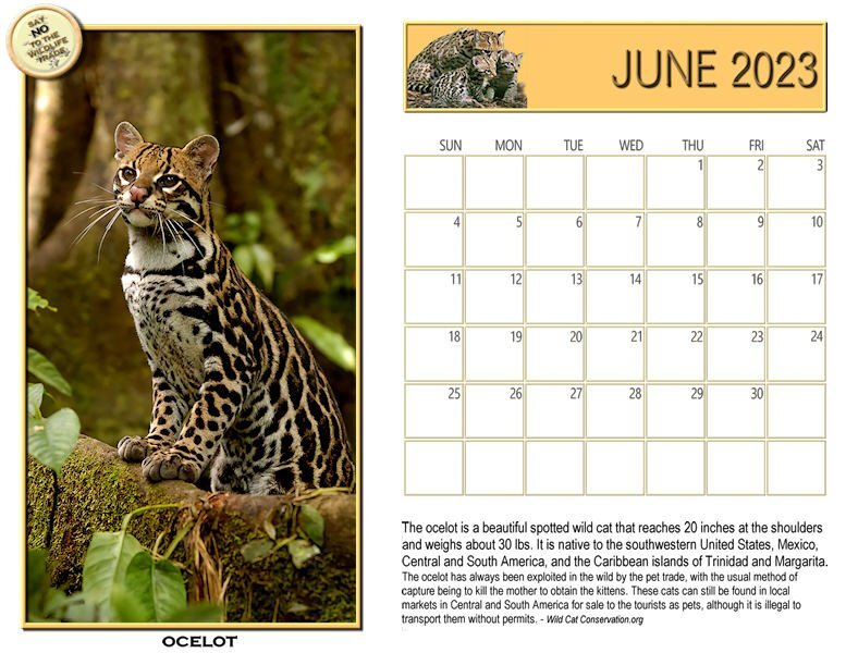
Let's start with a new Wildcat Calendar for June. Here's the Ocelot, a medium size wild cat. Found mostly in Texas, Central and South America, and a few islands. They have been hunted for their beautiful fur coats and recently, females killed and kittens stolen for the sale as pets. That doesn't usually work out once the cat is full grown and they end up in shelters or worse. I'll post a full size image on our Scrapbooking with PaintShop Pro Facebook group.3 points
-
It's about time. I was on Digital Scrapbook and noticed I had a picture there. Took me 1/2 hr to find it on my computer.2 points
-
Well, I like it plain white, so I wasn’t going to say anything here, but if you really, really want to, why don’t you put Eleanor on top on the texture? And the Eleanor layer gets “multiply” and it picks up the color and texture of what’s below it. I better add a little more to the above….what I usually do, because it might be too harsh on somebody’s face. Three layers. the bottom is full color, full opacity. Then your color or texture in the middle, and then Eleanor on top. You will change the middle layer of color texture to multiply, but also change the opacity slider or those texture marks will look like wrinkles on her face. (The bottom layer is 100% whatever color you want so you paper is opaque, not matter what that middle layer.)2 points
-
Hey, while I wasn't looking you added a photo! Nice to "see" you Susan.2 points
-
1 point
-
1 point
-
That background effect is really cool. It's interesting how you came up with it. I need to do more thinking out of the box like that.1 point
-
1 point
-
I am looking forward to the class. Thank you for your comments. I think I had to turn it into a raster to use the eraser tool on it. But, yeah, Vectors make my head spin. We will take the workshop and tame them demon vectors. It is dizzying trying to remember when to convert to this or that. I hear the words from Carole but it isnt sinking in. I think we need to do it and struggle through the blocks that arise to actually "understand" it. My vectors were in making shapes and sticking them together. After the fact, since I used "spades" in the cards, it would have been cool to use spades (outline) where the little circles are.1 point
-
Now that is really awesome, Susan! Yours looks just like it! The fading of a vector sounds like a real headache…any thing with a vector sounds like a headache…but I don’t think I could have even thought of it, much less considered how it would be done. I can’t wait for the class on Sunday! Maybe we’ll learn when to convert to a path, and when to convert to a raster. LOL!1 point
-
1 point
-
hahahaha. this is actually from 2018, in the hospital when my niece who just had a baby (c-section no less) had to get up out of bed to take a picture of me and Baby Luke. Worst. Aunt. Ever. I look the same, still crazy hair that needs cutting badly, but much more gray at temples. Ann has hinted I should add one for some time, so I'm seeing how long it takes for her to notice. I will try and get a new picture sometime soon.1 point
-
Thank you. I tried doing them outside too, but seems like my creativity stops at the studio door. ?1 point
-
1 point
-
I too am at a loss if technology stuff goes wrong. Just like if the lights dont work. My electrical expertise amounts to flipping the odd breaker switch when I use the microwave and the kettle at the same time. Technology is great when it works, when it doesnt, I'm reduced to cave-woman mentality.1 point
-
You have a good sense of knowing when to say..."can you make a script for that". You both make a dynamite team. I like your papers too, also a lot. the patterns are nice, not too big and overwhelming. They are classy; one could say, patterns grown up. And, who doesnt like popcorn? Put butter on your flowers and call it popcorn, after all they did come from a plant. When I try out this script I'll have to refer back to this post. I'm looking forward to seeing where you go with the kits. You are very creative and I love your energy.1 point
-
Downloaded folder...it was empty. It was the only folder I was offered access. Love the kit!1 point
-
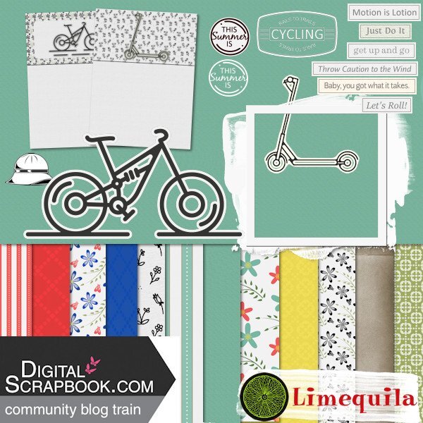
If you want to help me, it would be ideal, Susan or anybody, really. I di d a kit for the Pixelscrapper BogTrain, but I don't habve a blog. Or a store or anything,. LOL1 So I think I used Dropbox, but if anybody would like to see if it works, i woukld be beholden to you! The ugliest preview I have ever seen, but I'm not sure how to make one. Here is the link for the kit.l I'm worried about three things -- people can mess with my other folders and files at Dropbox, &/or people can delete or mess around this this kit. OR there is nothing there to download because I did it all wrong! https://www.dropbox.com/scl/fo/938obtx011pzkpliijw2m/h?dl=0&rlkey=r97c19okadh1sjmekc3osi2t71 point





Resized.thumb.jpg.d25811db03a63358cedab1e79f527635.jpg)
