Leaderboard


Popular Content
Showing content with the highest reputation on 04/15/2023 in all areas
-
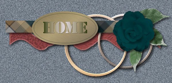
Finally took some time to complete a challenge. Thank you as always Cassel for stretching my comfort zone and teaching me countless lessons. Paper inspiration from Marisa Lerin"s - Hello Spring Kit but were coloured to follow the given pallet. I created the Elements and filled them with the paper patterns. The fonts used were Culrz, DeVinne, and Cooper Black Out . The photos are mine taken on a sunny morning when the sun was back lighting them so they had some transparency which I found interesting. Love seeing all the creative talent in this Campus,
 3 points
 -
I tend to pick clusters up here and there as I don't feel mine are very good. This one worked pretty well, using supplies from my Rustic Build-A-Kit, except for the greenery. The wavy ribbon is from a textured paper with a blinds texture on the edge.
2 points
-
Donna, I did play with your pattern and colorize and color (RGB) and my favorite is this one in silver.
2 points
-
Clusters are about grouping elements, and not photos. Of course, if you are thinking of them as page templates, they rarely make sense! ?1 point
-
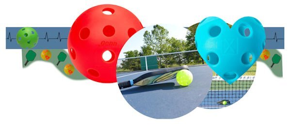
I don't enjoy clusters and rarely, if ever, use them. I had to turn to pickleball to get started. I didn't add shadows...should I have. If anyone else used shadows, they would want to add their own.
1 point
-
What you posted is a 600 px. I did try AI resizing to 3600 and it keeps the shininess but the weave is enlarged. I could post the 1000 px but we cannot post 3600 px as it is too large for the forum. I was able to post it in the facebook group so you can look there.1 point
-
That's ok, Carole. I enjoy playing with templates.1 point
-
Adjust>Color>Channel Mixer Output channel: grey; red: 94%; Green: 101%; Blue: -6%; Constant: 15%; Check Monochrome. You can see how OCD I am! I played with that greyed pattern with everything I could find: Adjust>Color; Adjust>Hue, Saturation, Lightness>colorize and everything else. And I even played with AI resize to increase the 600 px size to 700, then to 800, then to 900, and then to 1000. This was because I couldn't get a good pattern to cover a 3600 px page. If it takes it, I will post it as 1000.
1 point
-
Sorry to see you work so hard. When I create it, it is already in layers. The idea was only to use the shapes as placeholders, not as exact shapes, which is why I didn't include the layered version. But if that is what participants want, next time, I can share the layered version. It is created using the Cluster Template Maker.1 point
-
I created a PSPIMAGE template from Carole's sketch. The wavy ribbon is still a bit rough. ? I'll post it in the Files on Facebook for whoever would like it.1 point
-
Donna and Susan: I took my pale pastel in 3600.jpg and posted it in our Facebook group files so you can colorize to your liking. Enjoy!1 point
-
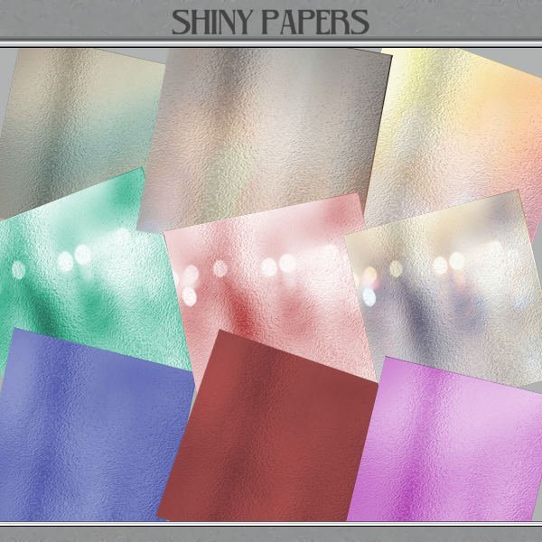
I have a small set of pale pastel shiny papers in my files but with no identifying information as to where they came from. After seeing that Donna tried to colorize hers, so I thought I'd try on mine and have had some success. I did them all in 3600 but here's a preview. Voila!
1 point
-
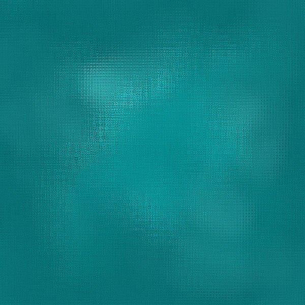
I've been playing with that reflection effect. I'll post the dark blue sample that was posted by Donna and for the comparison the one Ive been playing with. Many different layers but really using a glitter by Cassel and using different blend modes (mostly soft light) and then playing with effects>texture effects>mosaic glass several times, and then sharpness several times, this is what I came up with. Oh, yeah, also effects>distortion effects> fine weave also. While I was playing, I had Donna's image up for comparison with what I was doing.
1 point


Resized.thumb.jpg.d25811db03a63358cedab1e79f527635.jpg)