Leaderboard


Popular Content
Showing content with the highest reputation on 04/11/2023 in all areas
-
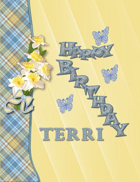
Thank you, Monique, I actually made the daffodil bouquet and plaid for a March birthday card. I used Vectortube on her name and the bow for the March birthstone which was created using FF crystal and a preset shape made into a tube.
 3 points
 -
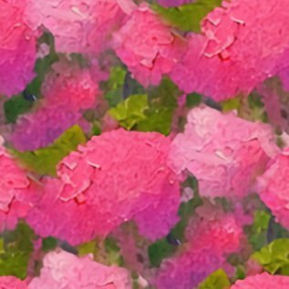
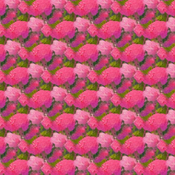
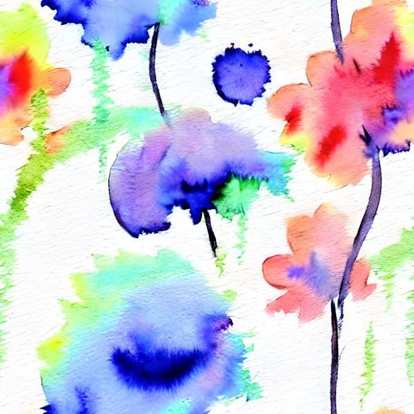
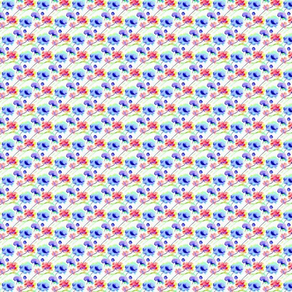
and while i'm at it -- I also worked with the CF Spark images I showed previously. With my camillia picture which I ran through pic to painting and CF Spark, I finally chose the one that Susan liked and made a pattern from it in a smaller size and made a paper with it - playing with it on a 45 degree angle really came out interesting. I also made a paper from one of the patterns made by another artist in watercolors that was posted in Spark.
3 points
-
This is the black and white one. I made it on only 1 layer - using the above steps. I tried changing color with Adjust>Hue, Saturation, Lightness - but you can see that it doesn't work very well so maybe you need to choose the color first and then create it.
2 points
-
My son and his girlfriend don't want their daughter (my granddaughter) on the internet, so I had to blur her? I changed the photo with Adobe capture in a line drawing. All the other elements are from kits in my stash, mostly from pixelscrapper.? Edit: (I removed the project, it didn't feel right somehow)2 points
-
I'm too OCD. I couldn't stop working on that glimmer effect. I'm going to post the last 2 I worked on last night and took down the steps I took to achieve the result. Donna, maybe this is what you are looking for. I did try to do it in black and white thinking that I could colorize them with some of the tools in PSP, however, that doesn't seem to work and keep the shininess we are trying to achieve, but I'll show it anyway. I worked in a 1000 pixel square. 1: Fill with a light color; 2: New layer: use a darker hue of the same color; 3: Use the paint brush (I chose the cloud brush - used size 50, but you may like a larger size which I used in the 2nd one, hardness 50, step 5, density 100, thickness 100, opacity 100, check Smart Edge - and brush all over the layer; You can merge the 2 layers - I merged visible to a new layer; 4: use a small gautian blur - I used 5; 5: Effects>Texture>Mosaic Antique - I set it with # of columns 75, check Symmetric, tile diffusion 100, grout width 10, grout diffusion 15; 6: effects>texture>mosaic Glass - I set it with # columns 100, check Symmetric, glass curvature 75, edge curvature 3, grout width 3, grout diffusion 0; 7: Adjust>Sharpness - I did this about 3 times. I did save as a pspimage as well as a jpg. Since it won't post at 1000 pixels, I resized it to 600 pixels square.
1 point
-
A very nice one to put on an actual card and send it!?1 point
-
April Palette Challenge. Created the little flowers for the background paper (pattern, flood fill). Background paper overlays, blend modes, and colours, using several layers. Replicating colours from the photos. Some of the first things I learnt to create were the eyelets and stitching, when I first joined the campus. Due to adding noise, and textures some colours have have changed slightly. Some flower pics I have taken on one of my trips home.
1 point
-
I opened a blank square page, flood filled it with the blue, opened a new raster layer then used a not solid brush to make blobs of the other colors all over the page. From there I played with the kaleidoscope until I got something I liked. With that I used the pattern to make this.
1 point
-
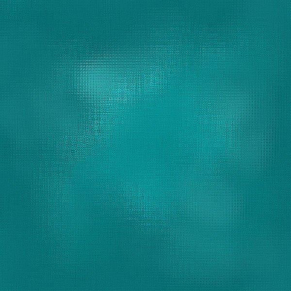
I've been playing with that reflection effect. I'll post the dark blue sample that was posted by Donna and for the comparison the one Ive been playing with. Many different layers but really using a glitter by Cassel and using different blend modes (mostly soft light) and then playing with effects>texture effects>mosaic glass several times, and then sharpness several times, this is what I came up with. Oh, yeah, also effects>distortion effects> fine weave also. While I was playing, I had Donna's image up for comparison with what I was doing.
1 point
-
An Easter card. The daffodils and leaves were extracted from photos of daffodils in my yard. Bow is a Cassel bow. I made the plaid and the letters are from my kit altered to change stroke and fill.
1 point
-
Those are very neat. I tried it but didnt get good results and it kept saying I was in line and it took more than 5 minutes. I am not that patient, the results were not great. For me I find it a dilemma. If i think it but dont have the skills to execute it, and I have someone/something else design it, who is the artist? I do understand it is a tool in our toolbox and we should use all the tools at our disposal. I will come around as it has very pleasing results for you. I think I'm not creative enough or perhaps descriptive enough to get those needed results. That 3rd from the left top row flower grouping is really pretty and would make a great paper. Maybe I should re-think my logic.1 point
-
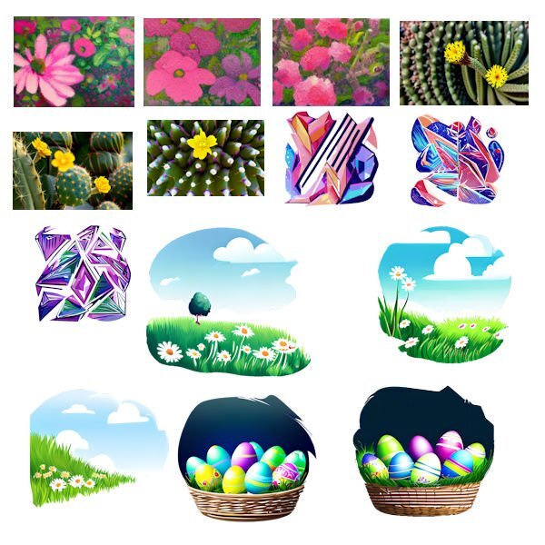
I've just discovered what CF Spark can do. So I will show what I have been playing with today. The last 5 are something I just asked it to create with a description. The others are from a beginning picture.
1 point
-
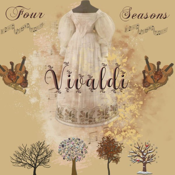
This project was originally meant for the song challenge, but it isn't a song? But what a struggle it was! I always "save as" when I'm working on a project and add a number to every version. This time it was 28 versions!? (Normally about 10/12) Font ChaseCallas and Beauty night butterfly with a bevel. The instruments are picture tubes on a seperate layer and later on merged. The musical notes on the Staves(?) are from Janet Kemp (Pixelscrapper) Trees and background also from Pixelscrapper I think. Costume I had on my computer.
1 point
-
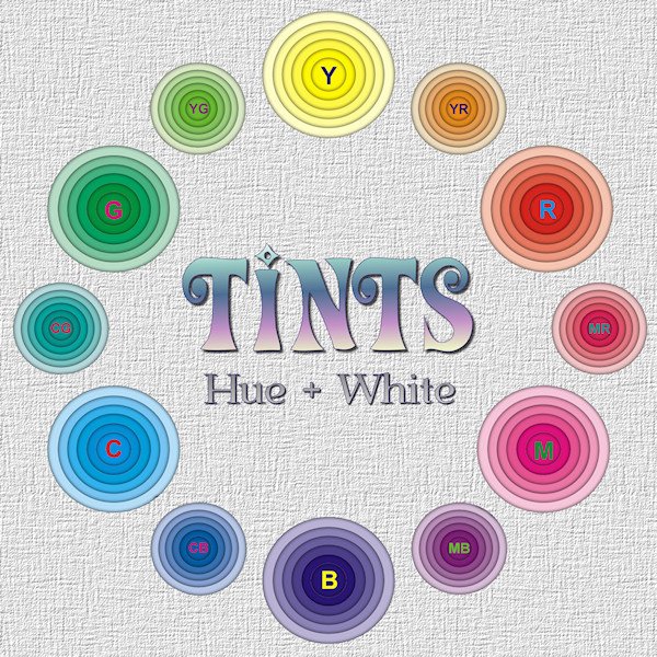
I was playing with the Shadow box Master class. And I had this color wheel in mind (although I don't actually subscribe to the "color wheel" model?). As it turns out, those little circle layers are too small to be effective at showing the depth. it was a good learning experience, and I've included a larger version so you can get the idea of the depth. It's good for big layouts. I look forward to trying the ones from the masterclass.
1 point